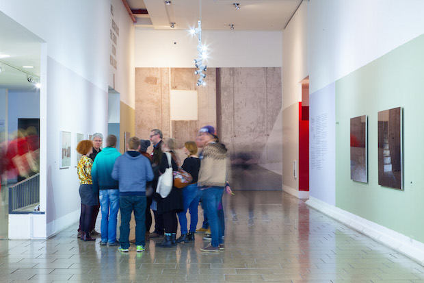
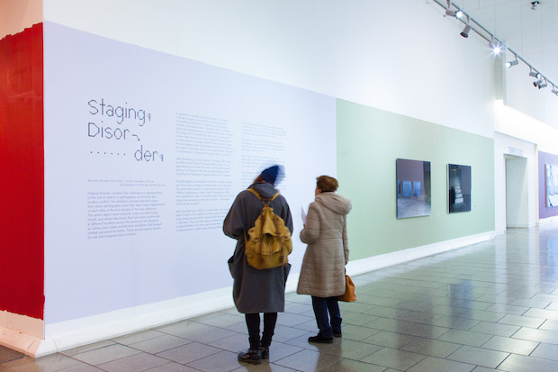
LCC’s new exhibition Staging Disorder examines the work of seven photographers each interested in the environments used to simulate and prepare for modern warfare. We caught up with Studio Hato to discuss its innovative identity.


Tell us a little bit about Staging Disorder and some of the works involved in the show.
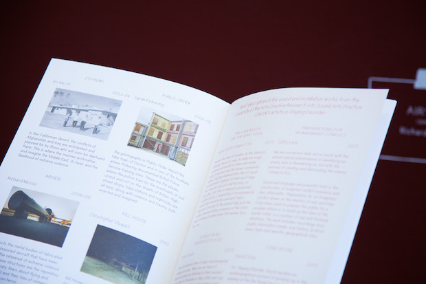
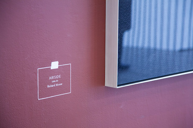
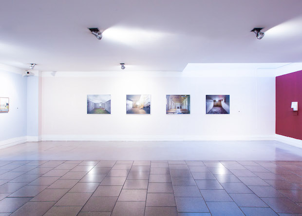
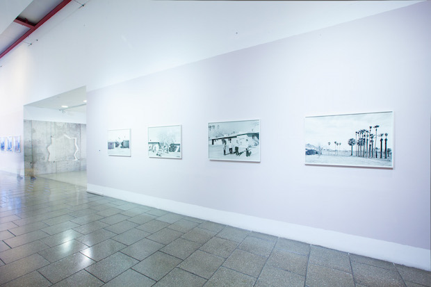
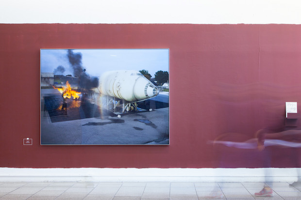
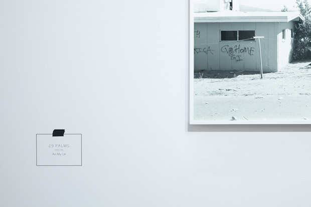
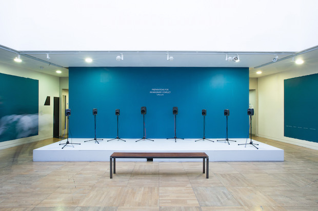
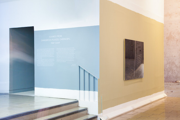
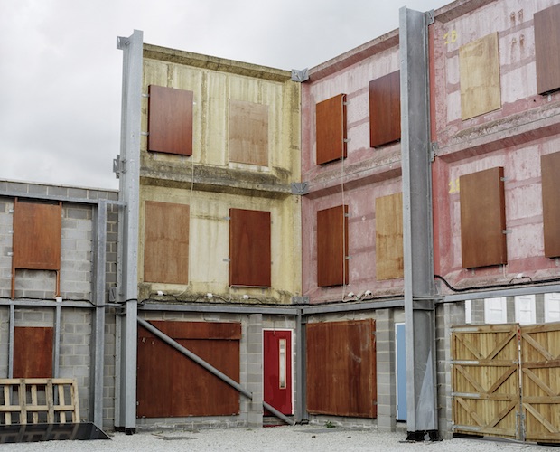
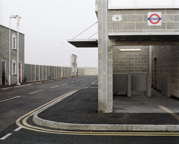
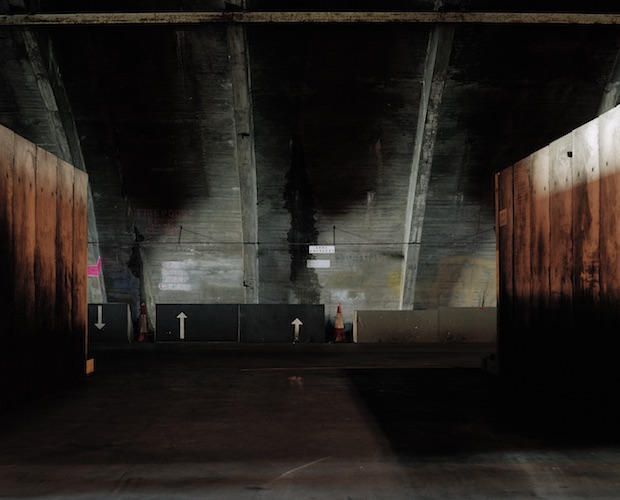
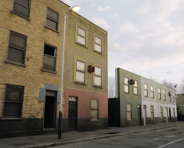
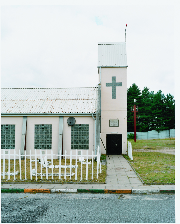
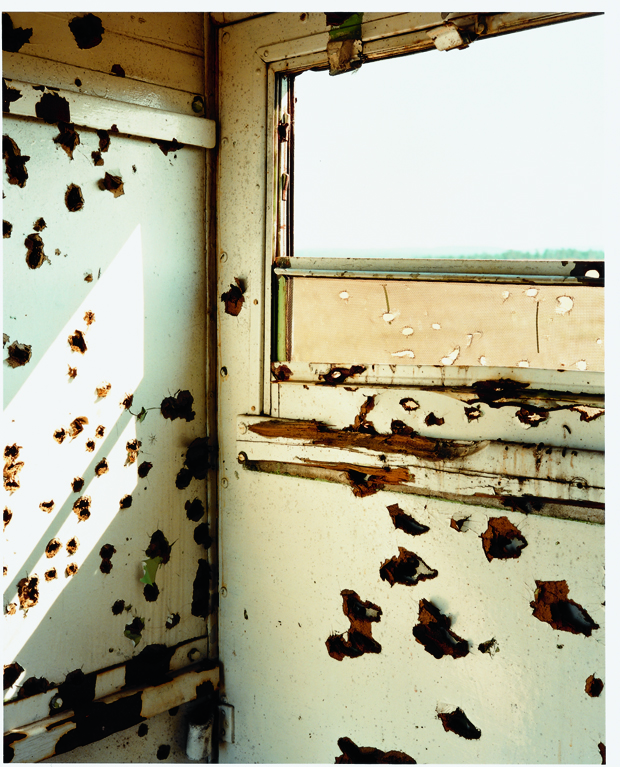
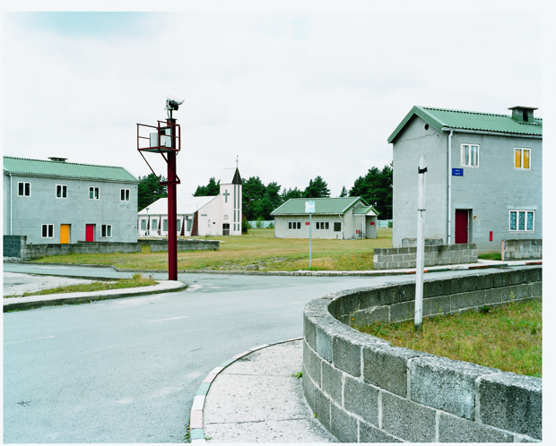
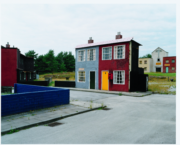
Studio Hato: Staging Disorder is an exhibition of photographic and sound works depicting the contemporary representation of the real in relation to modern conflict. The curators have selected the work of a range of highly-regarded international photographers (such as An-My Le, Richard Mosse, Sarah Pickering, and Christopher Stewart) with the work of London’s sound arts research group CRiSAP.
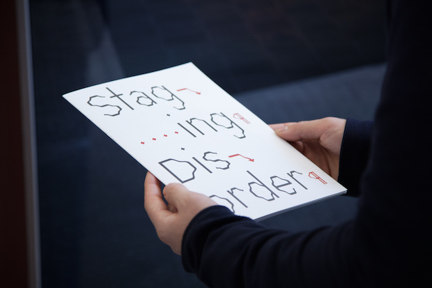
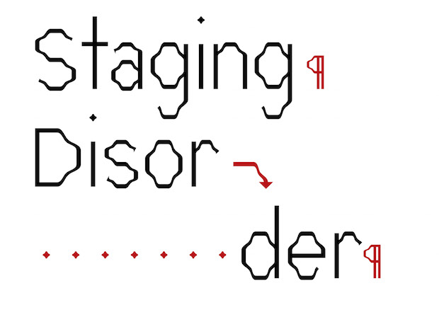
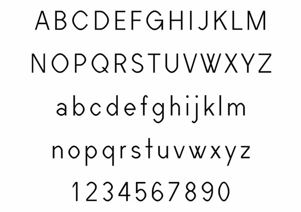
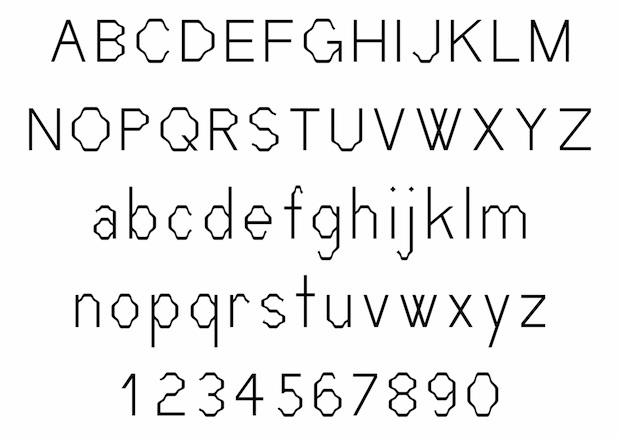
You designed a typeface for Staging Disorder using Metaflop. Tell us more about this interface and the type you designed?
SH: Metaflop is an open source online tool built by Swiss designers and programmers Marco Müller, Alexis Reigel, Simon Egli and Linus Romer. It allows you to control and test the design of a typeface from a set number of variables and parameters. We felt that this process connected with the themes of the work in the exhibition; controlled exercises, testing grounds and so on. Also, we liked the idea of the typeface representing sound and resonance as communicated by the CRiSAP works in the show.
What was the concept behind the exhibition’s identity?
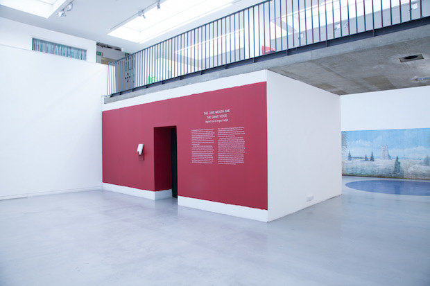
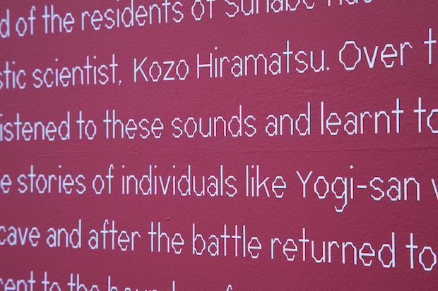
SH: The context of Claudio Hils and Sarah Pickering's work was a huge influence in the design of the exhibition. In these photographs you see staged areas – we wanted to translate this idea of the constructed and temporary into the context of the gallery space, leaving the machinations of the exhibition installation and preparation seemingly exposed. For example, leaving the paint at the edges of the walls unfinished, and using rubdown captions as a stand-in for simple paper and tape. We used a rich and elegant National Gallery-style colours as a way to create a resemblance of a more traditional gallery space, especially given the building is a university and the main portion of the exhibition a busy thoroughfare that needed to be transformed in the context of such monumental works.
Staging Disorder
London College of Communication, London SE1
Until Thursday 12 March 2015
lcc.arts.ac.uk
studiohato.com