Fresh from The Royal Danish Academy of Fine Arts, this Copenhagen-based designer exhibits an impressive array of self-initiated projects and a penchant for monochrome.
Fresh from The Royal Danish Academy of Fine Arts, this Copenhagen-based designer exhibits an impressive array of self-initiated projects and a penchant for monochrome.
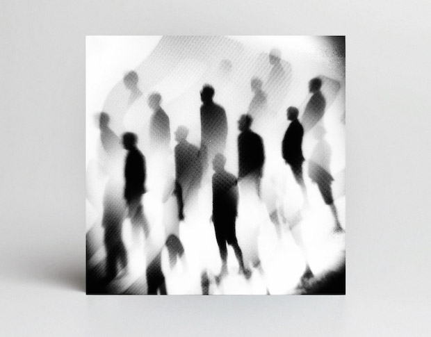
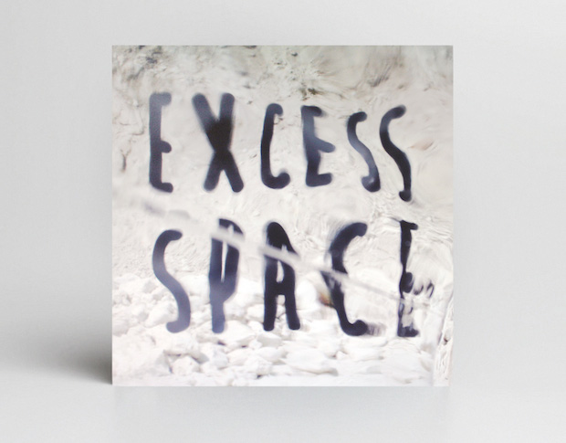
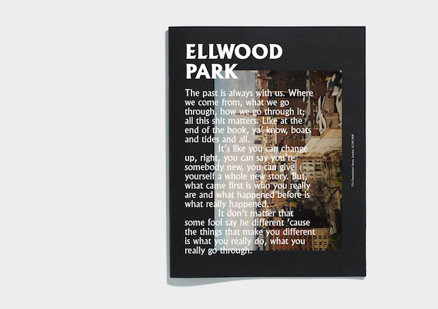
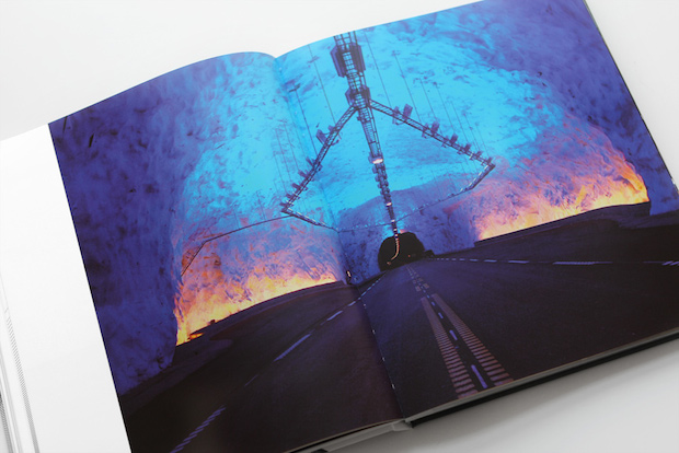
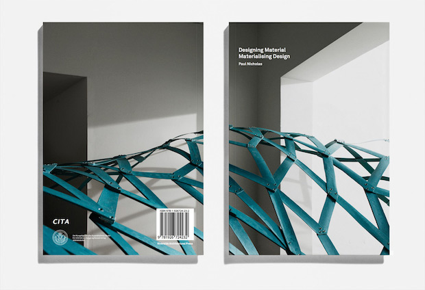
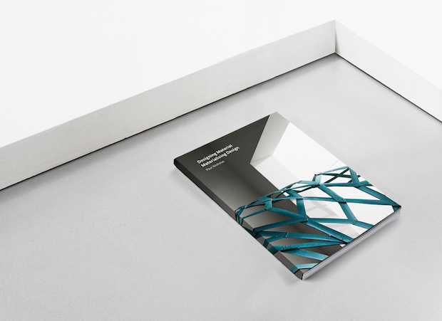
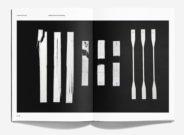
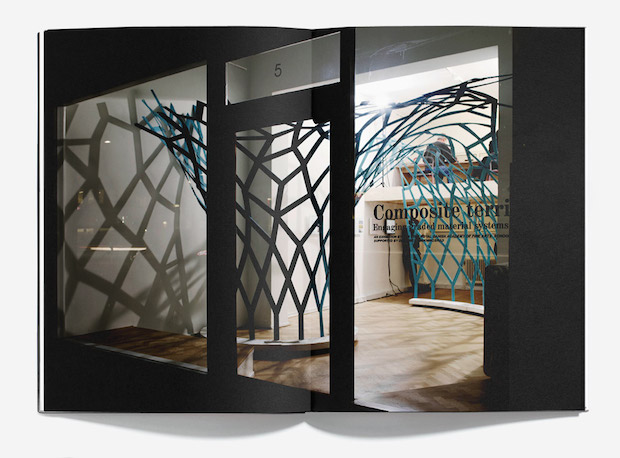
Excess Space, Daniel Siim, Visual concepts for danish music act Ginger Ninja's second album 'Excess Space'. Released by Sony Music. 2013Excess Space, Daniel Siim, Visual concepts for danish music act Ginger Ninja's second album 'Excess Space'. Released by Sony Music. 2013Ellwood Park, Daniel Siim, Personal project, work in progress. 2014Nordic Light - Interpretations in Architecture, Daniel SiimDesigning Material, Materialising Design, 128 pages, printed on 120g Munken Lynx Rough. Published by Riverside Architectural Press, Daniel Siim, 2013Designing Material, Materialising Design, 128 pages, printed on 120g Munken Lynx Rough. Published by Riverside Architectural Press, Daniel Siim, 2013Designing Material, Materialising Design, 128 pages, printed on 120g Munken Lynx Rough. Published by Riverside Architectural Press, Daniel Siim, 2013Designing Material, Materialising Design, 128 pages, printed on 120g Munken Lynx Rough. Published by Riverside Architectural Press, Daniel Siim, 2013Designing Material, Materialising Design, 128 pages, printed on 120g Munken Lynx Rough. Published by Riverside Architectural Press, Daniel Siim, 2013Designing Material, Materialising Design, 128 pages, printed on 120g Munken Lynx Rough. Published by Riverside Architectural Press, Daniel Siim, 2013Designing Material, Materialising Design, 128 pages, printed on 120g Munken Lynx Rough. Published by Riverside Architectural Press, Daniel Siim, 2013A Calculated Use of Type, ongoing personal project, Daniel SiimA Calculated Use of Type, ongoing personal project, Daniel Siim
Describe your style.
I’ve lately become more engaged in a clean and minimal aspect of graphic design, which might be noticeable in my monochromatic style. However dull it may sound, I think I would thrive in a black and white world.
What appeals to you about working in monochrome?
I enjoy finding some sort of peace and balance when working on a project, which I often feel is best obtained through a monochromatic approach. As I mentioned before, I’ve become more committed to a systematic and subtle minimalism when working with publications or identities. However this kind of tendency has left me a bit apprehensive in terms of colourful palettes.
Tell us about a project that you’ve particularly enjoyed working on.
Right now I’m working on a piece called Ellwood Park, which is a self-initiated editorial project about crime in the Baltimore area. I really enjoy being able to experiment with this type of project because of the diverse layers, both in terms of style and content. The last couple of months I’ve had the pleasure of indulging in more personal projects, which I think is a great way evolving as a graphic designer.
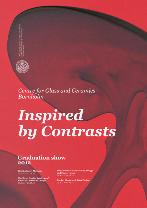
What was the thinking behind the identity for the Centre for Glass and Ceramics?
For this project I used an image of the work of a recent glass graduate to create a series of posters for the graduation show at Centre for Glass And Ceramics on Denmark. It’s one of those projects where one image or element lays the groundwork for all of the materials used. I really liked the organic shape, it’s almost as if a new life form is flourishing, which seemed like a good parallel to a graduation show.
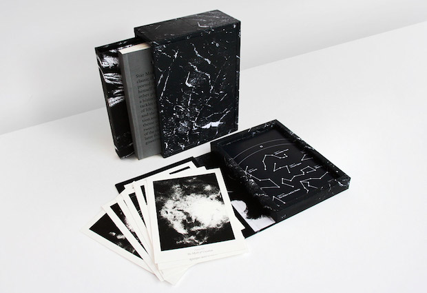
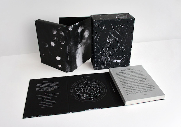
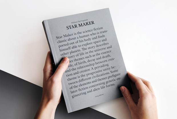
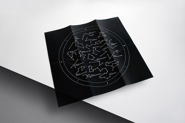
Tell me a bit more about the Star Maker book.
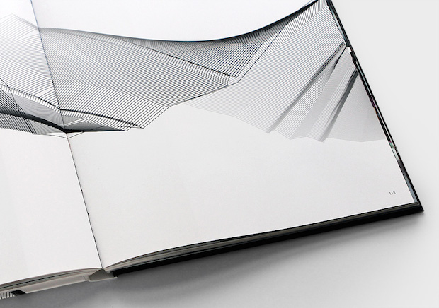
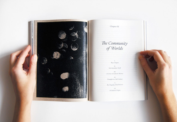
This is my BA project from the Royal Academy of Fine Arts’ School of Design. Because of the immense growth in digitalisation, namely because of the e-book industry, I wanted to create something which could work as a break from our current digital habits. I decided to redesign the sci-fi novel Star Maker by William Olaf Stapledon, which was first published in 1937. The project serves as an experiment on highlighting the qualities of a book's physical existence, some of which cannot be accommodated by an e-book. Always keeping a focus on the coherence between design and product, the project ended up as a comprehensive study of paper and layout. It resulted in a 230+ paged book using various recycled papers, a bookcase containing sixteen A5-sized artworks inspired by each chapter and a constellation map of the book’s content.
Where would you like to go next?
I’m not sure if I have a profound plan for my future, right now taking one day at a time satisfies me. However, I would like to travel outside Denmark someday and experience creativity abroad.
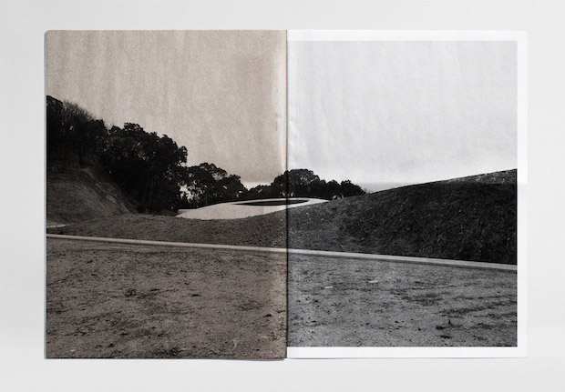
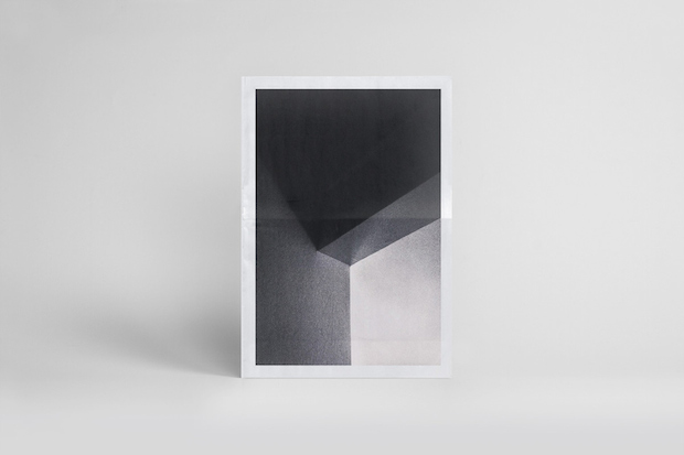
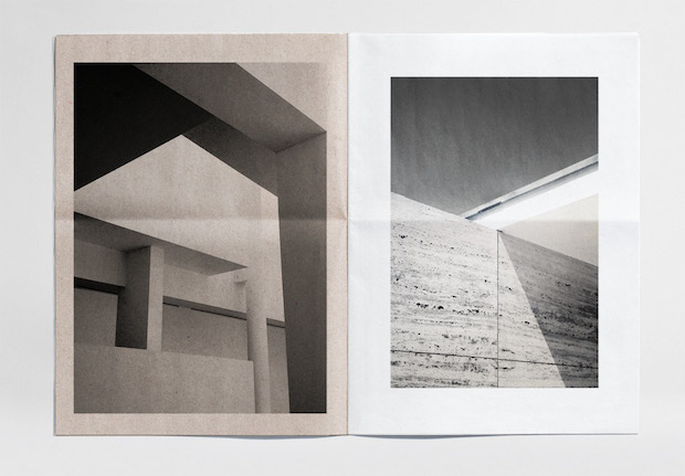
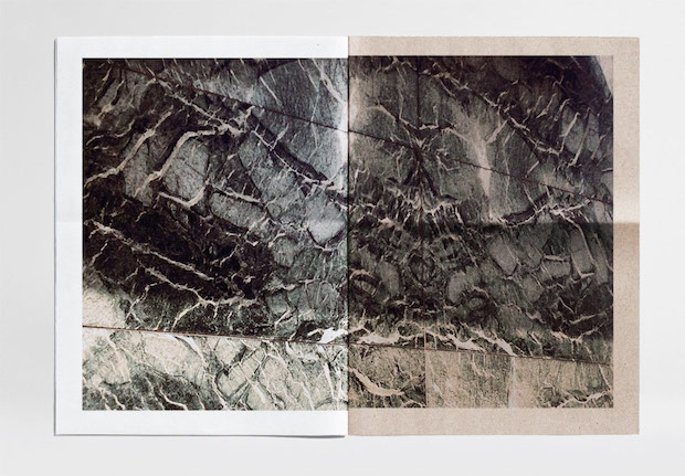
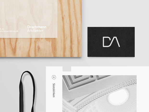
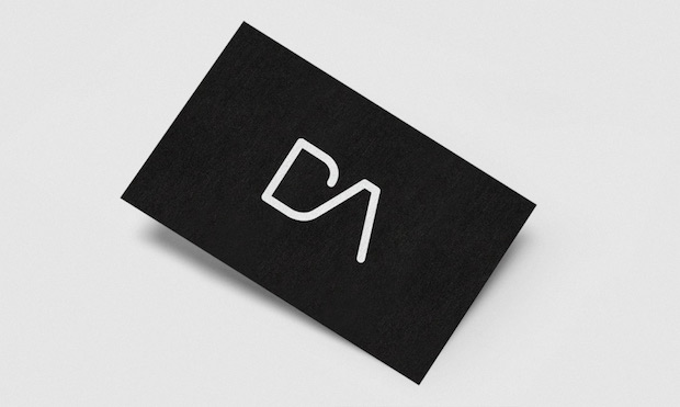
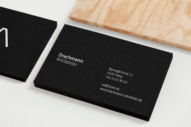
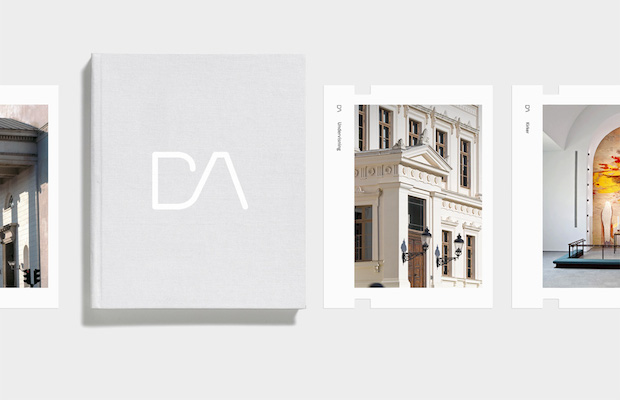
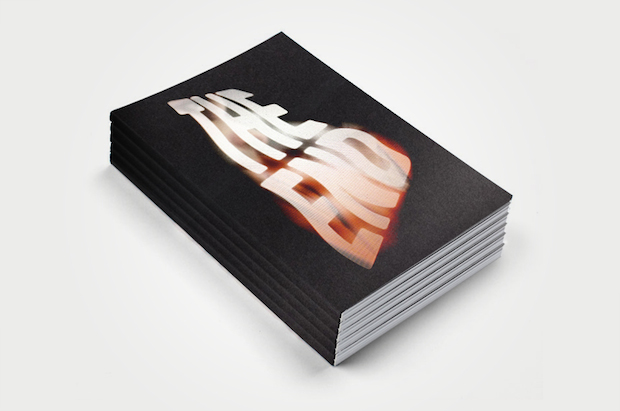
Redesign of sci-fi novel, Star Maker, by William Olaf Stapledon, first published in 1937, Daniel Siim, Publication 2014.Redesign of sci-fi novel, Star Maker, by William Olaf Stapledon, first published in 1937, Daniel Siim, Publication 2014.Redesign of sci-fi novel, Star Maker, by William Olaf Stapledon, first published in 1937, Daniel Siim, Publication 2014.Redesign of sci-fi novel, Star Maker, by William Olaf Stapledon, first published in 1937, Daniel Siim, Publication 2014.Nordic Light - Interpretations in Architecture, Daniel SiimRedesign of sci-fi novel, Star Maker, by William Olaf Stapledon, first published in 1937, Daniel Siim, Publication 2014.Monolith, Daniel Siim, 30 pages, printed on 80g Zeitung and various recycled paper. 2013.Monolith, Daniel Siim, 30 pages, printed on 80g Zeitung and various recycled paper. 2013.Monolith, Daniel Siim, 30 pages, printed on 80g Zeitung and various recycled paper. 2013.Monolith, Daniel Siim, 30 pages, printed on 80g Zeitung and various recycled paper. 2013.Monolith, Daniel Siim, 30 pages, printed on 80g Zeitung and various recycled paper. 2013.Identity for danish architecture firm DA Architects, Daniel Siim, 2013Identity for danish architecture firm DA Architects, Daniel Siim, 2013Identity for danish architecture firm DA Architects, Daniel Siim, 2013Identity for danish architecture firm DA Architects, Daniel Siim, 2013The National Film School of Denmark, dentity and concept proposal for The National Film Schools graduation show, given the title "The End”, Daniel SiimThe National Film School of Denmark, dentity and concept proposal for The National Film Schools graduation show, given the title "The End”, Daniel SiimThe National Film School of Denmark, dentity and concept proposal for The National Film Schools graduation show, given the title "The End”, Daniel SiimTypeface, work in progress, Daniel Siim, Centre for Glass and Ceramics, 2014Typeface, work in progress, Daniel Siim, Centre for Glass and Ceramics, 2014Poster pitch for graduation show at Centre for Glass and Ceramics, Daniel Siim, 2012