
Celebrating its 30th anniversary, the Information Design Association’s annual conference gathers the best speakers in the field to debate the state of the art. Grafik reports on last week’s event.
Over the course of two packed days at the RIBA, the Information Design Association’s (IDA) 2014 conference addressed an eclectic mixture of topics ranging from health and migration to exhibition design, pedagogy and urban planning. Conceived as eight distinct sections with both long and short visual presentations under the overarching theme of Information Design Matters, the event as a whole sought to explore the broad scope of work being carried out in the field. Also apparent was the very worthwhile nature of many of these projects, which emphasised information design as, foremost, a public concern, critical in the processing of vast amounts of data.
While the projects which were showcased presented very distinct briefs and outcomes, many were unified by both their power to tell a story through hierarchy and logic, and by methodology, which was heavily geared towards observational research – carried out through both watching and talking. Far from offering definitive solutions, practitioners rather posited information design as a tool to extend graphic literacy and support strategic systems thinking, resulting in longer-lasting and viable change.
The following examples highlight the diversity of projects which were presented, with user-centred design thinking present at the core of each one.
The Things They Carried
Frog Design, Milan, Italy —
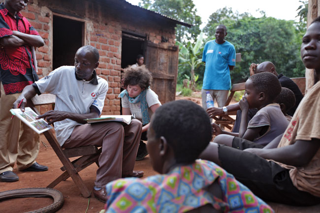
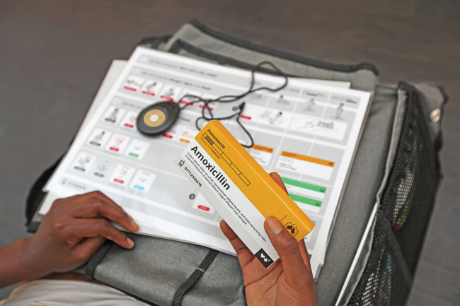
Roberta Tassi and Chiara Diana of Frog were charged by UNICEF to design ‘a comprehensive systemic solution to empower community health workers at a global scale.’ Frog carried out extensive research in isolated communities in Uganda before settling on its final design, the Backpack Plus. Vast stretches of underdeveloped and poorly accessible land lie between these communities and the medical facilities of towns and cities. As a result, large numbers die from conditions very often treatable with basic medical knowledge. Community health workers (CHW) are selected from these areas and trained to carry out basic diagnoses and procedures. Information is transmitted top-down, from NGO headquarters to aid worker to CHW to patient.
Moving from village to village, and most often on foot, the CHW, already empowered with vital knowledge of the area and its residents, must deliver the right information at the right time. Frog’s task to develop a total system that facilitated dialogue between dislocated parties resulted in an extremely simple but immediate tool: a uniform product designed as a carrier of information. The Backpack Plus (named for both its heart and plus-sign logo and its potential scope) is multi-purpose, enabling the wearer to travel large distances with materials, be identified upon arrival, keep hands free and, on unfolding, have a ready surface to both treat and to signal through gestures any necessary information that cannot be communicated verbally. As Diana emphasised, Frog’s design created a live framework that continues to evolve beyond its original intentions?
In Fear We Trust
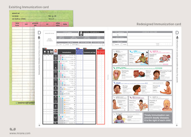
Immunisation card, IIT Bombay, Mumbai, India —
Mandar Rane and the Indian Institute of Technology Bombay have redesigned the immunisation card given to new Indian parents.
The original card, which, as Rane demonstrated, was highly confusing for users, was often the cause of infants being incorrectly immunised. Focusing on clarity, the IIT team have eliminated unnecessary information and added additional sections to enable parents and doctors to better understand what vaccinations the child has already received. Importantly, the card’s redesign also emphasises the possible effects of skipped vaccines through the use of graphic images displaying the infant as sick and in distress. By employing fear tactics as a necessary tool in the design process, Rane believes the card will ultimately transform the system of vaccinating Indian infants, in turn empowering parents through legible and correct information that protects their children.
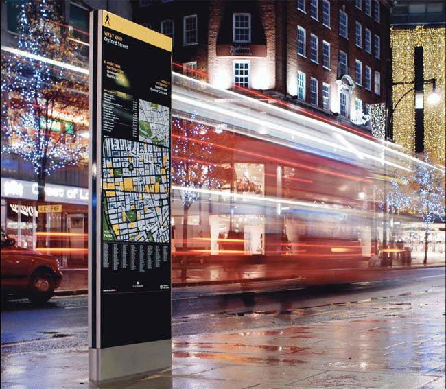
Legible London, Applied, London, UK —
Having already witnessed the success of his Legible London project and its adoption in other cities around the world, Tim Fendley of Applied asked “What’s next for Legible Cities?” Breaking a system – in this case a city – down into its component parts allows us to begin to understand what we’re working with. Yet, as Fendley stressed, those parts together make up the identity of a place and cannot be picked up and moved to another. Legible London’s design is a product for London about London and its success lies in that understanding. It is trust that ultimately drives an information design project like this, and for that trust to hold, wayfinding tools must be clear and correct. Pointing to a video of a Wembley signpost being blown full circle by the wind, Fendley aptly observed, “If one element fails, the whole system fails.”
Outside the Box
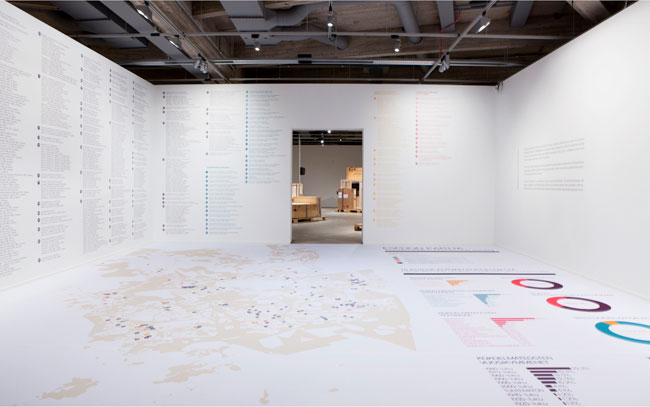
Exhibition for EMMA, Stefania Passera, Espoo, Finland —
Asked by the Espoo Museum of Modern Art (EMMA) in Finland to design an exhibition that would survey the extent of its public arts collection – much on permanent display across the city – Stefania Passera created an information design temple. Banishing objects to their storage boxes she instead showcased the collection through corresponding info graphics, laid across the gallery’s floor, ceiling and four walls. By interacting with the data on display, visitors could grasp the degree to which they interacted with the collection at large on a daily basis, without always begin aware of its significance or provenance. At the exhibition’s closing, Passera’s design was purchased by EMMA and incorporated into their permanent collection.
Social distribution model, Works that Work, The Hague, The Netherlands —
Works that Work
, a print and digital magazine that features innovative design thinking across the globe, was founded by Peter Bil’ak and Anne Miltenburg in 2013. Moving beyond the four walls of the gallery, its articles highlight the vernacular, mundane and overlooked, as well as the local and global. Faced with the crushing distribution rates that often deter independent publishers, Bil’ak and Miltenburg devised a ‘social distribution model.’ To a large extent, such a model puts the onus on readers to keep the magazine in circulation by seeking out local vendors to carry it. The system will likely serve future editorial and design projects, enabling the survival of print and, with it, the dispersal of ideas.The IDA conference ran 7-8 April, 2014