In the first of a new series of interviews focusing on a significant piece of work by a legend of design, Thom Swann interviews David Gentleman about his work for Stop the War Coalition, his wide ranging practice and his advice for today’s up-and-coming designers.
Thom Swann:
What led you to create the original 'no' poster, and how did it come to be used by the Stop the War Coalition?
David Gentleman:
It came about because I was appalled by the prospect of the war for a while before it actually happened, I'd been on several of the marches against it, and when it looked really imminent, I wanted to do something more specific, to make a more visible contribution. I thought of the idea of a ‘NO’ poster, but I'd already sent something to Stop the War Coalition and had misaddressed it and never heard anything back from them, so this time I made sure I was sending it to the right people.
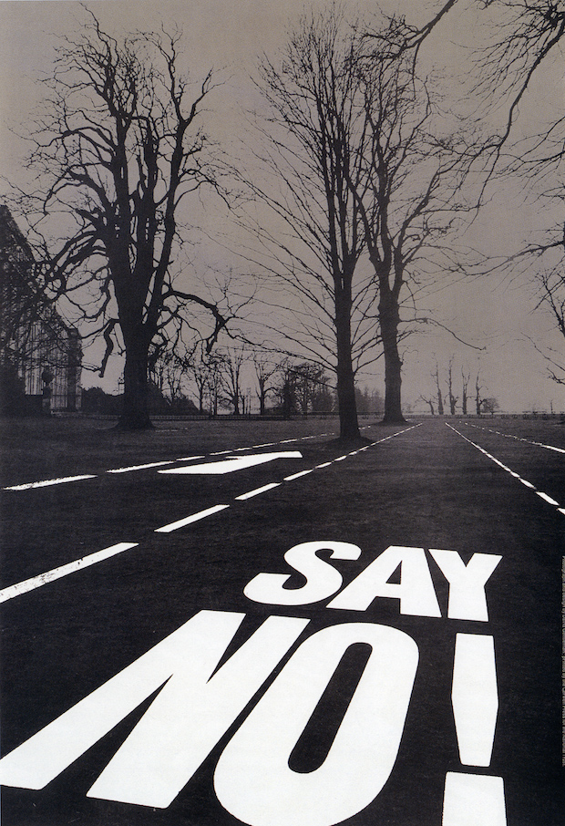
The newspaper photographs of the marches that I’d been on made them look like very big events but you couldn't read what many of the placards that people were carrying said – some of them were homemade, which is great, but a lot of them were printed and they were quite hard to read over a distance.
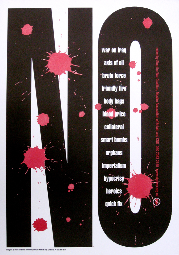
So I got in my mind the idea of just a big ‘NO’ poster. I photocopied this design and reduced it to roughly the scale of the press photograph and stuck copies down over the placards people were carrying. Even at smaller sizes the posters looked really quite convincing. I'm sure that helped Stop the War Coalition to be persuaded – and also they needed something in a great hurry and here it was.
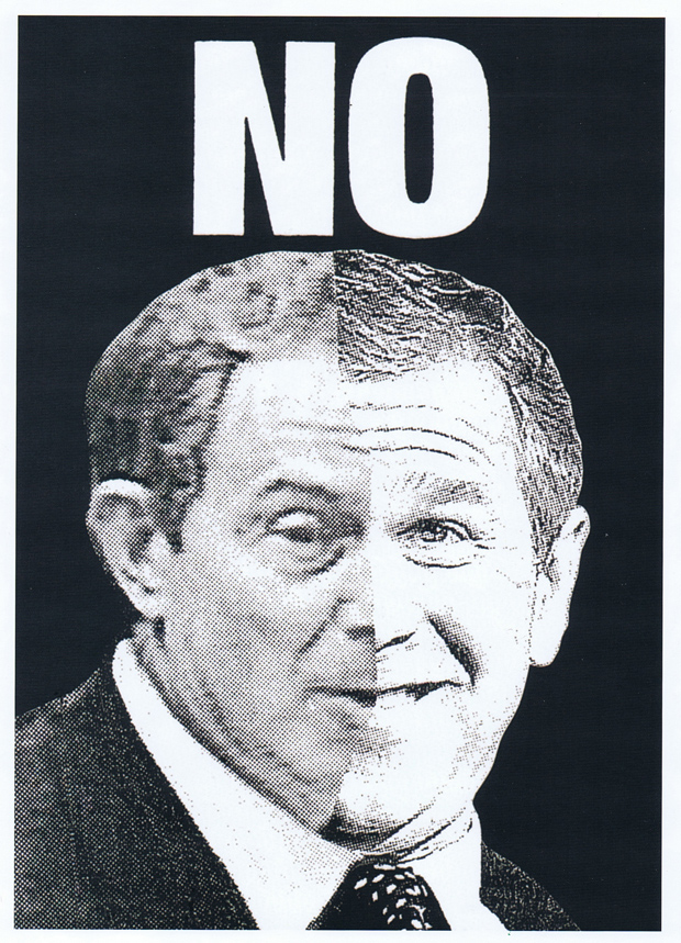
TS: What was the design that you initially sent to Stop the War Coalition but which you never heard back about?
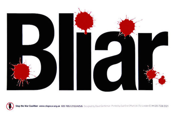
DG: It was the first poster that had ‘NO’ on it at the top, but it also combined half of Tony Blair's face with half of George Bush's underneath the ‘NO’.
TS: Do you think your follow-up poster was an improvement on the original?
DG: It was certainly much more legible, you can't get a much shorter word…
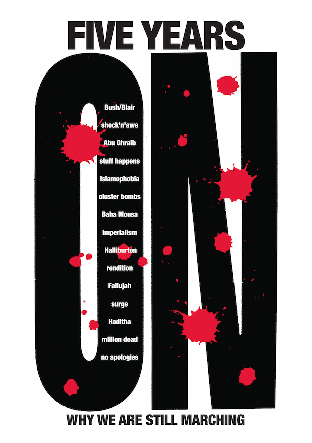
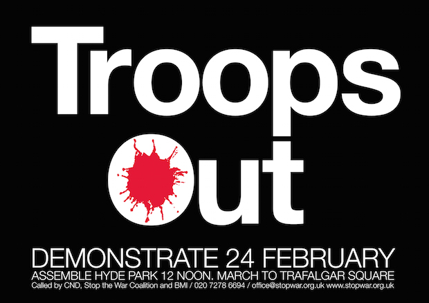
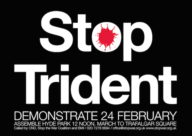
And the blood stains which feature on the poster weren’t there initially, not in my first ideas for it. I wanted to make it a bit more emotive before it was actually issued, so I put the blood on at that point and it gradually became a kind of consistent feature running through the lot.
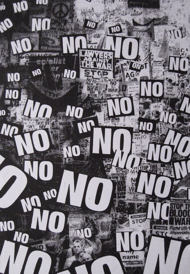
TS: I've noticed that your posters are still commonly in use, the later versions which are against military action in Gaza particularly, how does it feel to know you've made a lasting impression on the visuals of British anti-war politics?
DG: Well, I don't go around patting myself on the back – but it would be nice if it was so. I hope the placards helped the organisation to make some sort of impact, but I don't suppose the marchers paid much attention to who designed them.

TS: These weren't your first protest posters though, you did some of sorts for the National Trust in the seventies I believe?
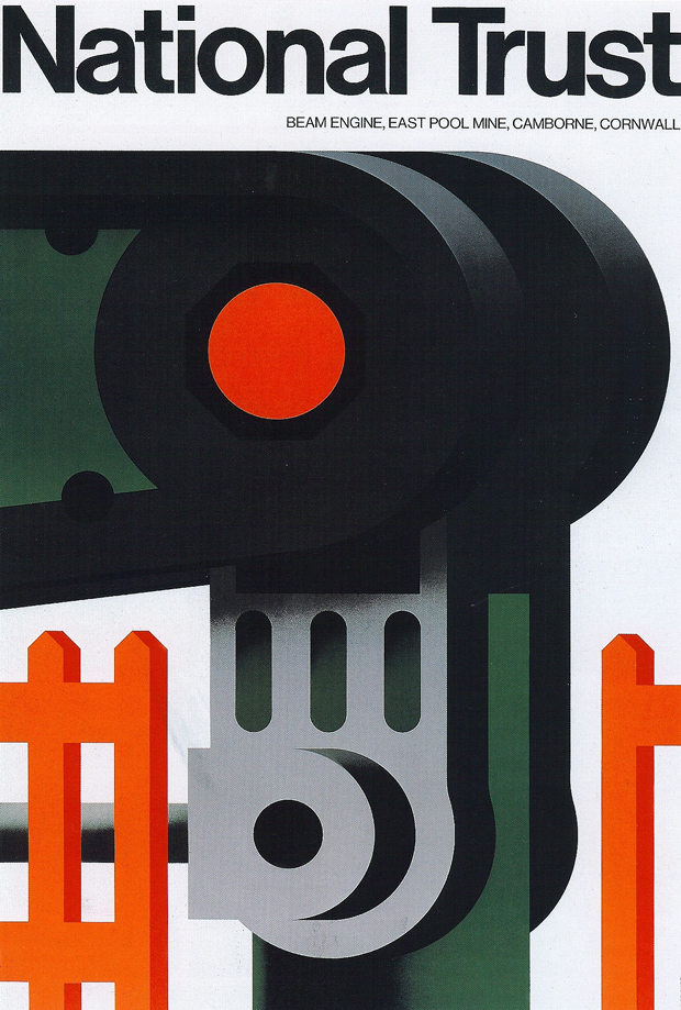
DG: I did a set that could accurately be described as protest posters against a two-lane highway that was planned to go through Petworth Park. The National Trust wanted to encourage protests against that – the copy on one poster was ‘SAY NO!’. But I’d already designed several other less controversial ones for the National Trust, which I was happy to do because I thought it was essentially a very well intentioned organisation.
TS: Was working with people like Labour politician Tony Benn and other well-intentioned and often nationalised industries such as British Steel, the Post Office and Transport for London, political in nature?
DG: Not primarily, though I enjoyed designing the British Steel logo because I thought nationalisation made sense. Tony Benn was important (and it was actually him who I asked who to send the Stop the War poster to later on) but I’d started designing stamps in 1962 – which was a couple of years before Benn turned up as Postmaster General.
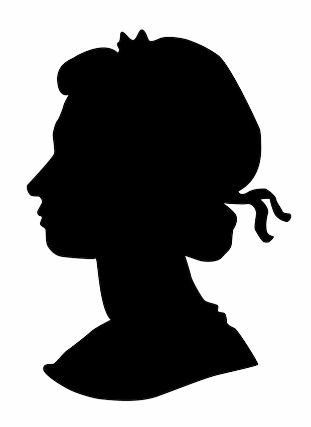
My initial connection with him was that he wrote a public invitation to people at large asking anybody who had views about how stamps could be made better or more interesting to write to him. So I wrote saying that commemorative stamps would be better without the Queen's head because it was a very difficult thing to fit it in alongside any other graphic elements, which was true. There followed a month's silence, during which I thought I’d said too much, while the letter must have been slowly percolating its way up through the organization. When it eventually got to Benn, he asked me to come and see him at his Post Office headquarters, which were very grand, and I was a bit alarmed at the prospect. But he was incredibly approachable and we got on and developed a very good working relationship.
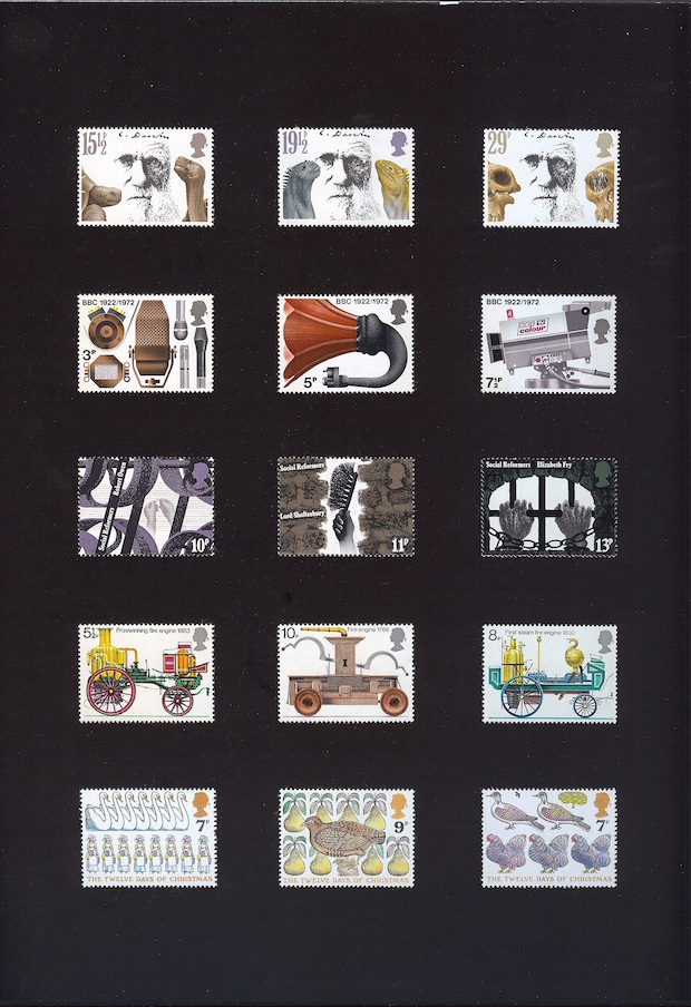
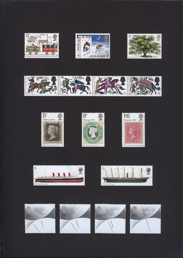
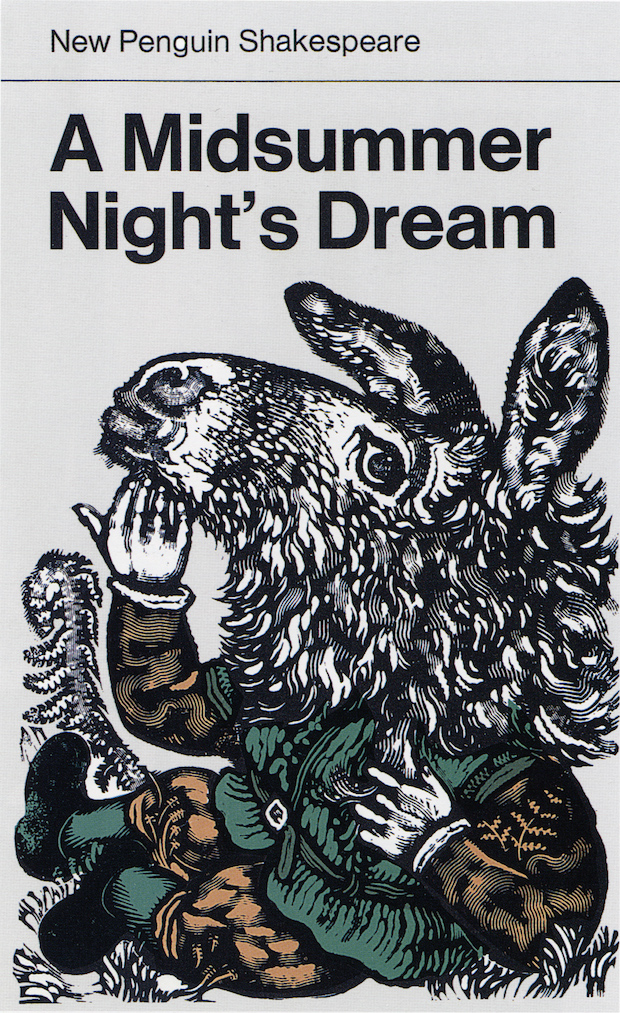
The Queen’s head eventually became the smaller profile silhouette that’s still used. I also suggested to him that stamps should have a less restrictive and more interesting range of subjects. In those days they had to be about some contemporary event: the set I did for Shakespeare was occasioned not by the 400th anniversary of Shakespeare's birth but by the fact that there was something called the ‘Shakespeare Festival’ to commemorate.
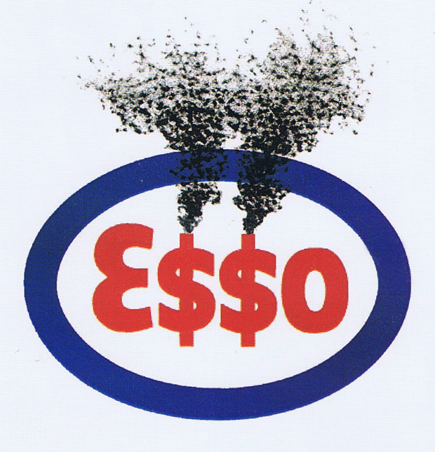
TS: Some years ago you did a logo for Greenpeace, a subversive version of the Esso logo, after you had initially done some illustrations for that company back in the 1960s. What's changed from you working for the company to now wanting to subvert them?
DG: What had changed was in me - I don't think anything had changed in Esso. Earlier on I might have thought this an imprudent thing to do. Later on I thought it was important to do it from an environmental point of view.
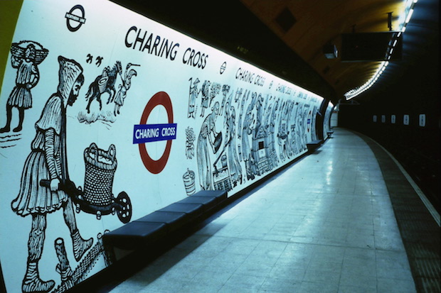

TS: You have a strikingly diverse portfolio, both in terms of style and in terms of the media that you've worked in, from stamps to the hundred metre-long mural at Charing Cross Underground station. Do you think that's due to your own nature or to do with the era you were educated in, one where people less easily fitted into professional niches such as graphic design or illustration?
DG: It's a mixture of things. I think it's partly temperament but also background. My parents were artists and my father started as a painter at first – I mean first chronologically – and then also became a designer, and a good one, but I think he would rather have spent his life as a painter. And then it was also the climate of the time – it was probably a bit easier then than it is now to do a variety of things; now all the tendencies are towards pigeonholing and I think that's a pity. Another factor is that I've always worked on my own, and if you do that it's easier to change course with nobody leaning on you.
TS: You’ve not only illustrated and done cover designs for trade and limited edition books, but you’ve also fully illustrated and written many books yourself. Is there a certain appeal to producing paintings and prints that go into books, and as such are democratised, as opposed to purely for the gallery?
DG: At the beginning of my working life I just wanted my work to be seen, I didn't at that stage mind what it was for but I wanted it to be known about. I was forty before I ever had an exhibition of watercolours, and since then I’ve had them every two or three years. But once a picture sells (which is great) it also vanishes out of my sight, only relatively few people see it; I can't always remember what it looked like or even doing it, whereas if it's a print or in a book it still 'exists'.
TS: How do you see your more overtly graphic work, such as the NO poster or book cover designs, as opposed to your pictorial watercolours and lithographs – are they entirely different things or do you see them as two points on a spectrum?
DG: I do think of it as a relatively unbroken spectrum - the thing that is really different from one to the other is its purpose and who it's aimed at, but the actual kind of interests and techniques, they merge rather than being out-of-touch opposites.
TS: On a similar theme, most graphic design students are taught very differently to illustrators today, and they're not, on the whole, taught to draw. Do you think that's a shame – is drawing an important part of a design education?
DG: I honestly don't know, I'd like to think it was, though I'm sure that a lot of designers can flourish without needing to know much about drawing, whereas I imagine you couldn't survive nowadays without computer skills. But, in relation to one's life experience, I think it is a pity not to have had the chance to draw and not to have reasons to persuade one to go on drawing, because I think it's a useful skill; useful in helping one to think. Drawing enables one to see and to work out why things are as they look. Drawing is key to my interests, but that's not to say it is to everybody's.
TS: The popular opinion is that it's harder for students graduating in today's climate than in years gone by, but it can't have been easy in the fifties when you left the RCA?
DG: It certainly didn't seem all that easy in the fifties. On the other hand, I’ve always had something to do, never had absolutely nothing to do in my life, though sometimes it's been more, sometimes less. But I can't say that it was easier, I think it's always been quite difficult.
TS: Is there a particular piece of advice that you'd give to young designers and illustrators going out into the wide world of design, particularly those trying to forge their own path as you did?
DG: If you're confident and tenacious enough, I'm sure that it's worth trying to go on your own. Tenacity and working hard is a great door opener.
And I do think that drawing is a useful skill; people who don't draw think they can’t, but then I think I can't half the time. And while it helps if you have to do something that involves drawing, it's worth countering the inevitable notion that probably almost everyone has – that they're not much good at it – and just sticking at it.