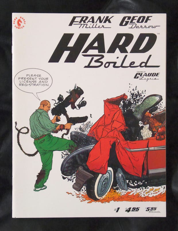
With its punchy colours and automotive typography, the cover of comic Hard Boiled belies its tax collecting narrative, but then this isn’t HMRC. Designer Manuel Sepulveda (aka Optigram) explains the visual appeal of this outrageous title. One of my favourite Frank Miller-scripted comics is the three-part sci-fi series he wrote for Geof Darrow, Hard Boiled, about an ultra-determined tax collector named Nixon. Published by Dark Horse in 1990, I’d initially read about it in The Face, as they often used to cover news of the best in comics, and the collected paperback went top of my ‘Wants’ list. Eventually, however, I tracked down the individual issues because the covers were just too good. The colours punch out beautifully against the crisp, white background and the use of classic automobile fonts for the titles perfectly introduce the cold, chrome-trimmed dystopia depicted within. The logo design is credited to Steve Miller, who also designed the Sin City logo.
I think my admiration for Darrow’s impressively detailed artwork drew me towards artists that were similar to him, like Moebius, and you can easily see his influence on Darrow, as well as that of manga artists like Tezuka Osamu and Katsuhiro Otomo. Perhaps no comic book art before or since has engrossed me as much as that in Hard Boiled. Some of the panels have so much going on in them that it’s like looking at a Where’s Wally? picture, except here it’s an orgy of sex and mayhem. The illustrations may look painstakingly meticulous but you can tell that Darrow totally enjoyed doing them (and colourist Claude Legris must have had great fun colouring them in), full as they are with sickly funny details, details that you would miss if you read the story at normal speed. The back cover quote from Rolling Stone sums it up well: “...intricate, kinetic and thoroughly outrageous.”
The story itself strikes a perfect balance between humour, macho violence, social commentary and dystopian horror, ie, it’s got everything you’d want from a comic. This is like Blade Runner put through an industrial grinder and spat out at 200mph. It was because of his work on Hard Boiled, which won an Eisner award, that the Wachowski brothers asked Darrow to be the conceptual designer for the Matrix films. In 2001, David Fincher was lined up to direct a film version for Warner Bros, with Nicholas Cage starring as Nixon – you can add that to your awesome-films-that-never-happened list.
Miller and Darrow make for a dream collaboration here and if you ever want to prove to someone how good violent comics can be, Hard Boiled is the book to show them. The individual issues include readers’ letters and my favourite one contains the following observation: “All other comics are OK they have some violence but not enough for DAMN RIGHT!!!!”
optigram.net
Manuel Sepulveda (aka Optigram)
This Santiago-born graphic designer is electronic music label Hyperdub’s go-to creative. Often focusing on geometric abstractions, he’s also responsible for a host of artwork for labels Planet Mu, Public Information and Warp, all with a dark, sci-fi-led bent. He designed the logos for musicians Cooly G, LV, and Africa Hitech, and posters for many more. His intoxicating style has found a new application in personal project Recovered Memories, where Sepulveda redesigns the covers of classic science fiction novels as he reads them.
Dark Horse Comics
Founded in the mid-1980s by book shop owner Mike Richardson who was tired of the low quality stock he was receiving and thought he could produce better, this Oregon-based publisher is now one of the biggest in the US. Its titles include The Mask, Buffy, Star Wars and Hellboy. Last year saw the release of one of the highest-selling books in the company’s history, The Legend of Zelda: Hyrule Historia! but the boat was somewhat rocked earlier this year when Disney announced that the Star Wars comics license would move from Dark Horse to Marvel Comics for 2015.
June 19, 2014 3 minutes read
Death + Taxes
The punchy colours and type of comic Hard Boiled's cover belie its tax collecting narrative, but then this isn’t HMRC. Designer Manuel Sepulveda explains the visual appeal of this outrageous title.

