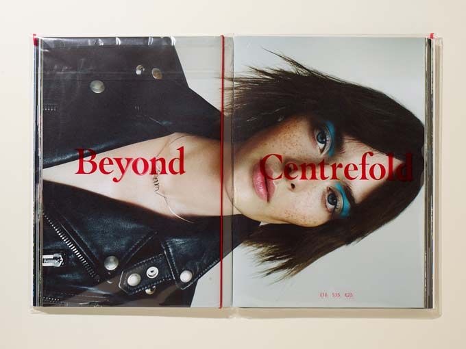
Large format fashion mag Centrefold recently celebrated its tenth birthday with an issue shot entirely with a Nokia mobile phone. Here Centrefold's founder Andrew G. Hobbs explains why...

About the project
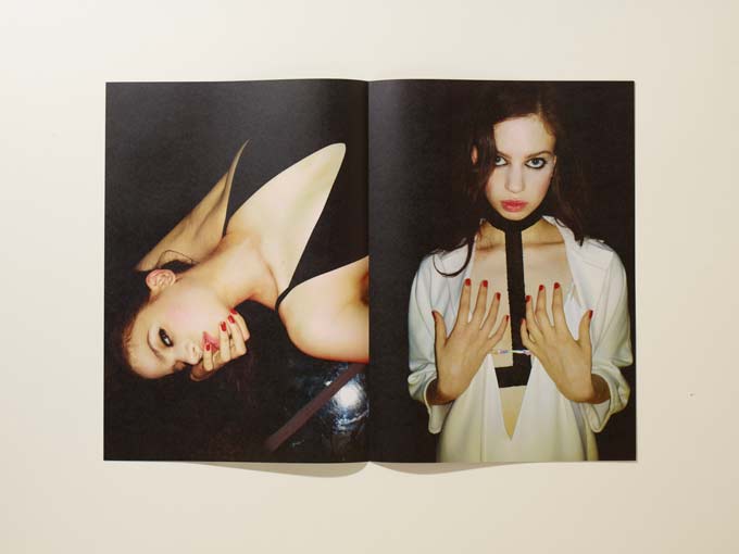
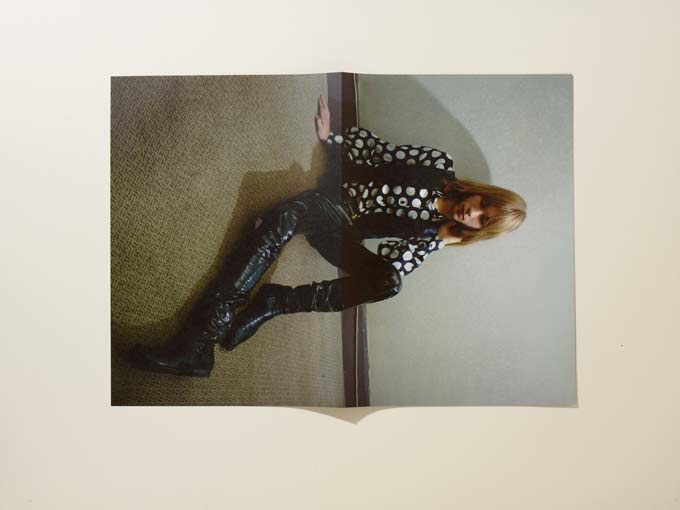
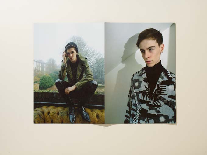
The project is a collaboration between Centrefold and Nokia Lumia 1020. For our tenth issue,Centrefold decided to produce an issue shot entirely on a mobile phone. The aim was to re-introduce the original concept of Centrefold as a folding poster coffee table magazine, to relaunch centrefoldmagazine.com and introduce a more comprehensive experience.
How did the project originally come about?
We wanted to try something special for Centrefold’s tenth issue, and decided that ‘beyond’ would be a good theme with which to explore the future of how we look at imagery. I met with friends from Nokia one evening and the theme ‘Beyond’ came up in conversation. A person from Nokia who was over from America was showing a Lumia phone to me and mentioned they were about to release the 1020. We all became excited about the idea of shooting an issue of Centrefold on the phone.
What was the original brief and did it change at all?
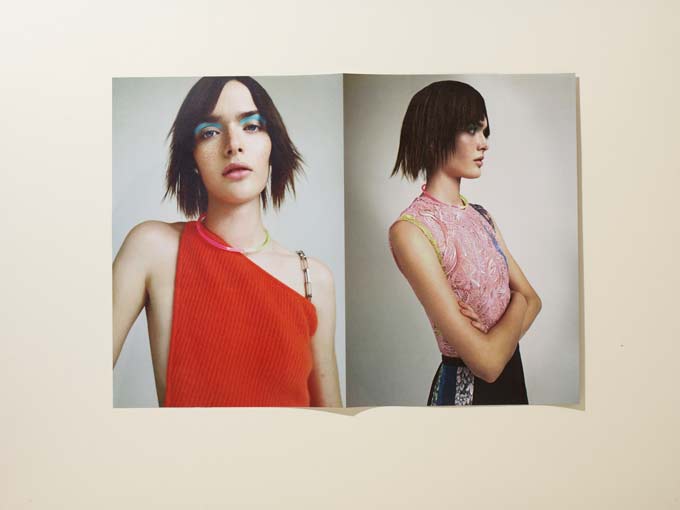
When we originally entered into this collaboration, the brief was for Nokia to provide the Nokia Lumia 1020 phones to our photographers so that they could produce content for Centrefold Issue 10. The nine photographers involved were challenged to explore the notion of 'Beyond' in whichever way they chose.
We wanted to explore varied social media platforms to publicise the project and deliver our content across these multiple platforms, so we incorporated exclusive behind the scenes videos and stills to ensure that the imagery was not only more accessible to our readership, but also more involving for the audiences of both Centrefold and Nokia.
This also meant that we needed a new website (which we are currently working on). We also decided on an exhibition to launch the magazine to the industry, showcasing the images in the publication, as well as additional unseen exclusive images.
This project came about after much planning and forethought, so both Nokia and ourselves went into it knowing what we wanted to achieve and how we wanted to achieve it. I don't believe that the brief changed, if anything I think the results exceeded all our expectations – which is the perfect place to end up when collaborating on a project like Centrefold.
Did this project present any particular challenges, and if so how were these overcome?
It has been surprisingly easy. All the photographers we spoke to found the idea of the project intriguing.
It was actually somewhat liberating to move away from all the photographic kit for a while, condensing it down to just a phone and whatever lighting was needed, if any. Initially, there was some getting used to how the Lumia camera functioned, but we did some test shooting beforehand so we knew how it performed before completing entire shoots for print. In any project there are always going to be challenges and different ways to approach those challenges but I make a point of collaborating with people who understand what Centrefold is about as a publication, and therefore are willing to respect that it comes with a very strong and specific identity that still allows for them to inject their own creativity into it.
What do you think has worked particularly well?
Shooting on a phone presents new and exciting prospects to a photographer. When shooting portraits people react differently when presented with a phone rather then a professional camera. We have become so used to friends shooting us on phones for an ‘instant’ image, that we reveal aspects of ourselves which can often be hidden when shooting with a team of professionals with lots of equipment.

Did this project involve sourcing any new materials or using any new processes?
For us, using the phone was the main new process that we employed.
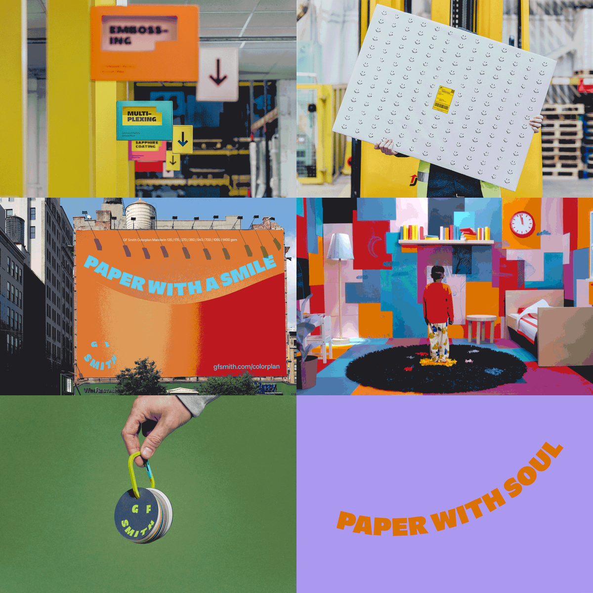
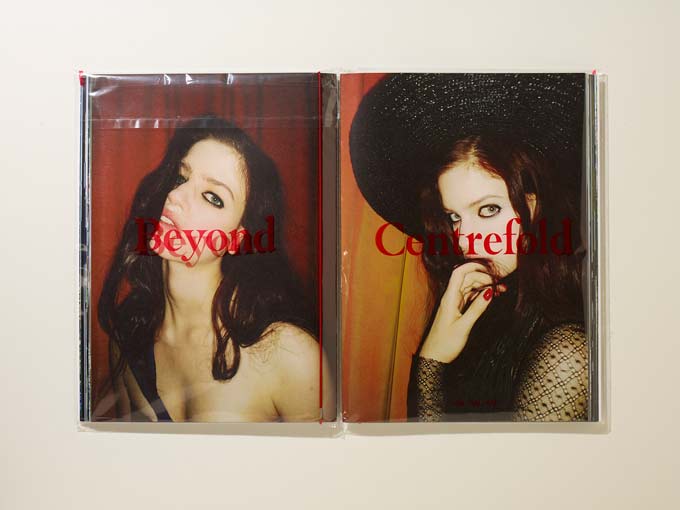
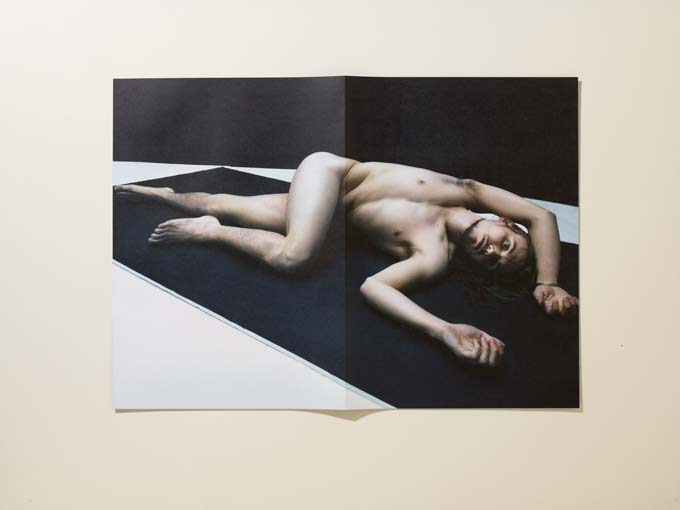
GF Smith has been one of our main supporters over the years and this issue was no exception. We use only the highest quality paper and printing techniques to produce the magazine. It has been nice to go back through our archive and reintroduce some of our original features from issue one so we wrapped the magazine in plastic envelopes with our cover logo printed on them.
The image is still the main focus of the magazine so when the plastic covering is removed, the pure image is what remains. We also returned to collating the magazine so that each image was a true A2 folding poster, and for the first time we have arranged the pages so that it can be rearranged to create multiple covers. The capability of creating your own order allows for creative juxtapositions between various images. I suppose you could say that we have gone back to our roots, adding necessary improvements and tweaks that feel relevant today.
What was the client's feedback?
Very positive, with talk of extending the exhibition to other countries. Technical spec
Paper: Zen Pure White 150 gsm and Naturalis Absolute White Smooth 135 gsm
Font: Masqualero, a new design by Jim Ford at Monotype.
Type consultation by Dan Rhatigan.
Printing: Pure Print, litho
centrefoldmagazine.com

