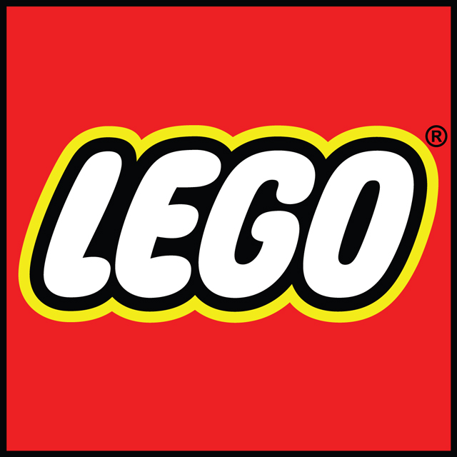
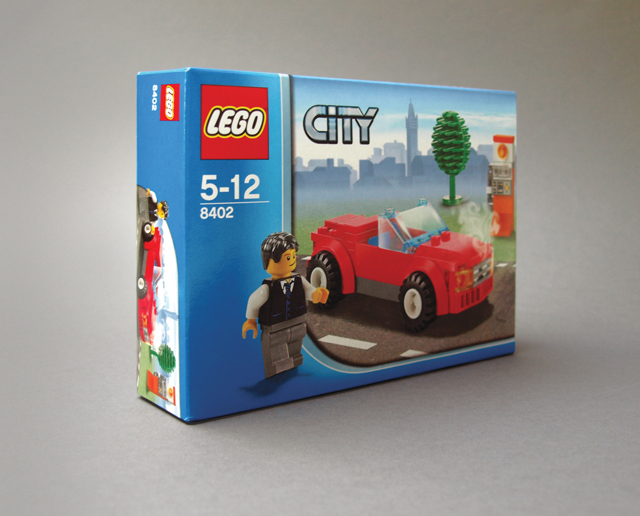
In this Archive piece, Rob Brearley of Golden sings the praises of the Lego logo – designed in 1973 and managing to escape the inevitable 'brand refresh,' it's a marque which still resonates with kids of all ages.

I've had to work with some poorly executed logos in my career, with awkward shapes, intricate details, shoddy kerning and myriad spot colours (invariably impossible to reproduce within budget) ranking among the most common frustrations. So on the subject of logos I’m clouded by bad experiences. Dare I say that in general I don't like the idea of logos. They rarely represent the company, product or service they’ve been designed for and they're often abused, misused or, worst of all, poorly constructed. When it comes to admiring logos, I'm driven by aesthetics, by curves, geometric shapes and composition.
Many of the classics have already been written about in these pages so I have decided instead to dig a little deeper and to think of something that isn’t necessarily a logo I wish I’d designed, but one that I’d definitely wear on a T-shirt.
Undoubtedly nostalgia and familiarity have aided my selection. The LEGO logo, designed in 1973, is a fantastic reminder that simplicity aids recognition. I love this logo. And the fact that it doesn't physically resemble the product it represents makes me love it even more. There are no building-block patterns or suggestive typefaces and it doesn't have any nodules across the top so that it can tessellate. The outer shape is dominant and the typography simply says this is fun and you're probably going to enjoy it.
Having resisted the urge to bevel the iconic vector beauty or undergo a ‘brand refresh’, LEGO has retained its playful innocence while successfully expanding the brand into the worlds of cinema, software, art, architecture and even business consultancy. It seems that familiarity breeds success for LEGO.
Ultimately, I suppose the fact that the product has stirred the imagination of millions of kids worldwide helps to make this logo a winner. It promises great things and, as anyone who has ever felt the satisfying snap of Automatic Binding Bricks will testify, it always manages to deliver.
wearegolden.co.uk

This piece first appeared in Grafik 179, November 2009.

