
The Design Museum’s shortlist of the 76 best designs of 2014, across six different categories, has been announced and it’s a more diverse and surprising affair than ever.

Now in its eighth year, Designs of the Year aims to promote design that ‘delivers change, enables access, extends design practice or captures the spirit of the year’ – no small task. With categories ranging from architecture to digital, fashion to graphics, this year’s nominees include a Peruvian billboard that incorporates an air-filtration system which is as effective as 1,200 mature trees at creating purified air, Frank Gehry’s adventurous, curved glass-clad Foundation Louis Vuitton building; and a toilet that turns waste into drinkable water, even when not connected to a sewage system or a power-source.
In the graphic design category is a combination of projects that shows the current diversity (or uncertainty) of the graphic design profession: from Alexandra Daisy Ginsberg’s speculative Designing for the Sixth Extinction to a monograph on a great Dutch designer by Jaap Van Triest and Karel Martens via an advertising campaign encouraging the consumption of odd-looking fruit and veg, it certainly is a mixed bag. See below for the graphic design nominees in full.
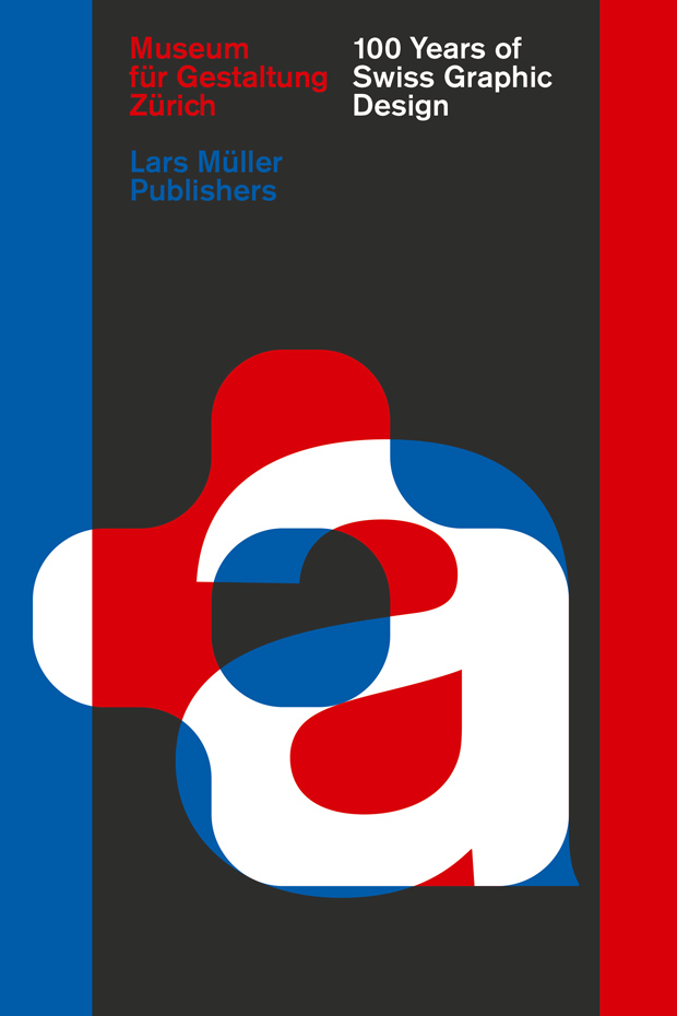
100 Years of Swiss Graphic Design
This Lars Müller book, designed by Zurich based studio Norm, features the development of Swiss Graphic Design over the past one hundred years.
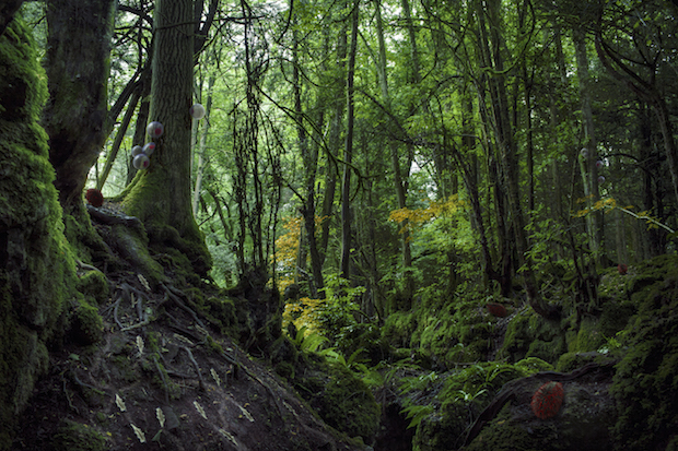
Designing for the Sixth Extinction
This project from Cambridge, Harvard and RCA graduate Alexandra Daisy Ginsberg investigates the potential impact of synthetic biology on biodiversity and conservation by imagining a future in which new companion species designed by synthetic biologists support endangered natural species and ecosystems.
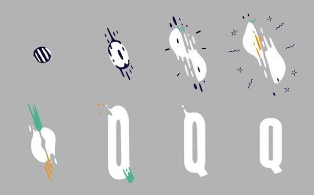
Franchise Animated
Franchise Animated is an animated typeface created through a mass collaboration between one type designer and one hundred and ten animators from all over the world, each of them animating one glyph in their personal style.
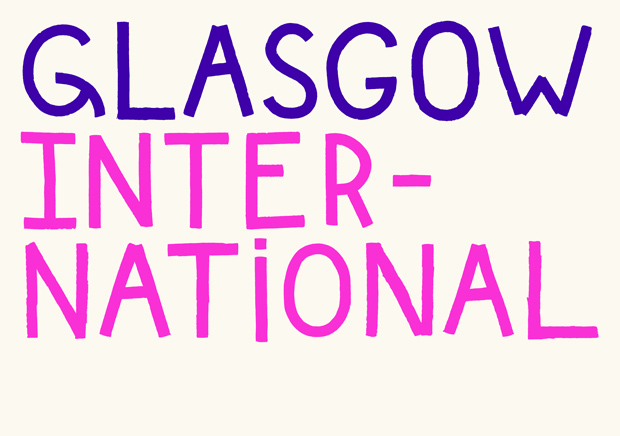
Glasgow International
This identity for the Glasgow International art festival is based around a highly characterful typeface that captures the feel of hand-painted lettering used on warehouses, docks and ships throughout Glasgow’s industrial areas.
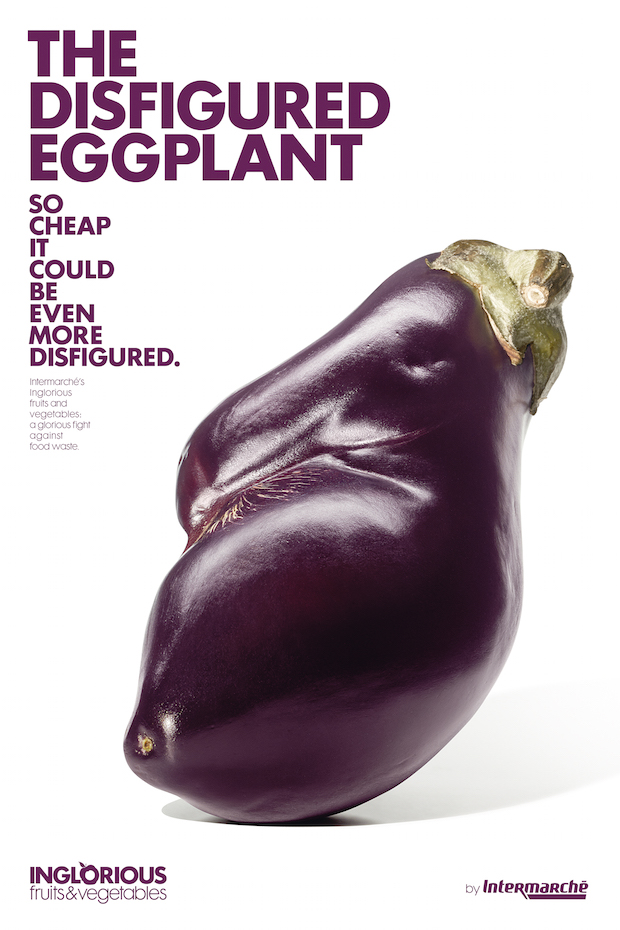
Inglorious Fruits and Vegetables
A multi-platform campaign designed by Marcel to promote imperfect fruits and vegetables by emphasising the charm, and affordable price, of the misshapen foods.
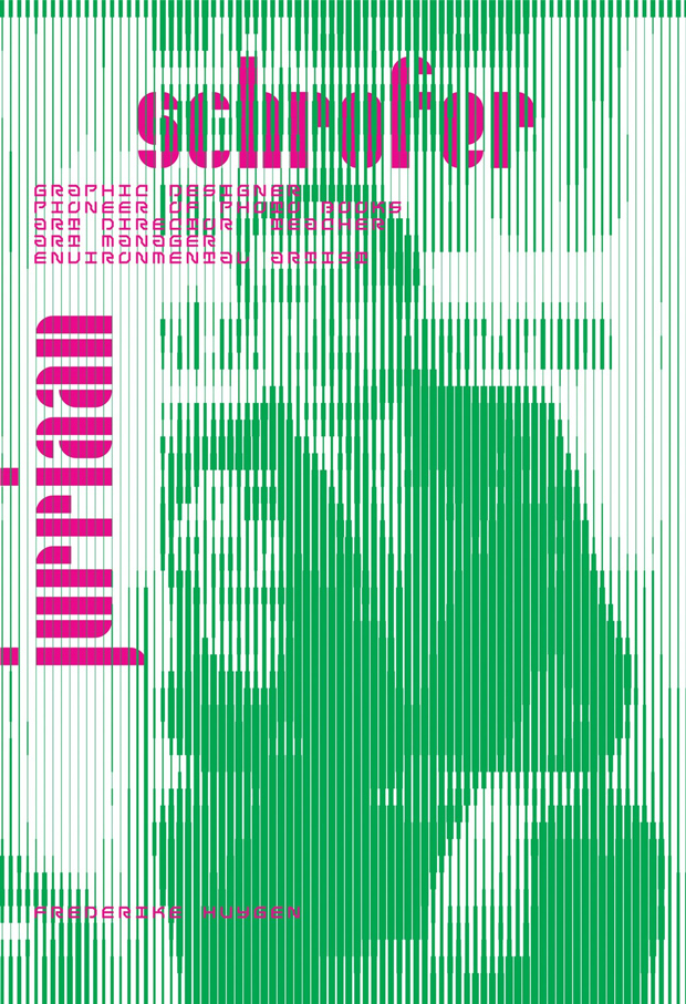
Jurriaan Schrofer (1926-1990)
A monograph designed by Jaap van Triest and Karel Martenson on one of the lesser known – outside of Holland, at least – but nonetheless defining figures of the post-World War Two Dutch graphic design scene.
Kenzopedia
Kenzopedia was a series of articles published throughout the spring of 2014 on Kenzo's website in order to reveal the inspirations and themes behind its spring collection. Each of the of the twenty-six articles started with a different letter of the alphabet and contained an illustrated story.
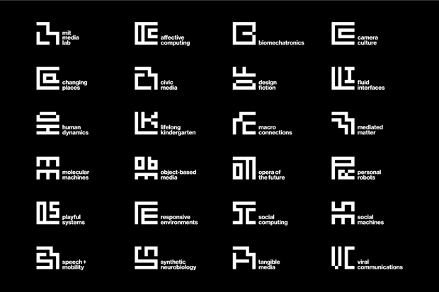
MIT Media Lab Identity
The new Pentagram designed MIT Media Labs identity builds on the previous system, designed only in 2010 and by Richard The and Roon Kang, by using the seven-by-seven grid of The’s anniversary logo to create an “ML” monogram.
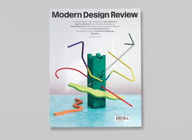
Modern Design Review Issue 1
A new magazine focusing on modern product and furniture design, Modern Design Review features art direction by Graphic Thought Facility and two custom typefaces employed alongside Starling and Haas Grotesk.
No 5 Culture Chanel
All the text and imagery in this Irma Boom designed book made to accompany an exhibition at the Palais de Tokyo in Paris is printed through blind-embossing, without any ink employed whatsoever.
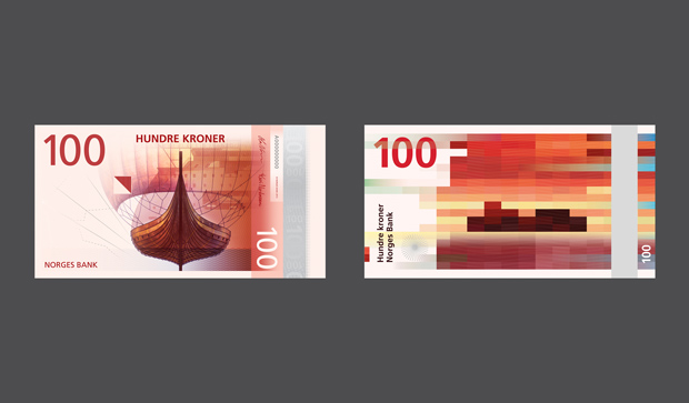
Proposals for banknote designs for the Central Bank of Norway
In 2014 Norges Bank held a design competition for a new Norwegian banknote series, with the theme of ‘The Sea’. These new bank note designs combine modern pixel motifs on one side and more traditional illustration on the other.
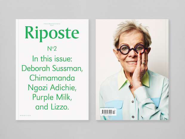
Riposte Magazine
Another new magazine, this ‘smart magazine for women’ profiles bold and fascinating women whose achievements speak for themselves, with essays and features covering a broad range of topics including art, design, music, business, innovation, politics, food and travel.
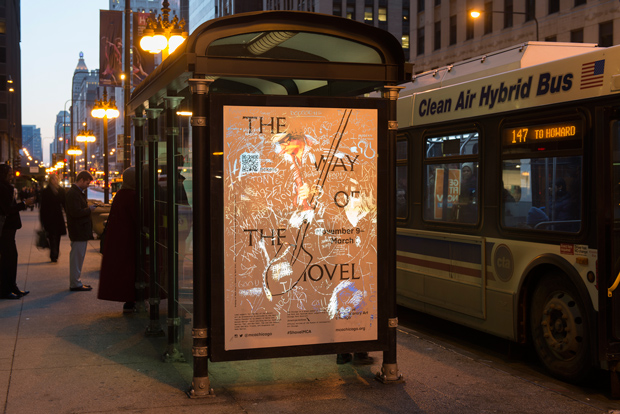
The Way of the Shovel: Art as Archeology scratch-off campaign
Responding to the brief that ‘Every piece of art is a story waiting to be uncovered’, these adverts for an exhibition at MCA Chicago makes the exhibition, which explores contemporary artists’ interests in history, archaeology and archival research, more approachable for the general public by getting them to take on the role of an archival or archaeological discoverer.
Wired Custom Typeface
A custom-designed typeface for WIRED, intended to be attention grabbing, as well as both playful and readable.
Design Museum’s Designs of the Year
25 March - 23 August 2015
Design Museum, Shad Thames, London
designmuseum.org