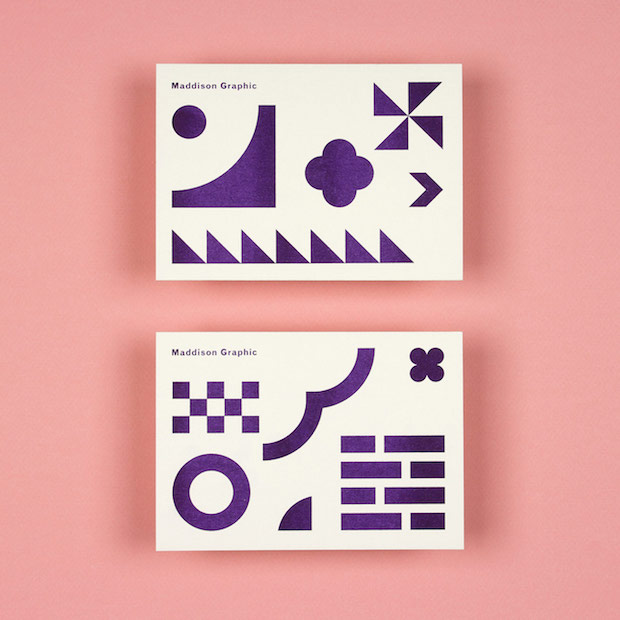
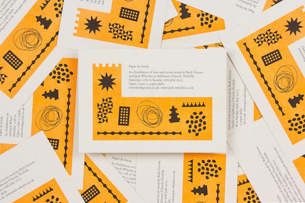
Brothers Alfie and Edward Maddison are the duo behind Maddison Graphic, an unassuming but highly talented design studio creating playful, stylish work from its base in Norwich. Grafik caught up with the pair to find out more about their practice to date and finding work in unusual places.

As brothers, were you always destined to work together–is your current practice perhaps a continuation of a collaboration started when you were younger?
Alfie:
We were close as kids but not in a twin-like way, and then when were sixteen and eighteen our friendship groups started overlapping more – I suppose from that point it wasn't unimaginable that we would work together. Edward is the only trained designer, he went to art school in Norwich whereas I went to work in London for an architect's practice doing admin and marketing. But I got a bit bored of that, which is when we started to work together.
Edward:
Yeah, it made sense because I'd been freelance, just working on my own for about a year after university and Alfie had developed a skill set doing marketing and creating bids, so it seemed a logical thing that we would try out working together. But neither of us had any experience, I'd never worked with another designer. I remember my tutor saying at the end of my final year at university that “you're not going to want to do a placement”. I wondered how she knew but she was right. That said, I think it would have been useful; it's taken me a long time to work out how to do everything
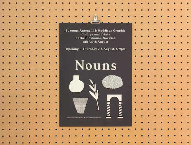
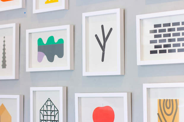
Both your parents work in creative fields, did this influence you from an early stage?
A: Edward was always the one who drew and as a result I probably tried to avoid doing the same thing, so I didn't do art at school or anything like that.
E: I think certainly we both absorbed a lot; our Dad, who is an artist, used to work for the National Trust and trained in medieval architectural history and our mum is a conservation architect, so we spent a lot of time in cold churches and country houses as children. I suppose it was almost inevitable that we would do something visual. I think particularly the ephemera surrounding architecture has been influential: the books and paintings and plans, which were around the house growing up.
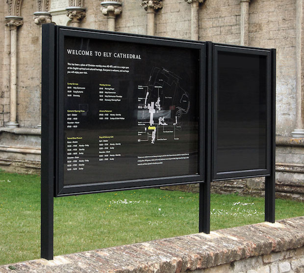
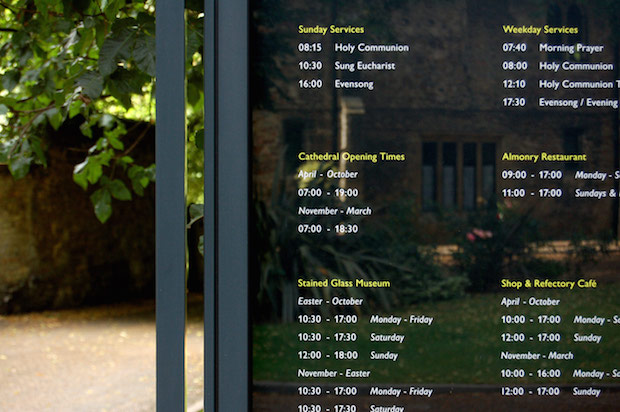
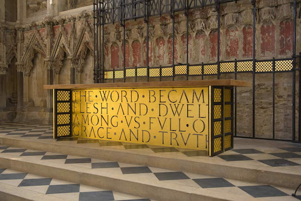
Was it quite daunting having the signage for Ely Cathedral as one of your very first projects?
A: It was a bit daunting but we took a lot of time over it. We thought very carefully about the best way to do everything.
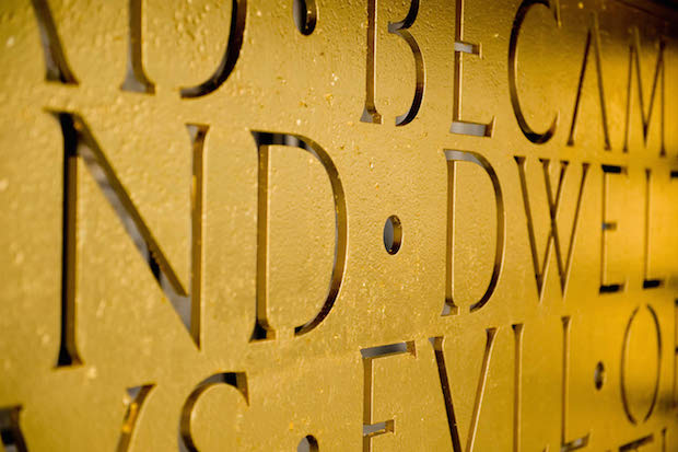
E: Yes, the requirements were quite awkward, it needed to be both affordable and adaptable. With a project like this, if you do anything too permanent people will end up putting stickers over your signs because times, prices, etcetera all change. And, in terms of the production of it all, we were very new to that as well. We had to do a lot of different trials; signs would lose their colour quickly in the sun or get hot and expand and then crack as they cooled down.
A: I think we're both fairly practical people, so when it comes to materials and construction, we both enjoyed finding out how things worked and what the options were.
Is there a particular attraction to working with local clients?
A: When we were based in Ely, before our move to Norwich, it didn't initially occur to us to work locally. When we moved to Norwich though we knew we wanted to work more with some of the potentially very interesting clients in the city. For example, we're particularly excited to be working with the Sainsbury Centre for the Visual Arts, they are possibly number one on our list of ideal clients here, having a beautiful Norman Foster-designed building and a great art collection.
E: It's quite hard to find clients in an area like East Anglia though; you find a lot more ambition for design in London, where there's more money to spend on good design, so it can be a bit tricky.
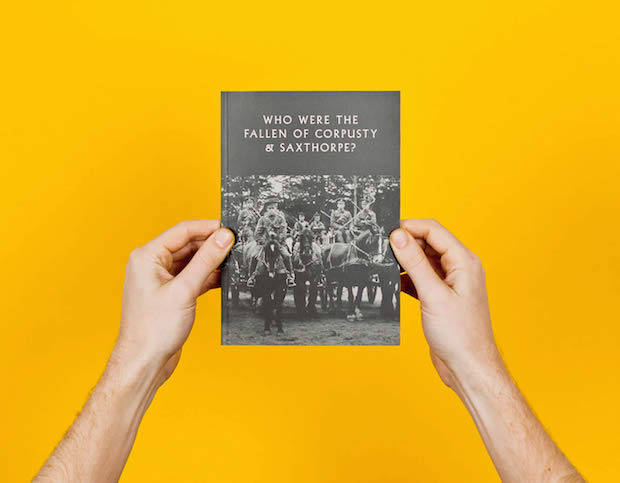
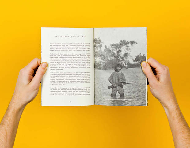
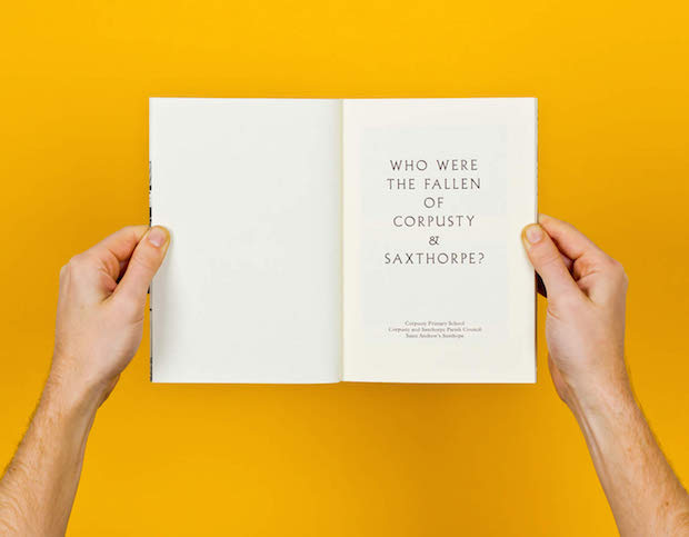
You did a project commemorating the fist world war in two tiny Norfolk villages, involving a book and an exhibition. How did this come to about?
A: One of the church wardens in the village organised the project and managed to get Heritage Lottery Funding for design and construction. We were very keen to do it because it was an opportunity to work within our community, I think working locally can be more rewarding, as you get to have a direct impact on the environment in which you live. However it is rare that we find such local projects with enough money allocated for design and it takes a client familiar with the funding possibilities to get these things to work.
Why Norwich, why didn’t you head west from Ely to Cambridge or London?
A: There's a very straightforward answer to that really, we were thinking of moving to Cambridge, but the simple fact is, it's as expensive as London. And we also had an affection for Norwich as we had grown up in Norfolk and Edward had studied at the art school there.
E: I still knew some people who had stayed on in Norwich after art school too. And while I'm very fond of Cambridge, I think Norwich is a more charming place to live and despite being further from London, is a bit more vibrant.
There's a big publishing scene starting to burgeon in Norwich now, have you been involved with any of the independent publishers there?
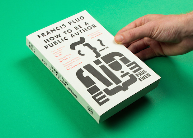
E: We've done quite a bit for Galley Beggar Press and I think Norwich becoming this kind of literature capital will hopefully lead to more potentially interesting opportunities from within the city. That said, the majority of our work is still coming from London.
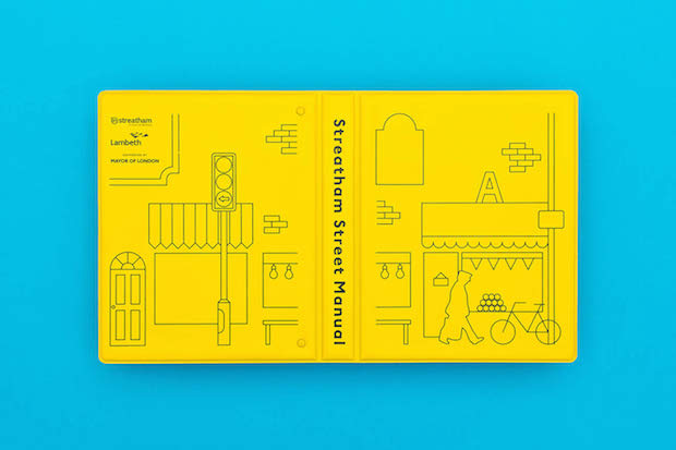
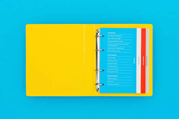
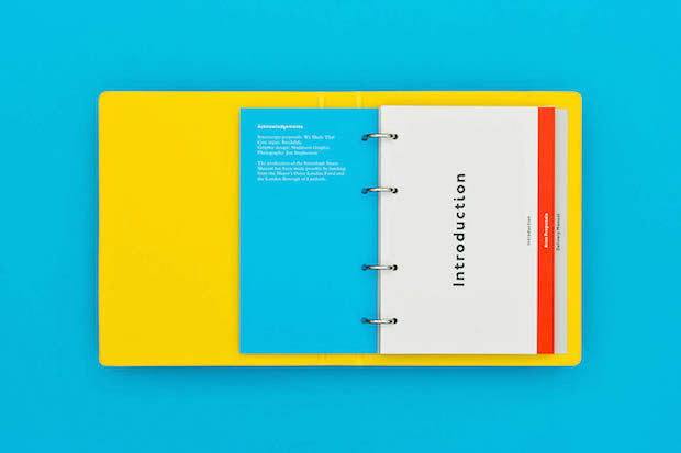
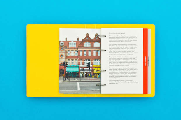
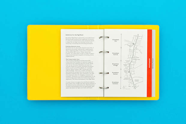
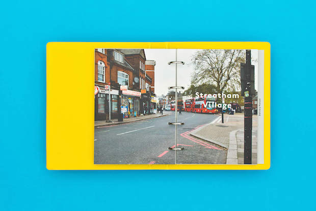
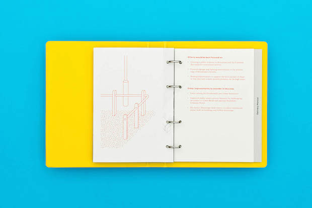
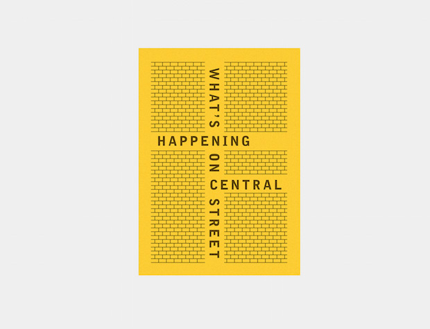
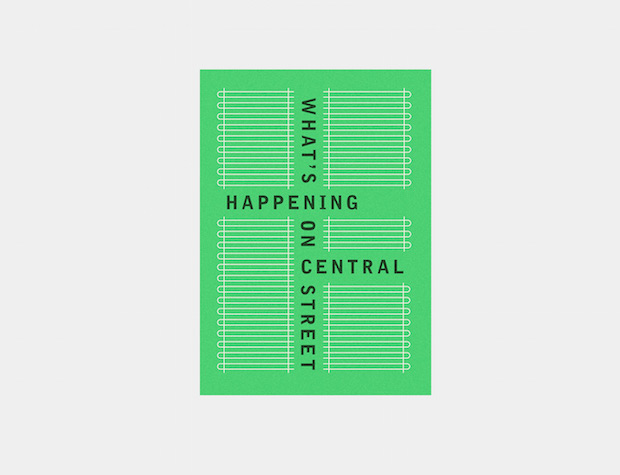
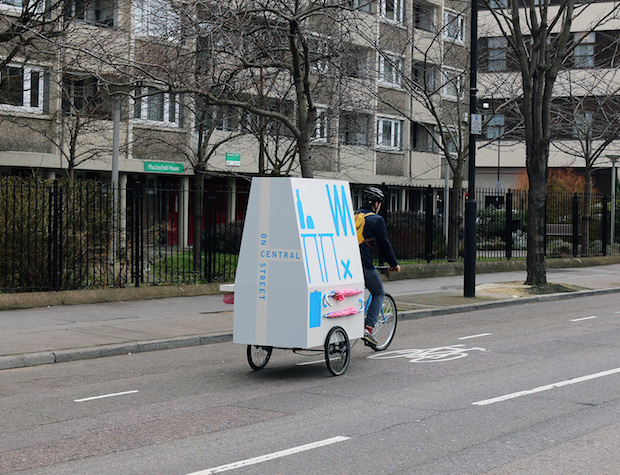
A: Yes we've been getting quite a bit of work with London boroughs and architects who work for those boroughs, which is very promising. We worked with We Made That architects to produce the Streatham Street Manual and they have been great, Oliver had bought one of our Boats prints for his dad and they had been looking for a suitable project for us to work together on.
Despite your work being far from conservative, a lot of it has been for Church organisations; have you ever had an experience where your work has been seen as a bit too out-there for them?
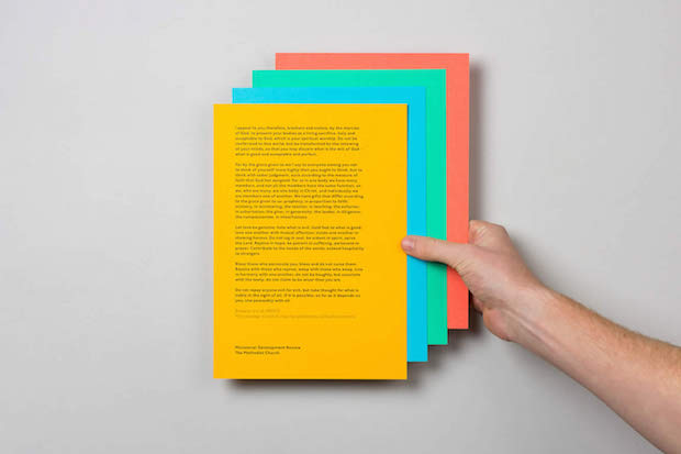
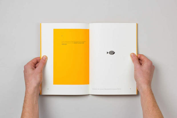
A: We did quite a lot of work for the Methodist church which came about by chance. We did a number of publications for them but we were only really in contact with one person there from whom we got really positive feedback.
E: Though we later learned that our work hadn't been universally popular in the church.
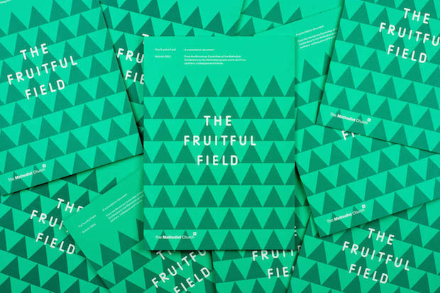
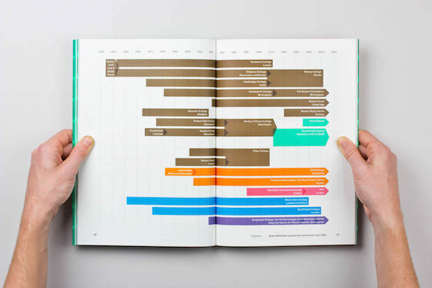
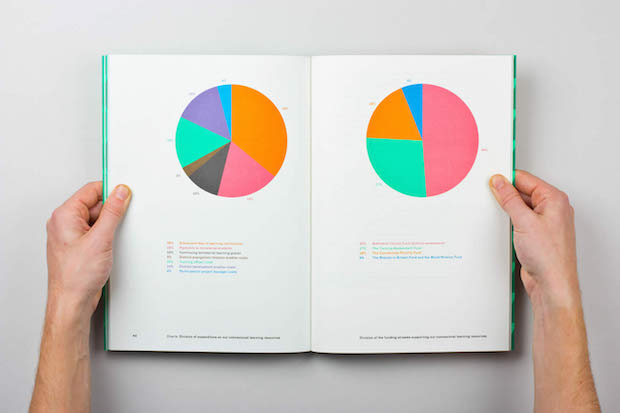
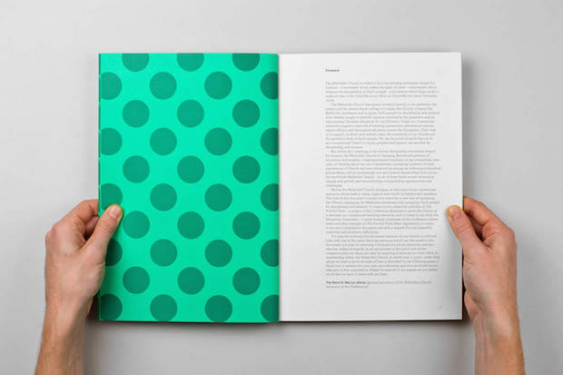
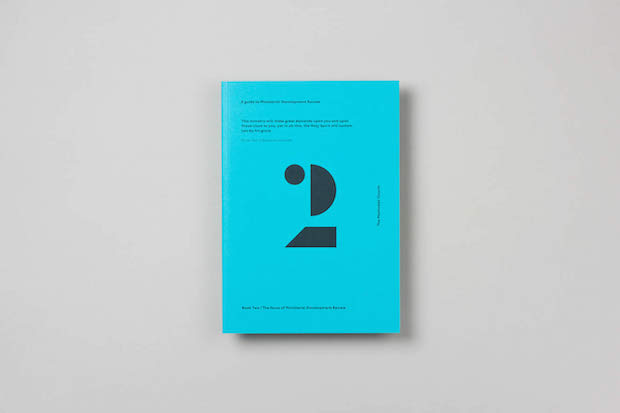
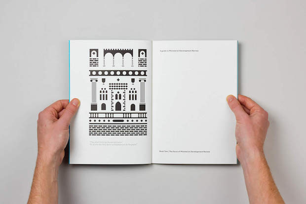
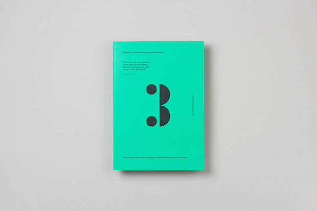
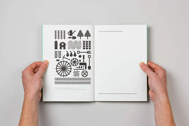
A: The problem arguably was the projects themselves; so, for example, we did some work on a book called The Fruitful Field. It was a scheme to amalgamate the church's training colleges, to reduce them from around twelve to two, so it was making a lot of people redundant, the evidently 'designed' book seemed to some lavish and unnecessary, putting us in a slightly tricky position
Do you think it's possible to persuade a client around to your way of seeing a project and the best way to answer the brief?
E: No, I don't think that works. If a client has come to us simply because someone's told them that we're designers you can tell they haven't really looked at our portfolio, it's easy to see it's just not going to work. If there isn't already a sensitivity for what we do in place then it probably isn't going to work. I don't mean in terms of our 'style', because that's something I want to avoid at all costs, more our approach to the work.
What's your working process like when you get a new brief?
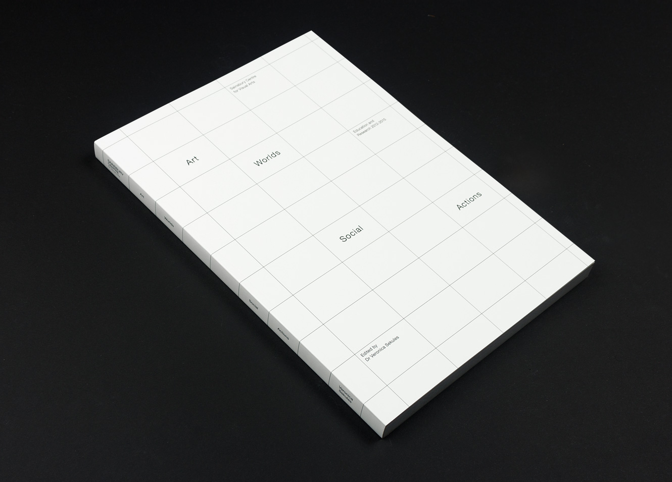
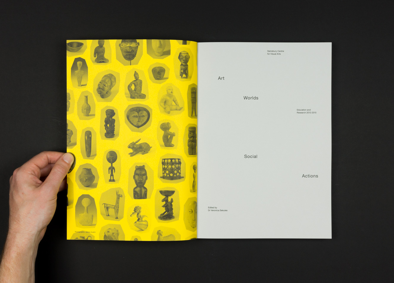
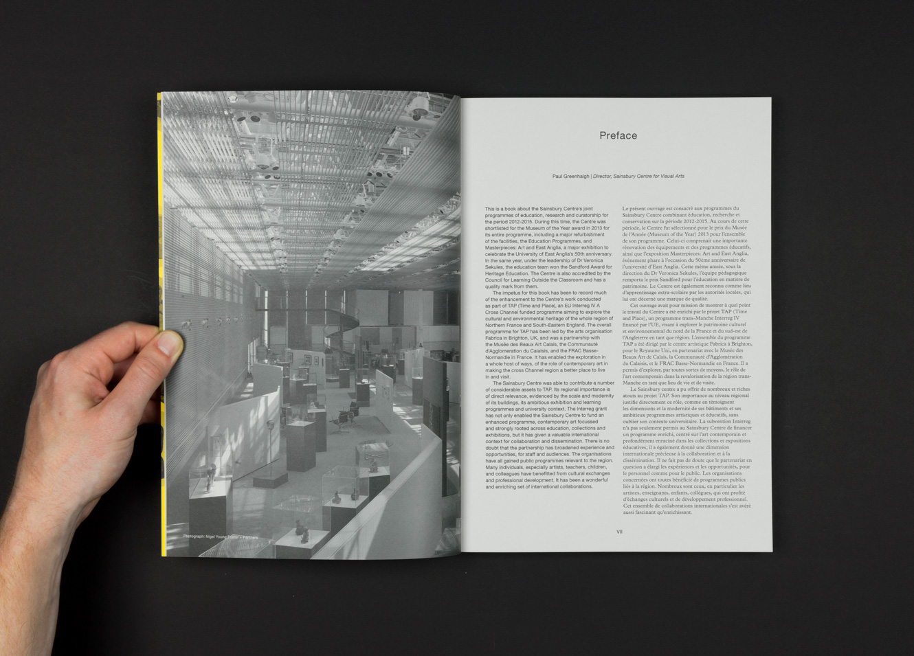
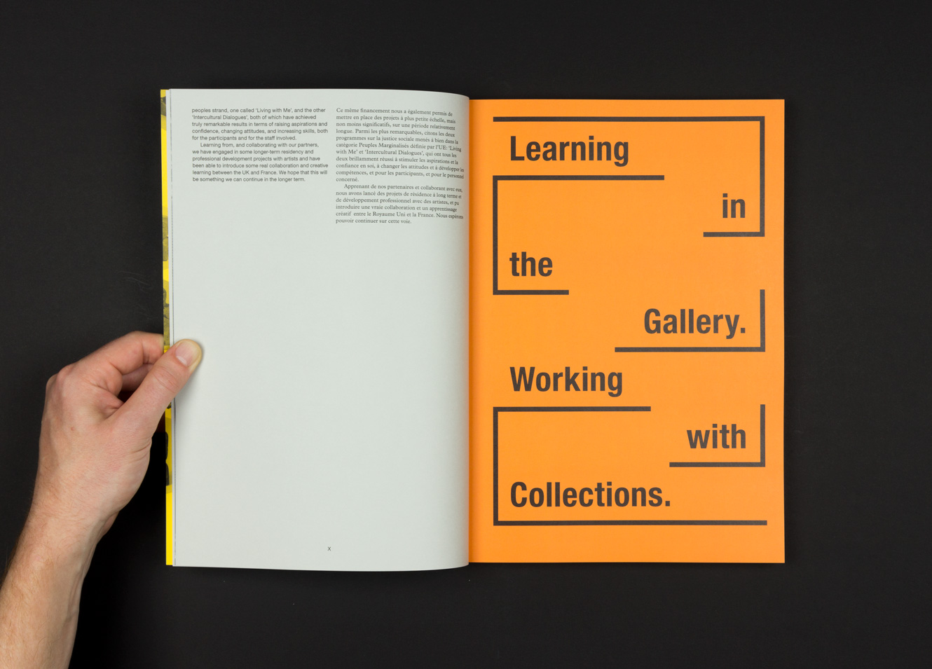
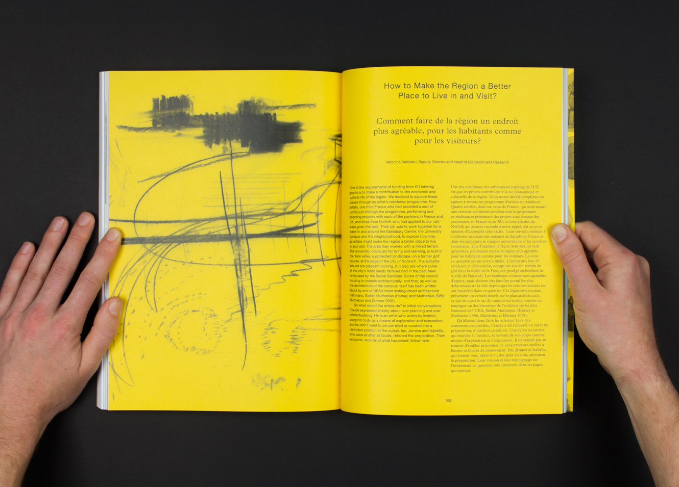
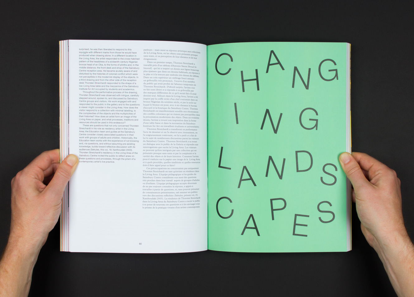
E: It's very different for each project. I think trying to find out as much as you can from the client is the first part of the process. And as we've mentioned, I think it's very important that the client understands what you're all about. If a client is sympathetic and wants involvement they will bring ideas and we'll work with them to flesh them out. In the case of the Sainsbury Centre job, it was very open though. So immediately you think “I can spend some time here thinking about this project from the bottom up”. We spent time looking at existing publications in the gallery and we looked at the building and at the collection. That said there were immediately technical concerns, the project had to be a bilingual publication (in French and English), so a lot of the detail was in looking at different ways to handle the type. To get type looking elegant while being functional can be really hard, a bit of a war between typesetter and content. So with that kind of project there's a mixture of understanding your client and also understanding your methodology, understanding how you need to go about something to do it successfully.
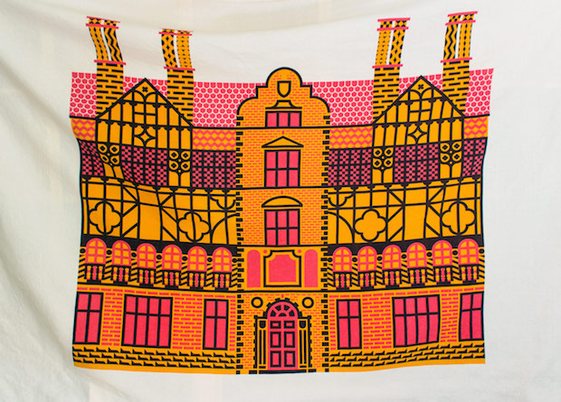
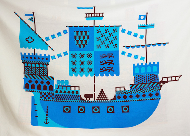

You do a lot of illustrative work as well, do you see yourselves as graphic artists – with an old school approach which allows you to turn your hand to different aspects of visual communication?
E: I think we primarily see ourselves as graphic designers, but you could definitely argue some of our projects are more graphic art. At some points I suppose we've done more illustrative work out of necessity but my degree course was Design for Publishing so I came out of that wanting to design books – and I still want to design books.
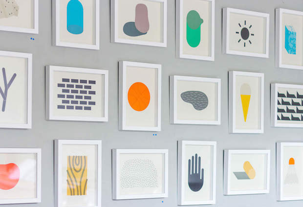
We started to realise if you're going to get anywhere you have to generate your own stuff because people aren't just going to employ you without a portfolio – and when you're just starting out, you're not going to get interesting jobs with opportunities to show off all the technical things you could be doing – I think we thought we ought to do something to get noticed so we designed prints and they were illustrative out of necessity. I illustrate like a designer though: when first starting I produced all of my images using very rigorous grids.
Do you keep a sketch book in which you develop these ideas?
E: No, I resolutely don't – I mean, I feel I should draw, and sometimes I will when I'm feeling guilty but I tend to work directly on the computer. I know of course that this is frowned upon, and I’m certain that it is restricting, but that isn’t necessarily a bad thing.
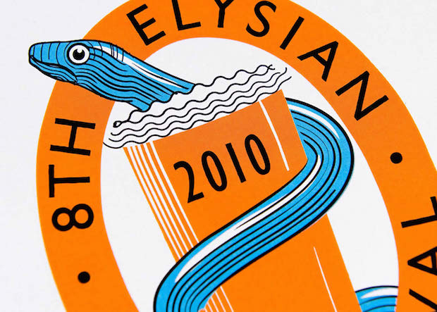
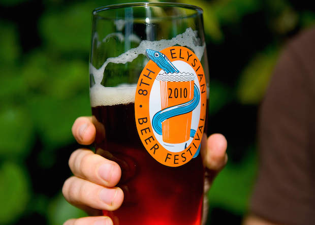
You used your own illustrations in the Streatham Street Manual though, do you think it's useful to the overall feel of the project to be able to do those yourself rather than commission other people to do them?
A: There’s something about keeping the overall language the same, and it also helps if the budget’s not huge! If you're trying to give something an identity, as with the street manual, then it's advantageous to keep direct control over the illustrations.
E: In that job, illustration wasn't part of the initial idea or budgeted for, but I thought the book needed something extra between sections, so being able to illustrate ourselves made that possible. I would love to have the opportunity to work with other great illustrators too though, we're not stuck to doing it ourselves by any means.
Has anyone particularly inspired your practice?
E: Well Jan Tschichold when I was learning the basics of typography was very important, discovering him felt like I'd found something absolutely amazing. Though I look at other designer’s work less than when I was studying, I have a lot of books and I am often referring to them, Jost Hochuli's work for example.
What does the future hold for Maddison Graphic?
E: Well, we don't really plan what we're going to do very much. We've been enjoying the work we've been doing in London recently, so hopefully more of that. The architects we've been working with recently, We Made That, do mainly publicly funded work, which we find really interesting.
A: The Greater London Authority are really enthusiastic about design, so actually this public work provides a lot of opportunity to do really interesting things.
E: We really like book design and would like to do more of that too…
