
In today's Archive piece, Fraser Muggeridge looks at the rather surprising forms of the full stop and comma from Transport for London's New Johnston Bold.

As a first-year student in Typography & Graphic Communication at the University of Reading in 1992, I wrote an essay on the typeface designed by Edward Johnston for London Underground Railways in 1916. It’s a well-known story of the creation of a distinct, legible and functional font for the twentieth century. I recall reading his 1908 book, Writing and Illuminating and Lettering, and drew parallels between its letterforms and that of Johnston as a calligrapher, in particular the hooked ‘l’ and the diamond shape dots on the ‘i’ and ‘j’.
Johnston Sans was redrawn as New Johnston by Banks and Miles in 1979 to include new weights and variants, then as ITC Johnston by ITC (International Typeface Corporation) in 1999, and most recently as Underground Pro by P22 Type Foundry. This is where you would think that the story would end, but there are two further weights: New Johnston Book and New Johnston Bold which are exclusively owned by TfL (Transport for London). The basic character letterforms seem in keeping with all the other versions, but to my surprise they contain a rather peculiar and beautiful full stop and comma that are very different in shape and form.
The full stop is much more like a concave diamond star in shape, as opposed to the original square at forty-five degrees, and the comma is sharp and spiky like a big cat’s claw. These characteristics are very subtle and are barely noticeable at small sizes, but when used large they really can be very striking.
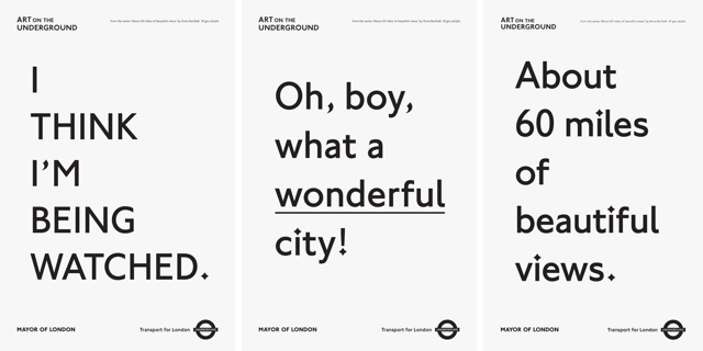
I recently worked with artist Anna Barriball on the design of her series of text-based posters About 60 Miles of Beautiful Views, commissioned by Art on the Underground (the art programme for London Underground). The text for the posters contained short phrases with full stops and commas, so the choice of which typeface to use became very simple: New Johnston Bold in huge type sizes from 180 to 500 point. It just goes to show that typeface choice can come down to the design of its comma and full stop.
pleasedonotbend.co.uk
This piece first appeared in Grafik 166, September 2008