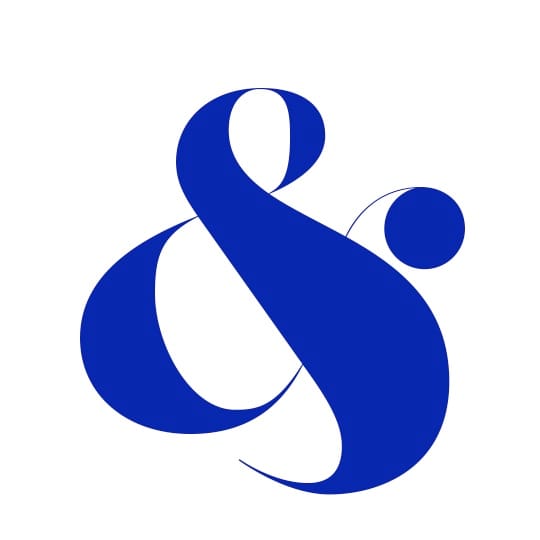
The distinct form of the ampersand allows designers huge freedom to experiment with abstract styles and iterations, argues Mark Richardson from London-based studio Superfried. Some consider it bad English or lazy, others just use it to save space, but I am rather fond of the ampersand. For me, it is the most eclectic character, where the designer has the opportunity to show some flair and eccentricity even in the most precise and modern of sans serif fonts. Originating as a ligature for the letters ‘et’ – Latin for ‘and’ – it can be traced back to the First Century AD. The ampersand was commonly used in the English language from 1837 and at one point was considered the twenty-seventh letter of the alphabet.
The intricate structure of the symbol allows the designer great freedom to experiment with a multitude of abstract styles without the risk of recognition as anything other than an ampersand. So often when designing type, it is this glyph that I have picked as my favourite to represent the typeface. It is consequently no surprise that it has been heavily featured in many a logo. The ligature has also led to interesting design projects such as Playful Ampersand by New York based type designer Moshik Nadav. Another is 300&65 Ampersands, a web project which features a new ampersand every day.
In The Elements of Typographic Style Robert Bringhurst suggests that is also worth investigating the italic fonts for ampersand inspiration. “Often the italic font is equipped with an ampersand less repressed than its Roman counterpart,” he writes. Or for the extreme enthusiast there are Ampersands 1 & 2, by CastleType, each feature 101 ampersands or the typeface Poetica, by Robert Slimbach, which features no less than 58.
So of all the typefaces, which features the best ampersand? An impossible question to which my answer would probably vary on a daily basis. However, at present I am rather fond of Bella by Rick Banks for Hype for Type. It perfectly balances the very classical origins of the French Didot style combined with the more modern letter forms of Herb Lubalin, John Pistilli and Jan Tschichold. Despite it’s classical appearance it still feels so fresh and modern.
The extreme think strokes in contrast to the equally extreme hairlines lead to a very bold yet simultaneously elegant and beautiful typeface. When I stumble upon a heading set in Bella, I find it almost impossible to resist taking another look to observe the detail. With this typeface there is the added bonus of a second ampersand. One is highly intricate, based on John Pistilli and Herb Lubalin’s Roman Face, which in turn look’s to have been inspired by Caslon by William Caslon I (1692-1766). The second is unique to this typeface and equally flamboyant. Therefore Bella and its ampersands are a worthy winner, at least for today.
superfried.com
Superfried
…is a London-based studio that specialises in forward-thinking identity and digital projects. The studio is also responsible for designing a number of experimental typefaces, which they license through Hype For Type. Recent fonts include the sci-fi face Box, Rails (a retro fashion-inspired font) and Neon, which features curvaceous form inspired by fluorescent-lit signage.
Ampersands
Etymologically, the word ‘ampersand’ stems from a corruption of ‘and per se and’, a phrase traditionally added when reciting the alphabet to denote the extra glyph. Perhaps the most interesting usage of the ampersand is in the film industry, where it is used to denote a closer collaboration on a screenplay than merely using the word ‘and’. For example, if two writers had worked together on a script, the Writers Guild of America uses ‘&’, whereas if two writers contributed to a screenplay but worked on it at different times, the body prefers the word ‘and’.
October 21, 2014 3 minutes read
Different Strokes
The ampersand allows designers huge freedom to experiment with abstract styles and iterations, argues Superfried's Mark Richardson.

