
When Two Points studio was asked to create an identity for Barcelona's annual Big Draw festival it applied serious-minded ideas about identity design with a natural sense of fun. Martin Lorenz draws out the story…
How did you approach designing an identity that needs to be applied across a number of media and respond to diverse visual content?
More or less fifteen years ago we turned away from designing logo-centered, static visual identities to specialised in developing flexible visual identities. We made this change to flexible visual (FVI) for several reasons.
Flexible visual identities are very easy to apply to lots of different formats. If the visual system is well defined, it looks good on any format/media. A logo-centered visual identity, on the other hand, is a bit more clumsy when it comes to it’s application. It doesn't adapt that easily to different formats. When we were commissioned to design the visual communication of the Big Draw festival, we knew that we would have to design lots of different items in a very short time.
We are a very small design studio – it’s just me, Lupi, Elio and two interns. We need to be very efficient. Designing a visual system helps in these situations. You do not have to think twice when you design the deliverables. The system tells you what to do. In the case of the Big Draw festival we designed all the deliverables ourselves, but a well defined visual system also allows you to hire others to do the applications without them ruining the design.
If there is the time and the budget, a visual system can be turned into a program too which generates the deliverables for you, like we did for Tonangeber. Such a program has a lot of advantages. The rules in a printed corporate design manual can always be misinterpreted, bent or even ignored, whereas a program just generates what it was told to generate (and no, we do not think that programs as such will steal our jobs, they just help us concentrate on the fun part of design).
Another reason why we specialise in FVI is our believe that a visual identity should be the visual language of a corporation, organisation, institution, event or product. A static, logo-centered visual identity is like someone who always shouts the same message, while a flexible visual identity is a bit more eloquent. It is able to formulate different messages, adapt to different situations and maybe even to different people, who want different things from you.
I just finished my Ph.D. about flexible visual identities at the University of Barcelona and my investigation shows that there are many other design studios out there who made the same move from static to flexible visual identities as us. It seems to be a trend that is here to stay.
Tell us about the relationship between the typo/graphic elements and illustrative elements….
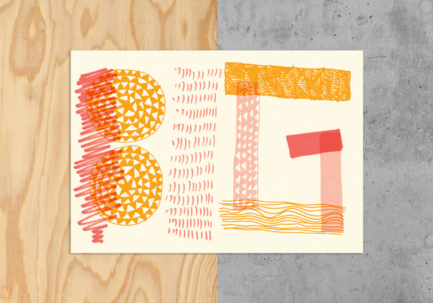
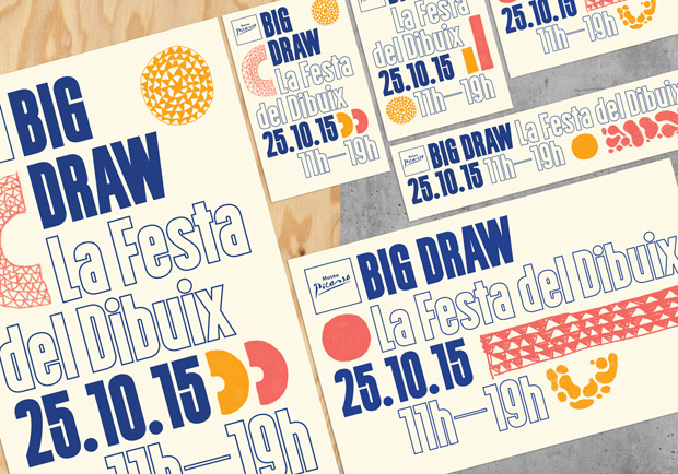
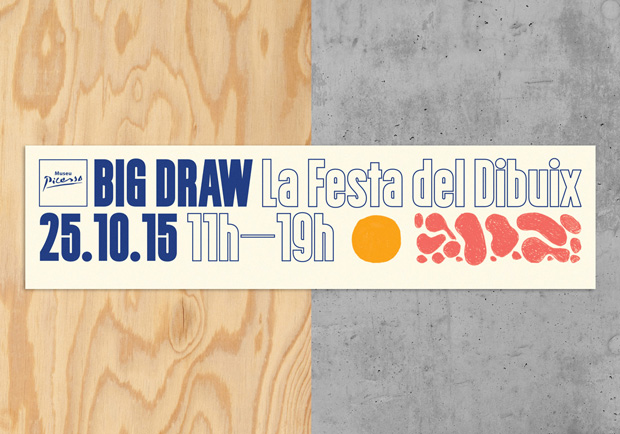
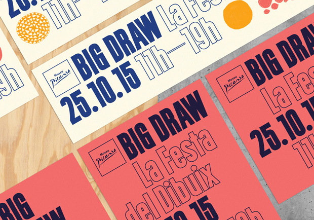
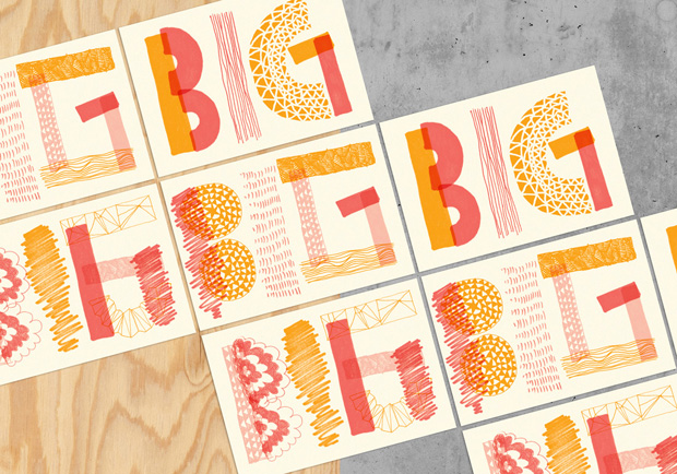
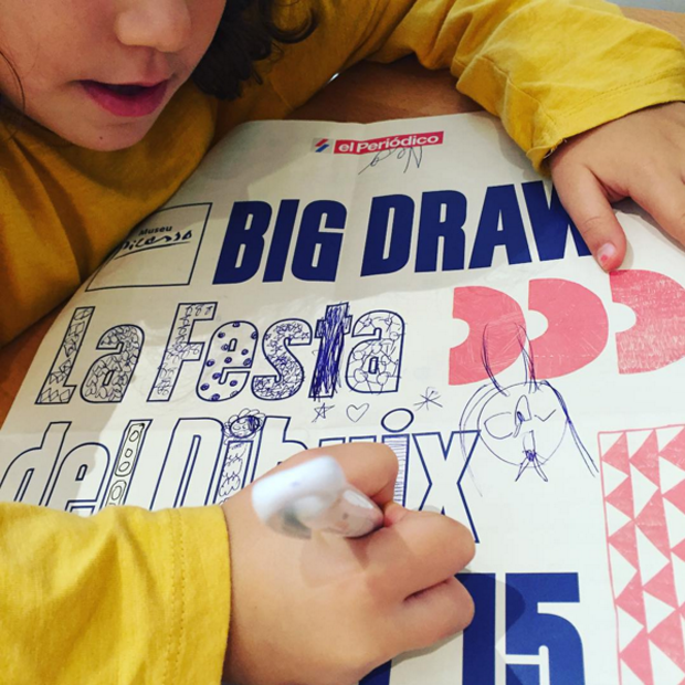
The Big Draw is a festival for everyone who enjoys drawing – kids, adults, pros and amateurs. Everybody draws differently, so how do you approach such a diverse group of people? A specific motif or style would always have an element that did not relate to not-relate to someone in the audience group. So we hit upon the idea of the doodle as a sort of common ground. Everybody has doodled at some point at their lives.
We added to this an outline typeface, which we designed specially. There was an image posted on Instagram from the festival of a his image on Instagram of little girl filling in the letters. When we saw this, we thought “YES! She got it!“. Most of the time, our work is being used as a vehicle for information, which is of course it’s primary function, but this time we were hoping to motivate people to do more with it, to make it become part of their creations and therefore part of the festival.
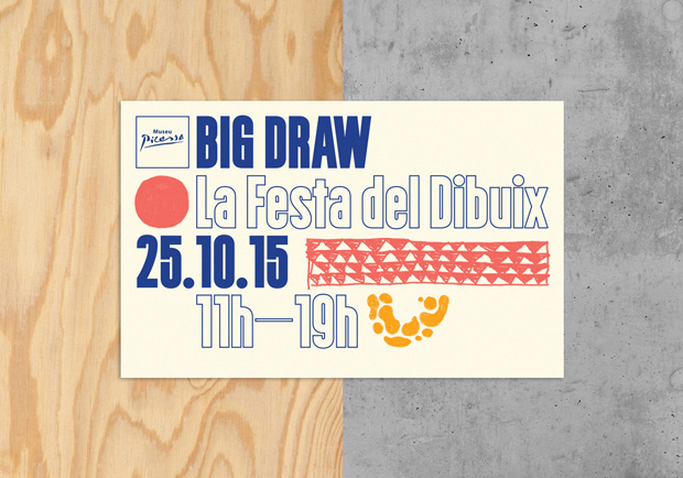
Production is a very important part of our job. It can convert a good design into a great object – something people like to have and keep. So we keep our printers close and consider them our partners. Sometimes it is difficult to offer new solutions to institutions because they have their ways of doing things, but if you are able to offer a nicer solution for less money you always find an open ear. For the Big Draw Festival we chose a rough yellowish paper that reminds you of sketching paper. And on posters and postcards we used three different Pantone colours, which made them stand out from the other standard CMYK-printed stuff.
The event looks like a lot of fun – what were your highlights?
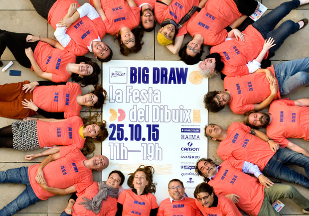
We go every year with our kids. We love that you can just walk around the beautiful medieval streets of Barcelona and join any workshop at any moment you like. It’s all for free and pretty informal. People are just having fun and the kids are so excited. This year the workshop by Agustina Guerrero was definitely an highlight.
What else is happening in the world of TwoPoints at the moment?
The biggest news is that we moved our headquarters to Hamburg. After ten years in Barcelona we were missing the rain. Well, no, that’s not really true. We were missing being up north in general. I am German, we both studied in the Netherlands (KABK, The Hague) and Germany (FH Darmstadt, HfG Offenbach), we have a lot of friends and family here. It is nice to be back. Barcelona will always be our second home though. We still go often to Barcelona to see family and friends and Elio has taken over our Barcelona studio. Together with him we work for several clients in southern Europe. That’s the great thing about Europe – you can have two homes. It just takes you a little more than two hours and you are in a totally different world.