
Atlas, the new studio of Astrid Stavro and Pablo Martin, has pulled off a stunning identity for an iconic new design landmark in Barcelona. Read how here... Please outline the various aspects and applications of the identity you have designed for Museu del Disseny Barcelona and the Disseny Hub...
The list of applications included the whole communication system: way-finding signage, a vast array of printed matter (brochures, stationary, posters, catalogues, etc), merchandising and the website. We worked side-by-side with NUG Architects and Franc Fernández, the architects we chose to develop the interior design. We were in sync from the start and have worked together to come up with the final solution for the project, down to the smallest details. Hopefully, the results will show in the merging of the visual language and the interior design. It has been a long and intense process, with many try-outs throughout the year, testing different materials and finishes. Translating the graphic visual language into a flexible modular system integrating form and concept has been an incredibly challenging and rewarding experience.
How did the commission come about and how long have you been working on it?
Initially, several design studios and agencies were selected based on their breadth and capacity of work. It was a very strict selection process, the studios and agencies had to pair with their chosen team of architects or industrial designers — the commission required the design of the new identity as well as the interior design. To make it into the first round, the teams had to present a series of recent projects which ranged from institutional environmental graphics, a minimum of three identities and signage for public infrastructures, websites, packaging design, editorial and advertising projects. The selected teams had to demonstrate ample capacity and experience to work with design in its broadest sense.
The strict selection criteria automatically disqualified many studios. Five of them were hand picked from the list by a democratic system based on points, with an emphasis placed on institutional and public work (the final break-down included some of the best design studios, agencies, architects, product and industrial designers in Barcelona). We were all asked to submit four A-3 panels, which had to include the full graphic identity and interior design proposal (a real exercise in restriction). A Jury panel representing different members of the design associations and institutions involved as well as members of the Barcelona Council assessed the five final proposals.

The winner was announced in a public ceremony in the Auditorium of the Design Hub in November last year. My partner Pablo and myself were not present, and we heard the results while we were in the midst of a meeting with a client in Palma. When Pablo answered the phone he shouted out loud — “we won!” — much to the client's surprise, who didn't know what the hell was going on. It really was a big surprise for us — we never thought that we would win the pitch. We were convinced that our proposal was too modern and risky. Looking back, what makes us proud is the fact that we followed our instinct: we developed what we thought that the client really needed, not what they wanted or what we thought they expected.
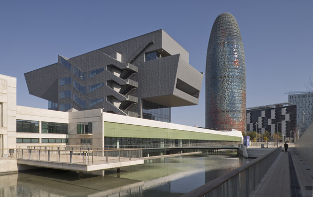
The identity is for an important design collection and an exciting new building in a rich cultural district of Barcelona... Is designing for a 'design' client more challenging or loaded with pressure than other kinds of clients?
Even if the context is 100% design-based, the end client is not necessarily ‘design savvy’: this is not a private business, the Design Hub Barcelona and Museu del Disseny are public institutions and ultimately depend on Barcelona's Council. Our client, in this sense, was BIMSA (Barcelona’s Municipal Infrastructure) which in turn, depends on the ICUB (The Culture Institute of Barcelona) and the Communication Department of the Design Council. It’s complex as there is lot of bureaucracy involved. In any case, I think that the pressure is the same. Working for design clients can be easier or more demanding depending on the context and viceversa. In all, the house style is a simple, pared back system which makes it a particularly brave choice on the part of the both the Museum, the Barcelona Council and everyone else involved.
How did you approach the visual language for such a broad collection of design?
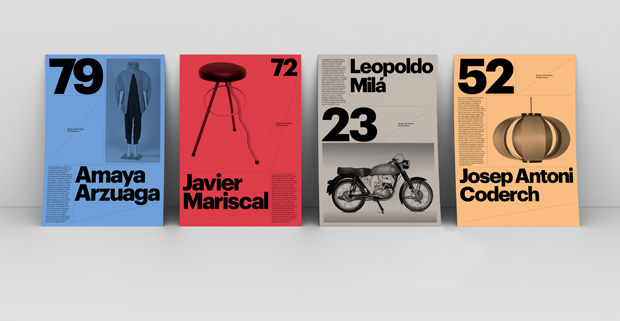
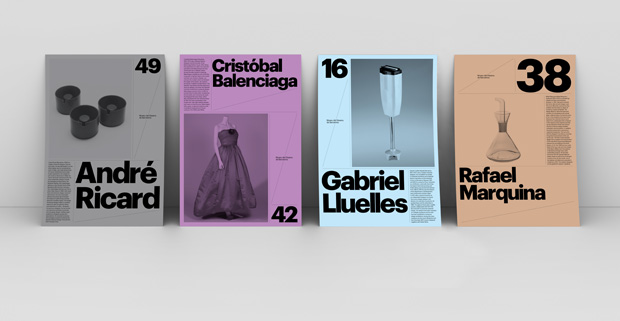
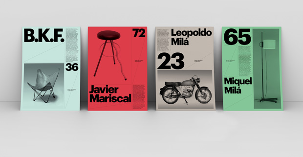
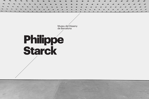
The system is based on a simple ‘connecting line’ which is the defining element of the identity. This line represents the unique geographic location of the building and manifests itself both graphically and physically through all facets of the identity.
The Plaça de las Glories is a large square in Barcelona, first designed by Ildefons Cerdà to serve as the city centre in his original urban plan (Pla Cerdà), placed at the junction of three of the city's most important thoroughfares: Avinguda Diagonal, Avinguda Meridiana and Gran Via de les Corts Catalanes. When seen from above, one can clearly see how this was Barcelona's first and foremost hub.
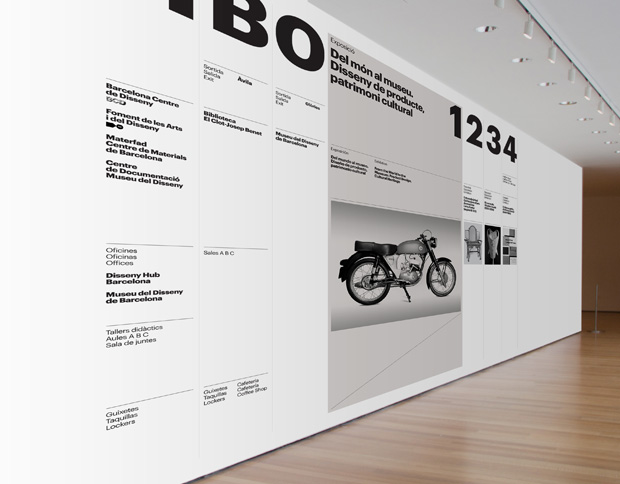
The new museum, on the other hand, presents a programme that integrates the present, past and future of the design arts in Barcelona. A simple line perfectly symbolises a place of interaction, engagement and connection. It creates a link between the city, the past and the future, connecting the multiple design networks in a single building: The Design Museum and the main design associations that are hosted inside the building, the BCD (Barcelona Design Council), the FAD (Foster in Arts & Design) and the Documentation Centre.
In a nutshell, we used a flexible and dynamic line as a graphic device to tie the whole scheme together. We tried to create a timeless aesthetic that would respect the identity of the existing design associations while reflecting the dynamic and changing nature of the building and the Museum. The personality is given by the system, not the logo, making it easily and instantly recognisable. Once the main concept was defined we started to develop the visual language. The flexible, pared down approach of the connecting line was conceptually appropriate but at the same time it felt like a simplistic device. It was vague and lacking in character. We focused on the choice of the typeface and colour palette. The identities of the FAD and BCD are set in Helvetica. Using Helvetica felt like a coherent but stagnating and dated choice. So we started looking for sans serif alternatives. It was important for the typeface to be flexible but not tied too closely to any particular era of graphic design.
Christian Schwartz's Graphik was the perfect solution in the sense that it’s a plain but relatively warm geometric sans. Its serious, pared-back forms reference classic sans serifs but remain thoroughly modern: friendly, playful, fun and serious. The high-contrast between the thin and bold weights brought an unassuming but distinct personality to the identity system. The perfect companion for our simplistic and highly conceptual line.


