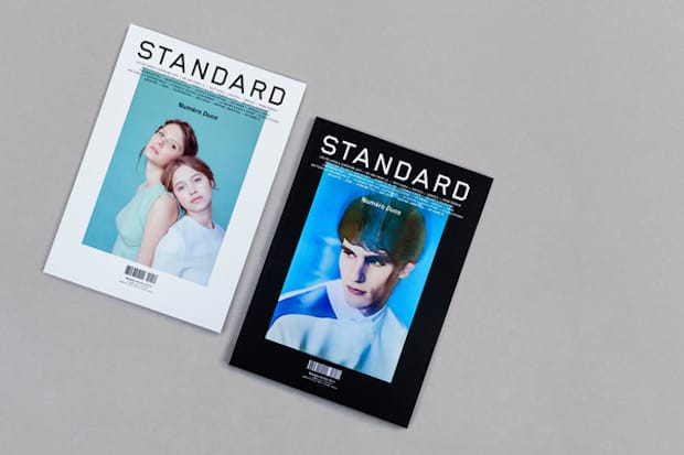
Redesigning an iconic magazine is challenging enough, without being briefed to abandon every existing element of its identity. Alexandre Bouichou from My Name Is talks us though the French studio’s redesign national favourite Standard and its split personality.
What was Standard like before the redesign?
Standard is a ten-year-old independent French magazine that deals with culture and fashion. Although their editorial direction has always been very strong, it feels like they never took the time to build a real visual identity.
How did the project originally come about?
The publishers had seen our work as part of The New Topographic Designers exhibition at Art Ligue gallery and through the Adidas Stan Smith launch event we worked on. Standard had just celebrated its ten year anniversary when they called us. They were changing the frequency at which they published and wanted a radical change in their image to accompany it, as well as more varied content. They wanted to start a new relationship with designers they hadn’t worked with before
.
What was the original brief from the publishers and did it change at all?
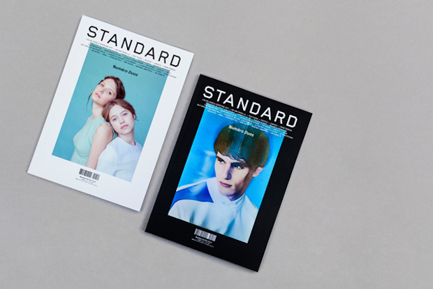
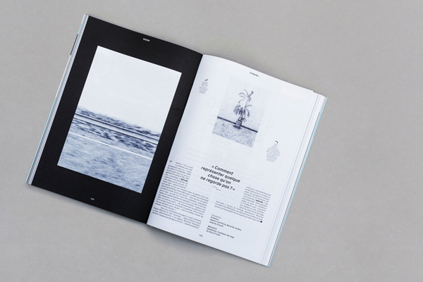
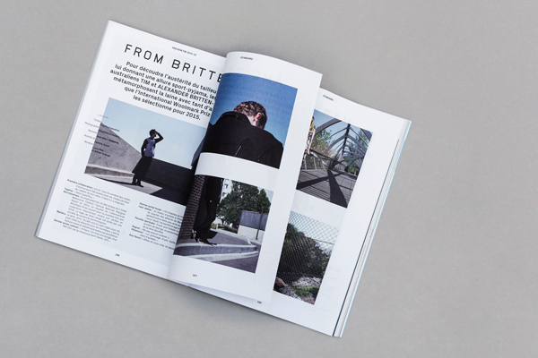
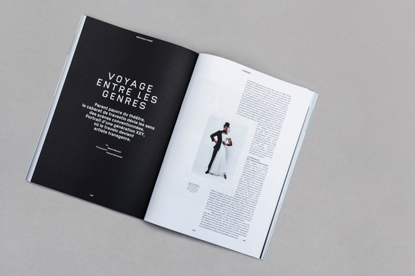
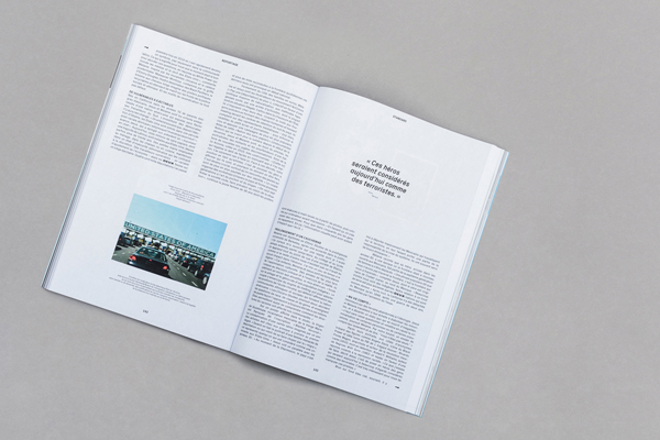
To be honest, there was no brief. The publishers presented us with the history of their magazine, their plans for the new version and their idea of having the upcoming issue deal with the theme of ‘Duo’. They just asked us to be as free as possible in redesigning Standard, the only consideration being readability. We came up with creative direction to support both those changes and their history – for example, it seemed obvious that we needed to create an identity that had something to do with the notion of standardisation, with a very strong grid. The idea of ‘Two’ that was the theme of the new issue (the Duo issue) was also an interesting idea to work on, so we felt like we had to find a way to make it appear throughout the whole magazine.
Did this project present any particular challenges, and if so how were these overcome?
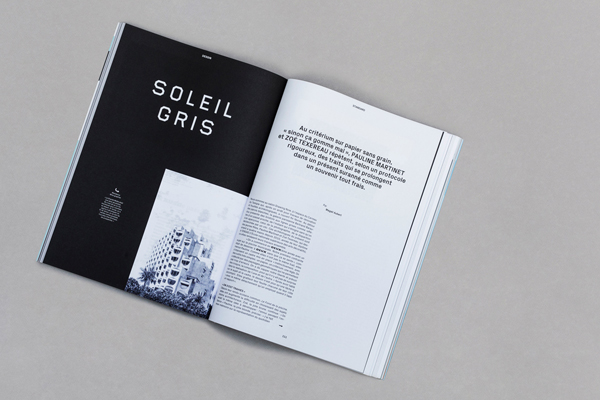
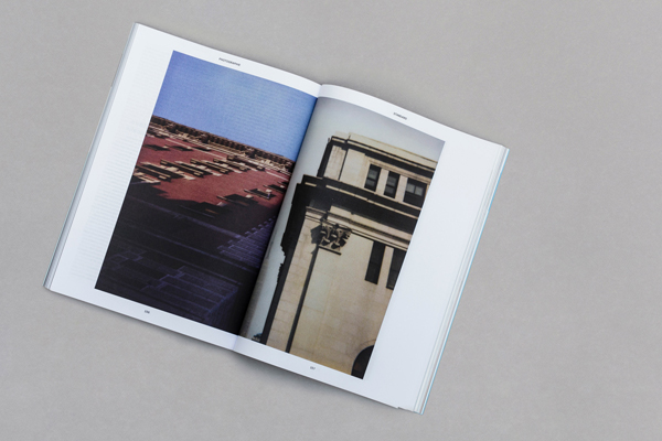
An editorial design project is mostly about finding a good rhythm and the right balance throughout the whole magazine. This is a challenge when it comes to a 256-page magazine that deals with a lot of different types of content. Actually, keeping a sense of harmony has been an even bigger challenge, since we wanted the grid to be almost invariable. Then, another big challenge was to create a whole new identity that kept something of the Standard essence, despite changing nearly every detail of the previous brand.
What do you think has worked particularly well?
We’re pleased with it as an object – the cover makes a really a good impression when you hold it. I think the cover was our main concern because no matter the quality of the contents, a magazine needs to shout from the newsstand. I think we succeeded in making the ‘Duo’ theme appear straight away from the outside. We split the magazine into two different sections (fashion and culture), and printed each on a specific paper with a specific cover. It means that instead of having a front and a back cover, we have a two-sided magazine with two different covers. Also, we maintained a great relationship with the publishers during this project. This is a very important thing for us, as a design project requires mutual trust and confidence between us and a client. We think it contributes to the success of a project.
Tell us a bit more about the inspiration for the typeface you created and how it was executed?
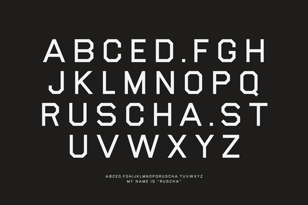
We created a typeface for all the headlines in the magazine and for the Standard logotype used on both covers. We designed it as a tribute to Ed Ruscha, and especially his paintings that show realistic landscapes with words displayed on it. To us, Ruscha's work is one of the most poetic visions of a standardised world, especially his work 26 Gasoline Stations, and his photos of car parks and oil stations.
Technical spec
Paper: Offset Arctic Paper’s Amber Graphic 110g, Novatech Gloss 115g. Cover: Novatech Gloss 200g and a matt laminating finish
Typeface: PX Grotesk from Optimo and Ed Ruscha by My Name Is
mynameis.fr

