Out of a super-creative Manhattan studio-share came a remarkable book about cities — Adam Michaels and Shannon Harvey of Project Projects and Inventory Press describe the art of the designer-publisher and sell-out architecture title 49 Cities

What is the background to this project; how did the commission come about?From 2006 to 2010 Project Projects shared a studio space on Ludlow Street in Manhattan’s Lower East Side with the architecture studio WORKac. We moved in together as friends and collaborators; the nice thing about sharing a studio space was that there was always an informal flow of projects that came up for us to work on together. WORKac had a longstanding interest in the “paper architecture" of the 60’s and 70’s, and with this project they wanted to analyse and push utopian thinking further into built reality. They sometimes called this interest “pragmatopia,” a concept that also resonated for us.
WORKac assembled the original team of researchers to determine which cities to feature, draw the site plans and do the number crunching behind each one. Project Projects was then brought in to help develop the overall structure, and refine the drawing styles and typography. The subject matter captured a lot of people’s attention, to the degree that both the first and second editions (the latter was expanded to include an essay by Sam Jacob and interview with Michael Webb) sold out within a year or so of each printing.The book’s viewpoint is a perversely quantitative approach to somewhat dreamy, unconstrained thinking... WORKac continued to receive requests for the book so they approached us about getting it back in print and setting up a wider distribution network. This was shortly after we had started Inventory Press in 2014, and it fitted nicely with our interests in projects that cross various disciplinary boundaries, or are in-between typical areas of activity (such as the pragmatic and utopian).

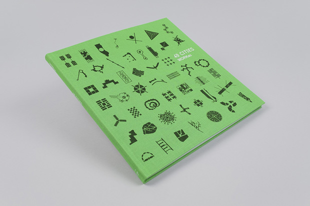
What points of differences are there in design terms in this edition of the book?The first edition (released in 2009) was produced in the summer months leading up to a fall exhibition at Storefront for Art and Architecture here in New York—so we were under a pretty tight deadline. Because it required a very quick turnaround it was printed in Queens at a printer that we usually use for faster, more ephemeral kinds of projects. Our priority for the expanded third edition was to increase the quality of production significantly while keeping the cover price relatively affordable. At our launch event for the title at the New York Public Library in November, Dan Wood said ‘in a way it’s the first edition of the actual book’—seeing as previously it had been produced on-the-fly, and had no formal distribution. We worked carefully to refine the colours of the interior and perfect the line weights of every drawing; we sourced a high-quality matte-coated paper stock, and bound it with a cloth flex-binding. New interviews with Yona Friedman, Ant Farm’s Curtis Schreier and Chip Lord were also added so these and all previous texts were edited for tone and consistency.

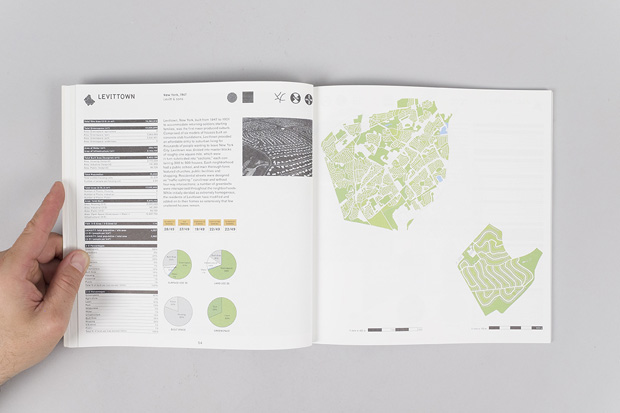
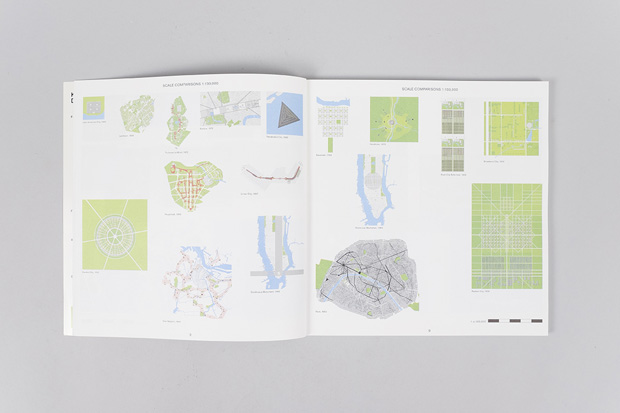
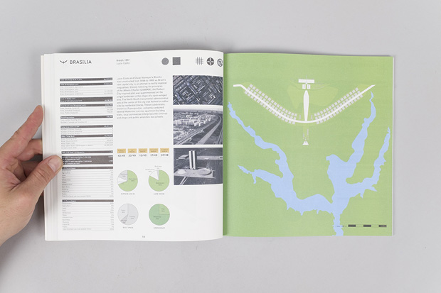
As an object of design, how did you want to unite the visual to the narrative of past architects and planners that had dreamed of “better” and different cities?The book’s viewpoint is a perversely quantitative approach to somewhat dreamy, unconstrained thinking. The way this plays out in the design is that for each city there is a page that almost feels like an instrument panel, or nutritional information, next to practical maps. This fairly dry presentation of factual information next to material that is unmoored in thinking presents an interesting kind of friction and an under-explored aspect of these projects.

How would you describe the studio process for this project?As designers and publishers, our role is in some ways that of ‘producers' of the project, involved in all aspects of its development, production and distribution. We met with Dan Wood and Amale Andraos of WORKac to discuss new content possibilities, and determined that some funds would need to be raised to improve the production values in the way that we all wanted to. We decided to try a Kickstarter campaign—our first—with the idea that how well it performed could help us determine an appropriate print run for the project. Dan wrote a rap (!) and made a short video that was a hit. The response to the campaign was fantastic; we exceeded our goal and were able to print a higher number of copies than originally anticipated. We made a special green-cover edition of the book that is available only for our Kickstarter supporters (and for a limited-time in our online store inventorypress.com). The copies that will be in stores worldwide will feature a vibrant blue cover.

