Today's Archive piece features Project Projects' Prem Krishnamurthy on the letterform ‘K’ from ITC's instantly recognisable (unless you're Google Books) typeface Buster.

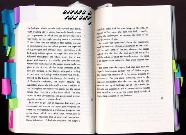
My first introduction to Buster was in the American paperback edition of Italo Calvino’s Invisible Cities. I cannot imagine a more appropriate choice for Calvino’s seminal text about language and space. Invoking the city in its architectural forms, Buster is a typeface defined only by its own shadow – a visibly absent alphabet.
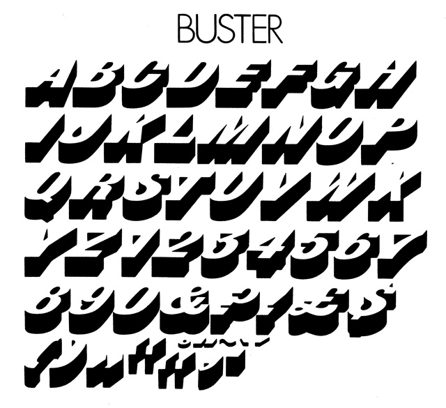
Buster was designed in 1972 by Tony Wenman for ITC. Built up from a bold, narrow nineteenth-century Grotesque, it consists of capital letters and is suited only for display. Legibility is not its strength; viewed in isolation or in certain colour combinations, Buster’s letterforms prove nearly impossible to decipher.
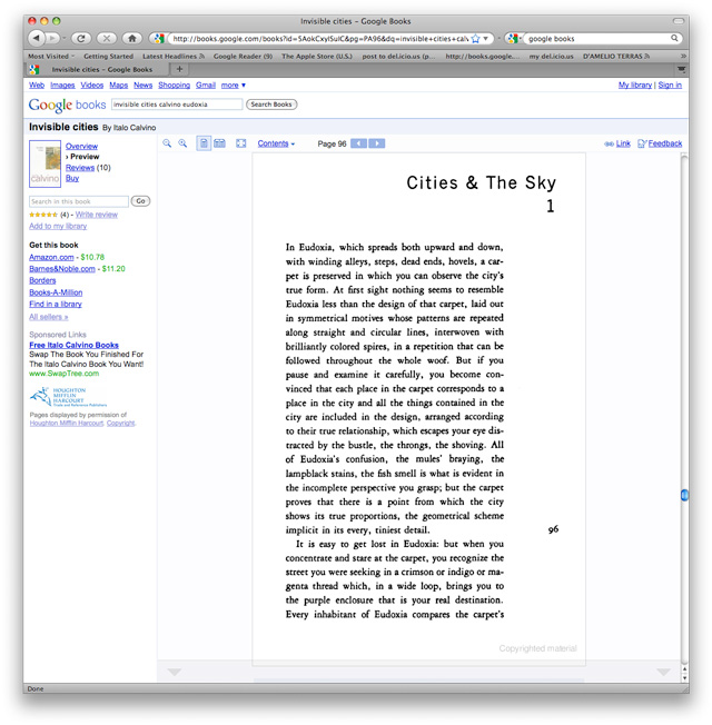
This may explain why the Google Books version of Invisible Cities replaces every instance of Buster with Trade Gothic. The purported mission of Google Books is to make book contents searchable, transparent and available to the public; Buster, evading Optical Character Recognition software, must therefore be neutralised.
Perhaps there exists an employee K., whose thankless task it is to eliminate each trace of guilty typefaces, page by page, from Google’s high-resolution scans. In the far-off future, when every new copy of Invisible Cities is printed on demand from Google’s digital repository, will he miss Buster’s presence?
Find out more about Project Projects here
This article first appeared in Grafik 179, April 2009