
Infuriating and fascinating in equal measures, it remains a must-see show in any design aficionado’s calendar…it can only be Designs of the Year.
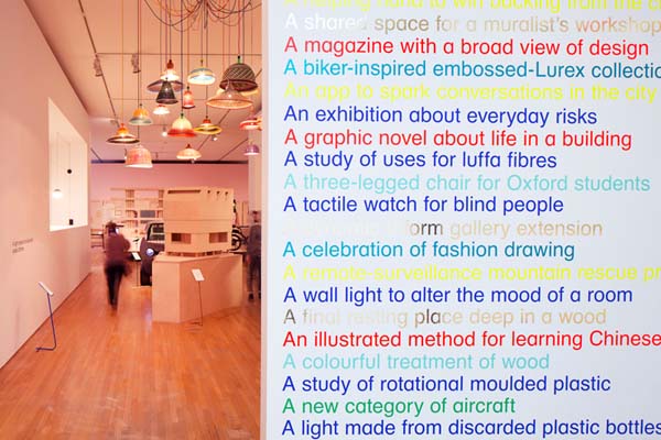
The Design Museum’s Designs of the Year exhibition is a perennially frustrating institution. The incongruity of making such a variety of objects and design solutions compete for attention is particularly acute for the graphics disciplines, which can struggle to make an impact when compared to those whose effects are more temporarily and spatially consolidated. In 2014, the judges will have to weigh Peter Bil’ak’s biannual Works that Work alongside David Chipperfield’s Museo Jumex; Experimental Jetset’s identify for the Whitney with a search and rescue UAV; and a type family for dyslexic students with Volkswagen’s 300mpg XL1.
Instead of grouping each discipline together, as in previous years, the curators have arranged them by ex post facto themes. This intensifying of the clash between objects and ideas makes for a more engaging reading of the space, but highlights the congruity issues on which the competition is predicated. Headings such as ‘Delight’, ‘Connect’ and ‘Situation’ may sounds anodyne, but, in combination with the explanatory wall texts, they extend the exhibition’s ability to identify emergent trends
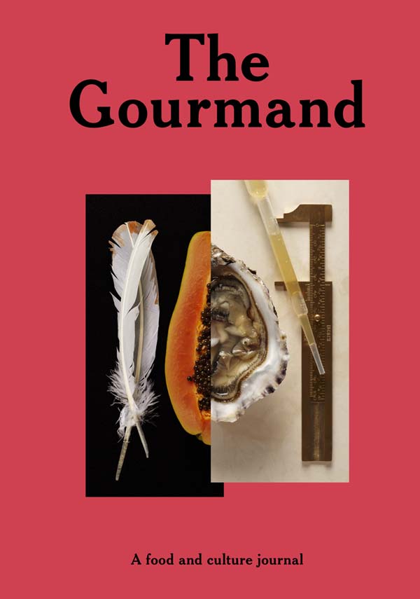
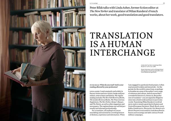
This year’s graphics quotient certainly feels reflective of the state of the art, with an emphasis on aesthetically bare but conceptually rich branding and a renewed interest in visual didactics. Most prominently, there are two nominations for new independent magazines, marking a resurgence in the genre. Works that Work’s strap line, “a magazine of unexpected creativity”, communicates the skew perspective it takes on design culture; art directed by Atelier Carvalho Bernau, it scores double points for being one of a number of projects in the show founded using crowdfunding.The Gourmand, the food and culture journal that has redefined food journalism with its aspirational editorial content and playful aesthetic, orchestrated by creative director David Lane, is another worthy if unsurprising inclusion, given the number of lesser imitations it has begot over the last twelve months.
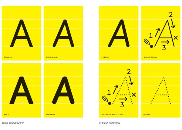
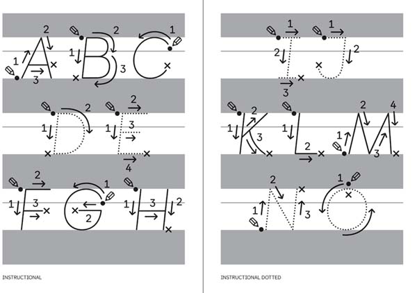
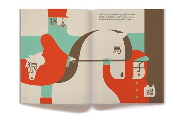
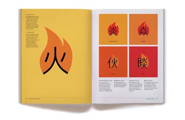
A preoccupation with basic lexical units characterises two of the strongest works on display, both of which re-state the valuable role that the graphics disciplines can play in education. The Castledown Primary School type family, created by Colophon Foundry, was commissioned by the school’s headmaster. Castledown is ostensibly designed as a dyslexic friendly typeface: it takes into consideration both readability and, by including a cursive iteration, teaching students how to produce joined up writing. Tackling more exotic alphabet, ShaoLan Hsueh and Noma Bar’s Chineasy elaborates visually on Chinese ideograms in order to make them more understandable to occidental learners. Using a range of techniques from illustration to animation, Chineasy makes meanings more memorable, but also deepens the student’s comprehension of the language’s culture.
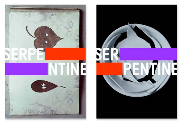
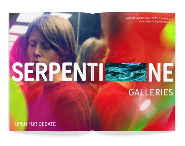
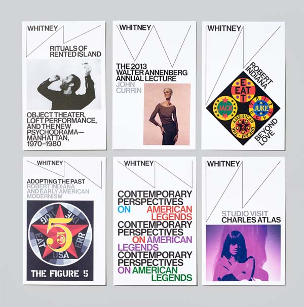
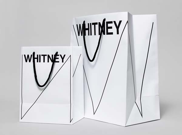
Communicating the culture of an institution may be a more finite challenge than that of a country, but it also presents a unique set of difficulties. For the new identity for London’s Serpentine Gallery, Marina Willer of Pentagram and Brian Boylan of Wolff Olins have created a cut-out device that acts both as a bridge and as an aperture, bisecting the gallery’s title to reveal content a layer beneath. Released to coincide with the opening of the gallery’s second Hyde Park space, this element references the actual bridge that connects the two buildings and the parkland space between them, as well as the Serpentine’s stated core-value of “openness”. In contrast, Dutch outfit Experimental Jetset’s “graphic toolbox” for New York’s Whitney Museum is a comprehensive 220-page manual of implementation guidelines. Also released to celebrate the completion of a new building, the scheme’s most visible addition is the “responsive W” logo which expands and contracts across any given context, using the abrupt angles of the Neue Haas Grotesk to emphasise the museums non-linear approach to art history.
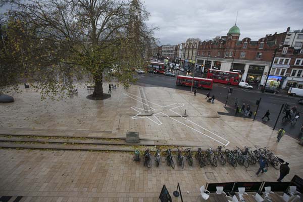
The only overtly political statement made by a practitioner in the graphics portion of the exhibition is the writer James Bridle’s Drone Shadow, a continuation of the technologist’s wider research into what is termed our “post-privacy” era. These “shadows” are the silhouettes of military drones outlined to scale in white tape across various urban settings. Their power comes from their drastic simplicity, materialising the very real possibility of an unseen surveyor (or even combatant) thousands of feet above. Perhaps, like Shepard Fairey's winning Obama poster for the 2008 American election, such a directly topical approach will give Bridle the edge, or perhaps Castledown’s social utility will give the judges reason enough to choose it ahead of a museum or a life saving syringe.
Admittedly, last year graphic design could claim a small victory: the winning Gov.uk website, engineered by the Government Digital Service, succeed partly through the adoption of Margaret Calvert’s Transport typeface. More commonly seen adorning British road signs, it was integral to making the website more accessible to non-web natives. However, Gov.uk was picked as a nomination in the Digital category, not graphics, highlighting the competition’s unhelpful reduction of complex objects. Of course it would be an equally reductive form of tribalism to to claim that something from the Graphics section needs to win to confirm the validity of its disciplines — the point is more that, by not associating objects by disciplinary origin on the exhibition floor, the museum has also inadvertently suggested a method by which the competition can take better account of the nuanced projects that it promotes. This year's jury consist of: Ben Terrett of the Government Digital Service; Frith Kerr of Studio Frith; Kim Colin of Industrial Facility; Piers Gough of CZWG Architects LLP; Tina Gaudoin, acting Editor in Chief of Elle Decoration. The jury is chaired by the journalist and broadcaster Ekow Eshun.
Category winners will be announced on 23 April. The overall winner will be announced on 30 June.