Grafik caught up with Craig Oldham, whose new book In Loving Memory of Work – a celebration of the visual material which emerged during the miners' strike – is a real labour of love.
The subject of this book is obviously very close to your heart – when did you first have the idea to make the booK?It all started pretty quickly. I’d had a discussion with a friend of mine in late 2013 who is a curator and he was planning an exhibition on the strike, featuring Jeremy Deller’s Battle of Orgreave, the following year to commemorate thirty years since its beginning. We talked about the visual outputs of the strike, and the ones I remember from the time, and it was one of those “that would make a good book” chats. And then in February 2014, a few months after that chat, my father came to visit me in Manchester and we sat and talked about his experiences… a year later to the day I was at the printers passing on press.
With your family being directly involved, did you feel a big responsibility to get it right? Massive. The people directly involved in the strike were always front of mind when I was curating and collating the book. I remember receiving a letter from Betty Cook, who is still a prominent activist, where she thanked me for making a book from the viewpoint of the working class, and I remember feeling a great responsibility to get both the book and the narrative right. It’s greatly important to them, and it was, and is, greatly important to me too.
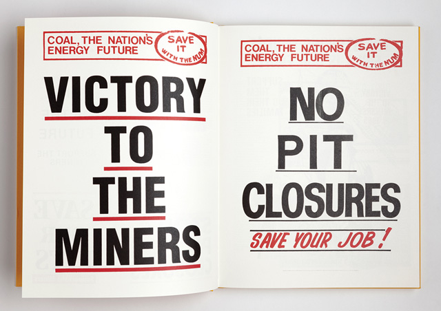
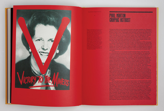
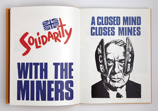
The miners’ strike has inspired numerous responses in the form of books, films and exhibitions over the years, how were you hoping to add to this existing body of work?The strike is a universal topic amongst the working class in this country because it was of such importance. It was a divisive time, but whether you supported the miners’ or opposed them, you were involved and it was important to you. Consequently people have, post-strike, realised their importance through film, or photography, or exhibitions and all very well. What I felt was missing and what I hope the book does, is join a narrative line through all of those things using the design and visual associations of all those things. Much like music does, an image or graphic is a trigger to a time and place and feeling that evokes so many things. Of course there are academic and reference books out there on the strike, but none really go into the visual culture of the time and go into what that actually is: the creative manifestations of people dealing with hardship and struggle. I want people to applaud those involved in the strike for their stoicism and fight, but also for their creativity.
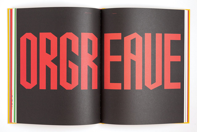
How did collaborators such as Jeremy Deller, Ken Loach and Alexei Sayle become involved?Once I had a good idea of what the book was, it felt important to have voices other than my own on the subject to stop it becoming a one-man crusade, but I also wanted to have contemporary voices on the subject to steer it away from lamentation and into reappraisal and, I suppose, celebration. I knew that Jeremy Deller had an interest in the subject from his piece The Battle of Orgreave, Ken Loach from his various miners films (notably Which Side Are You On?) and Alexei Sayle supported the miners through benefit gigs, so we just tried to get in touch in a classic six-degrees of separation kind of way. Ken Loach was incredibly generous with his time and thoughtful in his writing, as was Deller who really believed in the book. And I’ll never forget having a Skype conversation with Alexei Sayle whilst he was holidaying in Spain...
With a few notable exceptions, designers often seem wary of expressing a political viewpoint – by creating something which is very visually arresting, were you hoping to reach an audience which wouldn’t normally engage with the subject matter?I hoped the book would be a way in to the subject for a lot of designers, because I think it’s valuable on many levels. Correctly, one level is the political one, and designers often don’t express a political view, or worse, don’t seem to have one at all, but I think this is something all designers should have. Another level is a creative one; design is such a middle-class profession, surrounded with the myth that you have to be a creative to be creative – which I think is bollocks. Everyone has creativity in them and deals with their lives and experiences using it, and the strike is one clear and powerful, raw and potent example of that. So, I hope that young designers pick it up and learn about a recent history that echoes very closely a time they now live in, and also broaden their appreciation of creativity and creative expression.
How did you go about sourcing the visual material for the book?A lot of the material was collected at the source. My Dad and I travelled around meeting people involved in the strike and seeking their involvement, whether this was their story or their collections, and a lot of material was gathered in a personal manner. But there were also really sympathetic organisations – notably the Working Class Movement Library - which had vast collections of material, most of it uncatalogued and untouched, that helped us find some of the more unique items. And then of course, I was always out buying it. A lot of the material that made up the modest exhibition at the launch of the book is material I’ve attained for the book and now own, which feels strange.
What was the thinking behind creating the two bespoke typefaces?When it came to designing the book, and treating it much like any other design work, I wanted to use things for a reason, not simply a whim. I set a lot of the book in two faces that were used during the period, most notably the typewriter, because it was used a lot by the miners and their supporters in creating booklets and leaflets, and in AG Buch which was used by the coal board at the time before 1984. But both were pretty utilitarian, and the book needed something as special and heightened as the content it contained.
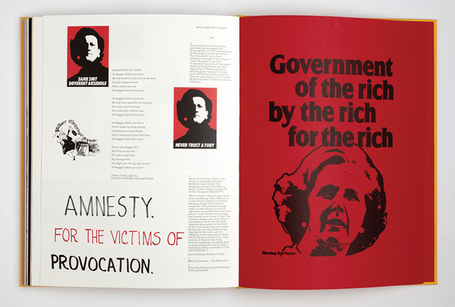
I’d seen some images from the TUC conference in 1984 and all over were these placards from Liaison Committee For The Defence Of The Trade Union (LCDTU). Black and white and extremely graphic. I replicated one message (Respect Picket Lines, I think) to create an accompaniment to the images and because it looked so different I decided to expand to the whole set. Working with Aaron Skipper, we drew the characters we had and then using that skeleton established the rest to use in the book. This became the Liaison font which we will be making available to buy shortly (with all funds going to the OTJC also). There’s also a couple more in progress, the second of which will be out soon.
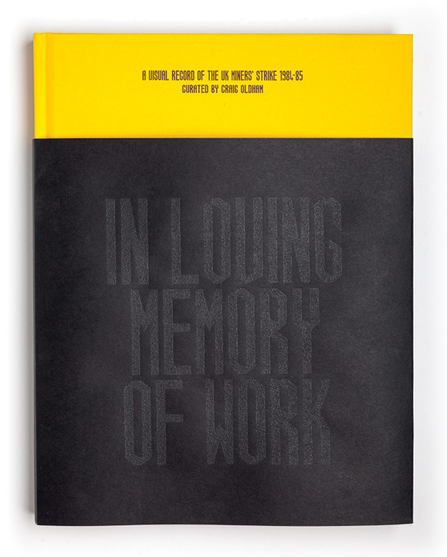
How did you go about creating the coal dust cover?With much strain. Finding a printer prepared to pass a combustable fossil fuel through a heated piece of machinery was somewhat tasking, but luckily we found them.