A marriage of two studios, Atlas dovetails the expert skills and creative vision of its founders: here they introduce a selection from an impressive portfolio of branding, identity, poster and typographic work.
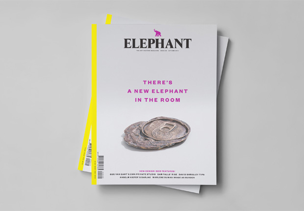
Elephant Magazine, 2014—present
Client: Frame Publishers
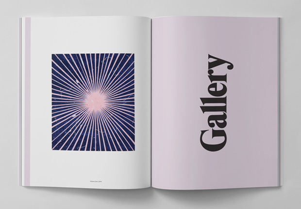
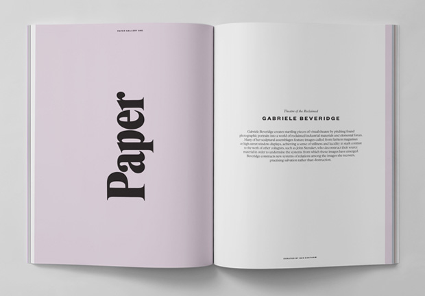
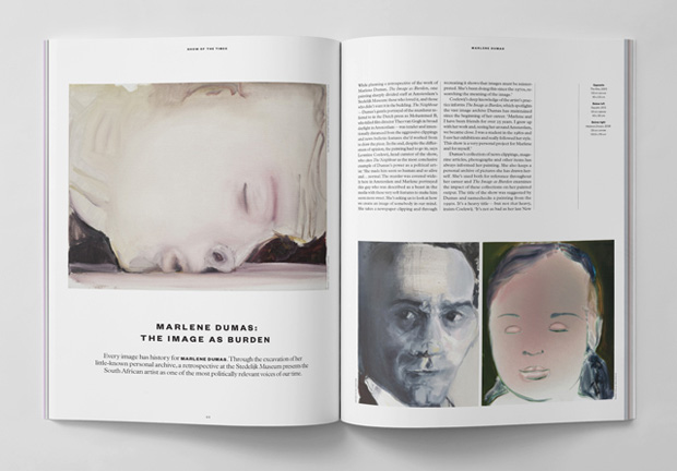
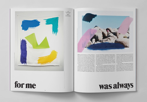
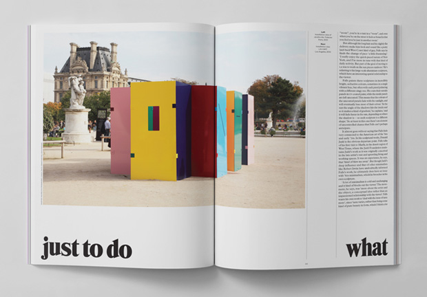
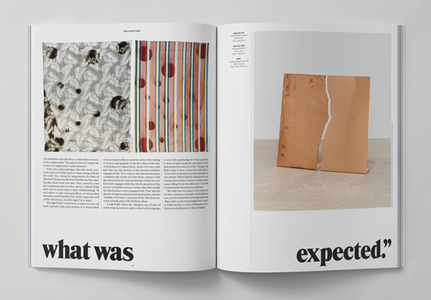
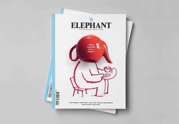
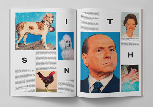
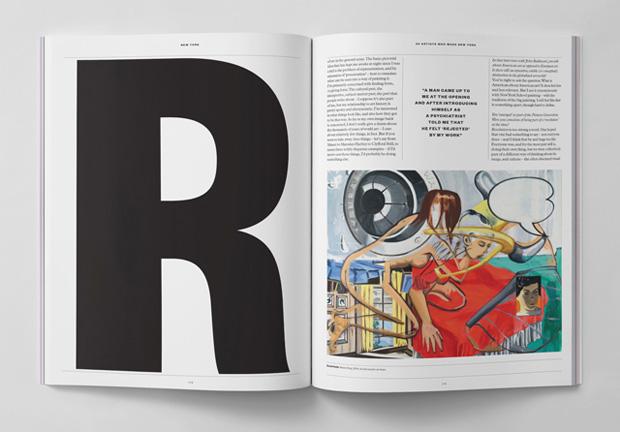
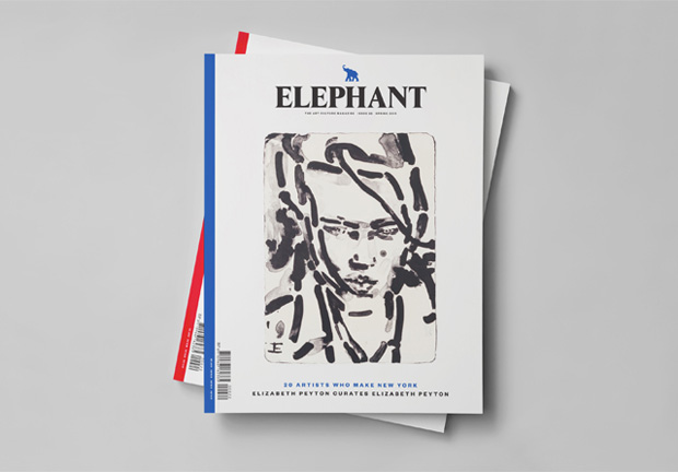
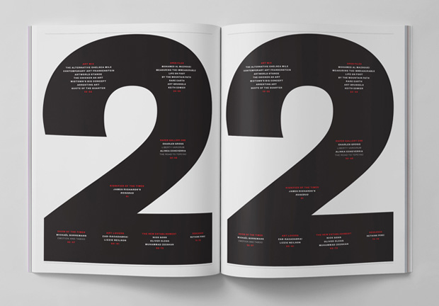
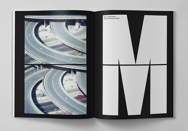
The new Elephant sees the contemporary art culture title metamorphose both editorially and in terms of design, with new features played out in new ways. We were commissioned to redesign the magazine making it more timely, more journalistic and ‘lifestyle’, more readable and enjoyable, getting skin-close in a way, to the lively culture that thrives in and around contemporary art. One of the overarching principles of the brief was to make Elephant look “less like a design magazine”.
We avoided the style-over-substance approach by letting the content speak for itself: the design is based on the content and not the other way around. It was about finding the right balance between words and images, creating well-considered, aesthetically intriguing, thoughtful and playful layouts that respond to the content without feeling dry, formulaic or over-designed. This was achieved by ‘editorialising’ the visual openers of the sections, allowing the imagery of the content itself to lead the navigation of the magazine (instead of dividing the contents into rigid, formulaic sections). In this sense, the design is closer to a lifestyle magazine that speaks to a broad, varied and multicultural art-loving audience. The 'sleeved' Paper Galleries with the different paper stocks add a nice tactile feel creating a moment of contemplative silence within the magazine. In summary: we tried to keep the visual language playful but transparent to let the content shine. Readability was a priority: it is irritating when the design interferes with the simple act of engaging with the content.
Further reading:
——
Forn Pes de sa Palla, 2014—2015
Client: Amadip Esment Fundació
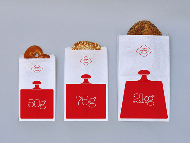
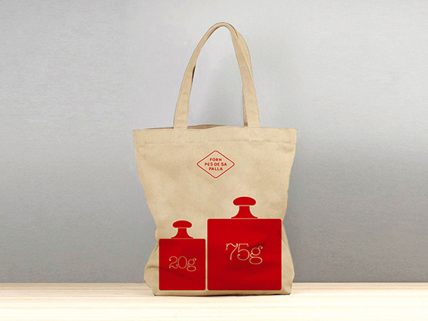
A visual identity and packaging for a traditional bakery. The visual language is based on the Catalan words 'pes de sa palla' (the weight of straw/flour). We used traditional graphic elements of baking scales and weights for the diverse range of breads and baked goods they sell.
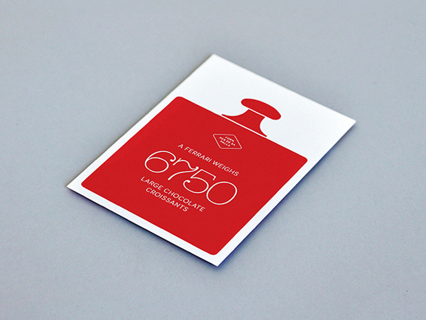
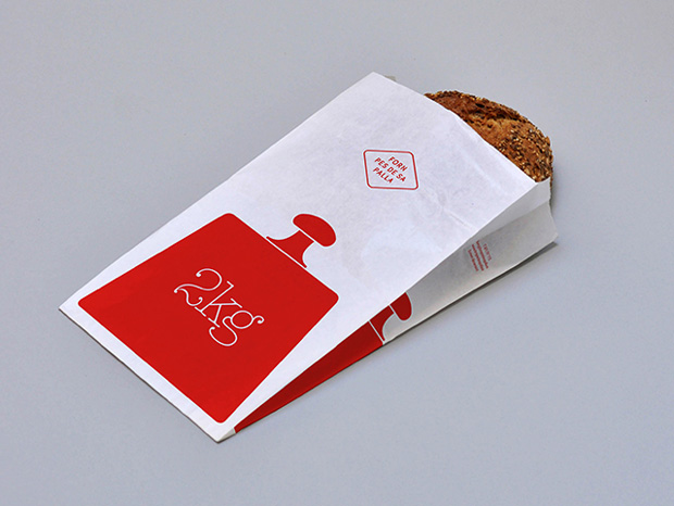
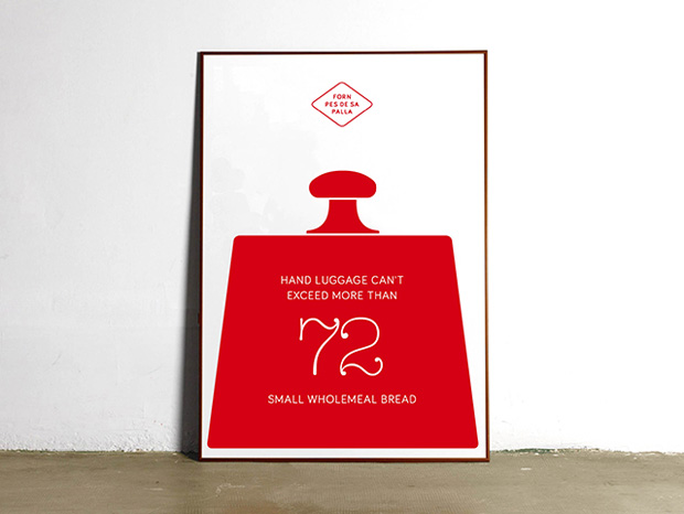
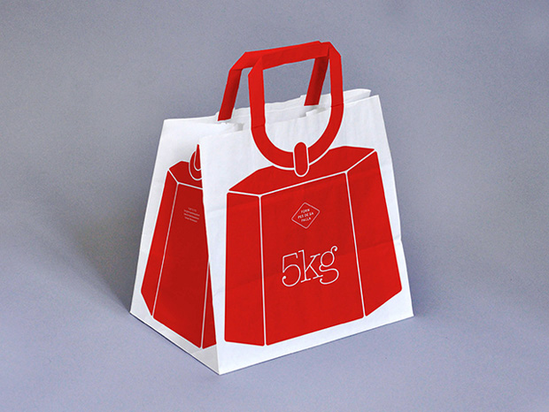
——
Creative Review Cover, June 2009
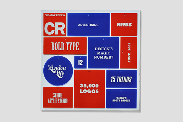
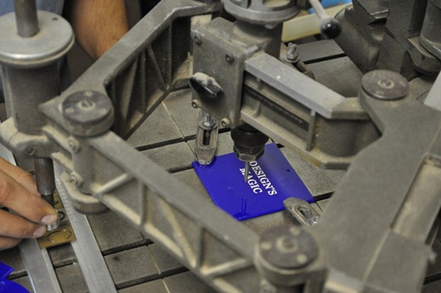
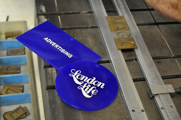
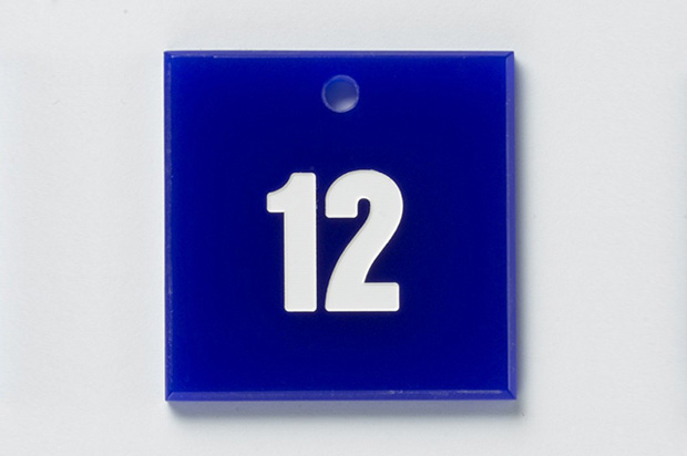
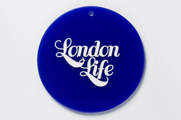
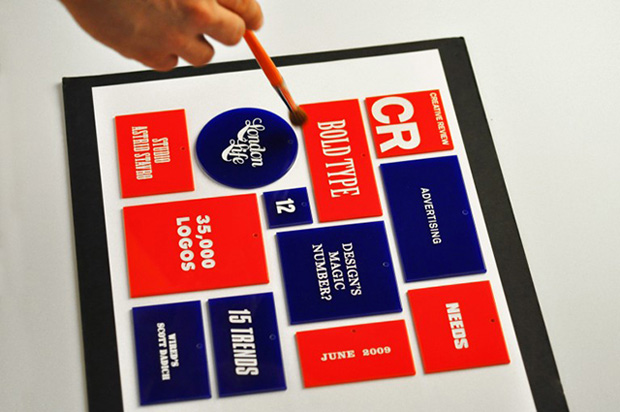
Creative Review invited us to design the cover of its June issue in 2009. We were asked to illustrate the cover with the content list they sent us. We spelled out the contents and the masthead in etched plastic chips and photographed them. A series of different typefaces playfully represent the variety of articles and features within.
——
Universidade de Vigo, 2009
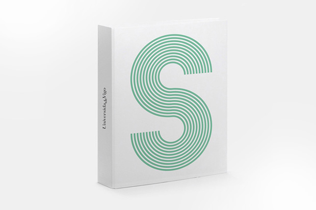
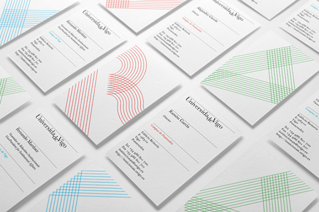
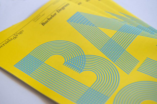
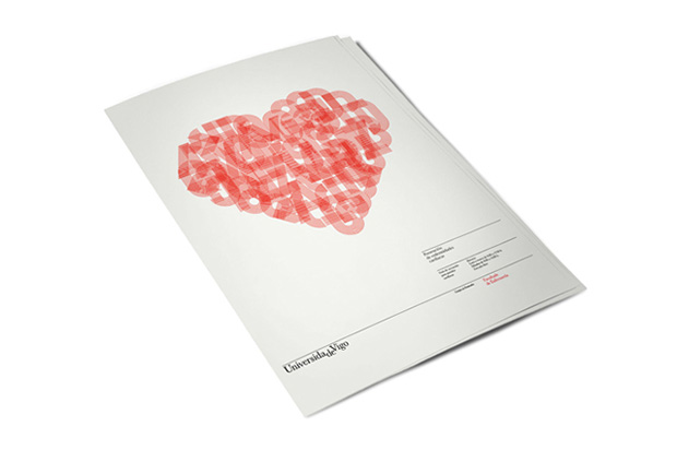
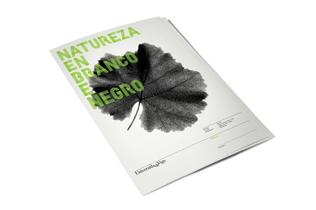
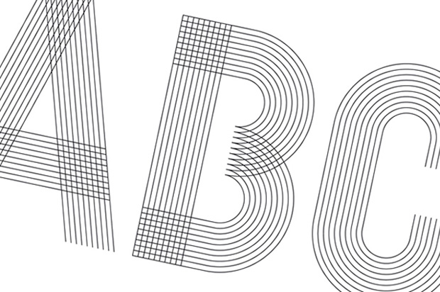
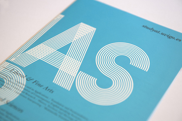
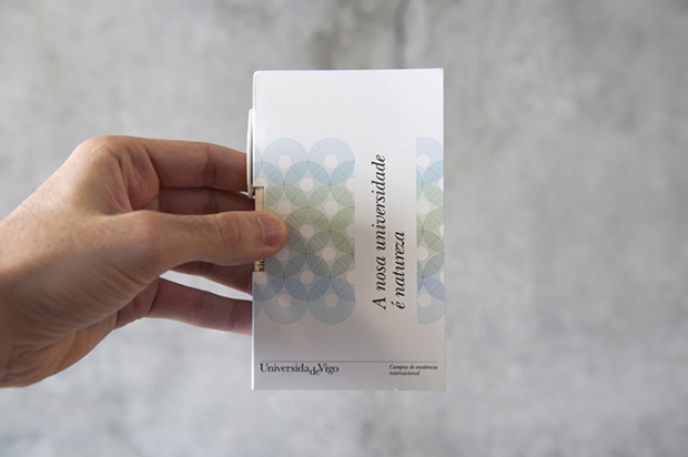
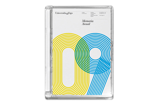
Corporate identity for the Spanish university. A bespoke typeface, Campus, was created to give a contemporary look and feel and make it instantly recognisable. The combination of a classic typeface for the logo, solving the dichotomy “Universidade de Vigo”, together with the bespoke typeface, reflect the tradition and spirit of the institution’s future.
——
Viva Massimo, 2015
Client: Husmee Studio Graphique
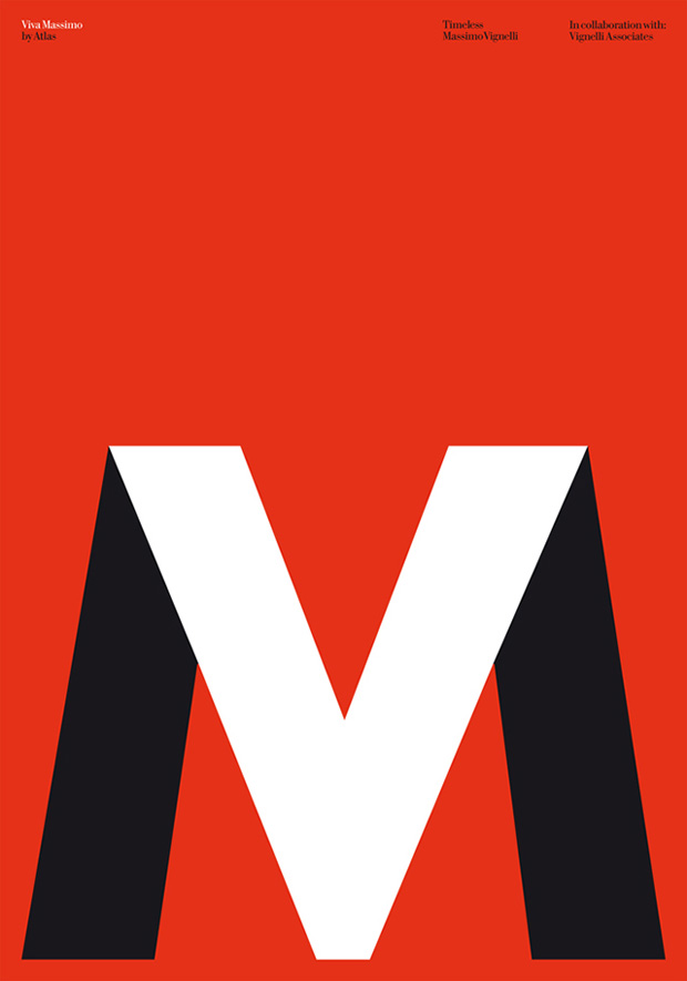
We were invited to contribute a poster the exhibition Timeless, organised by Husmee Studio Graphique in collaboration with Vignelli Associates. Based on the Modernist design language, the poster uses two of the six favourite Massimo Vignelli typefaces: Futura and Our Bodoni (a special cut designed by Vignelli). The initials of Massimo Vignelli's name were used to create an iconic mark with a double meaning: Massimo Vignelli = Viva Massimo. Following the Vignelli tradition, the poster focuses on simplicity through the use of basic geometric shapes with an added typographic twist. The exhibition took place at Cultural Centre Okendo, San Sebastian, from 19 February – 18 April this year and is relocating to the Barcelona Design Museum in June 2015.
——
A los Invisibles, 2010
Client: Consuelo Bautista / Foto BCN
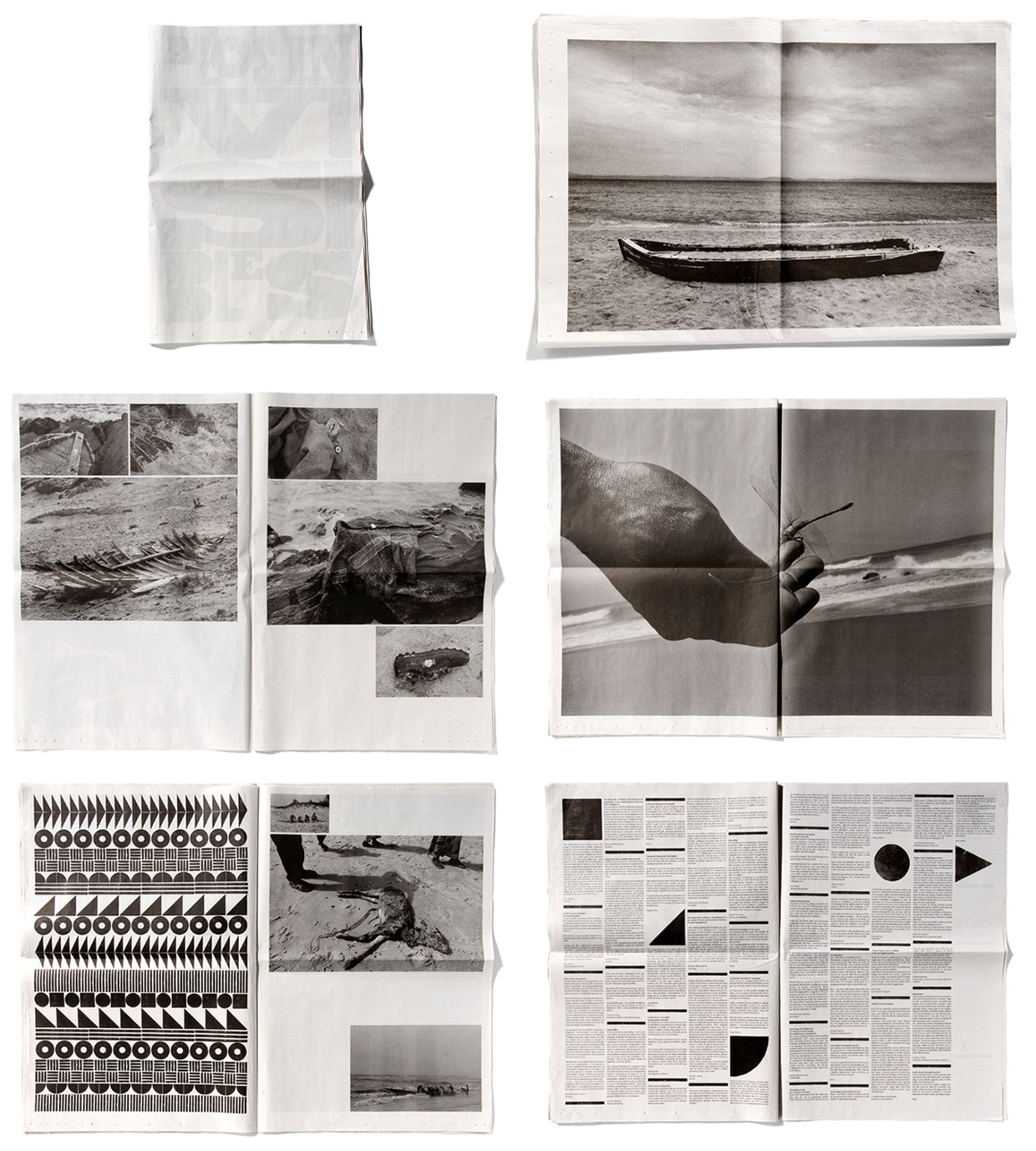
Creative direction and design for Consuelo Bautista's series of photographs portraying illegal immigration in Spain. The tabloid-format limited edition was distributed in the streets of Barcelona by illegal immigrants. Consuelo Bautista won the City of Barcelona Award with the project.
——
Maria Canals International Piano Competition, 2009—2010
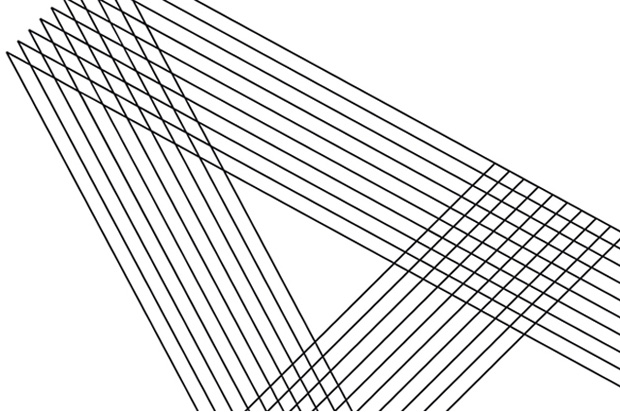
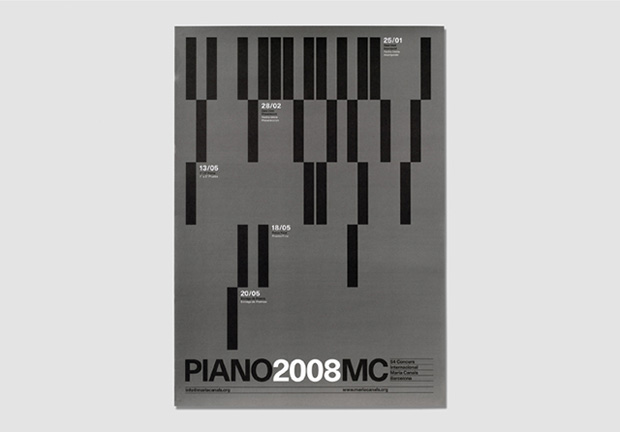
The graphic system for the Maria Canals Piano Competition is based on the ten lines of the stave in musical notation. We used a double pentagram to create a bold, easily-recognisable identity and build the grid and hierarchy of information in four languages.
——
Catalunya National Award, 2009—2010
Client: Generalitat de Catalunya
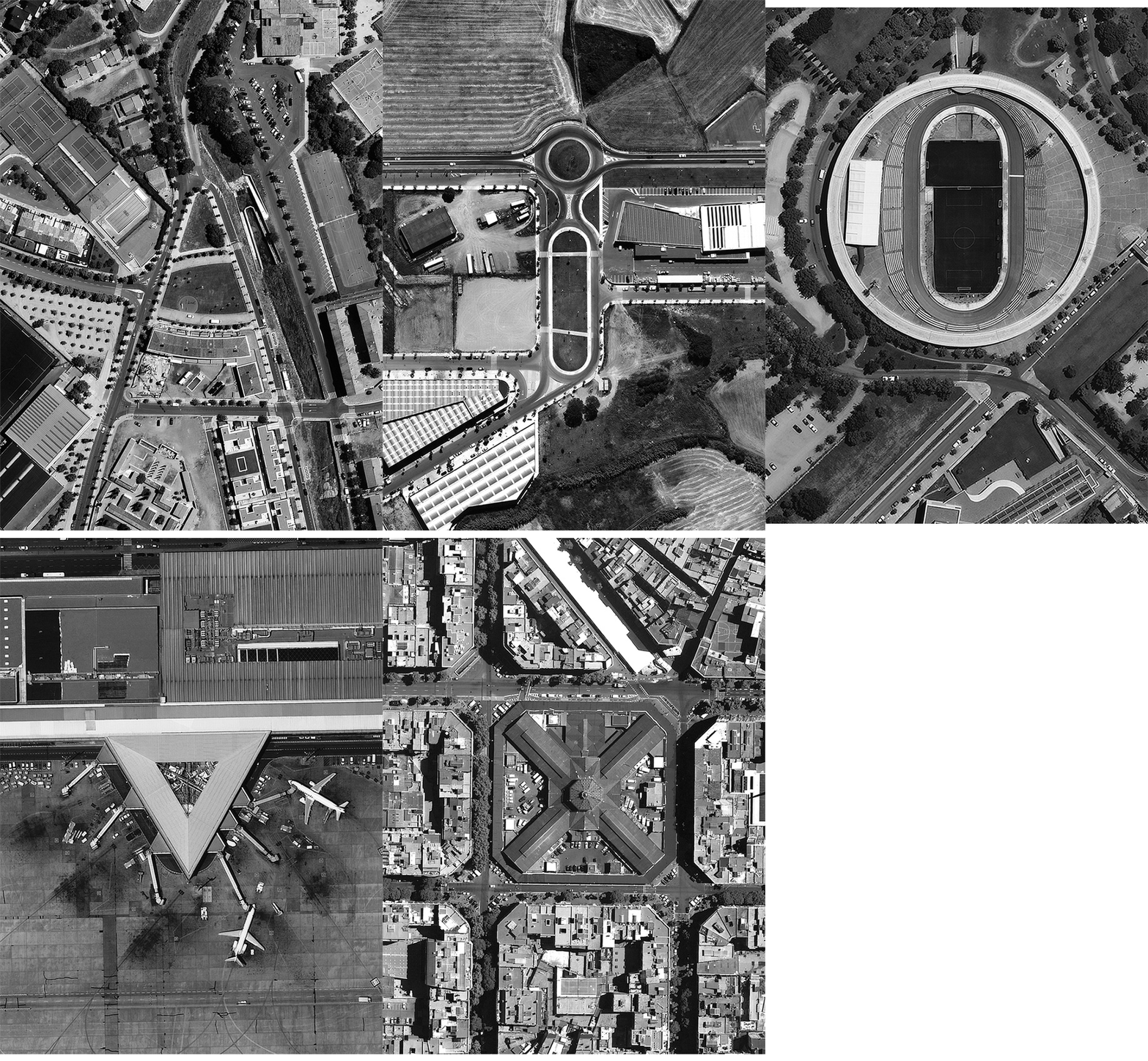
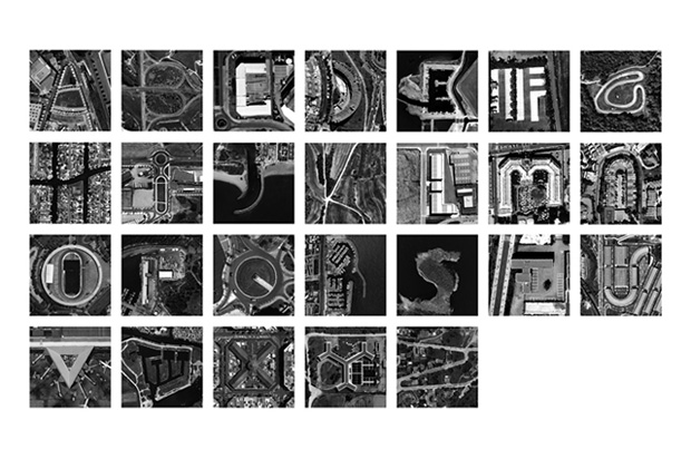
Alphabet created by satellite images of Catalunya used as the identity and catalogue for the National Culture Awards of Catalunya.
Designbyatlas.com

