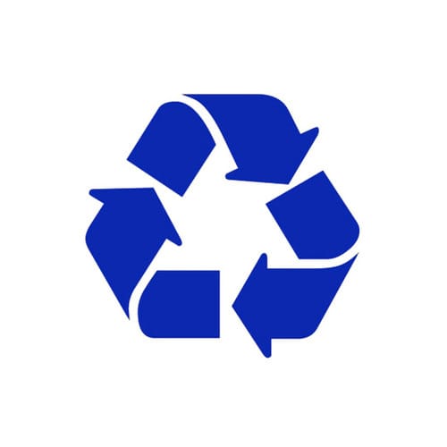
Both an archetypal emblem and a performative visual statement, the recycling symbol is the perfect way to represent thinking about creativity, argues Stockholm-based designer Viktor Hertz. Gary Anderson designed the recycling symbol in 1970, at the age of just 23. He won a sponsored art and design student contest, raising awareness to environmental issues, as a response to the first Earth Day. Originally standing on its tip, The Container Corporation of America, who sponsored the contest, chose to rotate the symbol and make it stand on its base instead. The pictogram is in the public domain, free to use in any way by everybody, and is probably one of the most universally known and recognised symbols.
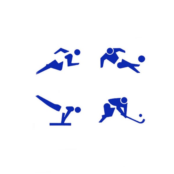
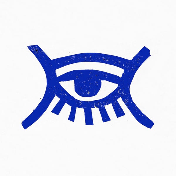
Except for being visually appealing, with those Möbius strip arrows forming a never-ending loop in a compact format, it also coincides a lot with my own personal work. I often recycle symbols and shapes – pretty much like digital composting, where I let different objects and ideas grow together into something new, after being cut up and put together again. It’s the perfect logo for this way of thinking about creativity, and how you get ideas for design and art in general, being influenced and inspired by already existing things. It’s like a visual representation of how everything in life is part of a remix culture, not only in the design world, of course, but biologically and environmentally, which it was first intended for.
The actual symbol itself is an example of recycling. Anderson used the same arrow three times, and so only had to design 33 per cent of the final image. He just re-used the same lines and shapes, putting them together in a circle. This way of thinking and executing a symbol is genius, I think. It’s informative and calls for awareness and action, while being both visually exciting and easy to understand. Not only is it telling people to recycle; it’s actually doing it itself, practicing exactly what it preaches. These kind of perfect visual statements don’t come around very often, and for me, it’s one of those “why didn’t I think of that?” moments. It’s a good thing, though, that I’m free to modify and use it in my artwork, as a designer. Why bother making new symbols and shapes, when I can re-use old ones?
viktorhertz.com
Waste
On average every person in the UK throws away their own weight in rubbish every seven weeks, and a total of 18 million tonnes of waste ends up in land fill a year. Recycling a single tin can saves the equivalent amount of energy as powering a TV for three hours and a tonne of recycled paper saves the equivalent of 17 trees, as well as 1727L of oil, 1.7sqm of landfill space, 4000KW of energy and 18,184L of water.
Viktor Hertz
Based in Stockholm, graphic designer Hertz specialises in pictograms, logos and poster design. He’s worked on projects for Ikea, Greenpeace and Ray-Ban, but it’s his self-initiated projects that win him the most attention. His series of pictogram movie posters went viral on launch in 2011 and more recently his Honest Logos project reimagined famous brand marques with more revealing descriptors (Nokia became ‘No kids want our phones any more’ and Nintendo became ‘Nothing to do’).
June 2, 2014 2 minutes read
Eco Icon
Both an archetypal emblem and a performative visual statement, the recycling symbol is the perfect way to represent thinking about creativity, argues Stockholm-based designer Viktor Hertz.


