
To mark the launch of Everything is Architecture: Bau Magazine from the 60s and 70s at London’s Institute of Contemporary Arts, Grafik asked six leading practitioners to talk about magazines which inspire their design practice.
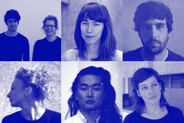
Sara De Bondt and Mark El-khatib
Partners at Sara De Bondt Studio
S: How about Index magazine, I used to love it.
M: Yeah, cool – maybe I could say something about Ark?
S: Super, let’s just make a list of all the magazines we love! In that case we could add the Monotype Recorder while it was edited by Beatrice Warde. And the Penrose Annual! Its mix of content and print technology is incredible.
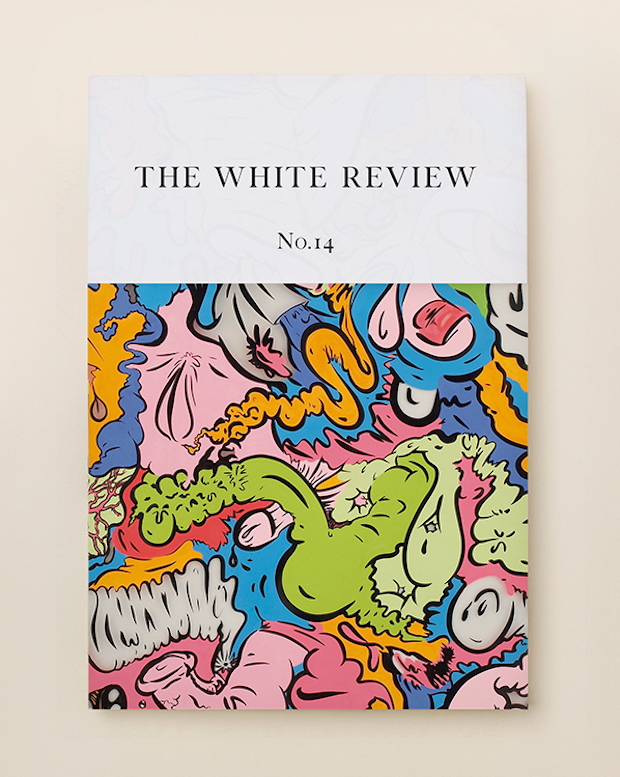
M: I guess it would be good to mention Eye and Dot Dot Dot. Maybe I could shout out for The White Review?
S: Or Picpus? Oh I know, Visible Language! That one is AMAZING.
saradebondt.com
Sophie Dyer
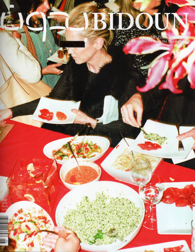
As a student I bought Korean Graphic and Middle Eastern focused Bidoun, mostly because the content and bilingual layouts felt exotic. I found the impenetrable flicks and loops of Korean, Farsi or Arabic exciting in opposition to their drab Latin counterparts. Amongst other things I now help design the bilingual Chinese and English journal Concrete Flux, and enjoy the challenge of typesetting Latin and Chinese side by side. Good translation is not direct translation and the same principle applies to typography, there is no one size fits all when you are typesetting in multiple languages, as I learnt from my early purchases of Graphic and Bidoun.
sophiedyer.net
Joe Hales
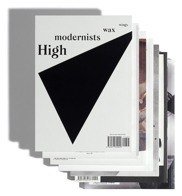
Dot Dot Dot
was one of the inspirations for some of my non-client, self-published work. For example, much of Playground Magazine (conceived and edited by Carianne Whitworth, 2009 – 2011) was influenced by the expanded design principles we had seen in DDD. Many things made DDD special: its non-fussy but always interesting graphic aesthetic, its collaborations, its content, its readability and humour, to name only a few elements. In 2007 came issue 15 and the birth of Mitim, an ever-changing, evolving typeface designed specifically for DDD, each iteration responding to the needs of the new issue. Mitim exposed the long and careful processes through which design can mature and develop whilst still belonging to (and feeling a part of) it's previous incarnations. This laying bare of an on-going editing process was a radical motivation for me to think of design as a time based medium, where even type set in stone shifts.
joehales.co.uk
Charlotte Heal
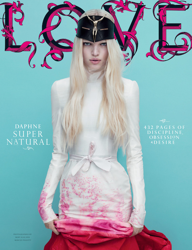
LOVE magazine Issues 1–7 has to be the chosen title for me. It is where I learnt the tricks of the trade from Suburbia. The experience taught me the importance of a keen eye for detail but equally the wider art direction and rhythm of the page. Despite being provocative and ahead of the curve, there was something very classic and refined within those issues too. Each one is very different while being connected through the type treatment and Suburbia's extensive editorial understanding. I’m inspired by the memory of the experience and the discipline – and lessons learnt certainly feed into how I work now. A firm favourite would be Issue 6 for its gothic femininity!
charlotteheal.com
Daniel Kang Yoon Nørregaard
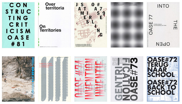
A magazine or, rather, a journal which I really like is OASE Journal. It’s designed by Karel Martens in collaboration with various students from the Werkplaats Typografie, and occasionally Aagje Martens. However, it’s more the designing rather than the design itself which I find interesting. By that I mean not only the links to graphic design as a craft but also the continuous challenging of its design, where each issue has a different look, dependent upon the approach or attitude towards the content, while still managing to sustain a cohesive identity. So it's more the potential and the fulfilment of the design that I find really interesting than the actual outcome. I also believe that the fact that – for the most part – OASE is being done in collaboration with the students is a big part of what keeps the outcome fresh and relevant.
danieln.dk
Sandra Zellmer
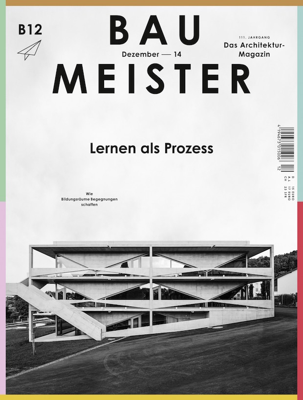
I keep revisiting the issue B12/2014 of BAUMEISTER, designed by Herburg Weiland. The cover shows a high-contrast monochrome image of a geometric concrete building by Angela Deuber. The cover design looks fresh and contemporary but at the same time reminds one of the visual language expressed in earlier Bauhaus publications. Unexpectedly, and with great confidence, a single typeface is used in one weight throughout the complete publication: Century Gothic Bold. This requires a perfectly defined typographic hierarchy that is applied with skill and great attention to detail.
sandraswork.com