Punchy typography, meticulous attention to detail and ideas so simple and concise that they defy alternatives, German studio Double Standards knows what it likes. Laura Snoad went to Berlin to speak to creative director Chris Rehberger about the studio’s unwavering vision.
As I walk down a somewhat scruffy street in Kreuzberg to meet Double Standards, the Berlin-based studio whose typographic prowess has just won them the brief to design the identity for the fifty-sixth Venice Biennale, I overshoot their office completely and have to double back on myself. Situated not far from the Spree roughly half way between leafy Treptow park and the hulk of techno institution Tresor (its latest incarnation has seen it set up in a former power plant in the neighbourhood), the studio’s founder Chris Rehberger was ahead of the curve in relocating the studio here five years ago, I later find out, as the neighbourhood is now thriving with start-ups and creative ventures. This is in part why I miss the studio. With a huge glass frontage looking into a White Cube-like space, I mistake the office for an art gallery in transition, the space resting between the end of one show and the hanging of the next.
Later, when Rehberger and I discuss what he wanted the studio to feel like, it seems like this confusion – or intrigue – was very much part of the plan. “I liked the idea of creating the atmosphere of an artistic studio or atelier,” he explains. “The empty space at the front looks like a gallery, but it’s not. Is the office an archive? Is it a library? You’re not sure. It’s kind of a twisted idea,” he adds mischievously. Rehberger was also keen that the office would offer the opportunity for the team to put on exhibitions or events. “I wanted to create a space that you felt you could fill with your ideas,” he enthuses. In some ways, this sleek, meticulously organised space is a metaphor for many of Double Standards’ projects. Aesthetically it’s similar (measured, simple, largely monochrome) but the idea of not immediately knowing quite what it is, hints at the playful nature of the studio’s output. Their solutions are straight-talking, obvious even, but more often than not, there’s a hidden ‘twist’ that demands a double take.
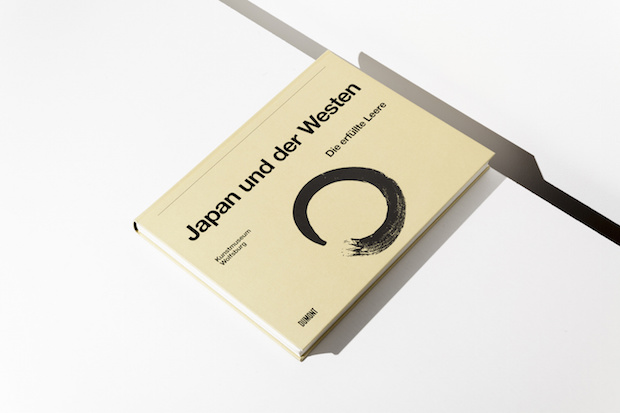
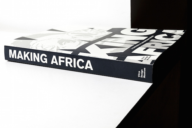
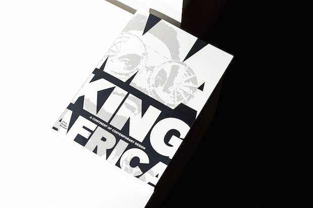
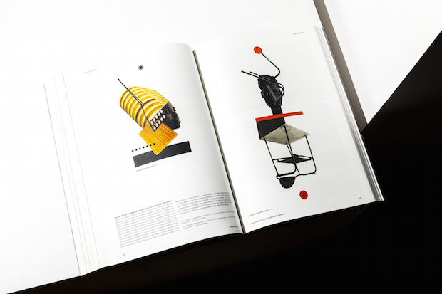
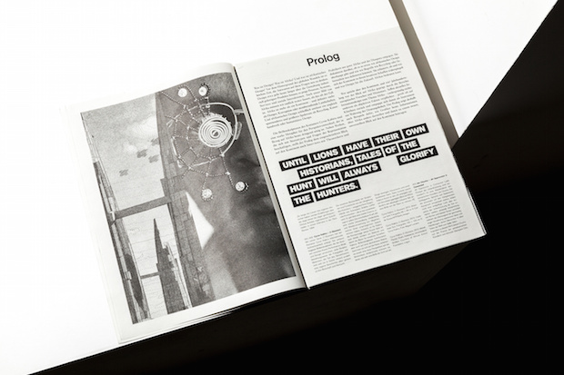
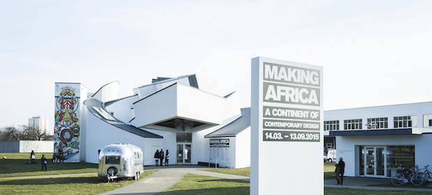
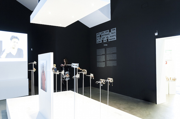
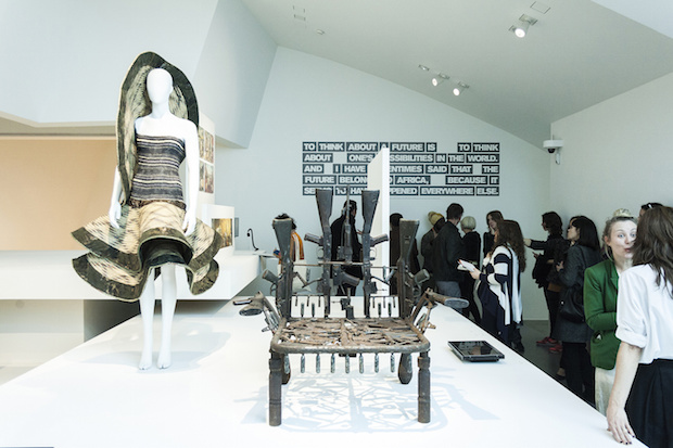
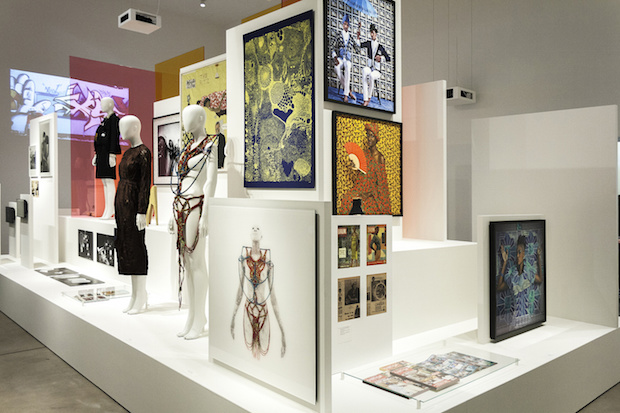
It’s perhaps unsurprising that Rehberger was drawn to recreating the atmosphere of a gallery, given that the large majority of the studio’s clients sit within the arts and cultural sectors. The team of twelve’s client roster reads like a who’s who of the art world, including Berlin’s Hamburger Bahnhof, the Guggenheim Museum in New York, the Tate here in the UK, and numerous theatres across Germany. Most recently the studio was responsible for the exhibition design and catalogue for the Vitra Design Museum’s Making Africa, a landmark exhibition that showcases more than 120 artists and designers from the continent at the iconic furniture company’s Weil am Rhein space. This embedding within the cultural industries is a trajectory that Rehberger has followed since his very first projects, but one that he somewhat fell into by accident rather than by design. “I was never very interested in design scenes in general,” Rehberger explains. “I’m a lot more interested in guys working in architecture, or writers or artists. You get the know people in those sectors, and you kind of grow into it. Early on I really wanted to work with commercial clients as well but the cultural projects tend to take more time and when you turn down work from a commercial client three times because you’re working on an art catalogue, they don’t call a fourth time,” he laughs.
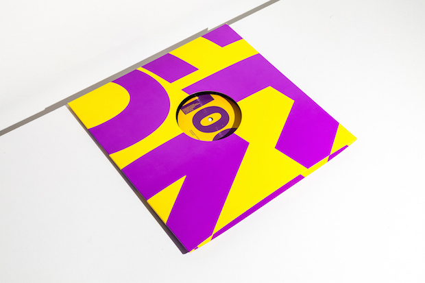
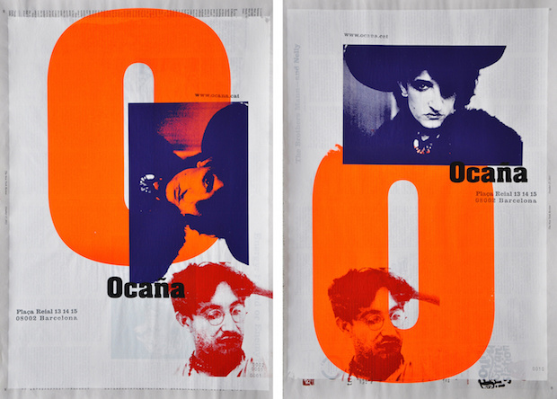
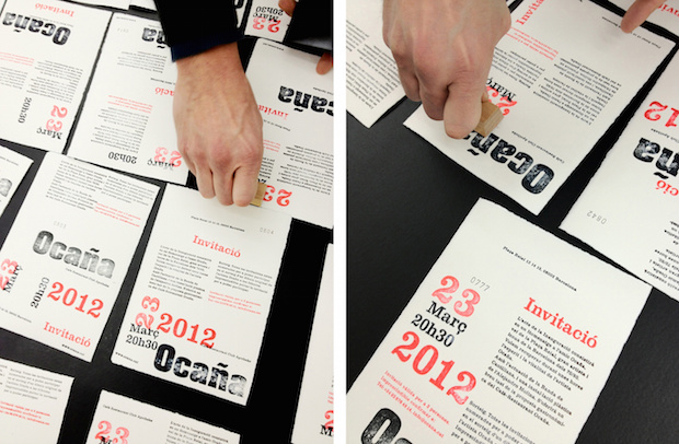
This trajectory began when Rehberger was still based in Frankfurt, and lived opposite the city’s arts academy. During that time, he spent a ridiculous amount of time in the academy’s cafeteria as the food was cheap and many of his friends (including his brother, the artist Tobias Rehberger) studied there. His work with the students won him the attention of the school’s director, who asked him to teach a class. “I was only twenty-three, twenty-four,” says Rehberger still in disbelief. “A lot of the students were older than I was.” Later in 1995, the director asked him whether he would like to design the identity for an arts festival. “I said ‘Sure, I can do that.’ I didn’t even realise it was a pitch. I did it and it turned out that it was for the second biggest art festival in Germany that only takes place every ten years. I didn’t know what to say – I only found out about its importance a lot later.” Rehberger developed 111 logos for the Skulptur Projekte in Münster 1997, using letters and punctuation to create sculptural forms – a typographic approach that is still an important part of the studio’s oeuvre. “I still wonder what made him give me this assignment,” he says, gobsmacked. “I never really dared to ask. It’s still crazy for me to think about.”
After five years in London freelancing for the likes of TV Age, Mother and Widen & Kennedy, Rehberger set up Double Standards proper when he moved to Berlin in 2000, drawn to the city at the same time as a large number of his international group of friends were moving to the cultural hub. “It just felt like the right time to be in Berlin,” he explains. Building long-standing partnerships has been integral to Double Standards’ growth from these early days, something that’s no doubt attributable to Rehberger’s enthusiastic and friendly nature – few designers write emails with quite so many excitable capitals, nor invite you clubbing within five minutes. “Compared to other studios of our size, I think we have longer relationships with clients,” muses Rehberger. “Sometimes it turns into a friendship, which is great because it just means the understanding on both sides grows.”
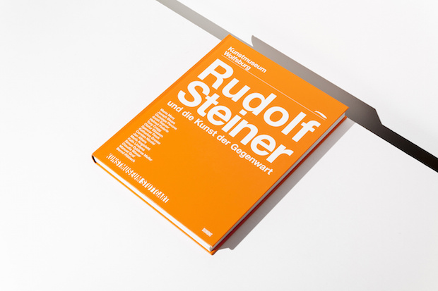
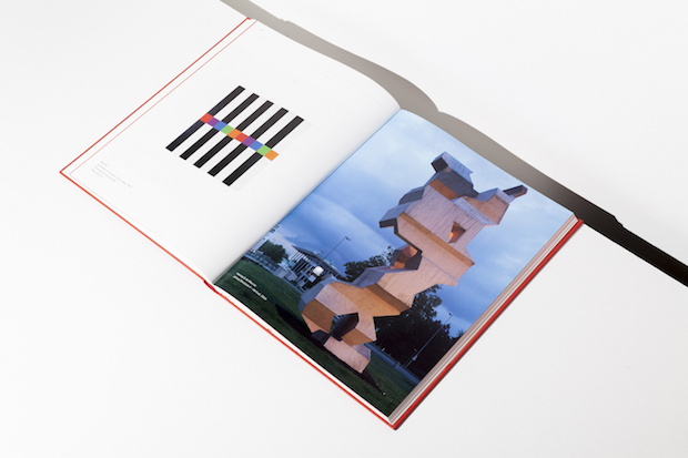
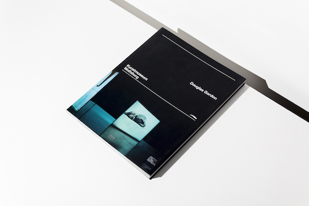
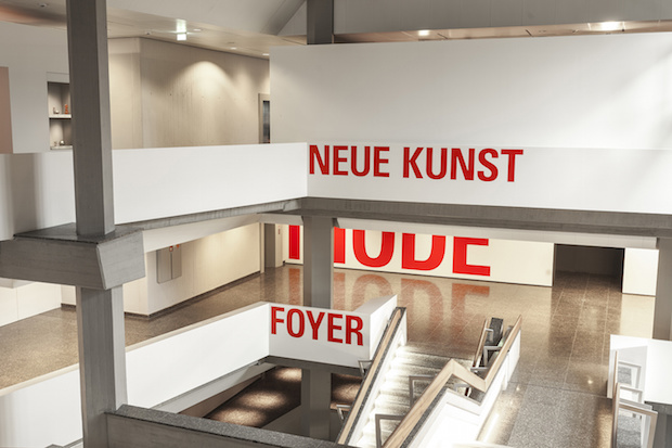
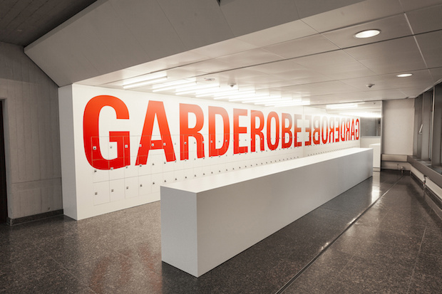
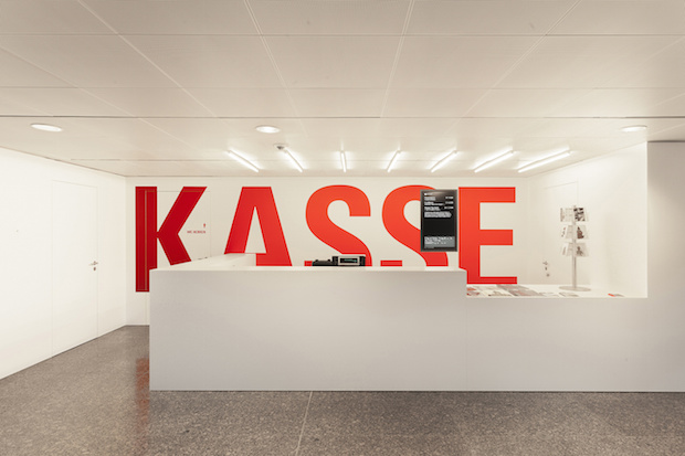
One of their longest-standing relationships is with the Kunstmuseum Wolfsburg, for whom Double Standards has created exhibition catalogues for eight years. It’s a tricky job juggling both the demands of the museum alongside nearly a decade’s worth of different curators and artists (who often have different ideas about how they want the work presented), while also trying to implement your own approach. “We have developed quite a strict design for them, but every time we try to fill this strict grid in a new way. It’s something that’s very interesting for us – narrowing something down and then trying to find the cracks in the system… a system that we ourselves established. Every time we surprise them with something new,” Rehberger says, clearly seeing the challenge as a kind of game between designer and client.
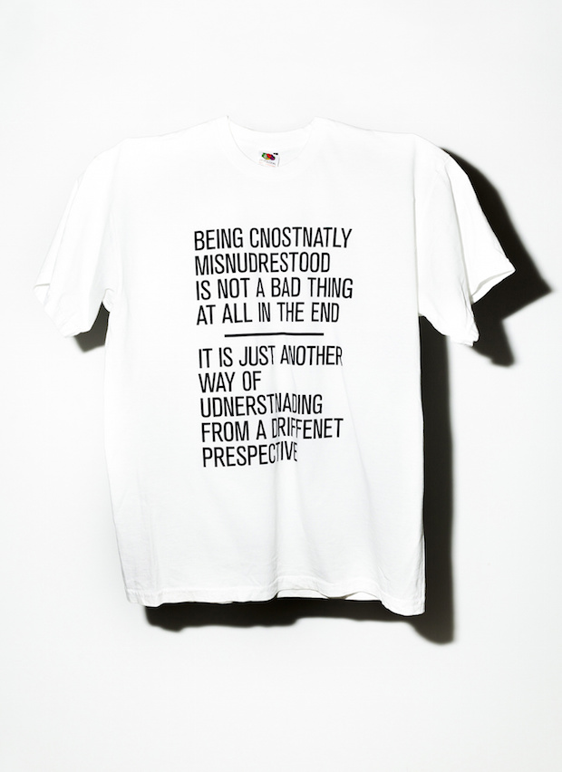
These relationships are often integral for generating ideas, ideas that perhaps wouldn’t be stumbled upon by an agency with a less approachable creative director. During a pitch for the Theatre Der Welt’s 2010 campaign, the Double Standards team got chatting to director Frie Leysen during a break in the formal pitch process, discussing misunderstandings and how we now live in a world so fast that we don’t even have the time to check spellings in our emails. Without realising it, together they’d stumbled upon the crux of the campaign. “Leysen exclaimed that that was exactly what the festival was about, and the idea was born,” Chris enthuses. “We misspelled everything on the posters and on the t-shirts – made these crazy sentences that didn’t even make sense.”
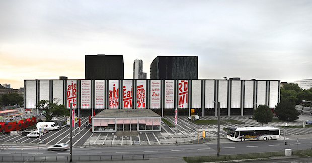
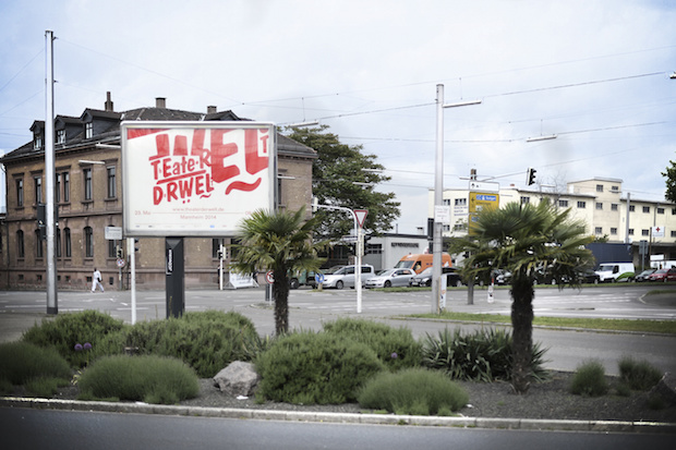
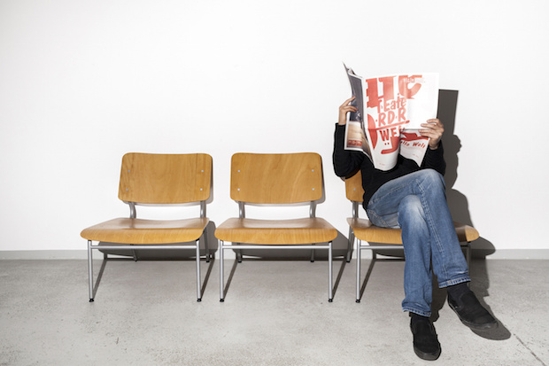
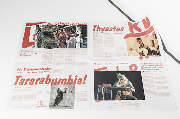
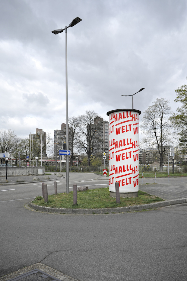
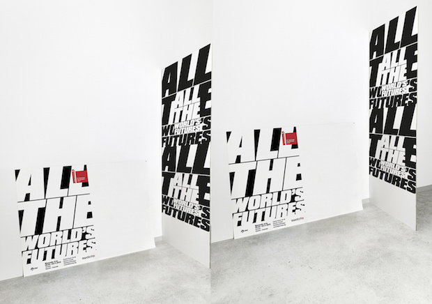
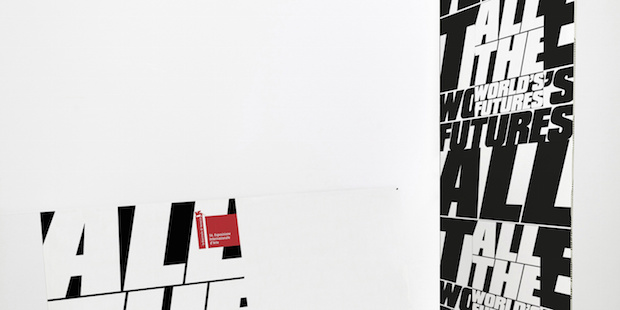
Double Standards was invited to work on the theatre’s 2014 campaign by new director Matthias Lilienthal – another talented and adventurous spearhead, with whom the studio had worked with before, creating around 375 posters for him over his career in the theatre business, Rehberger approximates. “He gets the fragmented way we think – it fits exactly with what he thinks about theatre. For him it’s not just drama and acting, he sees it as a socially important act.” Taking this inclusive attitude as a starting point, the studio developed a typographic campaign that centred around the phrase ‘Hallo Welt’. By honing Lilienthal’s all-encompassing socio-cultural agenda into the ridiculously neat “Hello World” (also a play on the theatre’s name of course), Double Standards created a campaign that so firmly hit the nail of the head that it almost feels like they couldn’t have done anything else – a cultivated determinism that Rehberger says more of less sums how they go about projects. “Our approach can sometimes be almost embarrassingly simple,” says Rehberger sheepishly. “It’s almost naive. Sometimes I’m almost scared to pitch ideas to clients, because they’re so simple. But an other level, it’s not so straightforward. There’s a twist.”
This concept of something outwardly simple but with complex ideas floating just under the surface is something you can see when talking to Rehberger about his influences. He cites Duchamp (whose readymades often required little artistic intervention but were profound in their conceptual thinking) and Kubrick (another purveyor of an almost graphic-approach to composition and framing) as key figures in his visual development. His family too has been important: he often bounces idea of his artist brother Toby, whose work can be found hung around Double Standards’ office, and his tendency towards typographic solutions comes from formative years in his engineer father’s office. “He had all these stencils and a drawing board,” he explains. “He could draw several fonts by hand. I never realised until about five years ago but that’s probably where I got it from.”
Today Double Standards works with a limited repertoire of around ten typefaces that they use regularly. “I’ve got to know them and I believe in them. I don’t waste too much time choosing a new one for every project, it’s more that they’re a logical interpretation of the assignment. We come up with the idea first, then find the typeface to fit with the idea, and then pick the colour… well, white or black most time,” he laughs. It’s quite a good job that the Rehberger avoids bespoke typefaces for each project, considering his latest font (a mix between Helvetica and Akzidenz-Grotesk) is still in development after twelve years. “They’re my two favourite typefaces. They’re quite similar, and yet so different. I want to produce something that’s like combining the two advantages of these typefaces. There are a couple out there that have tries, but it’s still not quite what I want.” The quest continues.
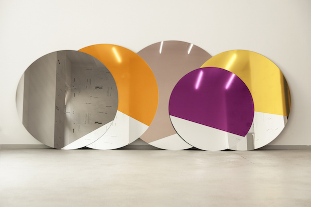
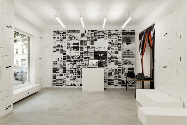
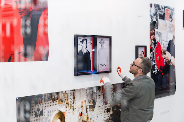
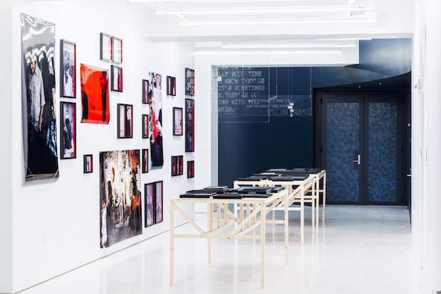
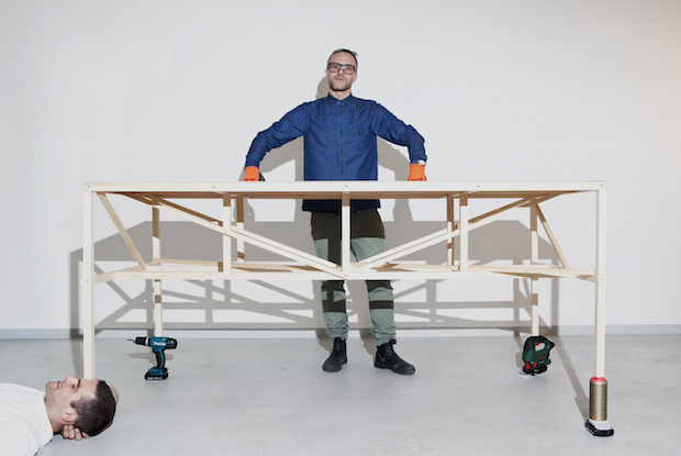
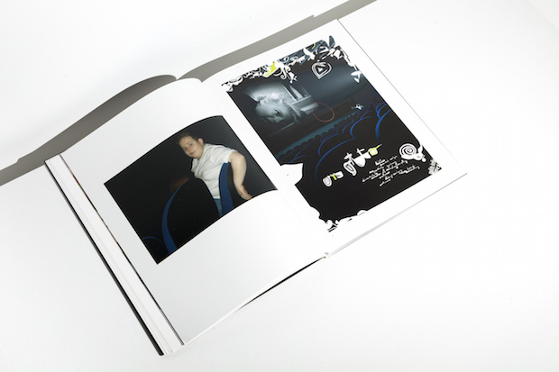
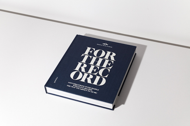
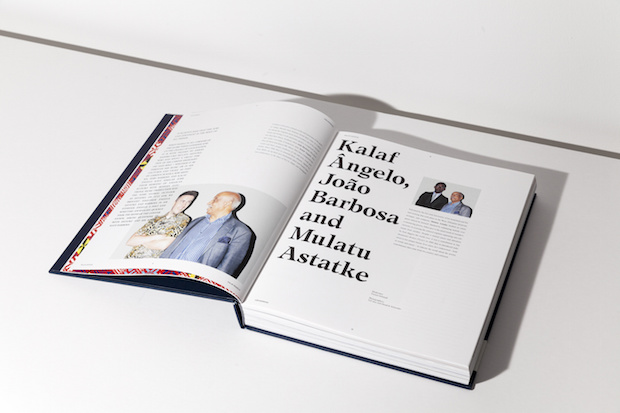
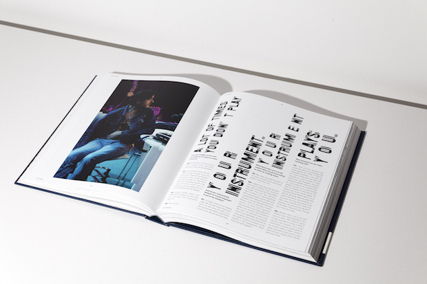
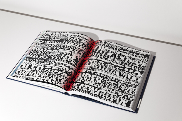
This type-themed perfectionism also plays out in the Double Standards office, as a meticulously organised system of labelled boxes line the walls, ordered by client and by job and each with a uniform Rehberger-designed label. “Everybody is so wowed by this,” laughs Rehberger. “But it just comes from when we moved office. We just had a big messy cupboard before and we knew we had a once-in-a-lifetime opportunity to do something different.” Although Rehberger dismisses the boxes as just an organisational system, actually it speaks of the studio’s interest in taking traditionally two-dimensional graphic design into three-dimensional environments. Its approach is holistic, and it frequently pushes briefs to offer clients something quite different to what they were expecting. Most notably is a recent project for shoe brand Camper where Double Standards was asked to design a some point of sale material and ended up creating fifty lamps. The concept was to imbue the shop with the feel of Majorca, where the brand originates, and so the team worked with a scientist to break down the exact colours of the sunrise on the island and then perfectly mimicked it in the lights. Double Standards has also designed furniture. It made tables for an exhibition to accompany the launch of RedBull Music Academy book For The Record – a tome featuring interviews between music luminaries that the studio also designed, setting each interview in a different layout inspired by each discussion. It also has created huge circular mirrors for a film project to promote the Lacoste LED shoe range, and has since started selling them direct to customers. “I have a general interest in designing everything,” explains Rehberger. “For me, graphic design is also three-dimensional. Printed work doesn’t exist by itself; there are always surroundings to a piece.”