Swedish designer Stina Löfgren talks us through the tribulations of putting faces to the names of some of the country’s most renowned cultural critics.
Can you begin by describing the project in basic terms?
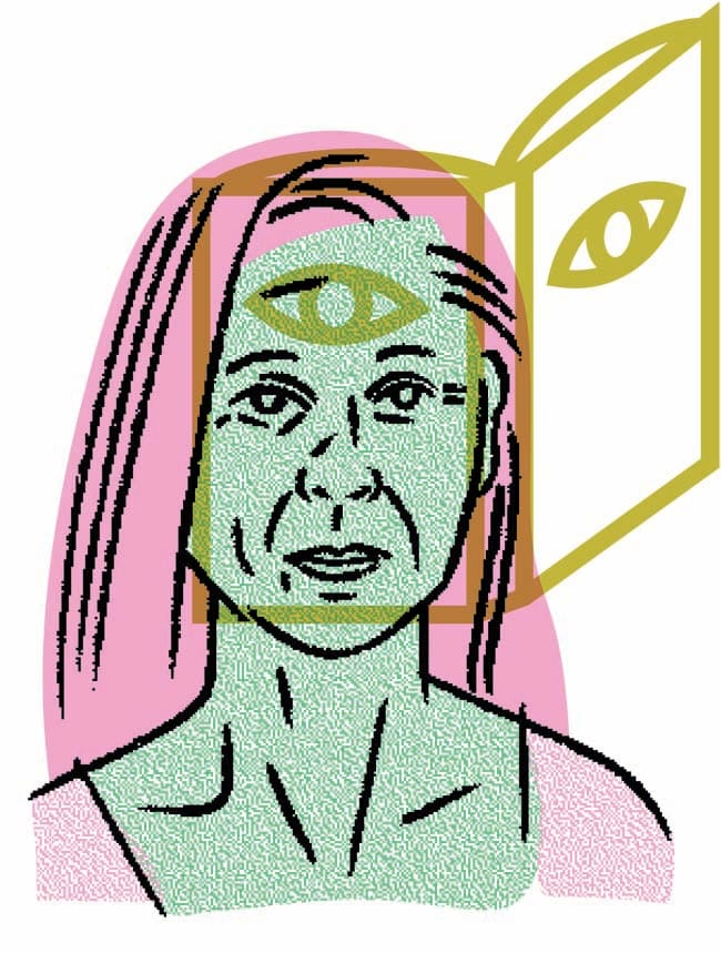
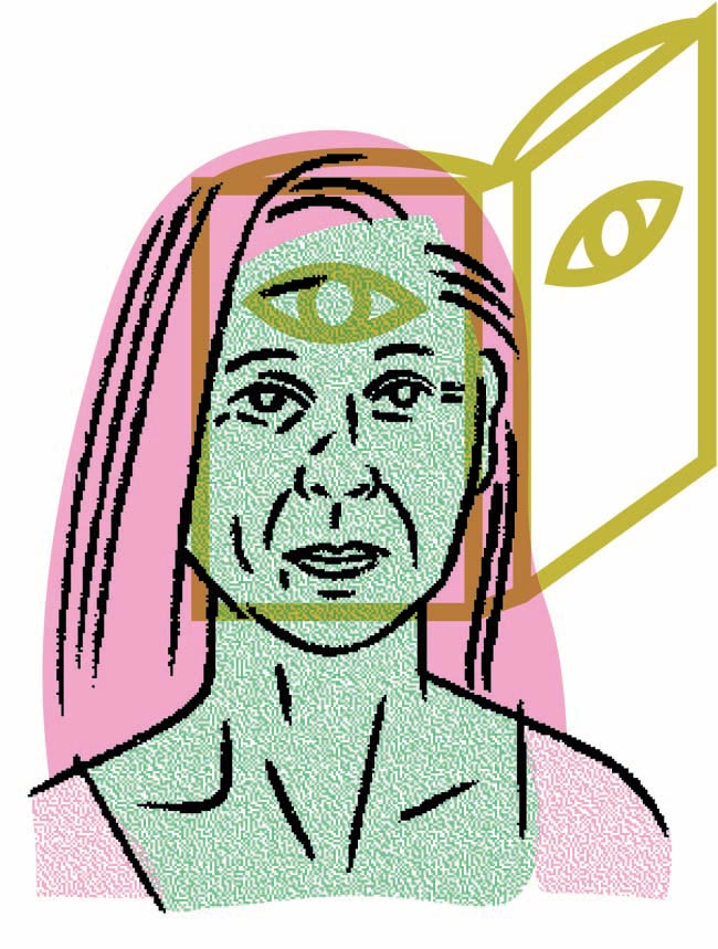
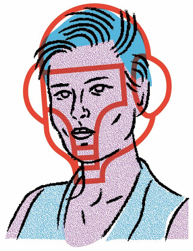
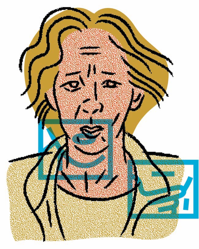
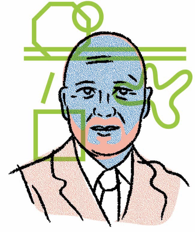
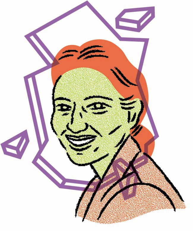
I've created portraits for an article in Tecknaren ('The Draftsman' in english), a magazine by the association for Swedish illustrators and graphic designers. The illustrations are of the participants in a roundtable on criticism within different fields of image and form-making. They're talking about what the aim of their critique is, for whom they're writing and about the changing conditions in the field.
How did the project originally come about?
The magazine has recently been redesigned and this issue is the first with its new form. I was contacted by the new art directors that thought my way of working would be a good match with their form and the subject.
What was the original brief and did it change at all?
Very straight forward: to do portraits that somehow also reflect the different fields of interest of the participants. The material I was handed was various photos and descriptions of the persons (I had read the writings of most but only knew some by face). The project took about two days all in all.
Do you read much critical writing and, if so, how does it inform your work?
I think the honest and concise tone that is sometimes seen in critique makes it easier to breathe in the public discussion, and it is essential for an open cultural climate. For myself, reading critical writing on taste and design was what made me start working with images in the first place. So critique has, of course, been and still is of great importance for my practice. By elaborating with motifs and visual expressions, you could say that I'm trying out different critical viewpoints.
Did this project present any particular challenges, and if so how were these overcome?
I often think a portrait says too little. I appreciate it when there's more focus on the subject-matter than on the personality (it’s often more interesting what the face says than what it looks like, right?). And I guess it's easy to get tired of faces in a face-focused society. But since the article that these portraits accompany was a transcribed meeting of five people, you also get an illustration of the meeting by depicting the participants. I think the biggest challenge was to find a good way to think about portraits. I wanted to do something that didn't put that much focus on a perfect rendering but that was still a strong representation of each person. By overlaying the 'field of interest' of a person on top of his or her face, I had an extra dimension to help me achieve that end.
What techniques, tools and processes were used?
Doing the basic portraits I used ink and brush, which I mostly use when doing line-work. But since the result was a bit too ‘proper’ I roughened it digitally, and did the same with the fills. The portraits were drawn from photos, which made them a bit stiff, so the roughening rescued them a little from the stiffness as well. I wanted each person’s profession/perspective to be just as important as their looks so I did that in a thick line. My studio’s new colour-copying machine was also a great help in trying out different combinations of colour and composition and added a lot of fun to the process.
What do you think has worked particularly well?
I tried to work with colours and colour combinations that I usually find horrible, and it turned out quite well I think. I like unnatural colour schemes and think they're a great advantage in the world of illustration.
Do you have a favourite of the series?
My favourite portrait is that of Ulrika. The photos I received of her were taken while she was speaking, seemingly without self-consciousness, and I think that's visible in the final result as well.
What was the client's feedback?
“Super nice”
stinalofgren.com

