
After a summer spent contorting characters, Liverpool-based studio Smiling Wolf talk type and the difficult but rewarding challenge of branding FACT’s latest exhibition.
Can you begin by describing the project in basic terms? What was the brief and remit for what the studio had to deliver?
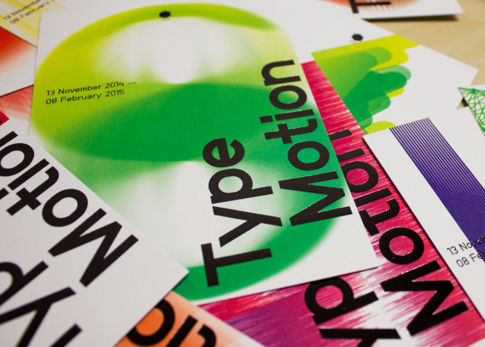
This was an incredible project to be apart of; Type Motion is a programme showcasing the best examples of moving typography in art and popular culture from 1897 to the present day. Held at FACT (Foundation for Art and Creative Technology) from 13 November 2014 to 8 February 2015, the programme combines an immersive exhibition with a series of film screenings, panel discussions and workshops. It is the first time the exhibition will be held in the UK, after a successful stint at ZKM Centre for Art and Media Karlsruhe.
Our brief was to create an engaging exhibition identity and visual toolkit to appeal to type aficionados as well as FACT’s core audience. The identity needed to have animated elements for online and installation usage too.
One of the central creative challenges with this project would seem to be the representation or communication of movement using mostly static media. How did you approach that?
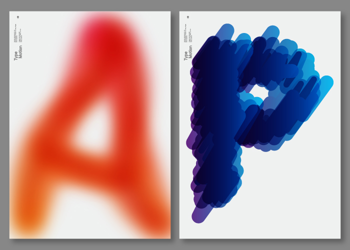
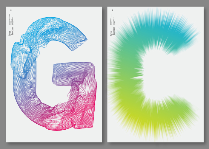
Having worked with FACT since 2000 and overseeing a rebrand of the organisation in 2011, we were very familiar with the visual language and in particular, the gorgeous Nebuau Grotesk typeface designed by Stefan Gandl at Neubau Berlin. This meant we could get up and running very quickly with visual research and experiments.
Initially, our explorations involved depicting simple movements in a word marque. We pulled apart letterforms — working in black and white — creating some very graphic outputs,which, whilst appealing, didn't quite communicate the energy of the exhibition. As we added colour however, the characters came to life. We pared back our approach to working with single glyphs as we began to distort and warp them further, establishing a number of treatments before we arrived at two palettes: 'movements' and colour. It was then a case of combining each glyph with the right techniques and colours to achieve a bold visual language applicable to everything from invites to tote bags.
With each letter being so different, we treated each layout in a consistent manner, opting for a large Type Motion marque to sit proudly above each character. For advertising, we allowed some letters to bleed in front and behind the word marque, giving another level of depth to the compositions.


