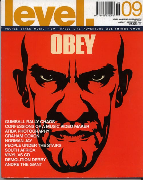
Bonafide magazine editor James Griffin heads back to the start of the Millennium to hype level., a publication that introduced a UK audience to the work of the then obscure Shepard Fairey long before anyone else. How do you identify a magazine cover that’s inspired and influenced your approach? My starting point was my stash of mid-1990s to early 2000s magazines. This goldmine has, over time, been whittled down, so theoretically only the good stuff remains: a mix of one-offs, year-long collections and dog-eared Sunday supplements.
My initial pick was the August 1999 cover of The Face. ‘Grin and Wear’ features three fresh-faced lovelies draped in streetwear and is as zeitgeist as you could get. I then considered the September 1995 cover of Rap Pages and a blindfolded Kool G Rap lightin’ up against a backdrop ridden with bullet holes – the message is, this G is untouchable. Disclaimer: I don’t own this issue but Brent Rollins and B+’s masterpiece is seared on my retina and part of my mental archive, so as this is about a piece of print I feel I need to own the physical publication I am about to champion.
So the journey ends with this cover from level. magazine. I remember seeing it in the newsstands, a beacon in a sea of FHM jetsam, Q flotsam and my usual buys of Hip-Hop Connection, Sleazenation, The Face and their ilk that oscillated between a being a great read and frustratingly inaccessible. In this world of print, level., a new kid on the block, had a unique charm.
level.’s issue 09 (August/September 2000) has a bold cover that employs Shepard Fairey’s iconic graphic, monochrome style. Ming the Merciless staring out with the ominous word Obey burnt in above his temple. On a regular newsstand in 2000 it was bold, dramatic and mysterious. In terms of design, it’s not amazing like an old cover of Avant Garde or Town magazine. The top half for example is cluttered and I’d have made sure that Ming’s face was untouched by text, but I can live with these niggles because it delivers cover-to-cover. It was a well-edited publication that covered a plethora of subjects with intelligence and in an accessible way – you didn’t have to have specialist knowledge of a subject to get it. Which makes it pretty unique.
Ten years later I actually interviewed Fairey for Bonafide issue 07 and told him that this was where I had first seen his work and eulogised about the magazine which has influenced what I want to achieve in print.
As happens with good things, level. ceased quite quickly. Co-founder designer Chris Noble actually brought it back online briefly in 2012 and there is an explanation of how obtuse distribution deals and a lack of advertiser buy-in ultimately sank the magazine. But for me it stands for a little piece of perfection and a benchmark to measure against: its 09 cover had the vision to introduce to a UK audience to a mysterious, politically attuned street artist who would go onto one of the most influential contemporary artists in the world, and was an thoroughly damn good read. So much so that it remains in ensconced in my stash, which means it passes the Covershot test in my book.
bonafidemag.com
Bonafide
Under the tagline ‘Documenting Concrete Culture’, Bonafide is an urban-influenced magazine that covers art, fashion and music. In print it’s particularly notable for its outside-the-box fashion shoots (see the current issue’s Sun Ra-inspired threads for a particularly excellent example) and online it offers insightful reviews of cutting edge electronic music and exclusive mixes. Bonafide has just celebrated its fifth birthday.
OBEY
Shepard Fairey’s now global OBEY Giant project and clothing label started as a humble sticker campaign in 1989 while the street artist was studying at Rhode Island School of Design. The original stickers feature a photograph of French wrestler and actor André René Roussimoff (or André the Giant) and were made to inspire curiosity into their meaning and the identity of their originator. As the project snowballed, the Giant image became more stylised, with later poster paste-ups featuring just a monochrome pictogram of the wrestler and the word ‘OBEY’. The OBEY project has turned out to be one of the longest-running and most widely known street art projects, and has inspired a huge number of imitations and parodies – most notably by Jack Black’s band Tenacious D.
October 28, 2014 3 minutes read
Fairey Play
Bonafide's editor James Griffin heads back to the start of the Millennium to hype level., a publication that introduced a UK audience to the work of the then obscure Shepard Fairey.

