
Along with architects KuehnMalvezzi, Berlin-based Double Standards has created a striking typographic wayfinding system for the city's Museum of Applied Arts – here the studio’s Chris Rehberger talks us through the process.
How did this project come about?
Along with architects KuehnMalvezzi (with whom we have a long standing and very close relationship), we won an international pitch to work on this project.
What was the original brief and did it change at all?
The Museum of Applied Arts and Design Berlin was looking for a redefining moment. They wanted the foyer to be a lot more welcoming and to provide a better orientation for the visitors. We worked with two different museum directors, so of course we had to amend and tweak quite a few times. But in general, KuehnMalvezzi and Double Standards are a very strong team. We had a very clear idea of what we wanted to achieve at the museum from the very beginning.
Did this project involve sourcing any new materials or using any new processes?
If it would have been necessary for the concept to use unusual materials and production processes, they would be there up on the walls. To us it’s whether the concept works or not and it was more the details that we were eager to unravel.
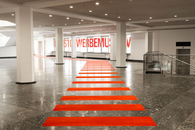
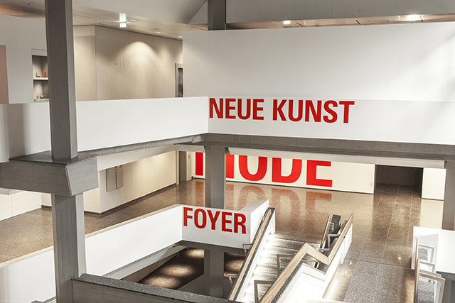
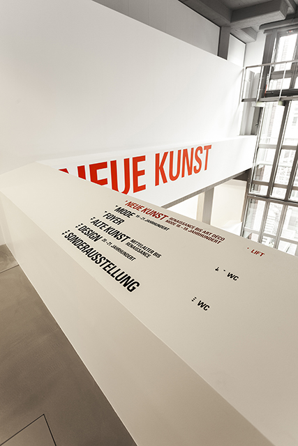
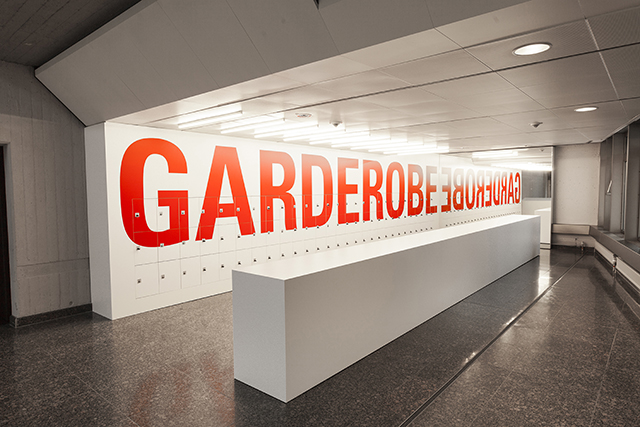
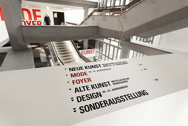
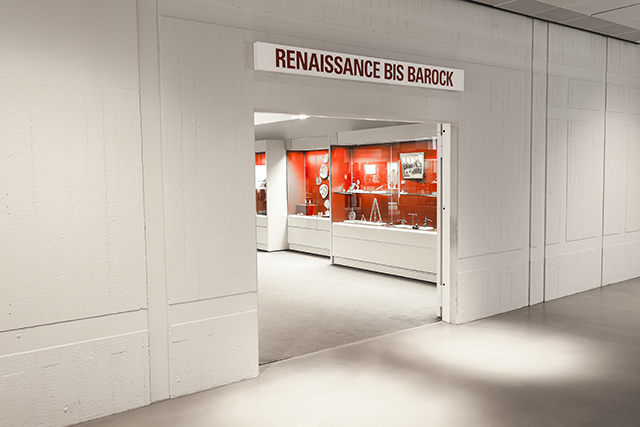
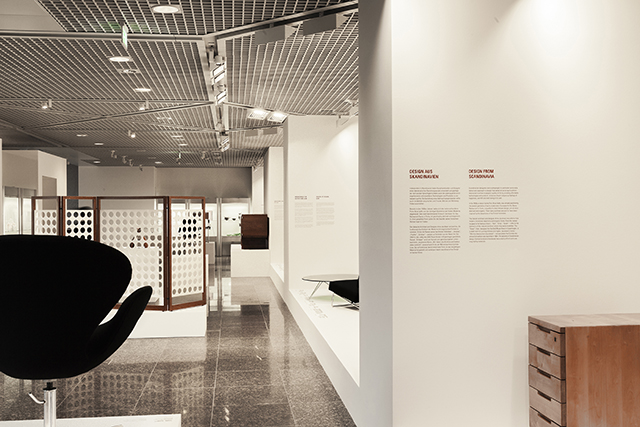
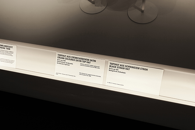
We had to communicate four different layers of clear information. We went from bright red for the so-called Super-Signs and gradually to black for the labels in the vitrines and cabinets. The closer you get to the objects in the exhibition, the more bibliophile the information gets.
Did the building present any particular challenges, and if so how were these overcome?
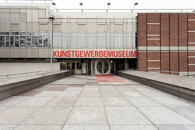
If you’re familiar with the architect Rolf Gutbrod you will know right away you’re in trouble. The building used to look like an ancient castle. It was dark, not very welcoming and the guidance system was sort of non-existent. So, it needed a very strong architectural intervention, which was provided by KuehnMalvezzi.
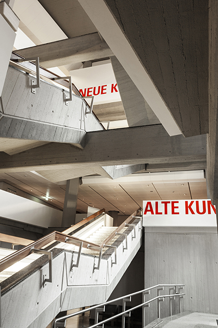
The staircase is the spine through the museum – almost acting as the distribution ramp to all the different departments of the museum. The handrails in the staircase were all housed in with drywall which gave us the perfect canvas to apply the necessary information on every level of the four storey building.
What was the thinking behind the choice of typeface and the extensive use of Uppercase?
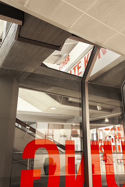
What was needed was a clear and undiluted message to divert the attention of the visitor, from the very difficult architecture to the wayfinding system. Still, we couldn’t make all the architectural elements vanish… Neither ourselves or KuehnMalvezzi can work magic, but we needed to grab everyone’s attention the second a visitor stepped in to the foyer. That’s why we chose the huge bright red letters. Univers Condensed is a typeface that is very well crafted without taking up too much space, plus it adds a bit of a drama, and a newspaperish twist, which I like a lot in this context.
The interior of the museum is very restrained and minimal, what was the architect’s response to your bold typographic intervention?
The whole project was developed together with the architects. It is a closed system, and every element, from the large letters in the foyer down to the labels in the Fashion section and small lettering on the walls, was carefully balanced and discussed between the two parties involved.
Is it problematic designing for an institution which itself showcases examples of exemplary design?
Not at all, It was a pleasure to work with all those things. It gives us the opportunity to complement them, and help the visitors to find what they are looking for…..or find what they never thought would be interesting to them.
Are there any particular challenges involved when working for cultural institutions?
We don’t differentiate between commercial or cultural clients, as they can all be equally as challenging. It is more the question which of the two different species feel more challenged by us. A very close friend of mine once said to me: “To work with you really is a provocation.” Well, I took that as a compliment.
Which aspects do you think have worked particularly well?
When entering the foyer I think the museum unfolds right before your eyes. I still can’t believe how well it has all worked. In one way, it looks like a three-dimensional map and in another it resembles a landmark turned outside in. And the third aspect is that it kind of appears like a model or an oversized mock up.
What’s been the response from the client and the museum visitors so far?
“Happy, stunning, never seen the museum this way…….” Those are the sort of comments we are hearing.
doublestandards.net
kuehnmalvezzi.com


