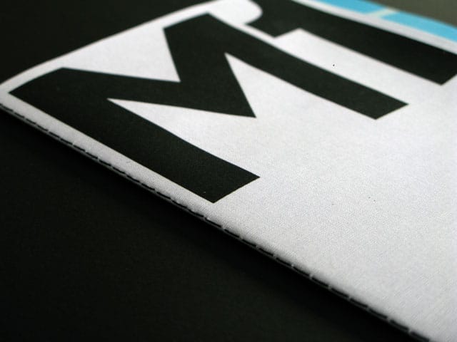
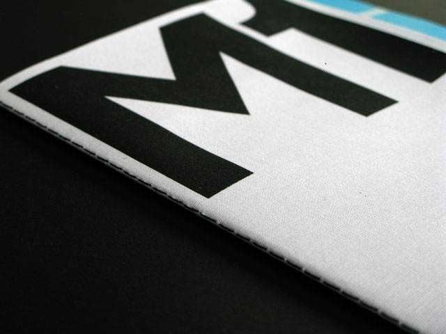
In this piece from Grafik 181, we revisit a publication celebrating Britain's most famous motorway, created by graphic designer and M1 aficionado Melissa Price.
Following her study in book form of the building façades of London’s Barbican Centre, Melissa Price of Cartlidge Levene created a screenprinted graphic homage to the M1 motorway, which celebrated its fiftieth birthday in 2009. Price put on her historian’s hat and delved into the background of the M1, and motorway design in general, to find inspiration for the book. She was delighted to find that motorways — something usually considered ugly, brutal or boring — could yield some true aesthetic pleasure and remarkable design strategies. “I was interested in the graceful curves and shapes of the junctions and found that there are huge variations, from the simplest interchanges to those with multiple flyovers and roundabouts,” Price reveals. Her research also unearthed the methods used by motorway designers to make our driving experience more enjoyable and safe.
“The earliest sections of the M1 had several long straight stretches which were discovered to have a soporific effect on drivers,” she continues. “In later motorway construction sweeping curved shapes were introduced after it was recognised that a changing perspective and vista helps drivers stay alert, improving safety. So the shapes and curves are not arbitrary, but designed with many factors in mind: optimum sightlines, ease of driving at high speed, blending with the landscape, and providing an ever-changing view for drivers.”
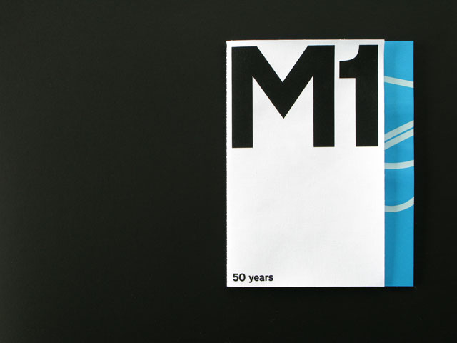
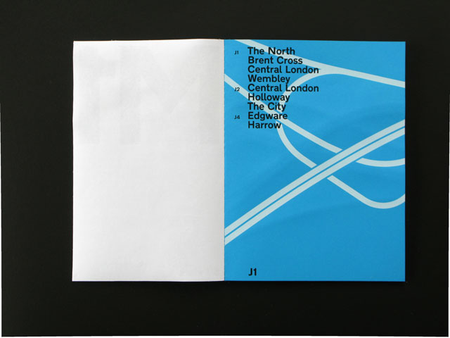
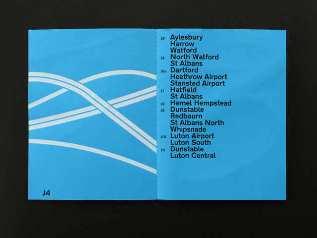
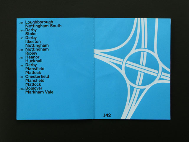
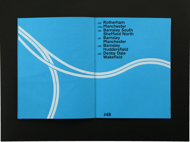
Price’s twenty-page book contains her collection of drawings of the motorway's junctions seen from above, and this view, executed in white and ‘motorway’ blue, emphasises the balance and simply elegance of these structures. Accompanying the illustrations are type compositions giving a full listing of the destinations signed from each junction, going in order from South to North. The book has a short cover in paper-lined bookcloth with a Singer-sewn binding. Despite Price’s clean modernist treatment, there is an unmistakable air of nostalgia about her undertaking, a whiff of Britain in the late 1950s, poised on the cusp of a new era, before the rest of the UK was crisscrossed with motorways and when ‘motoring’ – rather than simply getting from A to B – was a civilised pastime.
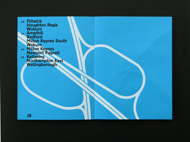
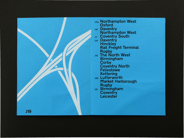
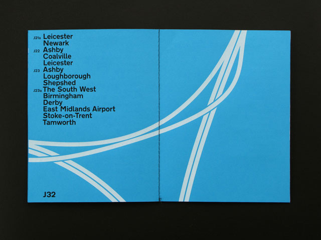
Melissa's M1 screenprints can be purchased here
This piece first appeared in Grafik 181, January 2010

