
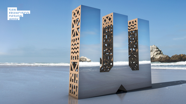
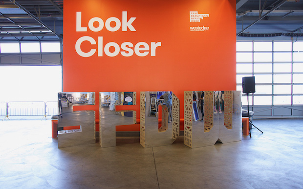
Tasked with creating a fresh identity for San Francisco Design Week, Bay Area-based studio Character devised a series of intricate monolithic letterforms, mirrored to reflect how design touches the world around us.
Tell us a little bit about San Francisco Design Week and what the project involved.
San Francisco Design Week is the Bay Area’s biggest design event, bringing together thousands of people across every discipline of design for a non-stop week of events, talks, open-studios and everything in between. SFDW is an opportunity to discuss, debate, explore, celebrate, and showcase San Francisco’s broad influence on the design world and beyond.
What was the original brief and how did that change at all?
With turnout increasing each year, the San Francisco chapter of AIGA asked Character to help design the 2015 campaign for San Francisco Design Week in aims to highlight the uniquely diverse ecosystem that makes up the San Francisco hub of creativity that we call home. The AIGA asked us to look at themes that could speak to this ever-growing community of industries and what role San Francisco plays within it.

How did your Look Closer campaign answer the brief?
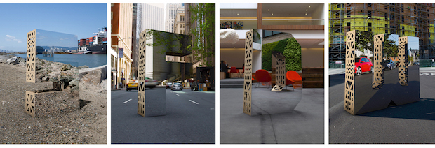
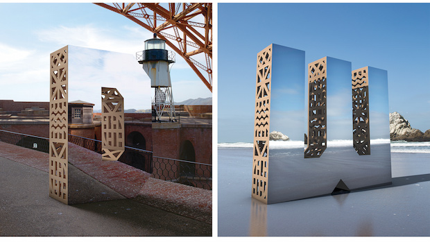
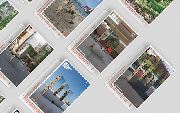
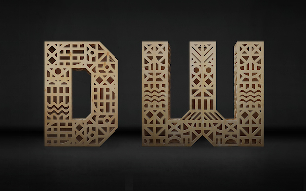
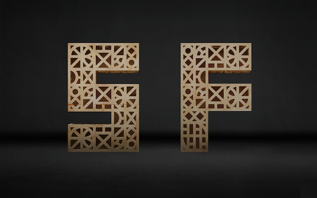
We told this story through a series of monolithic letterforms that on a closer look provide a glimpse into the intricate frameworks behind everything we see. While their mirrored faces reflect a seamless integration to our world, their wooden structures reveal the complex and intricate systems behind the ideas we often breeze right past, from the process and ideation, to the systems and frameworks that hold everything together. By photographing the letters in areas of the city that have a direct relation to the SF design community, we aimed to showcase the design that is all around us, even in the most unexpected of places. The decisions we make as designers reach far and wide, as do their implications for the future.
How did you choose the right typography for the project?
The core of the idea revolved around showing these intricate “structures” of design that exist behind our everyday lives. We looked at a variety of ways to illustrate this, from the scaffolding of construction sites, to the frameworks that hold together bridges and buildings. In order to make sure these “structures” were visible, we ended up designing our own modular typeface. This allowed us to make sure we had enough real estate to see these structures in their final form, as well as limit the number of templates that would be needed to cut and assemble for each wooden letter. To counter the bold, geometric nature of these large letters, we looked for a typeface that was clean and simple, but with a little bit of fun, ultimately landing on GT Walshiem.
Tell us a bit more about the photography used for the campaign.
We shot each hand-fabricated letter in an environment with a direct relation to the SF Design Community - from inspiration to production to reflection. The locations themselves needed to be a diverse set to really help illustrate this message. From beacons of timeless design (the Golden Gate Bridge), to epicenters of commerce (the Financial District) and innovation (start-ups), to nature (Golden Gate Park) and places of preservation.
What was the most challenging part of the project?
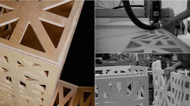
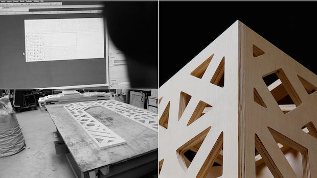
Constructing of the letters was quite a challenge. Translating the complexity of the design into something that could be CNC cut took a lot of back-and-forth to get just right, all within a fast timeline and on a limited budget. Ultimately, the mirrored faces were created using a laminated plastic over a mirrored paper, as using real mirrors or steel would have resulted in pieces that were far too heavy to move around to the degree we would need to.
What was the client’s response to the final campaign?
The client was incredibly excited with the final campaign. They felt that the execution was beautiful and truly captured the spirit of San Francisco Design Week. The amount of social media attention the work received was great (as were the numerous post-event requests to try and take the letters around to showcase at different events).
Technical spec
Four large 3D wooden letterforms, each CNC cut and hand assembled with mirrored fronts.The letters were built by Dennis Hodges, with final campaign photography by Todd Tankersley with retouching by Patrick Ferrari.The supporting typeface was GT Walshiem by GrilliType.
charactersf.com


