
In today's Archive piece we revisit Peter Knapp's Logoform article from Grafik 161 in which he talks about the contrasting logotypes of the US space agency NASA.

To boldly go where no man has gone before... or maybe not. There have been few organisations that simultaneously exist at the cutting edge of our imagination and the latest technology.
The laser-like modernity of all things ‘space’ was ignited last century by the likes of Star Trek, 2001: A Space Odyssey, Star Wars and the various Alien films. These movies had opening credits and accompanying graphics that drew from a colourful yet functional design style, a language that allowed us to think anything was going to be possible. Places where science fiction might meet reality.
So to NASA. This is an organisation that stares into the new frontier every day, claiming a mission to pioneer the future in space exploration, scientific discovery and aeronautics research. But it presents itself to a willing and optimistic public with a logo that looks more at home on the side of a B52 bomber. Where is the cutting edge of design as we grapple with the edge of space?
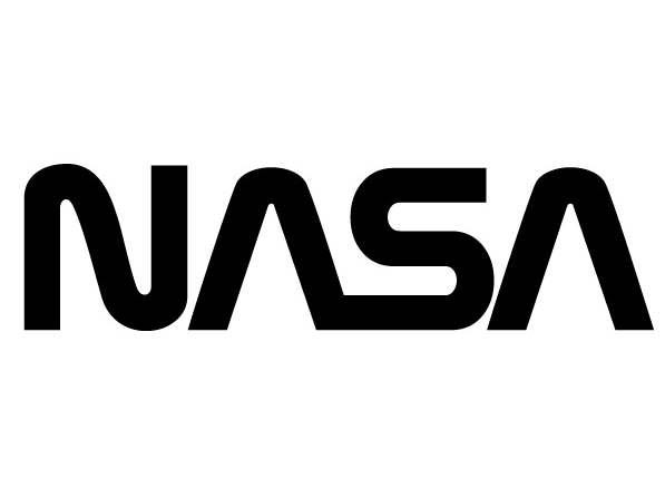
NASA did have a more modern version of a logo (nicknamed the 'worm') but it was retired in 1992, leaving the current version, referred to as the 'meatball'. If ever there were a moment for a design to push at the boundaries of aesthetic execution and look towards the future for inspiration, it is here.
In fact, the whole brand expression appears as clumsy and inconsistent, ranging from NASA Television through to NASA Kids and Earth Observatory. Surely producing a well-defined and visually engaging brand architecture is less challenging than hurling tonnes of metal into the corners of the universe?
As we struggle into the heavens I want to see a symbol of hope, of optimism, of progress, of life in space in the future, not something that is more akin to Stormin’ Norman and military prowess. Surely there is a different set of rules for ‘space’?
Maybe if the great Paul Rand and the visionary Gene Roddenberry had got together the solution might have been more fitting for brave new worlds and the wild black yonder?Peter Knapp is Global Creative Officer at Landor