
Nouvelle Noire’s Anton Studer explains the elegance of the gentlemanly ‘R’ from The New Yorker’s masthead typeface Irvin, a well-dressed letter that’s been in use for nearly a century.
As a Swiss type designer, I was tempted to write about something from Swiss type design history. There is, of course, the mother of all Swiss typefaces Helvetica, or even better Neue Haas Grotesk. But I feel there are other authors who could probably write about those two in far more detail than me.
Nevertheless, I found the letterform I’ve decided to write about in the city where Helvetica made history, New York. Some of you are probably thinking of the famous ’T’ from The New York Times. Wrong. The character which attracted my attention has ruled over New York for almost a century but has rarely been addressed until now.
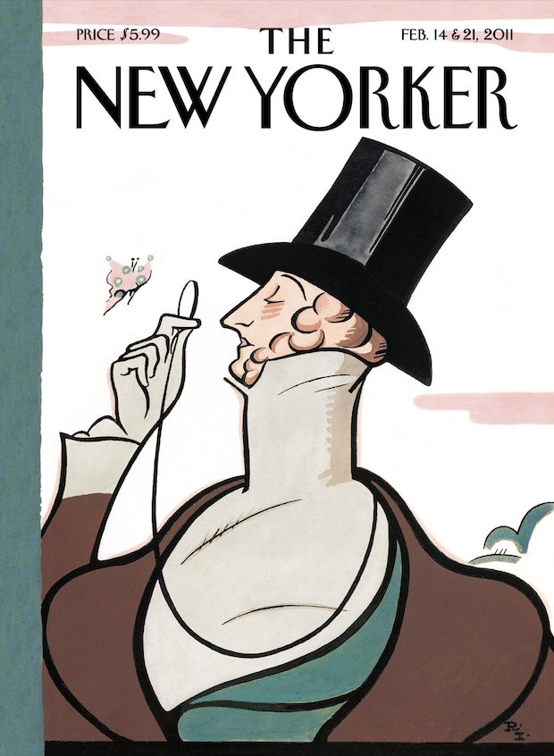
My letterform can be found in the masthead of The New Yorker magazine. One could claim it’s odd and a bit silly, but it is everything but outdated. Besides an almost circular ‘O’, a poorly drawn ‘K’ and not particularly special ‘E’, you find a very narrow but amazingly elegant and gentlemanly character, the letter ‘R’. It is not trying to be royal or extraordinary, just elegant and well-dressed like a dandy in the Nineteenth Century, showing the appropriate accessories: the top hat, a monocle and a tailcoat.
In fact, it is the perfect abstraction of Eustace Tilley, the dandy peering at a butterfly through a monocle that is used as the mascot for The New Yorker. He originally appeared on the cover of the first issue and is based on a 1834 caricature of the French amateur artist and dandy Alfred Guillaume Gabriel, also known as Count d’Orsay.
Both the typeface, which is used for the titling and the masthead, and Eustace Tilley where drawn by Rea Irvin, an illustrator and art editor who was a staff member right from the launch of the magazine in 1925. Apparently, he thought that the magazine would not have many issues, but now, almost a century later, it’s still alive with the same masthead and typeface as back then – now called Irvin.
nouvellenoire.ch
Anton Studer
… is an award-winning Swiss type designer who runs the type design studio Nouvelle Noire together with Clovis Vallois. As well as designing typefaces he is teacher at the type design postgraduate class of the Zurich University of the Arts and an assistant at the research project swisstypedesign.ch.
The New Yorker
Aside from Irwin, Adobe Caslon rules the roost at The New Yorker, where it is used for the body text of every article. The magazine boasts a few typographic and syntactical quirks, for example it uses diaeresis marks in words with repeating vowels, such as reëlected, preëminent and coöperate. Other archaic (but much-loved) touches include little-used spellings like focussed, venders and teen-ager, and the spelling out of numbers, even when incredibly large, e.g. three million five thousand and fifty two dollars.