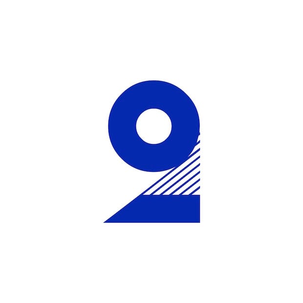
Cassandre’s mix of curves, diagonals and straight lines in typeface Bifur – most perfectly displayed in its stunning number ‘2’ – is a stroke of pure genius, says Barcelona-based designer and Ultra Types founder Wete.
I'm always looking for new fonts and trying to keep abreast of new releases, but it is also important to look back and analyse the past in the search of interesting projects.
As a graffiti artist, I have always been impressed by typefaces where the shape is special, those letters that somehow represent the author, their touch and their style. It's true that legibility plays an important role, but the shape of the letter is also part of the message, and Adolphe Jean-Marie Mouron, also known as Cassandre, knew it very well.
Cassandre was especially famous for his posters and illustrations – his work for Nord Express, Normandie and Harper's Bazaar are already icons of Art Deco – but his typographic work was outstanding too. Among them, Bifur typeface is an icon of geometric rationalism, a typeface more than 85 years old yet still modern and original. Perhaps, my favourite character from the entire alphabet is the ‘2’ for its visual power. By mixing curves, diagonals and straight lines, it creates a result that screams geometry everywhere. The synthesis or abstraction of the form plays an important role in this typeface. Characters like ‘W’, ‘X’, ‘Z’ and ‘1’ strike me for their simplicity.
Originally, the typeface had various styles. On the one hand there was the main structure of the shape, and on the other hand there were the lines, that could be thin, thick or a closed shape (so you could add colour). It was a quite versatile typeface because it could be used in small, medium and large sizes. This was reflected on Richard Kegler’s redesign of Bifur for P22, which adds some styles and layers to the typeface for a good use (also adding some lowercase and symbols).
Cassandre’s typographic work includes projects such as Yves Saint Laurent logo, the Acier Noir font or Peignot typeface (designed with Charles Peignot). Put simply, he was a genius.
ultratypes.com
wetecacahuete.com
Wete
Wete, aka Joan Ramon Pastor Rovira, is Barcelona-based graphic and type designer. He set up foundry Ultra Types in 2012, and is responsible for a number of unusual typefaces including Combo, hand-printed Deibi, geometric Roke and tattoo-inspired Favela.

