Grafik sat down with Eva Kellenberger and Sebastian White of design studio Kellenberger-White to talk cider, perry and Cézanne in the process of finding out more about their great identity for Fine Cider.

Can you tell us a bit about what Fine Cider is?
Fine Cider's a company based on the merchant model, it finds and works with cider and perry makers and distributes products to restaurants, bars and the public.
Fine Cider is trying to do something that doesn't happen with cider at the moment, and that's to foster an attitude where you appreciate cider with food – it's not just a drink like beer, it becomes something closer to wine.
How did the project come about?
The client knew about our work and I think he liked the atmosphere of it, and our approach to typography and different types of visual language which frequently use hand-crafted techniques.
He particularly liked an exhibition we'd done for Turner Contemporary about Constable and Turner, where we'd collaborated with a sign-writer to handwrite the exhibition identity and information. The lettering was copied from a caption of an 18th century gilded frame.
A lot of your projects, including this one, use a handcrafted visual vocabulary – what is it about this approach that attracts you both to it?
Sometimes with a project we try to create an image with typography and this method feels more natural then, especially in progressing the idea from our sketchbooks – which we work in first – to the final thing.
When we met each other at the RCA, the main thing we'd taught ourselves was book design, and the central thing in that is typographic voice; and then when you come into identities and branding you're also using typography a lot but we're also keen to develop a visual language where patterns and other mark-making are involved. We want things to be interesting and eye catching – and we enjoy the handmade aspect of the work.
Do you think there's a little too much digital purity in some design work at the moment?
I think if you open up inDesign, you can be constrained by the text box. With Glasgow International Festival identity, for example, we wrote the copy out on small napkins to see where the lines would naturally break in a tight space. The computer is a tool that you use but if it’s used too early it can shortcut the chance to capture other methods of design.
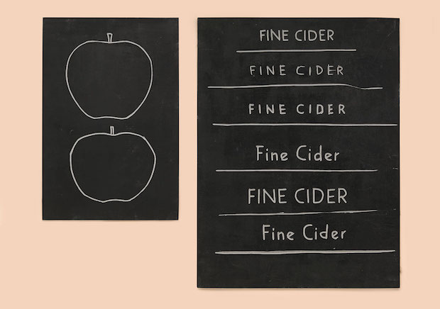
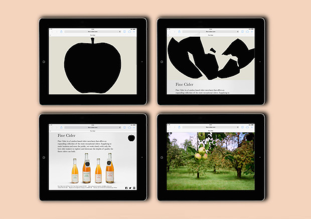
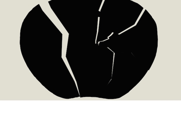
What's the design concept behind the apple logo?
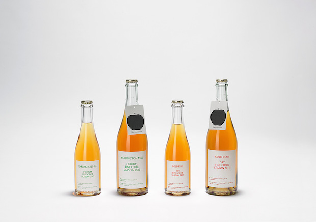
It's to do something very direct: with most cider labels you'd have a Romantic picture of an apple tree so we wanted to pare that back, to reflect the back-to-basics approach of Fine Cider. The apple is also intended to look squashed within the label: to remind people it's very natural and that all you’re drinking is crushed, fermented apple.
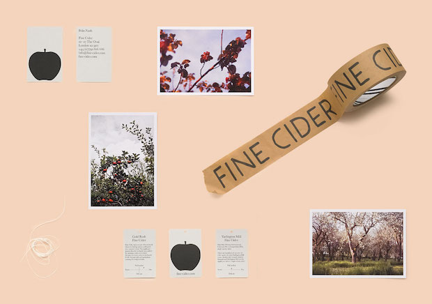
We’ll also be doing a peer logo for a perry drink Fine Cider are distributing, which will hopefully clarify to people what perry is.
What was the atmosphere you were trying to convey through your designs?
The person who has been producing some of the ciders Fine Cider is distributing currently has grown up understanding cider in Herefordshire, one of the main cider producing regions in the UK, so we wanted something that looked British, we wanted something that picked up on that bucolic atmosphere of being in the provincial countryside. We tried to imagine how people would do similar visual tasks for their locally produced cider in the past: you'd probably go to your local typesetter and ask for something to be made up. The apple logo, for example, is meant to be cut from a woodblock, although it's actually linocut.
What visual inspiration did you look at in this project?
We looked at these great photographs taken by the cider producer of his Herefordshire orchards, which we used on Fine Cider's website. We also looked at some of the work of Paul Cézanne, who's famous for painting pictures of apples and pears and people sitting around drinking, playing cards and enjoying themselves. Even the colours he used, yellow ochre for example, and the way he used that to convey a sense of his place in France was important to us.
How do you see the project developing?
The company is a start-up, so the project will keep on growing with them. Now the next step is to do the bottles for the perry Fine Cider are going to distribute; we're going to make the labels smaller so you can see more of the colour of the drink, which is important to us. Down the line, we'd like to design a glass bottle ourselves.
kellenberger-white.com
fine-cider.com