In this Letterform piece from 2011, Astrid Stavro turns detective on an intriguing letterform from a very well known typeface, Gill Sans lowercase 'a'. During 1915 Edward Johnston sought Eric Gill’s help in the initial stages of his designing of the Johnston Sans sign lettering for the London Underground. Fifteen years later Eric Gill set about improving on his teacher’s lettering and the result was Gill Sans.
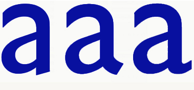
Designed during the 1920s, Gill Sans was eventually issued by Monotype in 1928. Flicking through typography books over the years, I gradually came to notice that the lowercase ‘a’ changed at different point sizes. What happened to the lowercase ‘a’? Why did the ‘a’ change from 30 pt onwards?
This discovery awakened my curiosity and I started paying particular attention to the lowercase ‘a’ whenever I saw it. Years later, via Typotheque, I read Ben Archer’s piece for Singapore’s Designer magazine, in which he argues that Gill Sans is a flawed masterpiece.
One of the points he articulates is precisely about the lowercase ‘a’. There are three variants on the lowercase ‘a’ on record: the original design is naturally quite similar to Edward Johnston’s Underground, followed by a second attempt that can be seen on early specimen sheets.
The third attempt is seen in all versions of Gill Sans since the early 1930s – a real shame as I think that the second ‘a’ is far better than what made the final cut. There is something weird about the curly tail; it feels unbalanced and basically quite ugly. One of the fonts available in the early times of vinyl lettering was Gill Sans, and, interestingly, the lowercase ‘a’ of the system PC font was the second ‘a’. I guess this means that actually someone must have redrawn it. Digital versions of metal typefaces are often missing critical elements of the original. However, isn’t it curious that someone redrew the letter for display lettering and nobody has done it for ‘normal’ printing?
The Helvetica of Britain
Gill Sans has been called ‘the Helvetica of Britain’ – while not quite as ubiquitous as its Swiss counterpart, its inherent ‘Britishness’ is only heightened by the fact that it has been adopted by a number of very British institutions including the BBC, the Church of England, the Royal Society of the Arts, Penguin Books and Network Rail. There’s even a (not especially funny) in-joke knocking around on the subject:Q: How do you do British postwar design? A: Set it in Gill Sans and print it in British Racing Green.
Mad Men
The use of Gill Sans for the logo and signage of the Sixties ad agency Stirling Cooper in the HBO series Mad Men was brought into question by Minnesota-based type designer Mark Simonson:“The way the type is used – metal dimensional letters, generously spaced – looks right. The problem is that Gill was a British typeface not widely available or popular in the U.S. until the 1970s.It’s a decade ahead of its time in American type fashions.”