
Martin Lorenz of studio Two Points has spent several years researching flexible visual identities for the University of Barcelona. Here, he reveals his findings about the nuances of this ever-shifting field of design...

There has been a growing interest in flexible visual identities in the last ten years, with lots of design studios starting to abandon the idea of the logo as the centrepiece of a visual identity, instead dedicating their practices to the development of visual systems. Books have started to reflect on this new approach and projects realised for big clients have brought the subject to the attention of a wider audience. The visual identities for Aol., the Olympic Games London 2012, the City of Melbourne and New York come to mind, but also the MIT Media Lab, Mohawk, Casa da Musica, Nordkyn, Stedelijk Museum and Walker Art Center have shown that the flexible visual identity is a trend that is here to stay.
Some call them ‘dynamic identities’, some ‘liquid’ or ‘fluid’ identities (referring to Zygmunt Bauman’s term ‘liquid modernity’). Further, ‘generative’, ‘responsive’, ‘evolutive’ or ‘living’ are all terms used to describe flexible visual identities. What all these terms have in common is an attempt to describe flexible visual identity as the opposite of the static visual identity, based on a static logo design.
There is no real consensus about what flexible visual identities are and do, and therefore how to name them. I have deduced that there might be another reason for the multiplicity of terms: there might be different types of flexible visual identities. In an attempt to bring light into this field, which still is at an experimental state, I started in 2007, an investigation at the University of Barcelona, which resulted in a doctoral dissertation, defended this January, 2016.
To start my investigation, I went back in history, and guess what, flexible visual identities aren’t new. In 1964 Karl Gerstner published the book Programme entwerfen and described exactly this trend— a visual identity that doesn’t need a logo anymore, a visual identity that is entirely based on a visual system, or as Gerstner calls it a “programme”. This book sketched out ideas for a future in graphic design we haven’t even reached yet.
Systemisation of images is as old as visual language itself. Whenever a visually coherent language was needed, systemisation took place. In his book Signs and Symbols (1981) Adrian Frutiger mentioned the drawings of ancient cultures. He suggested that an underlying grid established visual coherence in between the different signs. In his book Type Spaces (2004) Peter Burnhill analysed the in-house norms in the typography of Aldus Manutius and discovered the underlying grid system. Frank Blokland stated in excerpts of his not-yet-published doctoral thesis that the constructed nature of the calligraphic typeface Textura offered Gutenberg the perfect starting point for his movable type system, allowing him to easily calculate the length of lines in order to build the best possible justification of text.
But visual systems are also to be found in other fields of visual culture. Karl Gerstner analysed in his book Die Formen der Farben
(1986) various visual systems, from early geometry, to arabic pattern to modern constructive painting and sculpting. Josef Müller-Brockmann found old and new grids in his book Grid systems (1986) in type design, art, architecture, urban planning and product design. Not surprisingly, Semiologie Grafique (1967), a book by a non-graphic designer – the cartographer Jacques Bertin – was the biggest source of inspiration when developing my own diagram to describe flexible visual identities.
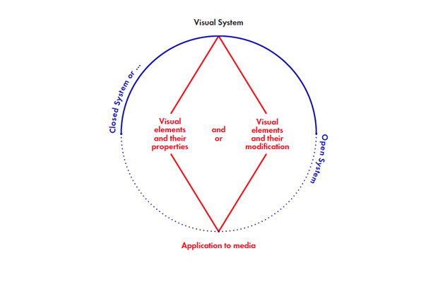
The basic idea of the diagram is that a flexible visual identity needs to have a balance between constants (which make the visual identity recognisable), and variables (which allow the visual identity to adapt to changing communicational or formal demands). Each of the components can therefore be either flexible or static.
The centre of the visual system consist of two different components, 1) the visual element and its properties and 2) the visual element and its transformation. The first component is the most common. The designer creates a set of elements which can be used to design the applications. For example a green circle, a red square and a blue triangle. The second type is less common, but also existent. A visual element is transformed in a specific way. Imagine using always the same old copy machine. It doesn’t matter which visual element – graphic, typographic or photographic – the copy machine will add to every one of these elements its specific texture and create a recognisable visual language.
Both components are often be combined. Imagine again the green circle, red square and blue triangle. That’s defined by component 1. Now, how these elements are combined, if they are multiplied or not, if the triangle can cut a hole in the circle or not, are transformations which are defined in component 2.
Both the visual element and its properties, and the visual element and its transformation may be self-sufficient or influenced by an external source. A self-sufficient or closed system works with predefined rules and data. An open system allows the influence by an external source, as for example the outside temperature or the wind direction. A similar source of flexibility may also be the application of the visual system. A visual system might adapt to the media it is applied to, be selective about the form and content applied and/or even change its shape. A static visual system usually only scale up or down the same image, but doesn’t adapt form and content. If we would talk about web design, we would use the terms responsively or adaptively applied.
Below are some examples of recent FVI examples, showing different types of FVI systems and applications. They represent various characteristics from my attempt to classify different types of FVI.
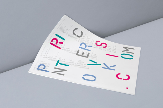
Flair identity by Catalogue and Clément Le Tulle-Neyret
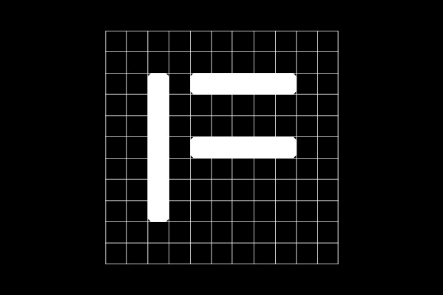
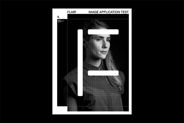
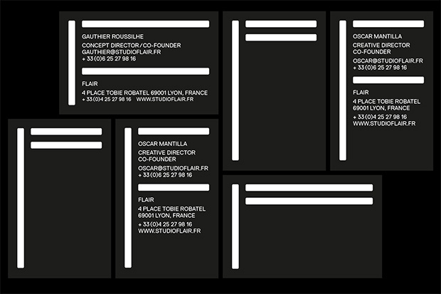
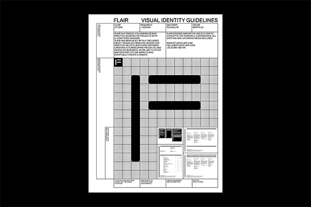
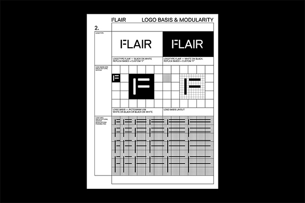
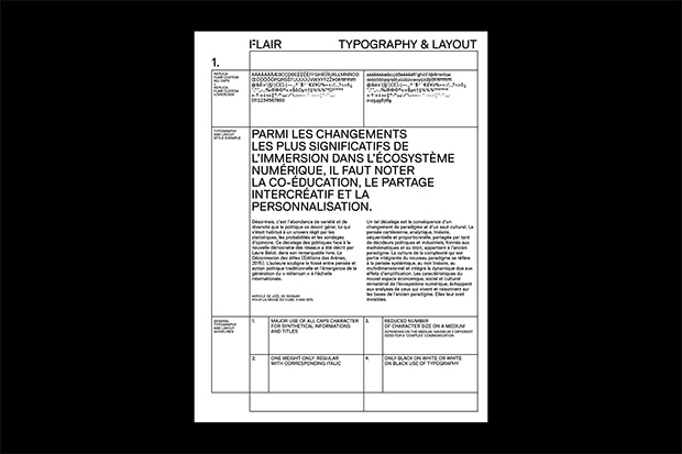
The FVI for Flair is based on a few simple visual elements. It is a closed system because no external data can alter the FVI, as it does in a project such as Nordkyn by Neue. The elements themselves do not produce the flexibility, it is the application to the different formats which show how flexible the VI is.
Clément Le Tulle-Neyret
Catalogue
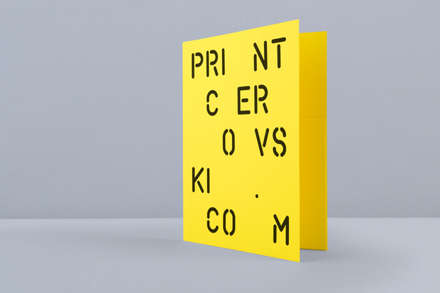
Cerovski by Bunch Design
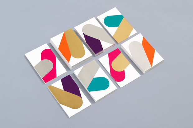
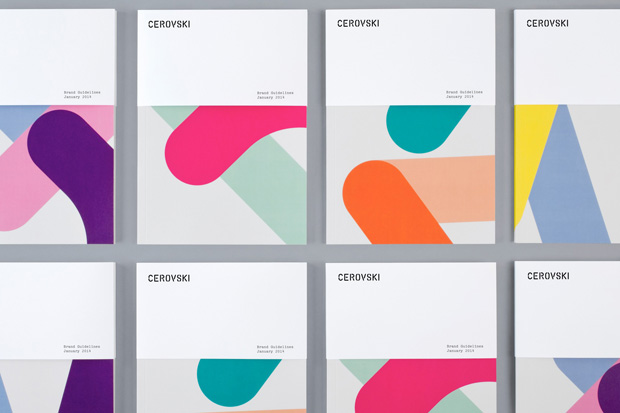
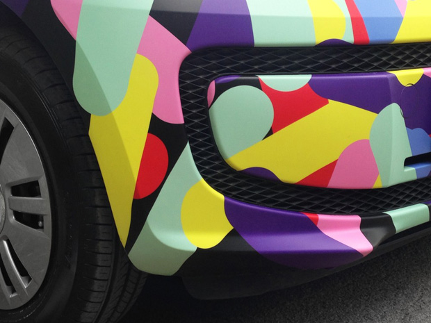
Similar to the Flair identity above, the main elements of the FVI of Cerovski are the visual elements (line with round ends) and its properties (the colour scheme). It is a closed system because no external data can alter the FVI. The great variety of elements, but as well their diverse ways of applying them to different media makes the VI flexible.
Beijing Design Week by Lava
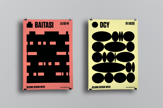
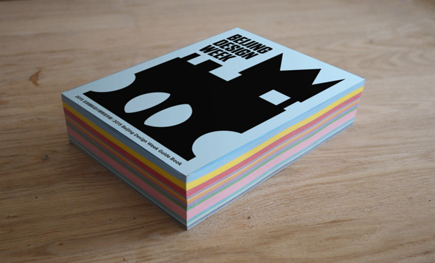
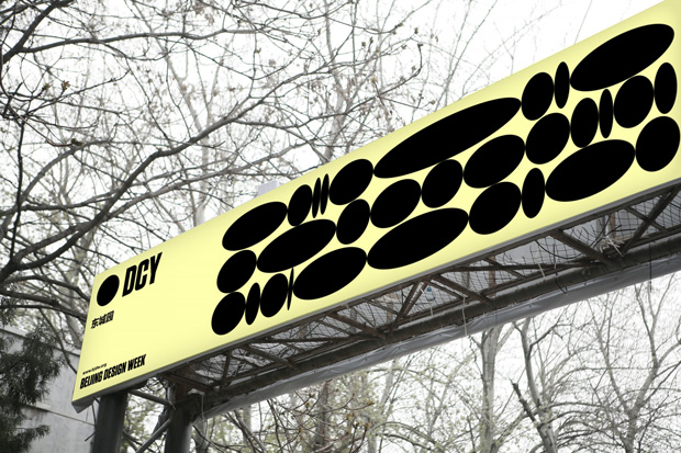
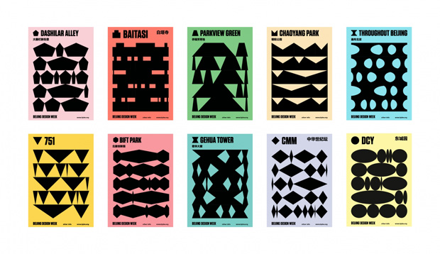
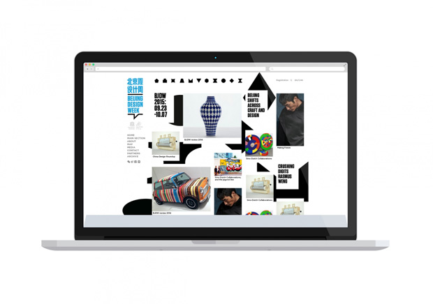
The design for the Beijing Design Week 2015 is based on a few visual elements and their ability to be transformed, stretched or jolted. It is a closed system because the elements are pre-defined, no new elements can be added. The elements and their ability to stretch or jolt and the various ways how the visual system can be applied to different items makes the VI flexible.
Glasgow School of Art
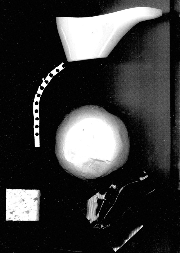
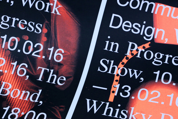
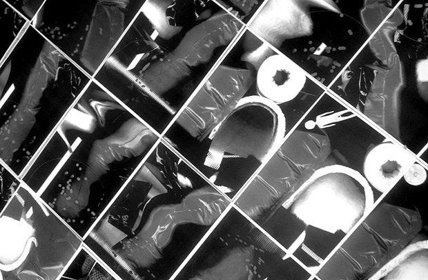
The visual system for the Glasgow school of art identity is open, as the scanned images in the background can always be different. The FVI is based on the visual elements and their transformation, which is, in this case, the scan of the objects. It creates a distinctive visual language.
Pick Me Up 2015 by Hato
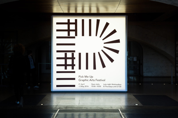
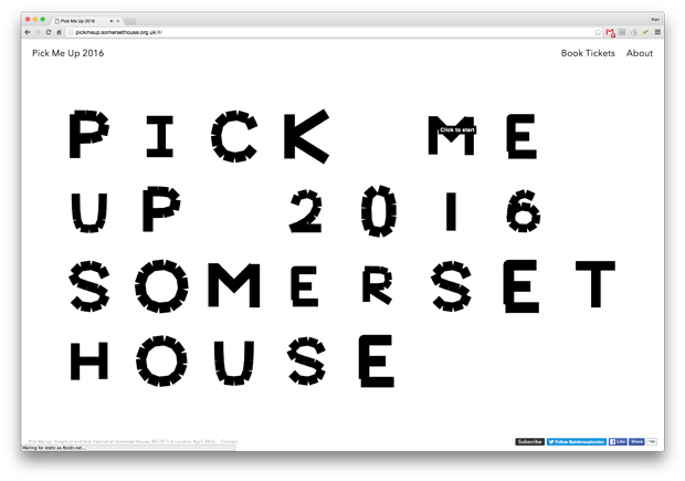
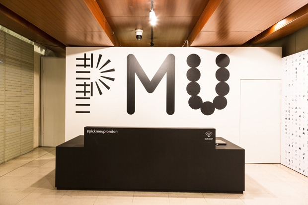
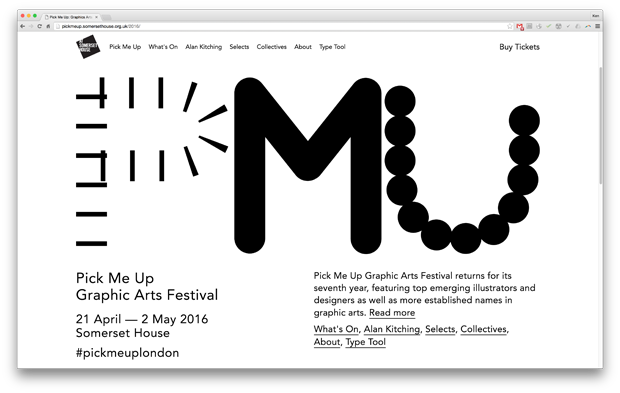
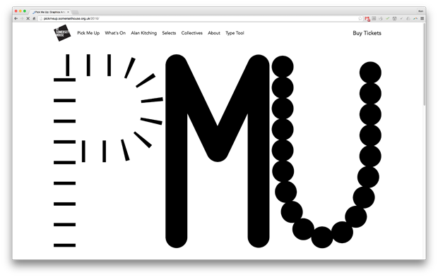
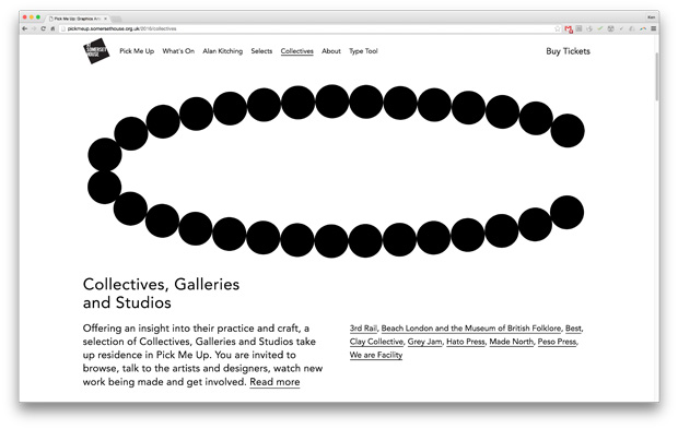
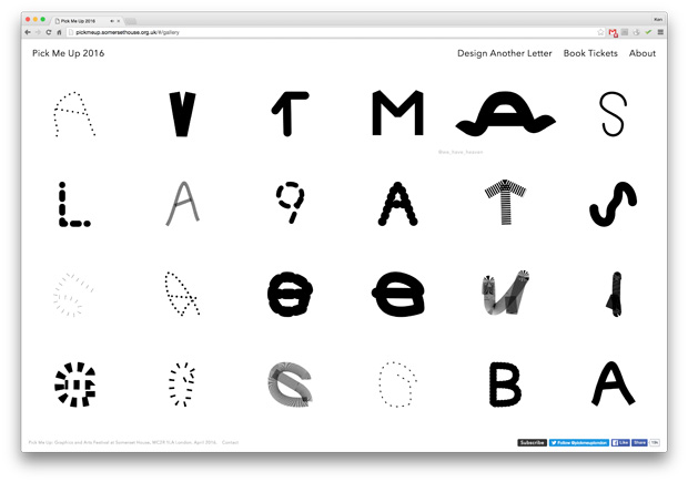
The visual identity for the Pick Me Up festival is a closed system, because the parameters are already pre-defined, nothing can evolve outside of these parameters. The flexibility is created within the parameters colour, length, density and width of forms. Interestingly, it included an interactive tool, inviting members of the public to submit designs using a type tool that allowed variations in design of letterforms within certain constraints.
Martin Lorenz is co-founder of Hamburg-based studio Two Points


