This graduating Chelsea College of Art student has a penchant for creating strong, colourful and carefully art-directed images – complementing her keen eye for composition with photographic ability and a creative use of typography.
How would you describe your practice?
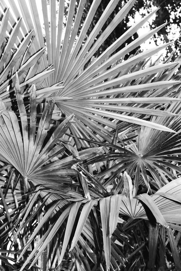
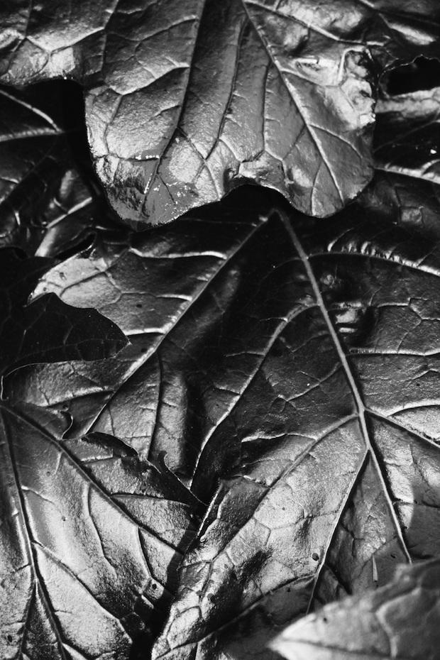
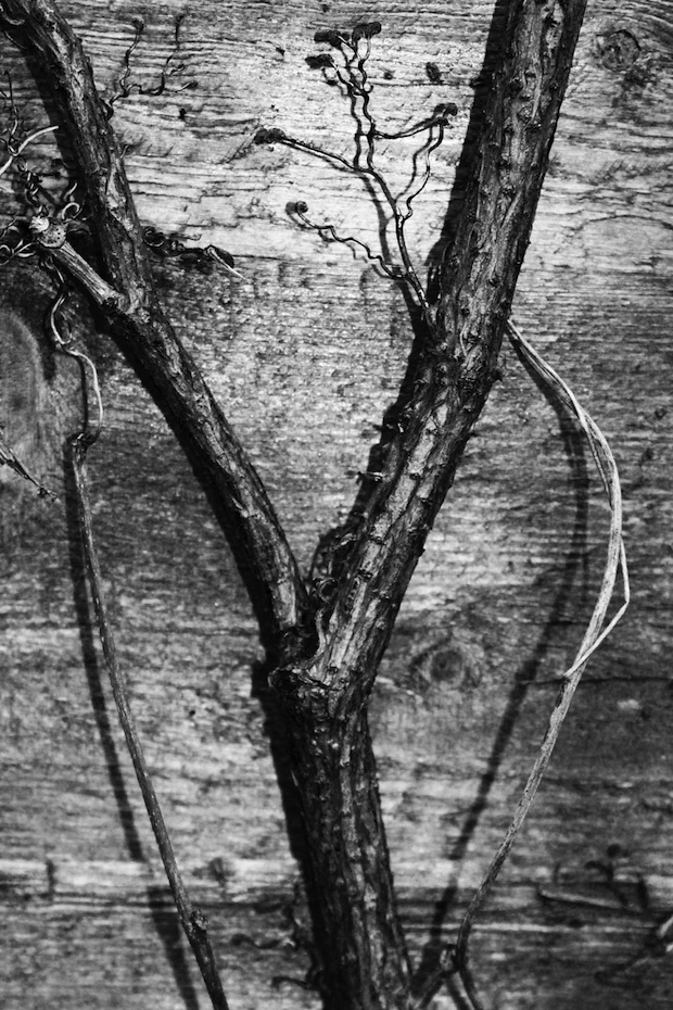
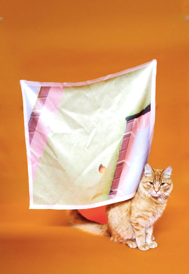
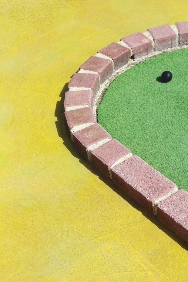
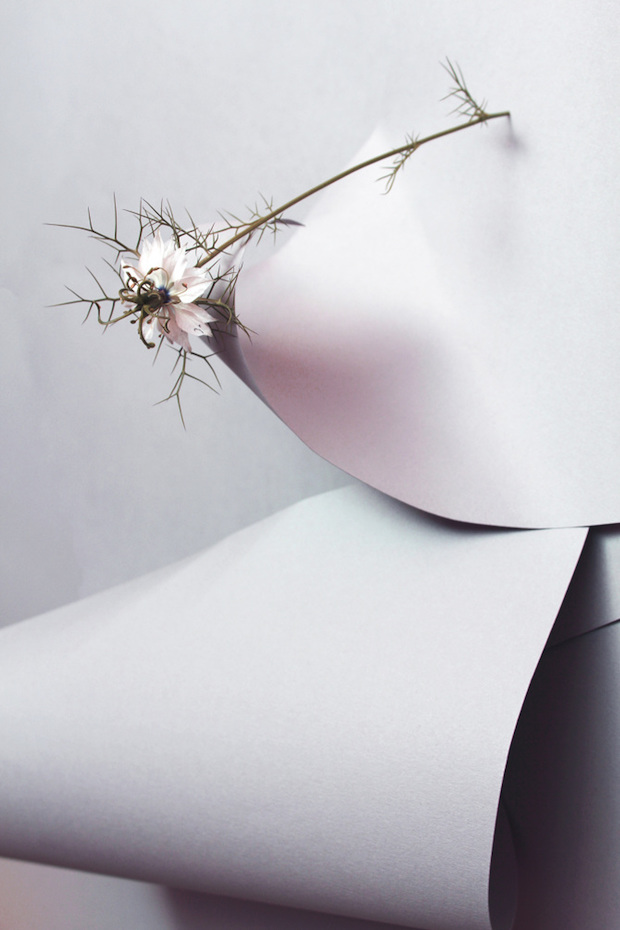
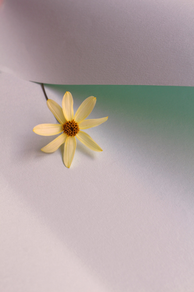
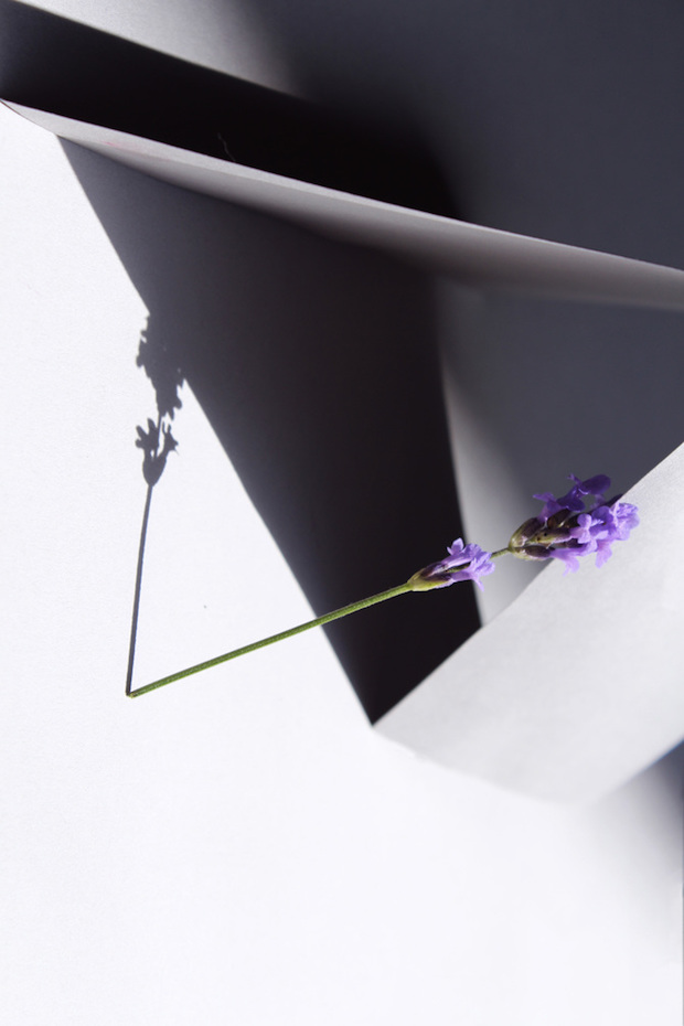
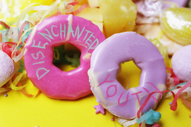
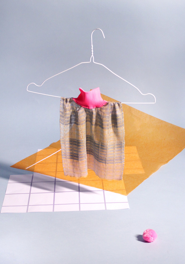
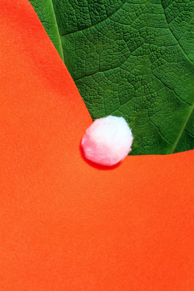
I’m an image-maker. My work is usually photographic, but I try to experiment across mediums to create eye-catching visuals. It’s usually colourful, and often contains an underlying humorous streak. I like taking objects and imagery out of their original context, and augmenting them enough so they become something else entirely. I have worked, and continue to work as a florist from time to time, so flowers are a reoccurring theme in my work. I’m also an avid doodler.
You're just graduating from Chelsea College of Art and Design's Graphic Design Communication degree course. What was the course like and what have you taken from it?
It has been three years of trial and error, finding out where my strengths are and what my visual language is. That’s the joy of a broad course, there’s opportunity to experiment and find your niche. Likewise, I’m lucky to be amongst a year of amazingly talented graduates in different areas of graphic design. Being in that creative company is invaluable.
Alongside photography and typographic design, your portfolio largely consists of strong art direction projects – is this the field you see yourself moving into professionally?
I’ve never really set a route for myself, or consciously decided to go any one way, but art direction is something I really enjoy getting stuck into. I know that I like being hands on with every project that I do and that it would be really exciting to work in a large team.
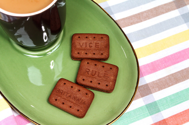
You recently won a pencil for your entry to Vice's 2015 D&AD New Blood Award brief Rule Britannia. Could you tell us a bit about the thinking behind this project?
It was a great but tricky brief from Vice: I was immediately drawn to it out of all the D&AD New Blood briefs this year. I knew there would be a lot of British stereotypes being thrown about, so wanted to flip one on it’s head, and be a bit cheeky with it. I think the biscuits and teatime were a good theme as they could be seen as a gluttonous vice themselves. The hidden messages of Britain’s disrepair on them were taken straight from tabloid articles. I think it reflects Vice’s brand of looking past the obvious stories to those overlooked by mainstream media.
What are you working on now and what's next?
My final project at Chelsea was in textile design, and I’d really like to explore that area more as it’s been reoccurring in my work quite a bit. I plan to continue freelancing, and trying to collaborate with as many people as possible.
flofairweather.com