Attention to detail and a distinctive illustrative style define the work of this young designer, whether he’s working on projects for German pop punk bands or creating a portfolio cover with elaborate laser-cut wood.
How would you describe your style?
Tough question. It seems a bit weird but I wouldn’t describe myself as an Illustrator but as a designer with a strong passion for illustration. There are big differences between all of my projects because I alway like to work in different styles but I think one common thread is that I put a lot of effort into the details.
Tell us about a recent project that you’re particularly enjoyed.
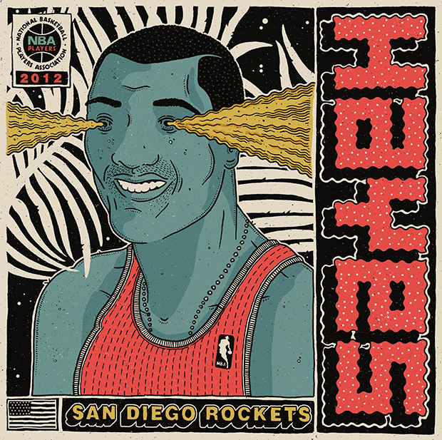
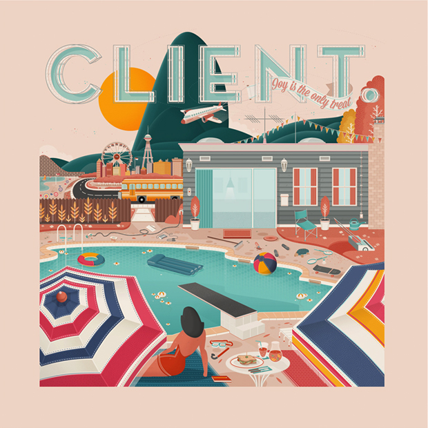
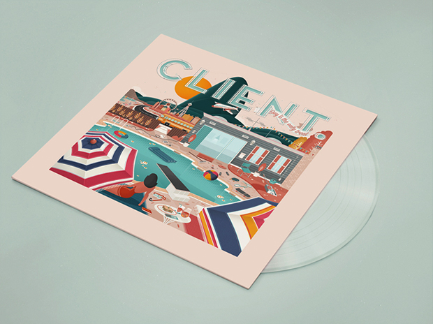
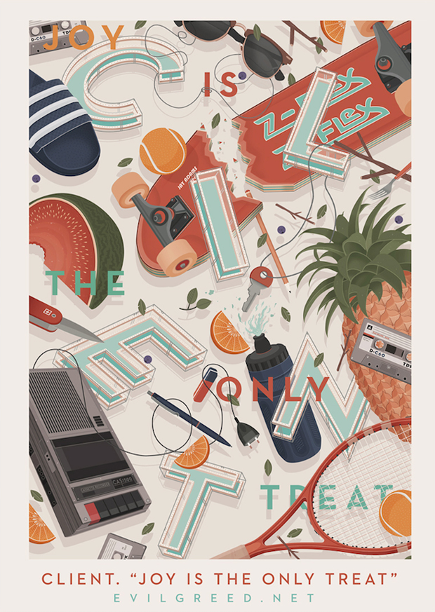
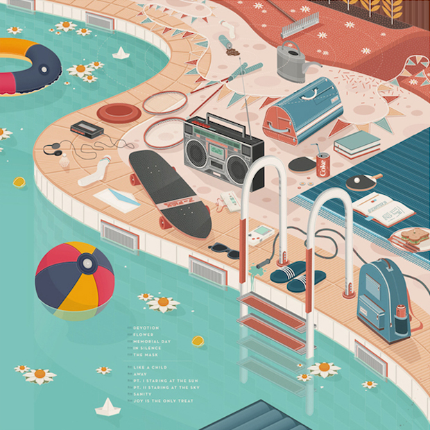
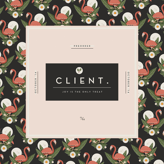
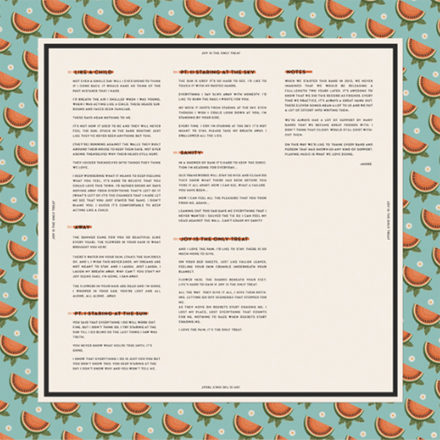
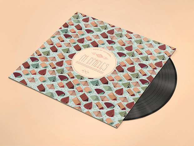
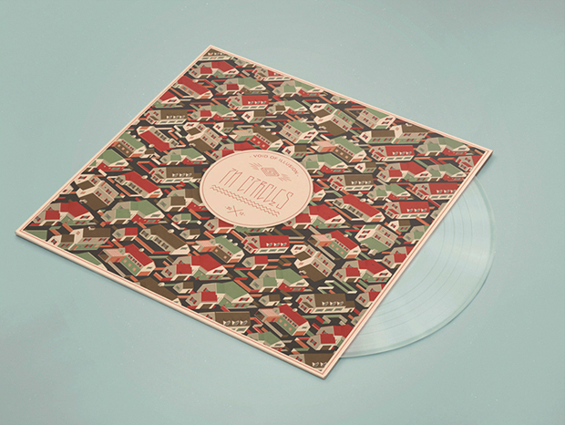
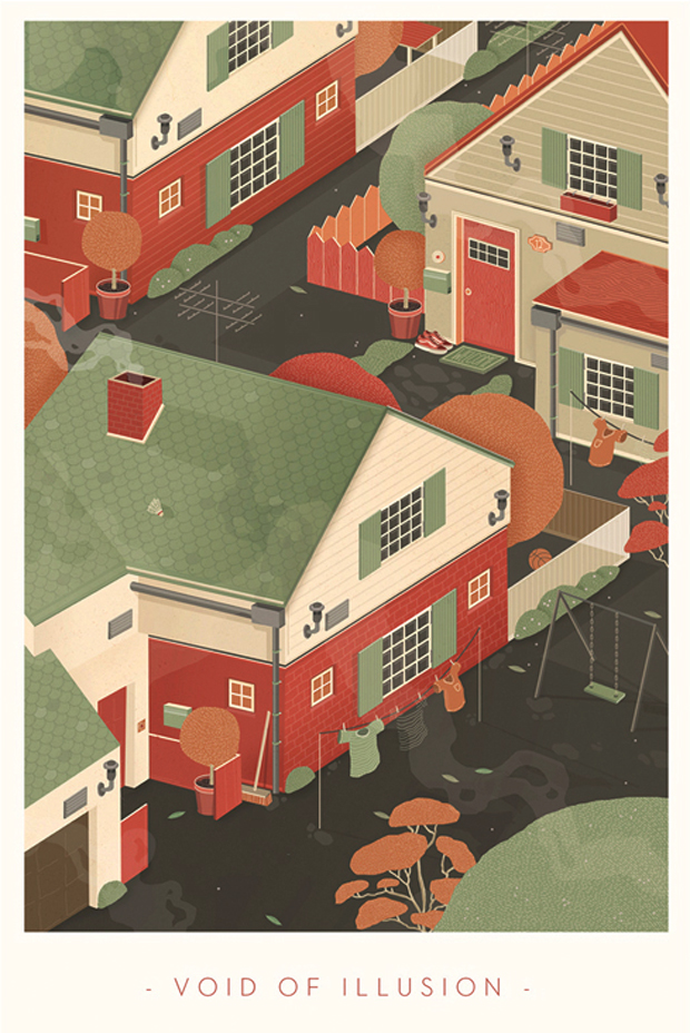
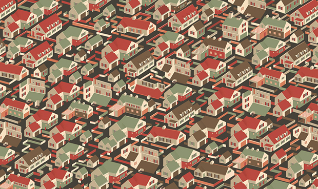
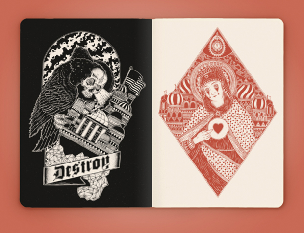
I really love working for bands. When I was young I was deeply influenced by skateboard graphics and hardcore punk record covers. I spent a lot of time at the local record store just to look at all different covers. I can still remember the day when I saw an Illustration by Raymond Pettibon (who did a lot of visuals for Black Flag) for the first time and it blew my mind. This was basically the reason why I became a designer. Fifteen years later a lot of things have changed but I’m still interesting in this world. I really enjoy giving good music a visual concept and I always try to put a lot of love into doing it. So the last project I enjoyed was the cover artwork for a german pop punk band called Client. I’m really glad that I did this job because I’m also a big fan of their music and I think the cover fits perfectly with their songs and lyrics.

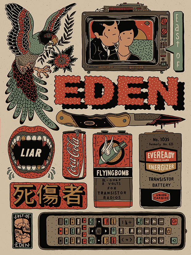
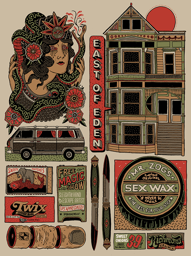
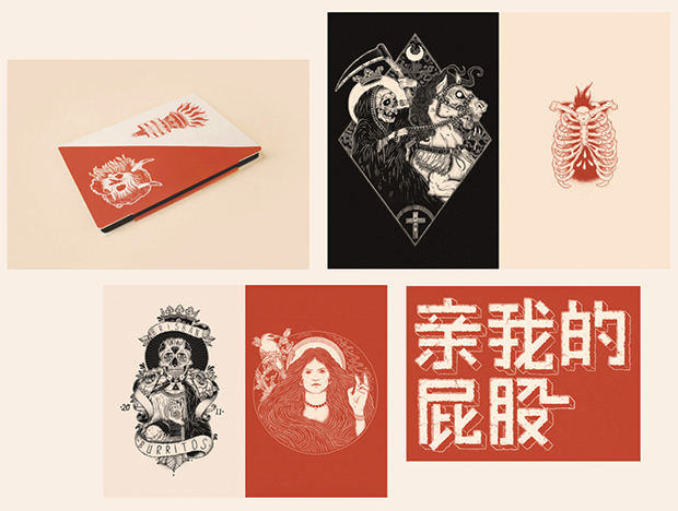
Tell us a little bit about East of Eden.
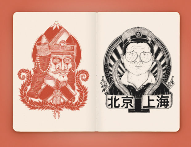
I get a lot of commercial work day-to-day that always has conceptual briefs. For this project I tried a completely different approach by freeing up my thoughts. The concept was not to have a concept. I just started drawing everything that came to my mind and then I combined all the different motifs in one project. When I was a child I collected trashy and colourful stickers. The whole project reminds me a bit of this collection.
What has been the most challenging commercial project you’ve worked on since you graduated and why?
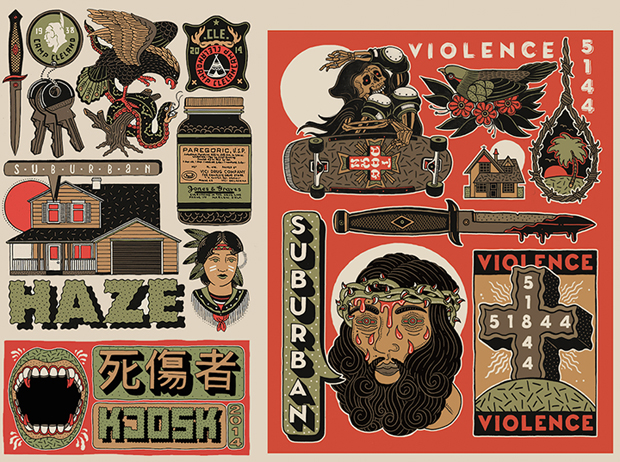
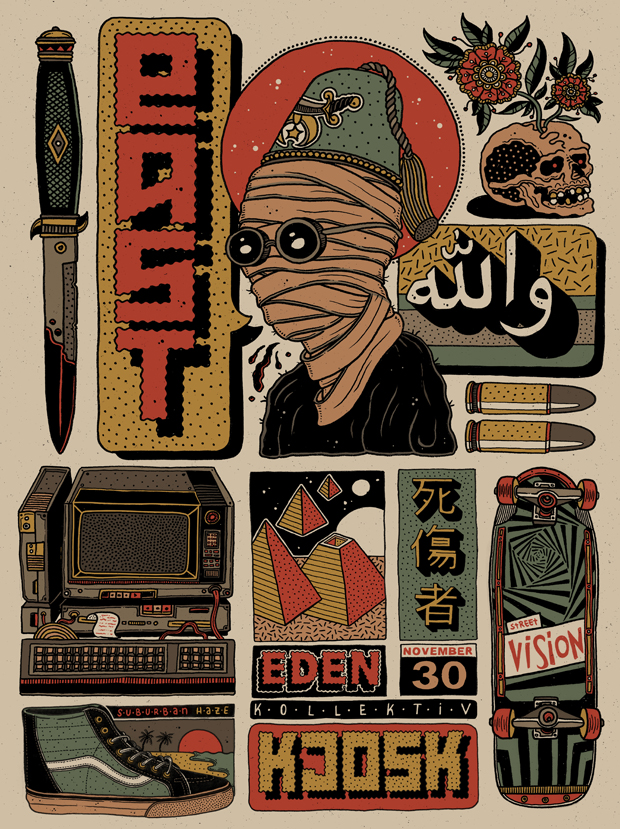
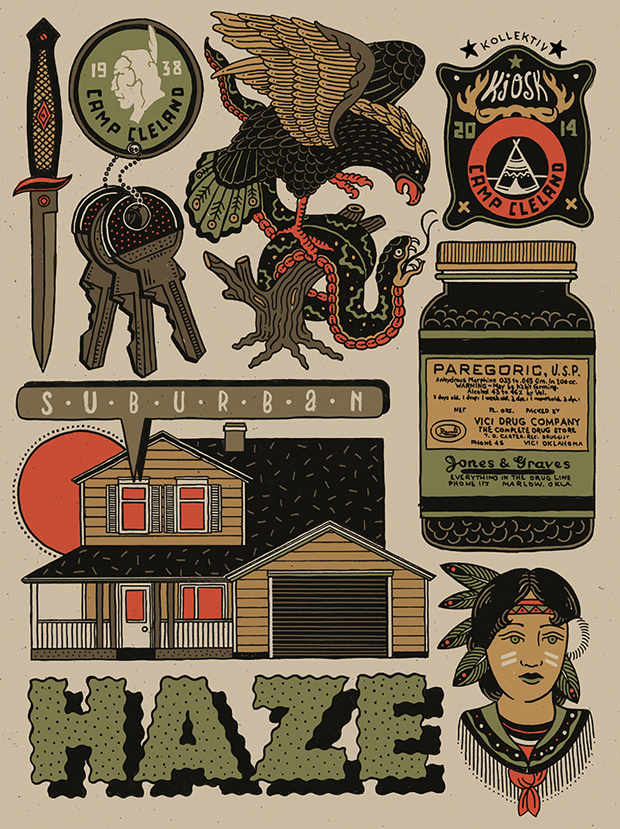
At the moment I’m building up a design collective called Kjosk with Lukas Zabek and Patrick Mariathasan. Currently we are working on the visual identity. The biggest part is already done but there are still some things to tweak. It’s not really a commercial job just yet but it is definitely the most challenging project so far, especially because I am the harshest critic of my own projects.

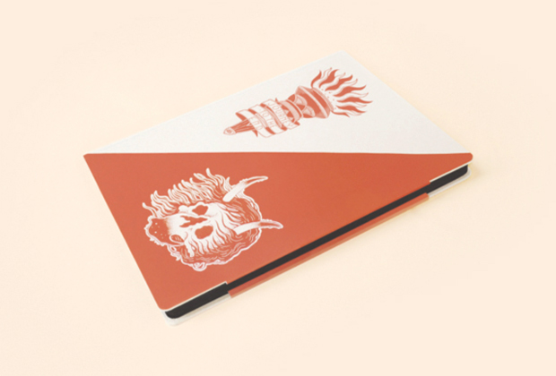
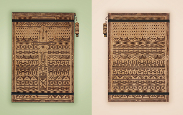
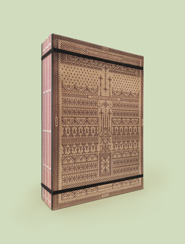
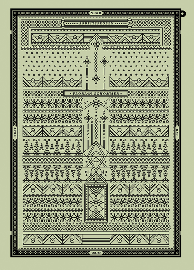
Your portfolio is incredible. Tell us about its wooden box.
Two years ago I decided to produce my first portfolio. It took me a few days to find the right concept and in the end I decided to do separate books for each project. I wanted to create a whole new world for every single book just to make sure that every project fitted perfectly in its own chapter. Therefore I created a wooden box which would contain all these different worlds. During this time I was travelling a lot around the world and nearly every project I did for university was influenced by all these journeys. I also decided to use this concept for the wooden books. I illustrated a clean pattern design that is based on a map. You can see rivers, trees, mountains and you can also find the four cardinal directions on the edge of the box.
behance.net/schommer
kjosk.de