
As the world continues to get smaller and corporations just keep on getting bigger, the demand for non-Latin typefaces has seen a dramatic increase. In this archive piece from Grafik 160, we asked a selection of leading type foundries and designers to choose one of their favourite foreign language characters – and here are the results.
Chris Cappaert, Faces
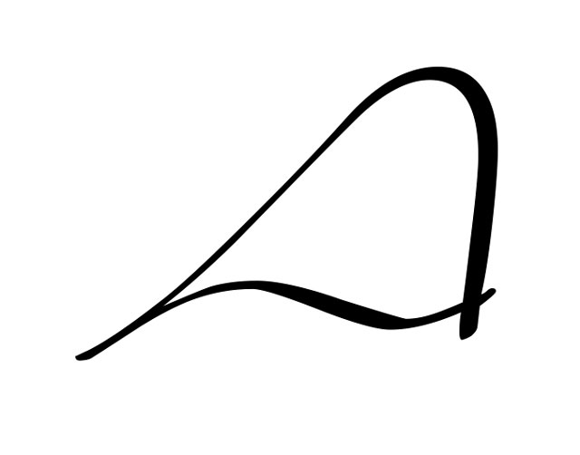
Liana Cyrillic capital ‘A’
I've chosen the Cyrillic capital 'A' from Liana Cyrillic, designed by Natalia Vasilyeva. I like the elegance of this freeflowing script face, and this is perfectly illustrated by the capital 'A'.
paratype.com
—

Jonathan Hoefler
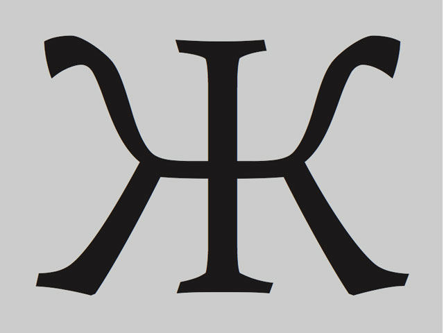
Archer small cap H-bar
This small cap H-bar is a notorious troublemaker in the ‘Latin-X’ range, required by Maltese, and shown here in H&FJ's new Archer typeface. Teeming with intricate features (two verticals, two horizontals and eight serifs), a type designer has to take every opportunity to alter the geometry of the letterform to avoid overcrowding, and rigid slab serifs offer few places to conceal these efforts. In this letter, the average reader will never notice that to get the character to work, Hoefler & Frere-Jones had to lower the letter's waist, carve out its serifs, and quietly thin down the centre of its intersecting bar.
typography.com
—
Jeremy Tankard
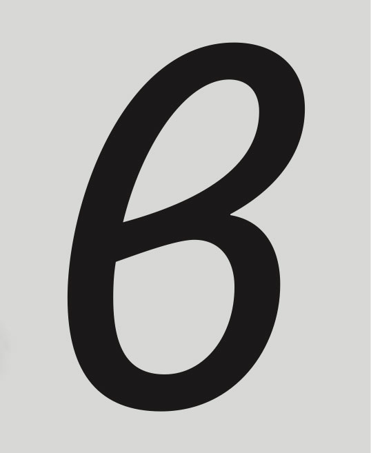
Bliss Pro Greek Italic lowercase beta
The Greek lowercase beta, together with theta and phi, has two forms in both the roman and italic styles. Either form is correct, although the more cursive forms are generally found as the standard ones in the italic. The Bliss typeface was expanded with Greek and Cyrillic scripts in 2006 and released as Bliss Pro.
typography.net
—
Michael Pieracci, FontFont
Cyrillic ’zhe’
FF Maiola is one of the first FontFonts to debut in OpenType Pro format with support for Central European, Turkish, Greek and Cyrillic languages. Veronika Burian’s book typeface has received awards from the Type Directors Club, Creative Review and Typographica.org. This character is a Cyrillic capital ‘zhe’.
fontfont.com
—
Mitja Miklavčič, Fontsmith
FS Albert Pro Extrabold, Cyrillic lowercase 'zhe'
Cyrillic letter 'zhe' is most frequently transliterated in English as 'zh'. Because of its interesting shape it is one of the first letters learned by children in those Slavic countries that use Cyrillic. The glyph is taken from a forthcoming version of FS Albert Pro. During the design process a lot of effort was put into maintaining the unique structure of Cyrillic script so as not merely to produce a collection of 'Latinised' letterforms. Besides the extended Latin and Cyrillic character set, FS Albert Pro will also include Greek letterforms. As in the case of the existing Latin version, the family will have nine versions.
fontsmith.com
—
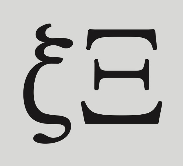
Freda Sack, Foundry Types
Foundry Old Style letter Xi
One of the few letters of the Greek alphabet not giving rise to a Latin character transliterates as Xi. The capital form derives from the Phoenician glyph depicting a ‘pillar’; the lowercase is more lyrical, almost cursive. Foundry Old Style is in development in several language versions; its humanistic design translates naturally into Greek letterforms.
foundrytypes.co.uk
This article first appeared in Grafik 160, March 2008