
Flair and experimentation run through the work of this Italian designer, whether he’s making drawings from charcoal pastes to explore its dystopian connotations or travelling around the country hand-painting signs for locals.
Tell us about a project that you’re particularly proud of?
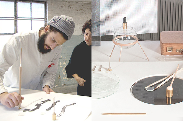
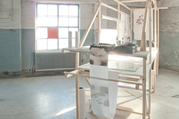
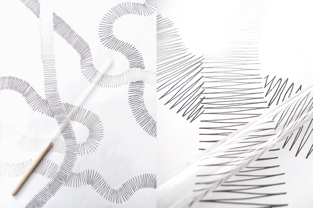
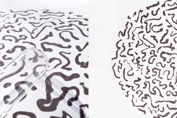
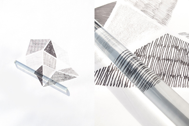
The Invisible Line is a project I exhibited at C-Fabriek during the Dutch Design Week 2013. It was a small production line of drawings and illustrations on thermal paper, a special paper which is chemically treated in such a way that it turns dark when heated. Illustrations were done without any added ink or pigment, just using a set of self designed heated tools used as brushes to leave traces on the paper. The Invisible Line was an installation to show and display a possible direction and I think there is still much to experiment with from a technical and expressive point of view. I see a lot of potential in the project. Studio
Formafantasma must be an incredible place to work.
How has their design approach influenced your own? It is, and I’m so glad I had this opportunity. Especially at the beginning, it was striking for me to see how differently they interpret things compared to what I am used to. When we started collaborating I had just come out of a very technical university, with its typical academic approach – pretty square. On the other hand, there was Formafantasma, and their design approach was a breath of fresh air. I discovered it was much closer to my own world, and it influenced my way of seeing things a lot. It taught me to believe in my own feelings throughout the whole design process, to and to develop a deeper and multi-layered way of interpreting things. Also it encourage me to care for every detail, in a very natural and spontaneous way, like when composing music.
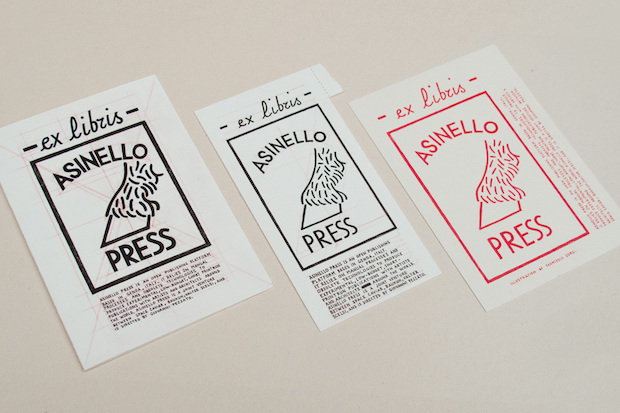
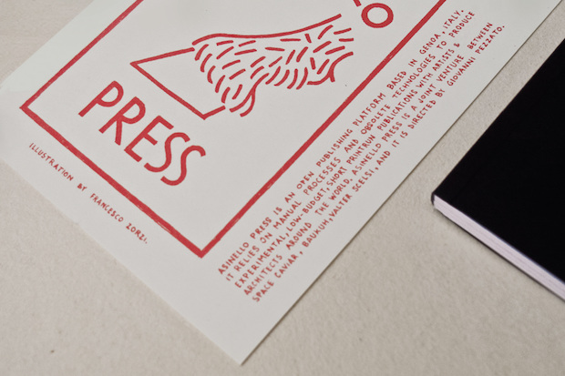
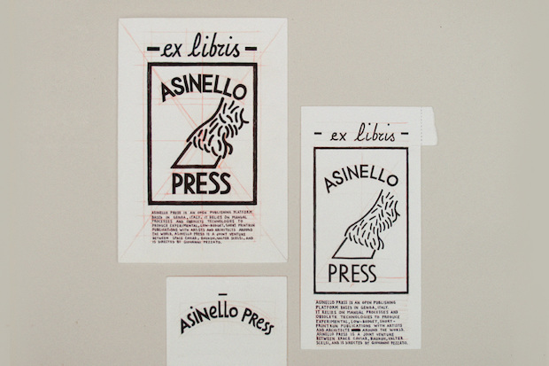
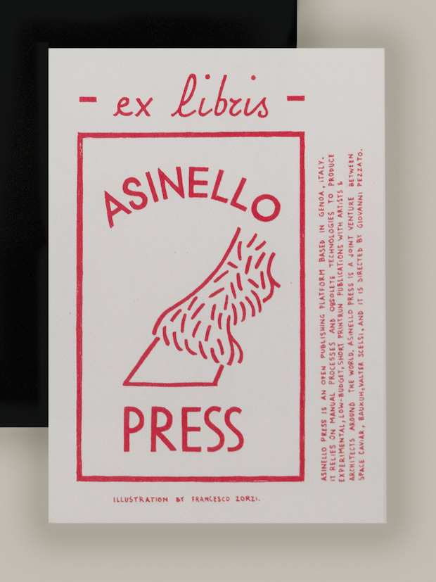
Tell us about your logo for Asinello Press.
The main identity of Asinello Press has been design by Giovanni Pezzato, who is also the editor of the project. He asked me to come up with an idea for the ex libris or bookplate that was supposed to come together with the first issue of the publication. The ex libris was an element to connect this experimental publication with a long-established tradition. Then when they received my illustration, they liked it so much that they decided to use it as the official logo of the whole project. Asinello Press is a publishing platform based in Genoa, a city in the northwest of Italy. In Italian ‘asinello’ means ‘little donkey’. This was the idea behind the illustration: a simple logo-like drawing, a handmade donkey hoof stamping on the ground. The mark of a donkey referring to those semi-manual processes and obsolete technologies used in short-run print publications.
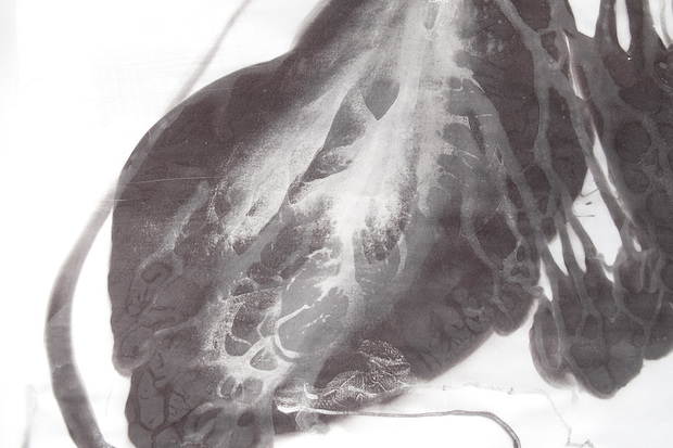
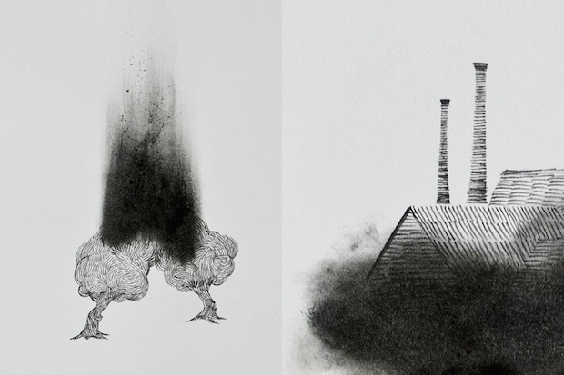
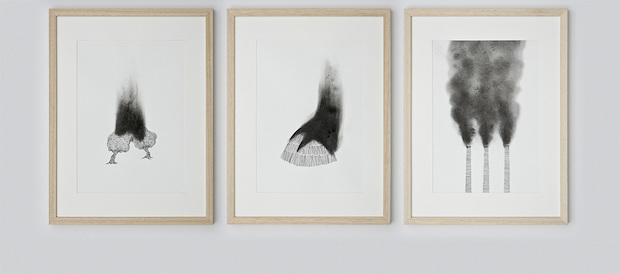
What do you find so powerful about charcoal as a material?
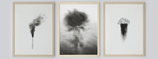
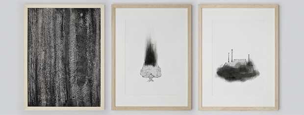
In 2013, the Vitra Design Museum contacted five design studios working in the Netherlands to collaborate with a Swiss partner to develop a design proposal for an exhibition called Confrontations. Formafantasma was one of them, and working in collaboration with a charcoal burner they developed a project called Charcoal. Collaborating with Formafantasma, I had the great opportunity to develop a collection of charcoal drawings as part of this project. They drew inspiration from the tension between the dystopian connotations of charcoal, causing pollution and destruction, and its beneficent use in healthcare and water treatment. Alongside the series of jars and charcoal filters they designed, I created twelve hand-made charcoal drawings portraying trees burning, polluted cities, fumes and black rain. The drawings were on display at the exhibition to highlight the misuse of charcoal throughout time.
Charcoal was both the medium and the topic of this series of illustrations. Instead of ink, each drawing was made using real charcoal from burnt wooden logs. Experimenting with it was particularly inspiring, and it led to results difficult that would have been difficult to reach with classic drawing charcoals. Used pure or grinded to a powder, the charcoal was mixed with various chemicals. I experimented with benzine, turpentine and ammonia, to get the best expressive and chromatic effect and to recreate the knotty texture of a burnt tree trunk.

Your Grand Tour project took you all over Italy. What are your tips for creating beautiful hand-lettering?
My process was pretty much self-taught and self-inspired. I knew how to paint but I had never painted signs before. I just always loved letters and colours, and I wanted to learn how to paint signs. So I thought the best way to learn how to do it was to go out there and just do it. Then I stumbled upon the movie Sign Painters, and I got so much inspiration from them! It just gave me the final push. I took these few weeks as a very personal discovery: a rediscovery of my own country on one side, and of my own skills on the other. It was a very special chance to travel around the Italian coast and countryside, experimenting with colour combination and hand lettering. I didn’t design too much, kept it quite spontaneous, and enjoyed every brushstroke. I think the best tip for creating anything beautiful is doing it first and foremost for yourself, and enjoying the process. It then has a special value that goes beyond any concept it may start from, and any story you may tell. When you do it for yourself, it just comes out better.


