Mark Porter Associates has transformed L‘Express, using exciting layouts and bold typography to take the popular weekly French news title into the 21st Century, while respecting its sixty-three-year heritage.
Editorial designer extraordinaire Mark Porter has just redesigned the popular French weekly news magazine L’Express. We caught up him to find out more about the redesign process and what it's like to design a publication in another language.
Can you tell us a bit about the magazine itself? What would be the UK equivalent of L’Express?
It’s hard to make a comparison because weekly news magazines are still thriving in France, in a way they simply aren’t in the UK (or the US). In terms of content it's something like New Statesman or the Spectator, a weekly with a focus on politics, culture and social issues. But in terms of reach and influence there is really no equivalent here, it’s more like one of the quality newspapers. It has an incredible history – some of the biggest names in French literature have written for it – but it is currently having to face up to the same challenges most other big print magazines are dealing with.
What was your original brief, and did it change at all as the project progressed?
The brief was to restore their leadership position amongst French news weeklies. Obviously, there is only so much design can do solve a problem like that, it has to go hand in hand with editing and promotion. But the existing design was very tired and undistinguished, so it was really a question of giving them a visual identity which respected their history but felt relevant to the modern media world, where print has to co-exist with digital and social media.
How would you say that the various design elements reflect what you were trying to achieve with the redesign?
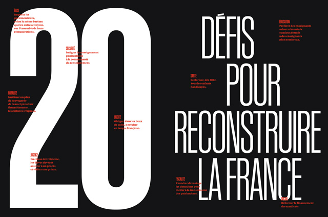
There is a recognisable language of weekly news magazines, which originated and grew with the iconic journals like Time, Newsweek, Stern, and so on. They usually have sans-serif typography, black mixed with red or orange, a particular way of using photography and graphics. On a project like this you have the choice of whether to ignore the conventions and try to reinvent the medium, or respect them. In this case we decided to create a design which worked within the framework but brought it up to date.
Are there any elements which you’re particularly pleased with?
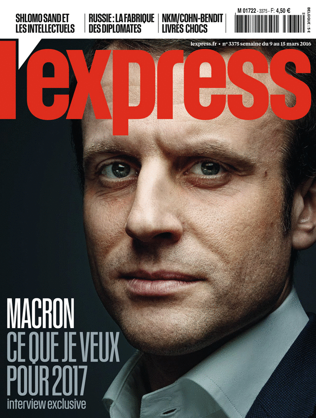
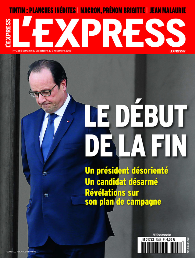
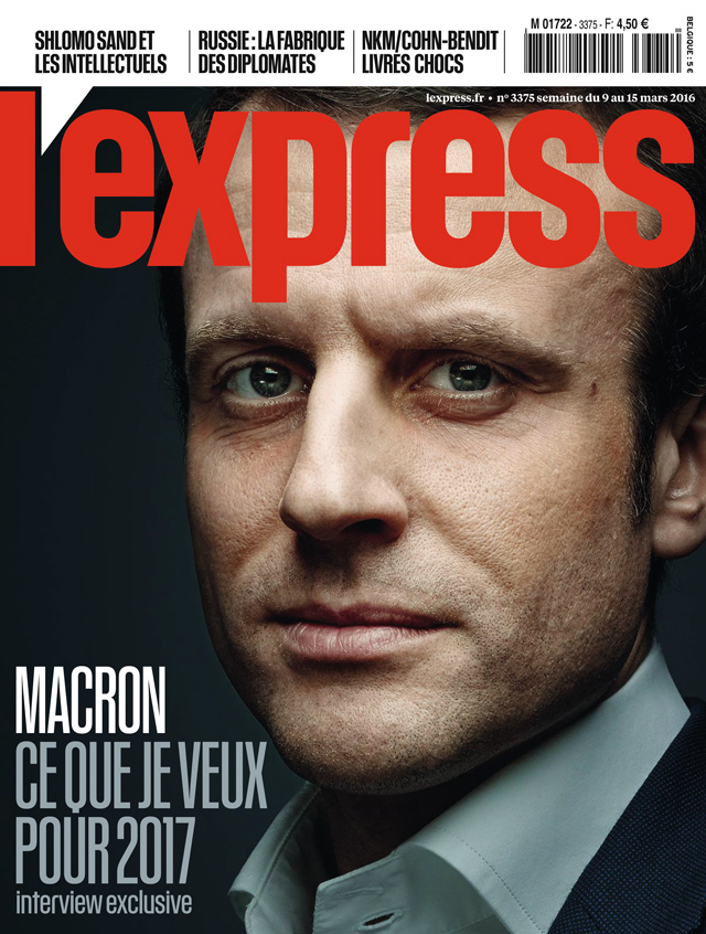
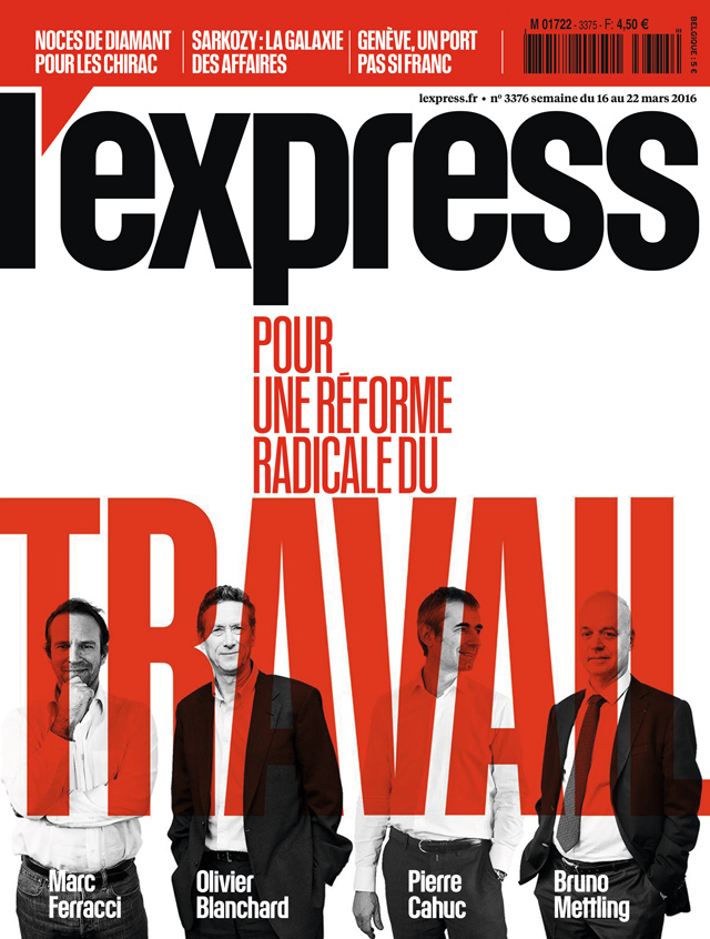
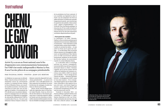
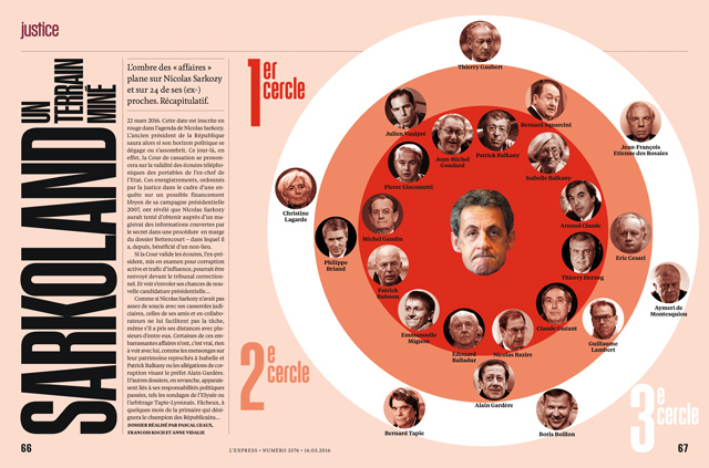
One of the problems with the old design was navigation – it was hard to know where you were as you went through the book. One of our solutions was to give each of the main sections a typographic “cover” of its own, using type and colour to define the character of that run of pages. But probably the element I am most pleased with is the way the logo appears on the front cover; the apostrophe between the L and the E is an important part of the name, but we treated it as a wedge which turns the promo panel above into a speech bubble. It got a lot of attention from readers and commentators, which is part of the trick of building an identity.
Are you a fluent French speaker? If not, what are the particular challenges involved when designing a publication in another language?
I’m not exactly fluent, but my French is OK. It certainly helps when communicating with the client and reading the articles. But we have also done a lot of projects in languages I don’t speak at all, like Swedish and Catalan. Typographic design in other languages is really about being sensitive to the form of the language. Languages can have very different typographic shapes, so a typeface which looks good in English just may not work in French, you have to choose very carefully. We also try as hard as we can to engage with the local visual culture, and allow the design styles of the country we’re working in to influence what we do.
Three new typefaces have been created for the magazine – can you tell us about these and how they’re employed within it?
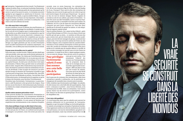
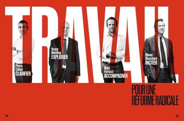
We began with a period of research in the archives of L’Express and found some issues from the 1960s which had some condensed sans-serif type which felt very contemporary. This led us to the Kommissar font from Commercial Type, which has the flavour you expect from a news magazine, but with a modern twist and a distinctive character. But we had all the accents redrawn so we could set it tighter. We mixed this with Feijoa from Klim Type which is sinuous and curvy and makes a great contrast to the angular forms of the Kommissar.
Is there ever room for playfulness in a serious news magazine?
It would be very boring if everything was deadly serious. Politics and culture can be funny subjects and it’s important to allow some playfulness if you want to keep the audience’s attention. From the visual game with apostrophe on the cover to the loosely drawn icons/ illustrations in the culture section, we have worked hard to keep it engaging.
What’s the strategy as far as the cover is concerned?
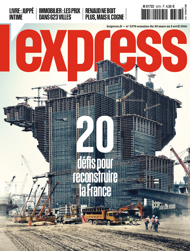
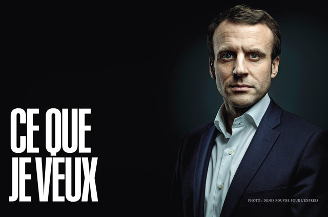
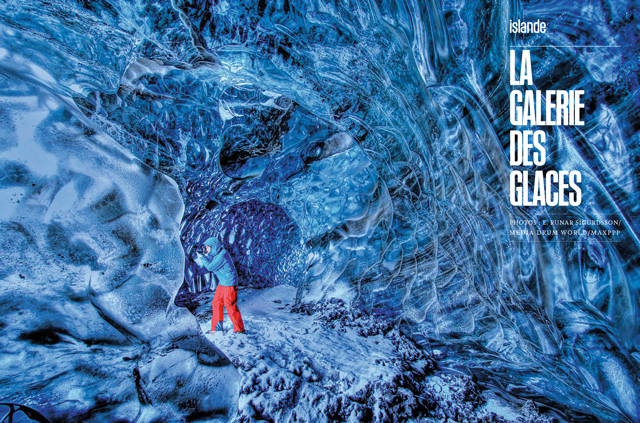
A lot of the sales are in the kiosk, so a big, strong, distinctive logo is vital. Beyond that we have encouraged L’Express to use every possible technique to make the stories look interesting and relevant. It can be challenging with the kind of themes they work with, but the first four covers in the new format used classic portrait photography, typographic treatments, illustration and CGI/Photoshop to mix things up.
What’s the reaction been from the readership so far
Extremely positive. Most people seem to feel that we respected the heritage of the magazine while bringing it into the 21st century, which is exactly what we set out to achieve
Studio: Mark Porter Associates
Creative Directors: Mark Porter and Mark Leeds