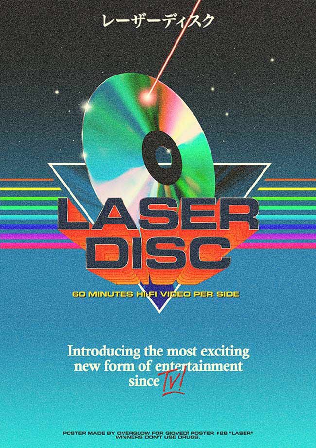
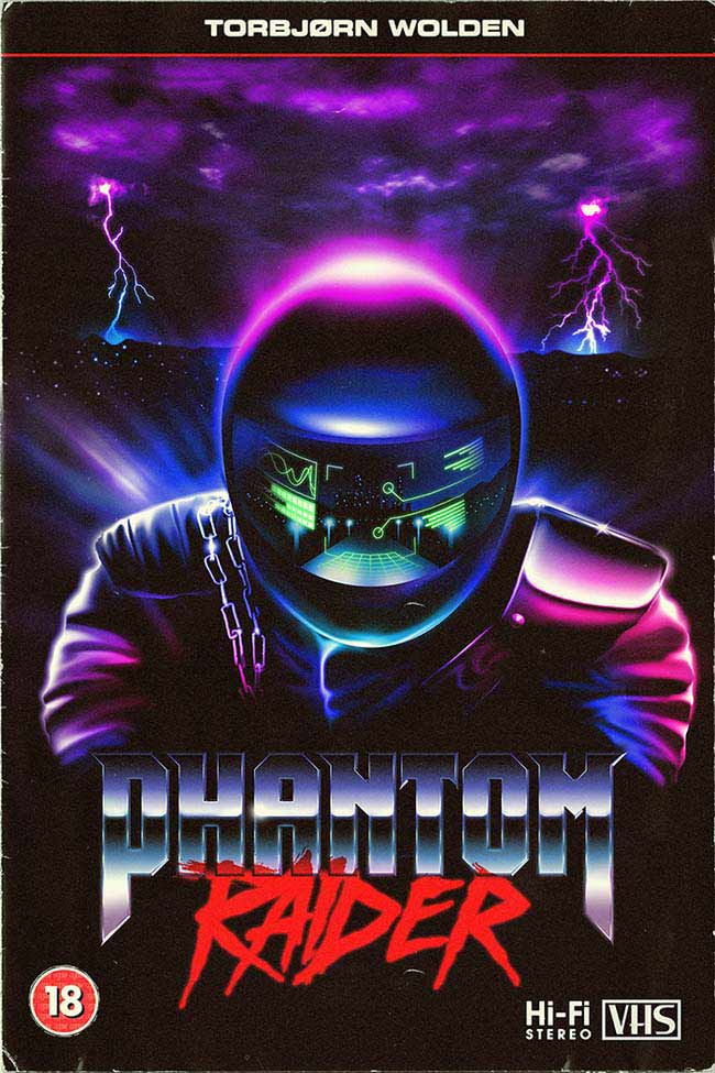
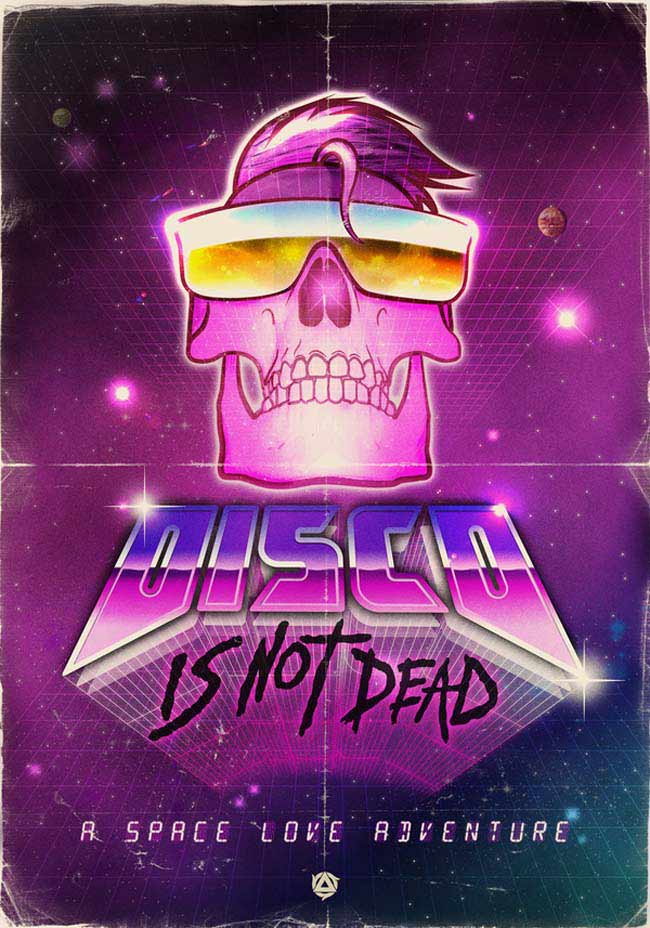
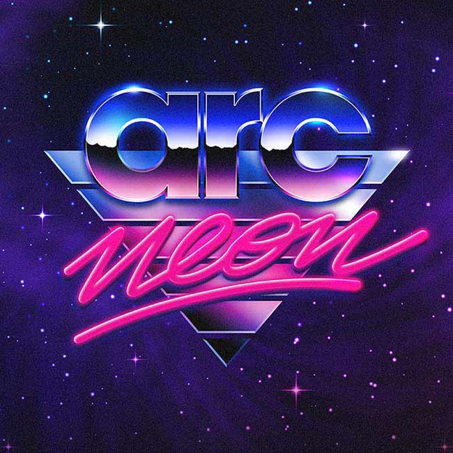
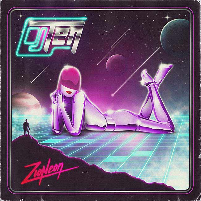
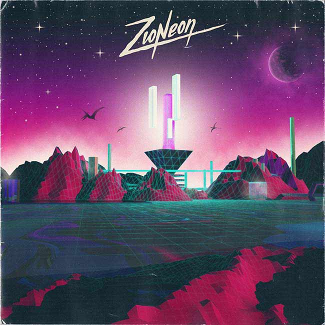
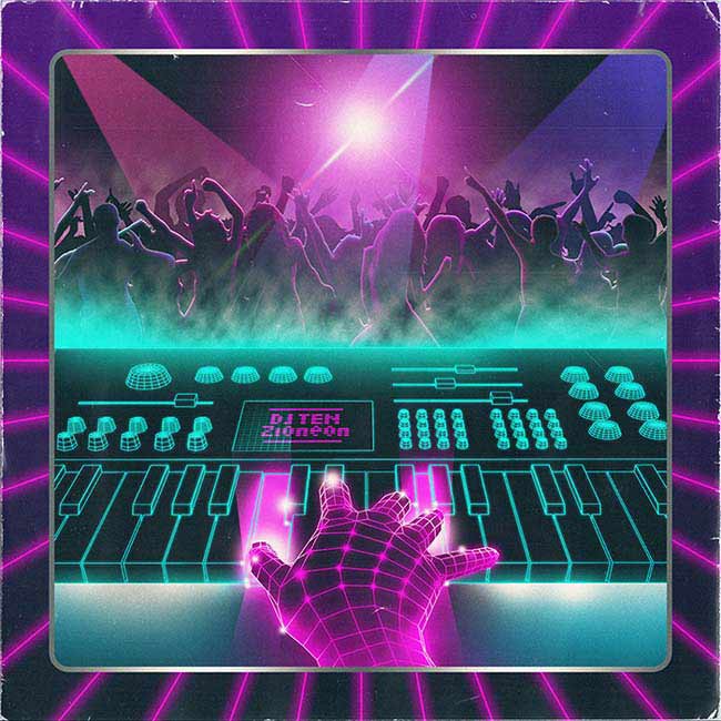
Known only by the nom de guerre Overglow, this designer conjures electric 80s artworks for 21st Century clients.

Describe your workspace to us.
My workspace is pretty basic. It's just my room and my MacBook, nothing fancy. I just need to have my space, a computer, headphones and some paper to sketch.
Where do you go for inspiration?
Back to my childhood! Joking aside, I still have a lot of GameBoy and Megadrive cartridges at home. I grew up playing a lot with video games and I've always been a fan of 80s/early 90s aesthetics. You can find a lot of 80s inspired Tumblrs gathering tons of original '80s pictures, commercials and graphics; they are such an amazing source of inspiration. But since this style is already an imitation of something, I usually try to create my stuff without being too influenced by specific images.I recently found some magazines that my parents bought back in the late 1980s with a lot of amazing retro ads. It's very useful to see how images and typography were treated at that time.
How did your interest in the aesthetics of the 1980s arise?
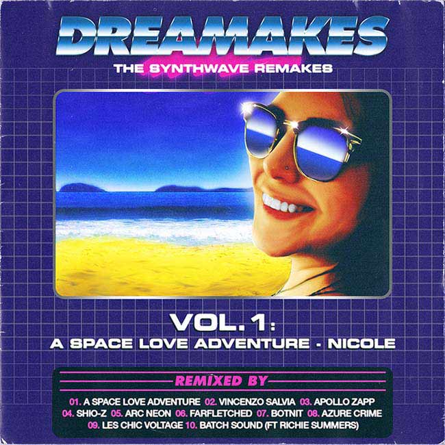
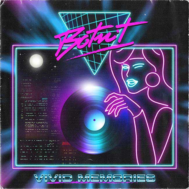
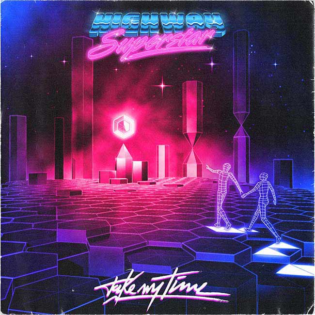
Everything started when I discovered Outrunners' album Running for Love and Money. Not only did they have that fantastic 80s sound, but they were the first example I saw using the same approach in their artwork.
That triggered the underlying interest I have — I subsequently fell in love with synthwave music and its album covers. Later on I found out that the Zonders, a graphic design collective, were producing many of these kind of works; they really prompted me to try to do something with that style.
Who are your heroes?
Well, there are people whose work, dedication, creativity and, above all, courage, I admire a lot. Those are the people that really inspire me to follow my passions. If I had to mention names, I would say (in no particular order): Stefan Sagmeister, Charles Bukowski, Bill Hicks, Walter White and H.P. Lovecraft. I admire people who manage to do what they like despite society’s relative opinion or their level of success.
What’s your most invaluable piece of kit?
As long as I have my graphics tablet, a computer and some markers and paper for sketching, I'm happy!
What’s been the best and worst reactions to your work?
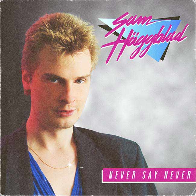
I usually have amazing feedbacks from the people who follow my work, they're the best. I started this 80s thing just for fun, but I never expected there to be such a large amount of love for the work. Recently I found an article about the Overglow project that mistakenly took my work as "a collection of graphics from the 1980s". It was funny and flattering to see that some people actually thought my works were authentic 80s graphics! The worst reaction I remember was about Sam Haggblad’s album cover. He plays authentic Italo-disco music and so we decided to imitate the Italo-disco imagery as much as possible: winking close-up of the artist, neutral background and not so refined typography. I had so much fun doing it and Sam and me really liked the result because it really looked like some of those crappy five Euro Italo-disco vinyls you usually find in flea markets. But some guy didn't catch the reference at all and made some very harsh comments… still, Den Harrow’s discography proves me right.
Tell us about the piece of work you’re most proud of.
I am particularly proud of the design I did for Lazerhawk, partly because it was so difficult to produce. I had the concept in mind but really didn't have a clear idea about how to give it shape. A lot of the time I was, like, "...and now what?” I made several attempts, and the file was huge, so it was very painful. Photoshop crashed several times but in the end we really liked the result.
What’s the biggest challenge of working in the way that you do?
The biggest challenge is always to try to create an artwork that looks genuinely from that era. With time I've managed to figure out the layer of styles/textures/effects bundles that help me in giving the work that 80s touch. The hardest elements for me, anyway, are the illustrations; I come from a graphic design background, so I don't have such developed skills in that field, and every time that I have to start an illustration I get stuck in that "ugh, this will be so difficult" limbo, until I actually get going.
What would be your fantasy commission?
You know, when I started the Overglow project, I decided not to use my real name because I didn't want to be labelled as "the guy who only does 80s graphics.” To be honest, I didn't expect Overglow to generate so much interest and, most of all, to be so exposed. I always thought it would have been funny to produce graphics in this sort of style, but presumed that it would have a niche appeal. I considered it a ‘fun’ thing, with its limitations in terms of work opportunities. So, to answer the question, my fantasy commission would be for a totally non-80s-related client to ask me for some 80s graphics, that would be really interesting.
theoverglow.com/
