
In today's Archive piece, Jesse Ragan looks at Ruzicka’s idiosyncratic lower case ‘g’, the cause of much consternation during his “posthumous collaboration” with the revered typeface designer.
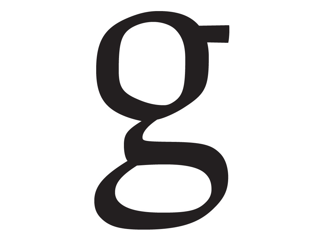
This ‘g’ encapsulates the understated elegance and idiosyncrasies that first captivated me in Rudolph Ruzicka’s masterful designs. Yet I struggled with this particular letterform as it stubbornly resisted my attempts to integrate it into a functional typeface.
“Type is meant to be read,” Ruzicka wrote in the booklet announcing his first typeface, Fairfield. “To submerge consciousness of type, all obvious cleverness must be ruled out. There should be a kind of impersonal ease about type—type is after all only a medium between writing and reading. But to invite continuous reading, type must have a subtle degree of interest and variety of design.”¹
A two-storey ‘g’ – as opposed to the more simple morphology – has a peculiar structure that insists on defying the system of a typeface. Its anatomy is alien, with an ear up top and a link connecting two bowls. A sprawling lower bowl requires counterintuitive weight distribution for stability. Even baseline and descender alignments surrender to the demands of ‘g’. Quite often this letterform carries more than its fair share of a typeface’s “interest and variety”, but it must find a way to rest at “impersonal ease” when composed in text.
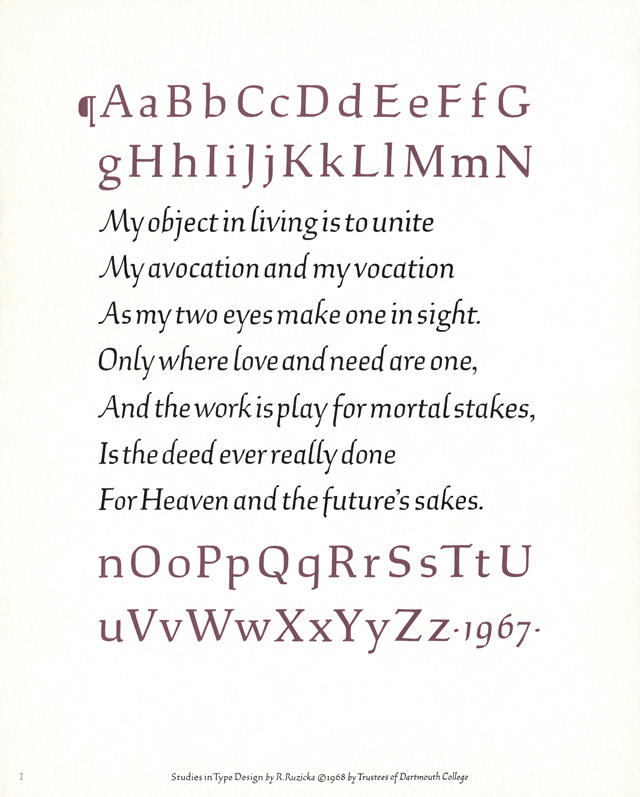
Shown below is the first plate of Rudolph Ruzicka’s Studies in Type Design, a book of hand-rendered alphabet designs published in 1968. Several decades earlier, Ruzicka worked closely with Linotype’s drawing office as they tested and redrafted his typefaces Fairfield and Primer. Ruzicka spoke from that experience in his introduction to Studies: “it is a far cry from design to type face. But it is a pleasure to watch and hopefully march in the parade.”²
The Ruzicka estate has allowed me to bring these long-dormant designs to completion as digital typefaces. In what I romantically describe as a posthumous collaboration, I imagine Ruzicka watching as I work. I try to look beyond the image on the page to the essence of every stroke and counterform, using what I have learned from his body of work and his writings. We don’t always agree, but I try to let him have the final say.
Ruzicka’s sturdy ‘g’ gently asserts a lighthearted tone amid a rather conservative alphabet. Calligraphic gestures create spring-loaded tension between angularity and softness. A wide-eyed upper bowl gazes forwards as it extends to reach the lower bowl, a firm horizontal expanse which roots the entire construction. It’s an oddly handsome effect. But as Ruzicka acknowledged, his alphabet design wasn’t quite finished, and my tests indicated slight revisions. To harmonise my ‘g’ (left) in the digital typeface, I reproportioned bowls, redistributed weights, and adjusted relationships between inner and outer contours. I trod lightly, careful to maintain the distinctive voice that endeared Ruzicka’s work to me in the first place. I’ve reconciled with this ‘g’, and in turn it has settled in among its alphabetic companions. Now I can attend to a more formidable challenge: creating a bold weight that would have met Ruzicka’s approval.
Read more on Jesse's project here
¹ “Fairfield: New Linotype Face Designed by Rudolph Ruzicka” (Mergenthaler Linotype Company, Brooklyn, New York, 1940).
² Studies in Type Design: Alphabets with Random Quotations (Friends of the Dartmouth Library, Hanover, New Hampshire, 1968).
This article first appeared in Grafik 185, May 2010