
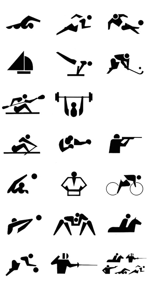
Hat-Trick Design creative director Gareth Howat praises the pictograms of the 1964 Tokyo Olympic Games, a sophisticated and inclusive system that helped define the public signage of the modern era. I have always felt that the Olympics are a great opportunity as a showcase for design as well as sport. I think designing the pictograms would be a design challenge that would be fantastically exciting and deeply scary in equal measures.
The history of their design has naturally been bound up with the politics of the time. The use of pictograms in an Olympic context goes back to the Berlin games of 1936, where some rather ad hoc pictograms were developed to represent the sports, but it seemed that they were also a declaration of sorts from a fledgling state. The London Games of 1948 also developed some crude versions of its own, but the designs for the Tokyo games of 1964 took a new and different approach and helped to defined the archetypal form for future pictograms.
The Japanese pictogram system was conceived by a team of designers led by Katsumi Masaru and was inspired in part by design language development that was taking place in Vienna at the time.
Pictograms were employed to help get over the language barrier that arises when people from all over the world gather together for the Olympics. There were symbols created for the various competition events but also the facilities such as restaurants and seating and so on. They have been highly influential and have helped to define a modern era of public signage ever since.
Katsumi Masaru stated, “It was the tradition of crest designs in Japan that we attempted to put to good use in our design policy.”
They are designed as clear and dynamic representations of reality. Their stunning simplicity meant they could be used in any media at any size. I think they were groundbreaking as they brilliantly represent the relationship between people, objects and motion - no mean feat.
They were more sophisticated than their London or Berlin counterparts, cleverly using simple shapes, silhouettes and negative space. It is remarkable that they are culturally, racially and gender neutral – an expression of cross-cultural exchange and participation, rather than a nationalistic influence.
hat-trickdesign.co.uk
Gareth Howat
…is the creative director of London-based studio Hat-Trick Design. Its client roster includes the British Heart Foundation, Dyson, Capital Radio and Royal Mail, for which it created a four stamps to mark the start of the London 2012 Games. During the 2012 Olympics, Hat-Trick also worked on fun, self-initiated project Pictograms For the Olympic Feats of Everyday Life, which involved designing icons for ‘sports’ such as throwing a spanner in the works, jumping to conclusions, and riding off into the sunset.
The 1964 Summer Olympics
As mentioned by Howat, the 1964 Summer Olympic Games, held in Tokyo, were not without drama. Japan was originally set to host the 1940 Games but the honour was passed to Helsinki after Japan invaded China, before ultimately being cancelled at the beginning of World War II. The Games marked a lot of firsts, not only was 1964 the first time the Olympics had been held in Asia, but it was the first time the event was internationally broadcast via satellite - and also the first time South Africa was barred from competing because of apartheid. One of the most unexpected triumphs came from Brit Ann Packer, who won the gold medal for the 800m, despite having never run the distance at international level before.


