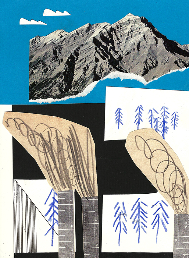
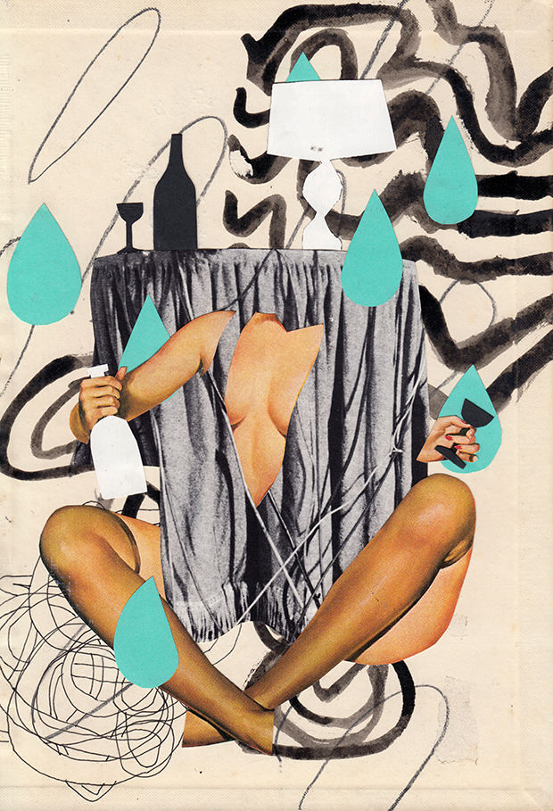
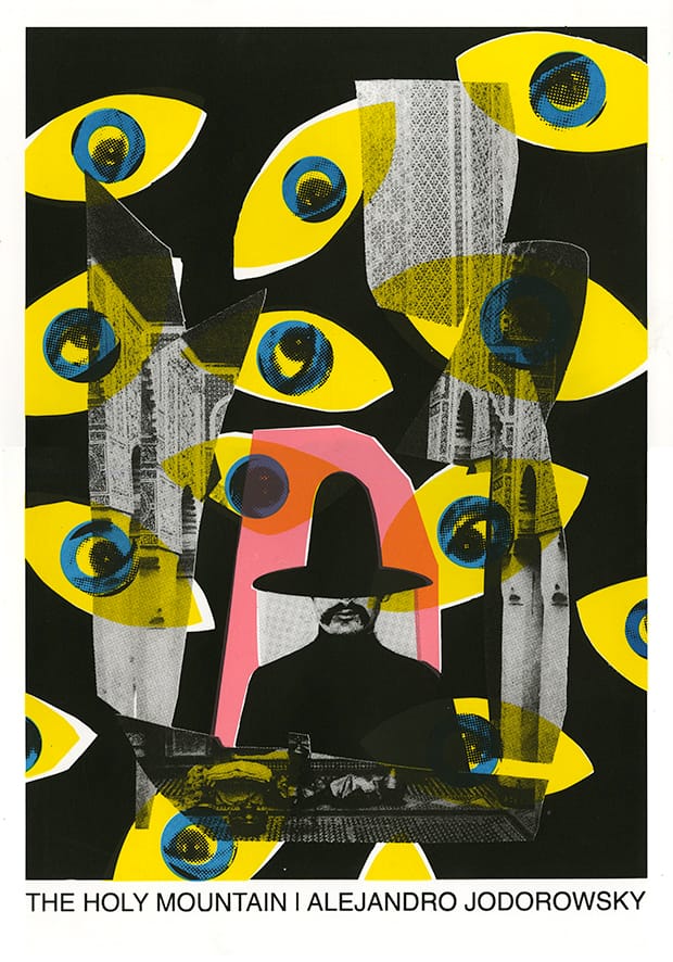
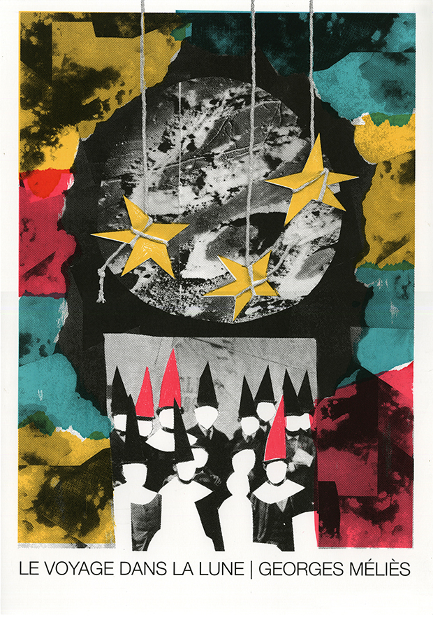
This Edinburgh College of Art student creates magnificent collages which distil film or book narratives into vital compositions, form exciting Riso zines and create obtuse images.
How would you describe your practice?
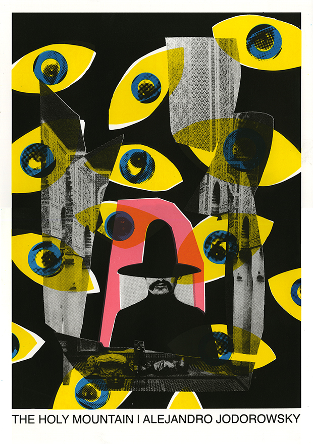
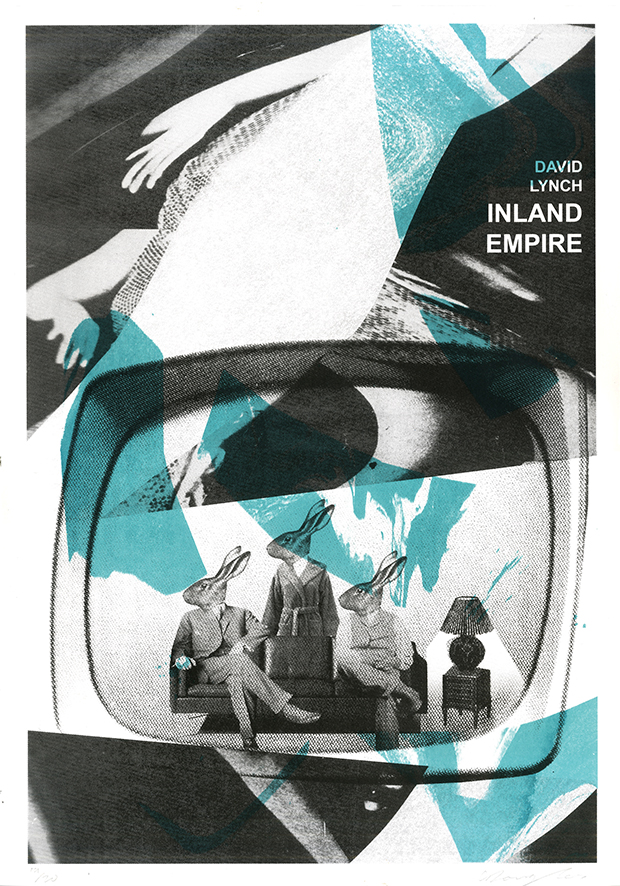
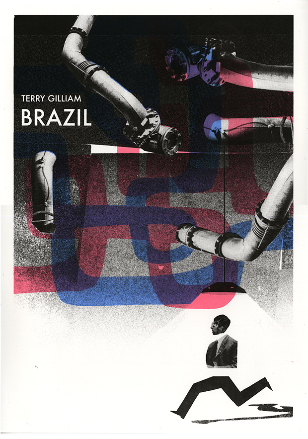
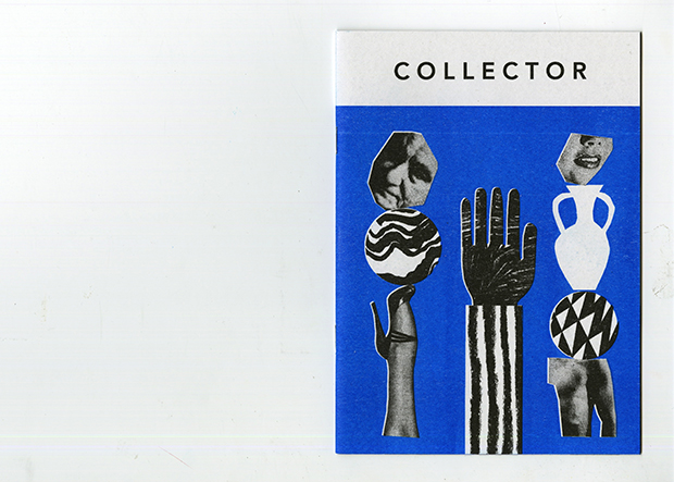
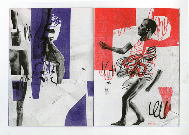
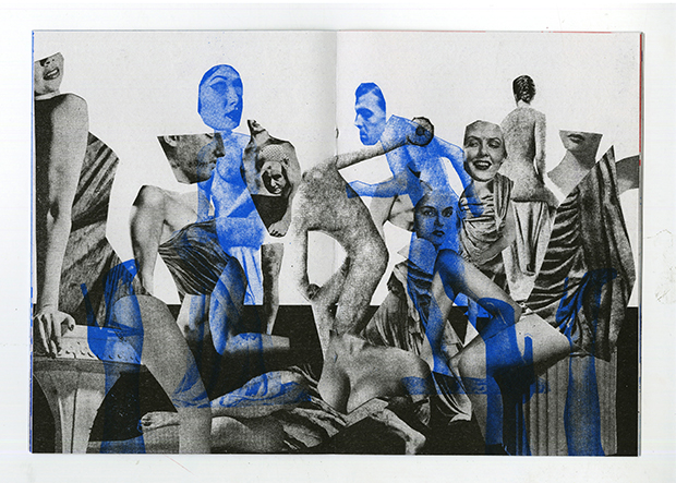
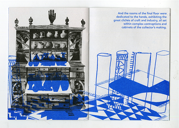
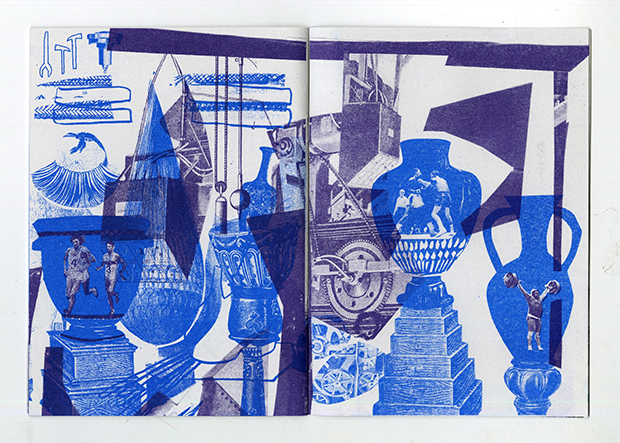
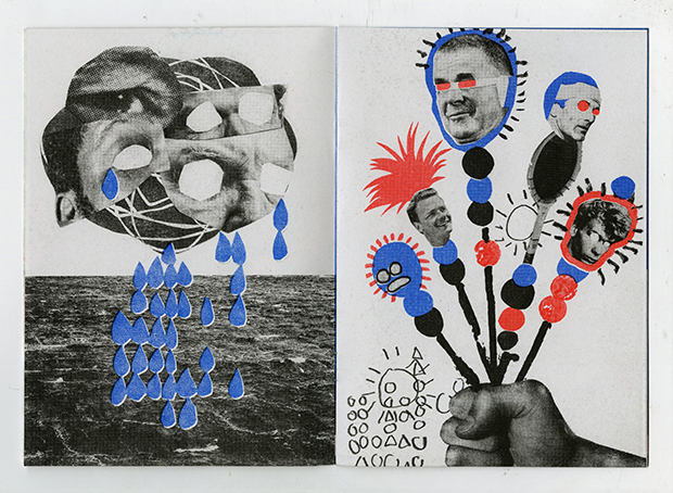
I’m an illustrator, but not everything I make is illustration. I like to work on strict design briefs and looser personal projects in parallel. I’ve always enjoyed the challenge of film posters and book jackets – distilling whole narratives into a single image. In my personal work I create a variety of things, including my own illustrated stories and more abstract work in various forms of printmaking. I like to combine analogue and digital processes: most of my work starts with quite crude, physical materials, moving through the computer and ending up as a riso or screen print. A lot of what I do is based on re-appropriation, letting found photographs and charity shop knick-knacks guide the images I make.
You're studying at Edinburgh College of Art. What is the course like and what have you particularly taken from it?
The course does a really good job of teaching students specific skills – draughtsmanship, storytelling, printmaking – while letting everyone develop their practice on their own terms. There’s no pressure to work with any particular medium, method or field of illustration. I think the most valuable lesson I have learnt here is how essential research is, first-hand and otherwise.
Your work is heavily collage based – what is it about this technique that appeals to you?
I could talk all day about collage. It’s a really immediate medium and it’s a great marriage of sculpture and 2D image making. Mainly, I think of the whole world as being a collage, a collection. Most of what we see around us is a composition made of the input of many different people. So using the photographs of others and manipulating it into my own visual language is, for me, the most direct way of responding to what I see and experience every day.
Many of your designs are ideas towards film posters. What's your opinion on the design of contemporary film posters?
It’s hard to comment on that without being speculative or generalist, but I do think film posters these days could do with more exciting design. A lot of the time illustration is used in really interesting ways, but too often a production company will resort to a simple still, or even worse a hazy amalgamation of the faces of the actors in a film. I think this happens more in Britain than in the rest of Europe or America. Good illustration has such a great power to capture the tone and feel of a movie, it should be utilised more often.
What are you working on now and what's next?
I’m currently designing a short book in response to a few days I spent in the Orkney Islands back in October. While there I found the landscape of Orkney is really interesting, it bears all these marks of its past – WWII bunkers, ruined houses, all manner of marine debris – and I was interested in how these prosaic structures relate to the Neolithic monuments there. The book is designed to recreate my own travel through this landscape, using collage and drawings from memory, and to elevate each subject to the same sacred status.
My degree show at Edinburgh is fast approaching and I’ll be graduating in June, so in the immediate future I’ll be working like a dog and then taking a holiday. After that I’m staying in Edinburgh, and hoping to set up my own screen printing studio with a few of my friends here.
georgebenjamindouglas.com
