
Typography and a highly sophisticated monochrome style go hand-in-hand in the portfolio of our latest recent graduate, fresh from a rather tasty internship at The Gourmand.
How would you describe your practice?
I think giving form and translating information into a visual and physical space is definitely at the forefront of my practice. I enjoy trying to display and arrange images and text in a way that’s both interesting and coherent. I always approach a design task logically, while also wanting to make the most out of smaller details, whether they be typographic, format-related, or something realised in the printed object itself.
You studied graphic design at Kingston, what did you take most from the course there?
The graphic design course at Kingston was a great experience. Despite the fact I’m known for criticising some aspects of it, I think what you learn as a progression through the three years as a whole is really unlike any other course in the UK. The course is so broad but its main focus is on ideas and research which tend to help give projects reason and extra depth, and the tutors will always be supportive of any direction you want to take a project in. Although it’s a course that has developed a very recognised voice over the past few years, it is now in a state of limbo due to the new tutors and the new course leader, Andrew Haslem, starting to have a great effect on the third year of the course. I hope they manage to adapt it in a way that keeps the course constantly unique.
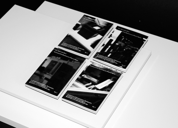
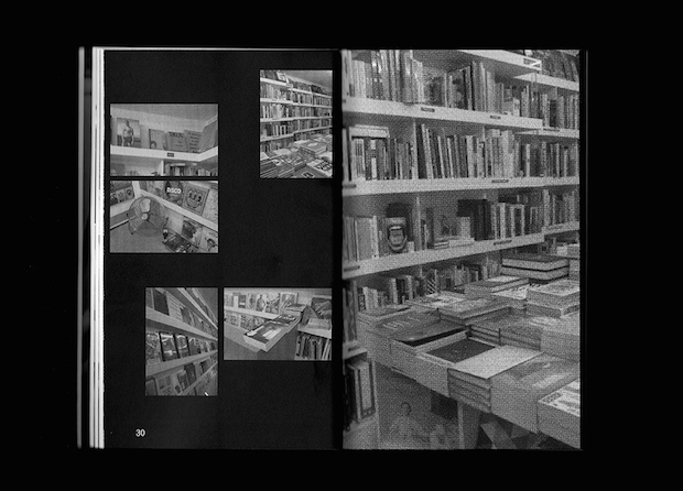
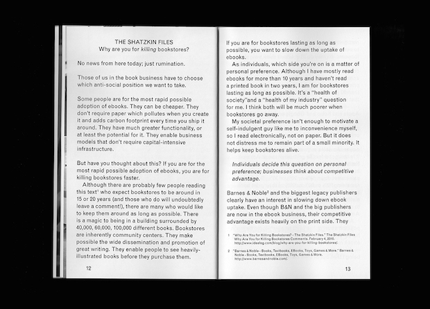
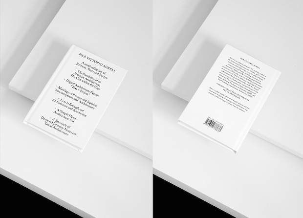
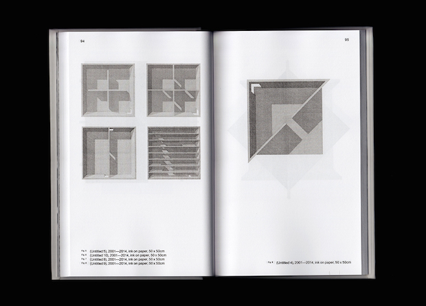
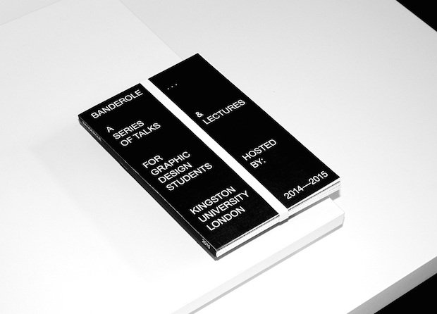
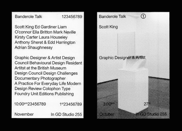
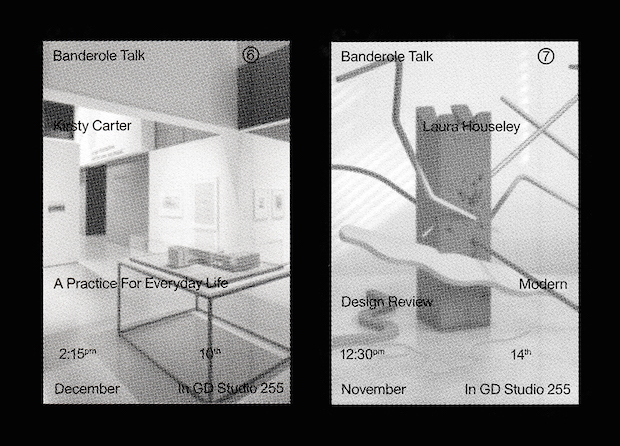
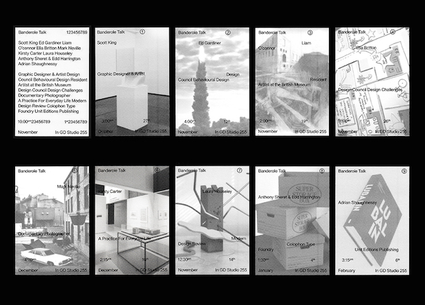
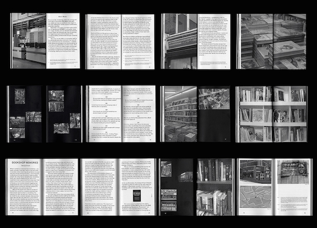
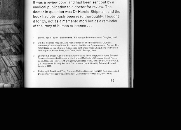
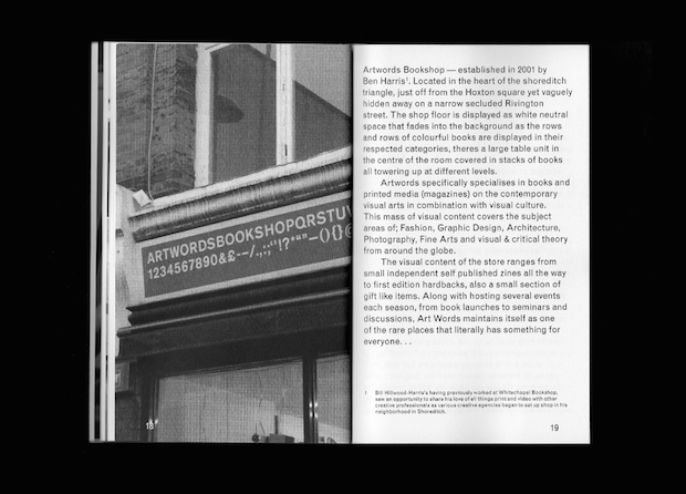
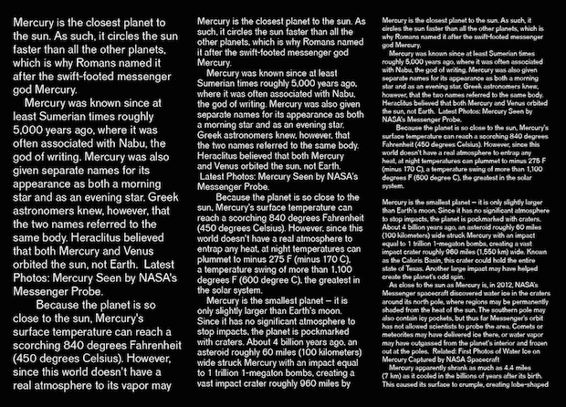
You did a publication made up of texts and images from the architect and critic Pier Vittorio Aureli, could you tell us about the thought-process behind the design and choice of content for this project?
The basis of the project was mainly an exercise in editorial layout but with lots of different types of content, after beginning to get interested in Aureli’s work I felt the range of his work would combine well into a publication. The ‘quiet’ design of the book is a way of trying to let the viewer easily engage with the text and images as best as possible; each segment of the book is different in content and so has different design rules applied to it, however as a whole they still feel like part of the same visual language.
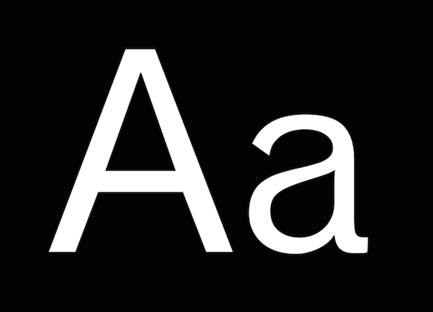
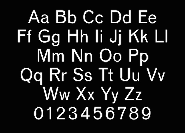
You've also been creating a new version of the typeface Venus, what was your motivation for doing so?
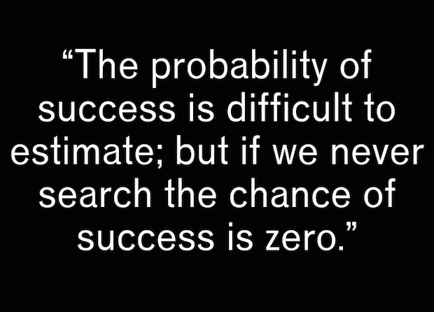
After starting to learn FontLab in my second year of university and beginning to have a real interest in type design I felt that heavily editing a version of an existing typeface was a better place to start than from scratch. I had always liked Venus (particularly all the capital letters) but always found it difficult to use for body text, it seemed too narrow and slightly condensed. Mercury is the result of my manipulations of the dimensions and the forms of all the letters in order to make it into what is hopefully a more modern and usable face for all situations. There’s still a lot of work to be done on it: I open it up every now and then in between other projects in order to keep refining it.
What are you working on now and what's next?
I'm currently still working on a few of my ongoing university projects. After recently finishing a design internship at The Gourmand, I am searching for more work opportunities with a focus on typography and editorial elements. I’m also looking forward to moving out of Kingston and will be based in Brixton from September onwards.
georgehaughton.co.uk