From a logo that nods to the early internet to a suit of animations created by the world’s top GIF artists, playful Brooklyn studio Dark Igloo talks us through its work for online GIF archive Giphy.

Tell us a little bit about Giphy.
The backbone of the site is a giant search bar that helps you explore the biggest collection of GIFs online. Once you’ve found something you like, there are a lot of awesome little one-click ways to share that GIF on social networks & text messages – Giphy was the first to build something like this. You can browse the portfolios of GIF artists, upload your own animations, even convert videos into GIFs. We’ve been working together for nearly two years now, in that time we’ve seen their traffic grow from one million to almost twenty-five million hits a month.
How did Dark Igloo get involved in the project?
Giphy’s founder Alex Chung is one of our oldest friends and clients, and we’ve always worked really well together. He brought us in to tell us about it when Giphy was just two or three people and some code he threw together over a weekend. It inspired us instantly, and we jumped at the chance to do the branding.


What was the original brief for Giphy’s brand identity and did it change at all?
Based on how we're all using technology today, they viewed GIFs as a file format primed for a modern resurgence - they’re both retro and current. The brief was to visualise that as simply as possible. The logo doesn’t need to be flashy and wild when it’s surrounded by dozens of GIFs.
What’s the concept behind the branding?
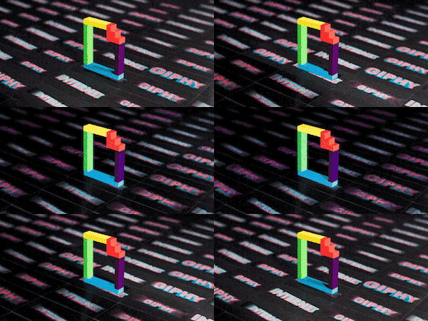
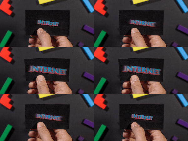
A gif is simple, but there are a million things you can do with it. We wanted to reflect that with our branding. So while the retro, file-type icon we made is very simple, we use it in lots of different ways. We exploded the logo into a geometric pattern. Its six colors are used as a palette across the site, animations and collateral. Certain shapes of the logo are used to build the large search bar on the site. The big idea behind the physical collateral was to make GIFs you could hold in your hand, so we commissioned some of our favourite GIF artists to make original animations, and turned them into lenticular hologram business cards, stickers, and postcards.


What did you want to achieve in the website design?
We aimed to make the process of searching GIFs as visual as possible. It should be just as easy to find something specific as it is to click around the site for hours discovering new animations. Our studio handles website animations, and high level design elements like the search bar & icons. Giphy’s team handles core design and development of the site. Across all the collaboration, the goal has always been to make the search bar a major piece of it visually, to pull the colours of the logo throughout the site, and to let the GIFs speak for themselves.
Tell us about animated logos you created for Giphy TV.
Giphy TV is awesome: enter any search terms, and it plays an endless stream of GIFs based on that theme. Watch kitten GIFs in a little window all day at your desk, or full-screen butt GIFs all night at your dance party. We've got some cool things in the works like making every tenth GIF a branded bumper by a GIF artist, inspired by the MTV logo animations we grew up with. Giphy has always believed artists are the heart and soul of GIFs and GIF culture. So, they dedicated an entire section of the site to celebrate, showcase and grow the GIF art community. We collaborated with some of our favourites from the site to animate the Giphy logo in their own style. The brief was really openL just use the Giphy colours, and show the logo.


Did this project involve sourcing any new materials or using any new processes?
After working in design in NYC for nearly a decade, we can tell you that Lenticular prints are some of the hardest collateral to produce. It’s a very niche market, lots of variables, and it took a little time to sort out which animations work best as holograms. But once we got over the learning curve, we got into an rhythm of making some awesome holographic pieces for them.
Where there any particularly challenging parts of the project?
The GIFs are what make Giphy special, and they all look totally different. It could be pixel art, a scene from a black and white movie, high-fashion, tv sitcoms… so at first, the prospect of tying them all together felt like a challenge.


What do you think has worked particularly well?
Lenticular business cards with a zoom effect blow minds. It’s the only piece of design that has caused complete strangers to yell “OH SHIT” consistently.
What was the client's feedback?
After working together for a few months, we formalised the relationship and now work with them on a daily basis to collaborate on creative, animation, content and design. The core team really trusts us, we’re always surprised and impressed by what they’re building, and we really wouldn’t be here without them.
darkigloo.com
giphy.com

