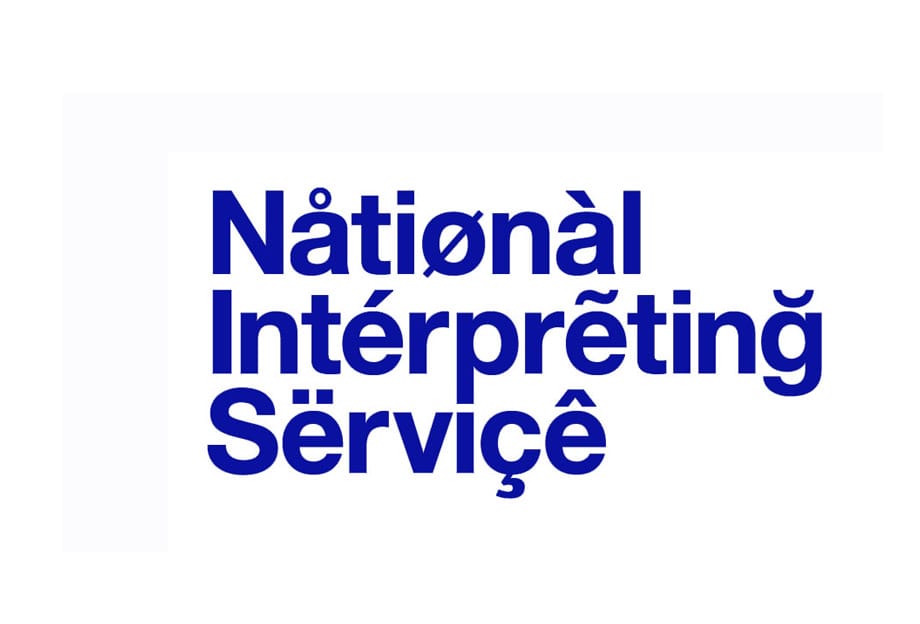
Rather than create an identity for the National Interpreting Service that split the logo into a symbol and explanatory text, Browns opted for a typographic solution that’s something tremendous, argues The Beautiful Meme.
The joy of creating a logotype for an organisation with a short name is one we all recognise. Indeed, there’s a mildly heretical case to be made that Lubalin with ‘Families’ and Landor with ‘FedEx’ had it easy. And the opposite of that joy? The sinking feeling you get when you realise the brand name you’re about to transform is simply a sentence with ideas above its station. Respect then to Browns when they did something tremendous with ‘National Interpreting Service’ in 2003.
The business is an over-the-phone translation service. Corporations can get twenty-four-hour access to translators covering the world’s languages. Through diacritic marks (we had to look that one up as well), the logotype tells a subtle story about the nuance of accents, rather than the blunter, and more obvious, message of language conversion.
We love this logotype for three reasons.
Firstly, it’s a logotype rather than a separate symbol. With such an unwieldy name, the easy route would have been a cute little mark representing speaking or listening or understanding or some other hack choice. Browns took the harder, intelligent route and pulled it off.
Secondly, the balance is beautiful. A perfect example of knowing how much is too much and how much is just right. Three diacritic marks on each line. One can only imagine the combinations they went through. They gave themselves a bit of a break in that they ignored how the glyphs effect the pronunciation of the name. Try reading it and you end up sounding like your drunk uncle being racist at Christmas.
As an aside, designers have a strange relationship with glyphs. Typeset the word ‘façade’ and the temptation is to use the cedilla from its French origination. This is obviously nonsense as we've taken ownership of that word and are designing in English. However, you still see people adding that visual flourish as some sort of shorthand to feeling ‘international’ - like a Mercedes logo hanging on the chest of a 1980s New York hustler.
Our third reason for loving this logotype is just that it looks cool. It would work just as well for that underground hip hop artist you keep hearing about. It has a wealth of visual treats to enjoy. With the eclectic mix of symbols – from harsh diagonals to flowing waves to solid roundels - it almost seems to tap its foot to an imaginary beat. It’s a logotype that knowingly nods at you. It’s a logotype that laughs at those ‘classics’ with their single word, handful of letters smugness.
thebeautifulmeme.com
The Beautiful Meme
London-based design studio The Beautiful Meme specialises in branding and identity projects for a range of different clients. In 2013, the studio rebranded the English National Ballet, combining a quote mark symbol (fostering the idea that the company had something to say) with moody photography. The Beautiful Meme regularly work with the Design Museum and recently developed the campaign for its Women Fashion Power show, which featured a typographic-led poster with the clever tagline ‘Not a multiple choice’.
Lost in Translation
Some brands really should have used the National Interpreting Service. In 2001 Honda launched its new car, the Fitta, only to find that in the Swedish, Norwegian and Danish languages, Fitta is slang for female genitalia. Mazda did something similar in 1991 with its Laputa – ‘puta’ being a Spanish word for prostitute. Lots of brands have struggled moving into the Chinese market. Coca-Cola was first read as Kekoukela in the country, meaning ‘bite the wax tadpole’ or ‘female horse stuffed with wax’ depending on which dialect you use. With some research they later opted for kokou kole or ‘happiness in the mouth’. KFC had similar issues, initially accidentally translating ‘Finger-lickin’ good’ into ‘eat your fingers off’.

