
There can be few tasks more onerous than regimenting one of the 20th Century’s finest minds. Two members of London-based illustration collective Heretic take up the challenge.
About the project.
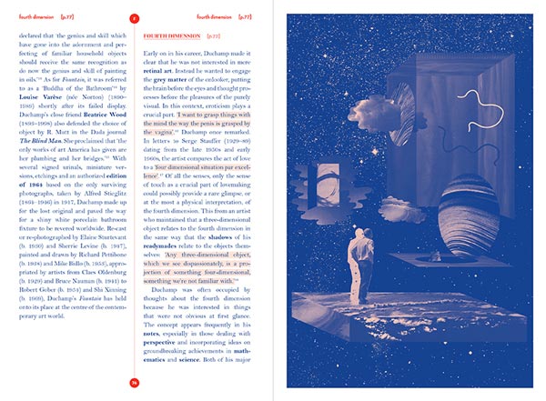
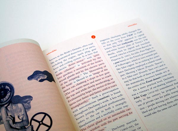
It’s a book about all aspects of the artist Marcel Duchamp’s life and work set out in short, accessible entries that consciously avoid any high-brow or elitist art world lingo.
How did the project originally come about?
I (Therese Vandling) do a lot of work for Thames and Hudson; I used to be in-house there, so the design director approached me and asked if I was interested this project. They were keen to use an alphabet that I had produced while at college — I didn’t want to revisit that so I convinced them to let me try something new and, because it was such a large job, to collaborate on it with another member of Heretic, Luke Frost.
What was the original brief and did it change at all?
Initially we were only supposed to do the illustrations for the A-Z letterforms. The job definitely grew in scale when we also started doing the entry illustrations, with it gradually being suggested that we did more and more of them. It was actually a very open brief and we didn't have too much direction from the author or the publisher, they seemed to be very happy with us getting on with it.
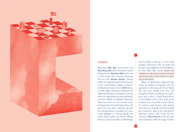
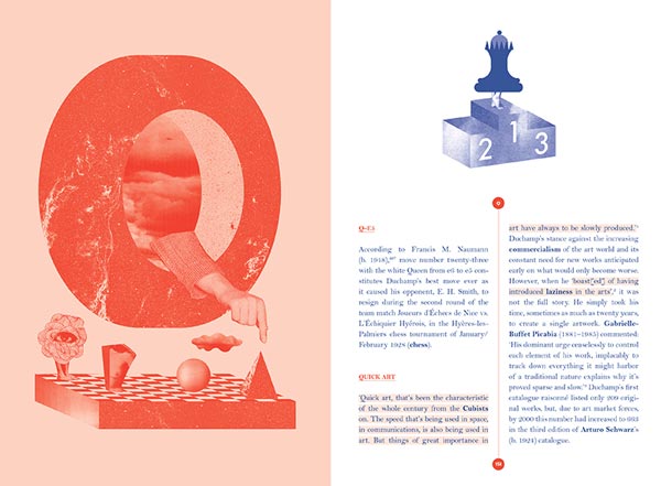
We didn’t have all the text to begin with, just a list of entries that were going to go into the book; the problem is that a Duchamp entry that says “breast” or “bicycle” has so much more meaning than you would initially imagine. We had to do a lot of reading before we could proceed. All the illustrations related to the entries and the content that the author, Thomas Girst, had written. We tried to read all of the text and to incorporate a lot of the ideas from, say, the ‘A’ section in that letter form; I don’t think the design director or editor realised that that was our methodology until much later and therefore why it took us so long. That process of learning and immersion is also one of the nice things about this kind of project, and of course the premise of the book is that it makes some of the tricky aspects of Duchamp’s thinking easier to grasp.
Did this project present any particular challenges, and if so how were these overcome?
When you work with collage you usually have an ideal image in mind that you want to find but can’t. That doesn’t stop you from trying to look for it for two weeks. You spend days and days in libraries searching, producing hundreds of photocopies, or delving into your own archives and book collections.With collage you quickly decide what parameters you need an element to fulfil, for it to be from a certain era, for instance, or for it to be at a certain angle. Though you never find it, in searching for it you’ll always find something else that fits the bill. As an illustrator, if you’re drawing you can usually find the exact right line and pursue it, but with collage there is more of an openness to chance and risk.
With this project there was quite a lot of work towards the end to make sure the flow of the publication worked well, tweaking type sizes and such. I think this book has put me (Therese) off justified text for a long time, because we’ve used quite a short line and I can’t even imagine the number of hours that I spent going over it to check for rivers… and it’s still not perfect.
What do you think has worked particularly well?
We weren’t under any pressure from Thames and Hudson to make the book look like a dictionary but we wanted to reference that form and to subvert it, to make it playful. The formality of that typology is concisely offset by our, sometimes quite brutalist, collages. As for the use of colour, the publisher said from the outset that it had to be two-colour, which made sense to us and looking at the finished object we really like the sense of low-fi-ness that it communicates.
What was the client's feedback?
The in-house feedback has been really great. We’ve also had some really nice emails from the author, who we’ve never actually met, but hope to do so at the launch party. Over all, the process went very smoothly; given the amount of illustration work (64 in total) we presumed that we might have a lot more alterations to do.
Technical spec
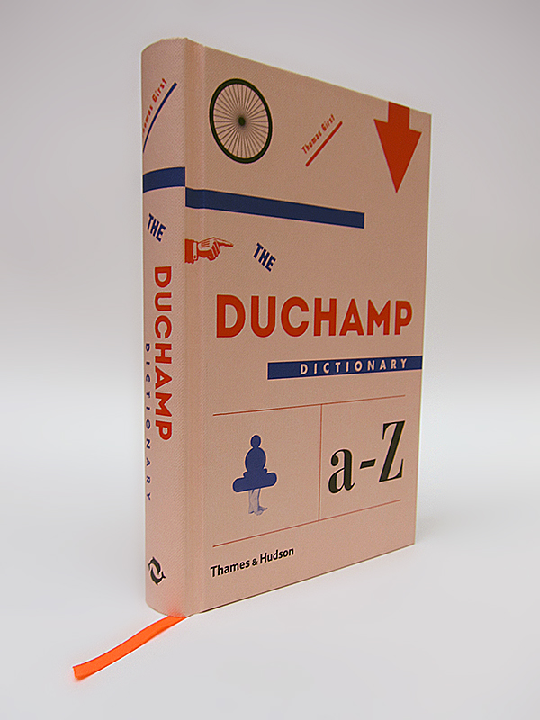
Inside we've used two typefaces, Bell MT and Neutra. The printing is two PMS colour throughout on 100gsm Yulong Light. Externally we've used five typefaces: Futura, Gothic Nr13, Intro, Bauer Bodoni and Bell Mt again.
The book is hardbound using Wibalin Buckram imitation cloth two PMS + Process K + foilblocking, with a rounded spine and ribbon.
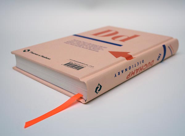
Title: The Duchamp Dictionary
Publisher: Thames and Hudson
Author: Thomas Girst
Date published: April 2014
hereticheretic.co.uk
vandling.co.uk
cargocollective.com/lukefrost


