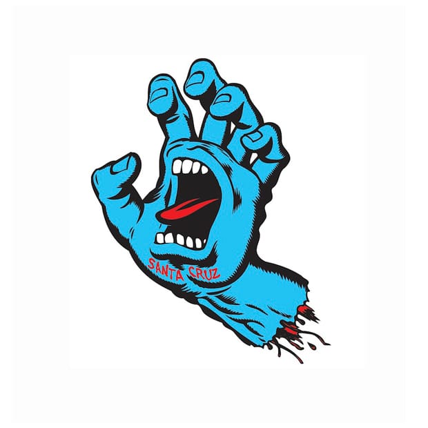
Visceral and lairy, Jim Phillips’ Screaming Hand design for skate brand Santa Cruz perfectly sums up the 80s teenager’s attitude, says Atyp’s Chris Angelkov. I loved this logo growing up. Everything about it – its irreverence, anarchy and energy. Looking back, it perfectly captures the scene we were engrossed in – a group of kids trying to form our own identities. Skating was the doorway that transported us away from the champagne-coloured Austin Maestros and Farah slacks of a lager-soaked mid-Warwickshire town. And Jim Phillips’ Screaming Hand design, which adorned our hoodies, articulated everything we couldn’t at that point in our lives.
We would all try, in vain, to perfect it on our maths books at the back of class, waiting for the last bell until we could get out and hit the mini-ramp in the few hours we had until dinner.
I’ve often wondered where and how the idea came to life. Sure, if you go really fast, you tend to scream. But it was such a strange and perfect combination of ingredients.
It brought a smile to my face to hear Phillips say that he had been drawing the motif since 1959 – on his schoolbooks at first and then repeated again and again until it became a kind of character. He would sketch it as a drowning surfer circled by shark fins, but when the time came (about twenty-six years later) he dropped on the immortal scream and the rest was history.
If we rewind a bit, we can see that this is just one of a prolific portfolio of artworks that seemed to pour out of Phillips. There were the Roskopp designs plagiarised in 2013, the Jason Jessee sun pattern, the Independent Trucks logo, and of course the Santa Cruz Logo itself.
Santa Cruz, the town, was a mecca for surf and rock music in the 1970s and by the mid-1980s the punk and skate scenes had emerged, combined and been let loose. Bands like The Clash and The Sex Pistols, which were transported from the UK, had been replaced by a new wave of punk bands such as Black Flag, Minor Threat and the Butthole Surfers, which in turn had come over to these shores in a kind of cultural exchange.
This West Coast export was a subculture that hordes of kids up and down the UK, with an aversion to Sergio Tacchini and white sports socks, embraced. It was the thing that made us feel different. It was the platform that gave us direction, kinship and creativity in our adolescent years. We were not necessarily a disenchanted youth: we had experienced Commodore 64s, Raleigh Gold Burners and some of us even had enough money to go on the school ski trip. But it was Thatcher’s Britain in the grip of the miners’ strikes and West Coast culture, even for a bunch of eleven-year-olds, was a magical form of escapism – summed up no better than by Jim’s screaming blue hand.
atyp.co.uk
Chris Angelkov
Angelkov founded Brighton-based studio Atyp with Merlin Nation in 2011. Many of the consultancy’s projects sit in the intersection between design, innovation and film, and the studio persistently dedicates time to exploring new techniques in self-initiated projects (like this film using a Cinema 4D dynamics engine) to keep up to pace with the latest innovations. Atyp’s clients include Burberry, Sony, the BBC and Nike, for whom they’ve just completed a holographic Digiwall activated by motion sensors.
Jim Phillips
If you’ve ever been to a skatepark, it’s more than likely that you’ll have seen some of this California-based designer’s handiwork. A prolific talent, Phillips has created thousands of designs for Santa Cruz, where he was creative director and still masterminds special edition decks for the brand today. Phillips attributes his success to testing out new designs on his son Jimbo, and his loyal studio members. The plagiarism that Angelkov alludes to was fashion designer Jeremy Scott’s 2013 A/W collection that was emblazoned with Phillips’ work without permission. The copyright dispute was settled some six months later and Scott agreed to pull the controversial designs.
June 26, 2014 3 minutes read
Go Faster
Visceral and lairy, Jim Phillips’ Screaming Hand design for skate brand Santa Cruz perfectly sums up the 80s teenager’s attitude, says Atyp’s Chris Angelkov.

