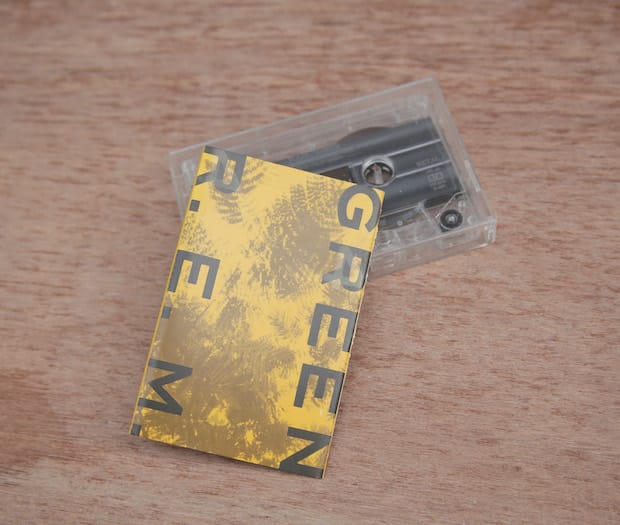
Deciphering the graphics and print techniques on the sleeve for R.E.M.’s GREEN paved the way for NYC designer Joe Shouldice’s love of hidden extras. 1988, I was barely a teenager and I either bought or was given the R.E.M. album GREEN. I found the music was fine, nothing that I particularly loved. I didn't even know what graphic design was and the ‘design’ of the cover art was not really something that I particularly liked, with the exception of one thing. Printed ‘invisibly’ over every ‘R’ on the cassette sleeve was the numeral ‘4’ (I later learned this invisible printing to be a spot varnish). Additionally, wherever ‘4’s were to be printed, in their place were ‘R’s. In a pre-internet age there was no way for me to answer the question why anyone would ever intentionally do something like this and it absolutely fascinated me. (In writing this article I learned – thanks Wikipedia – that this was basically just an inside joke carrying forward a typo where Green was accidentally typed ‘G4een’).
In hindsight, I realise that this made me aware of these little decisions that could add intrigue and surprise to otherwise mundane graphic design. It lead me down the dark rabbit hole of finding subliminal words in advertising (discovering that nine times out of ten, this will be the word SEX). A couple of years after encountering GREEN I remember finding a special edition Pepsi can designed with blue and pink neon shapes on a black back ground that, when stacked correctly, spelled out just that. It makes me appreciate designers who put in the extra effort to provide a little smile to the five or ten per cent of their audience who will notice or care about those things – it’s always something that I try to incorporate into the work at yesyesyes design.
yesyesy.es
Joe Shouldice
Toronto-born Shouldice set up design and branding studio yesyesyes in 2010 after four years as creative director at Stefan Sagmeister’s eponymous studio. Based in Brooklyn, yesyesyes expands from just two or three designers to a much larger team to match the scale of projects and is known for its boundary-pushing use of material, embedding a HB pencil in a book cover or intricately die-cut posters, for example. Since March last year Shouldice has also been the art directors for littleBits, an open-source library of electronic modules that can be used to make a variety of products from synths to microphones.
R.E.M.’s GREEN
This record, made in 1988, was the first released by R.E.M. on a major label after a deal with Warner Bros. Records reportedly worth in the region of $6-12 million. Warners Bros. stayed true to its promise to allow the band total creative freedom; GREEN continued to explore political themes and was filled with R.E.M.’s unique brand of ironic pop melodies. In the United States, the band chose the release date to coincide with the 1988 presidential election and used many interviews surrounding the release to attack candidate George Bush Snr. Its artwork was created by New York-based painter Jon McCafferty, and was the first to feature lyrics from the band (for World Leader Pretend) and to be released in a special edition version.
May 13, 2014 2 minutes read
Good Spot
Deciphering the graphics and print techniques on the sleeve for R.E.M.’s GREEN paved the way for NYC designer Joe Shouldice’s love of hidden extras.

