
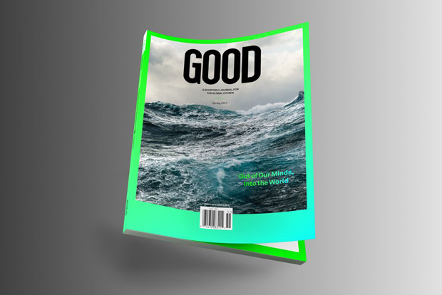
Nicole Jacek's LA-based studio has transformed GOOD magazine into a feast of lip-smacking visuals and hard-working brand identity. Find out how they overcame tight budgets to deliver it...
How did your relationship with GOOD magazine come about?
Casey Caplowe, one of the founders of GOOD, called us over to meet about possibly collaborating. He is a big advocate of the creative community, and the time and thought he invests into elevating creatives is admirable. Better still, Casey is a risk-taker. He asked us to take on the redesign of the magazine and collaborate with him on content.
Where do you start when re-designing a magazine? What are the biggest challenges to tackle?
We actually didn’t start with the design. It was more important to look at the overall structure of their company first to then define what the magazine should be—from a content and design perspective. We felt the magazine should be a by-product of the GOOD brand. Since GOOD Magazine was going through the process from being an activist magazine solely, to bringing in more of a lifestyle component, we had to be very careful to not end up with something over-designed and in the end nothing tangible. We wanted the content to drive the magazine, not the design. We tried to keep it very simple and put our efforts into the content. We worked in close collaboration with GOOD’s Editor-in-Chief Josh Neuman, Casey, and the awesome GOOD team.
We are driving the printers insane... pushing each issue from a production standpoint. The biggest challenge is always to make gold out of nothing, and money is always one of the factors that create hurdles for any creative to get over. Unlike the majority of current lifestyle magazines with small print-runs, we can’t print sheetfed, which then limits our production and printing options. So, we are literally driving the printers insane with what we are asking for, and pushing each issue from a production standpoint.
Tell us about your approach to key aspects of the design, such as text, type and image treatment…
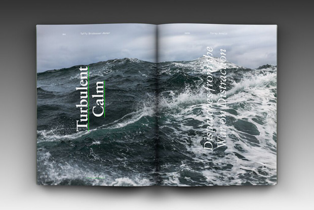
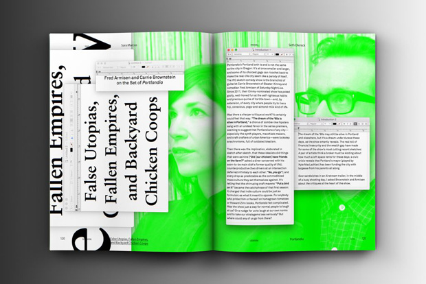
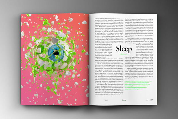
We took the key elements of GOOD’s previous design and eliminated everything unnecessary. We introduced one new type face—Akkurat. Simple and timeless. Overall we tried to make sure the text is legible and easy on your over-stimulated-internet-eyes. Everything we wanted to do is to give the reader space to enjoy a GOOD read. That’s about it.
How do you feel about the print magazine landscape in general – what part does good design play in sustainability for a magazine?
It’s pretty obvious that our reading behaviours have changed significantly – weekly disposable magazines are disappearing or have disappeared already. At the same time, quarterly lifestyle magazines have popped out everywhere. Most of them are beautifully crafted and quality printed pieces. The majority are probably more beauty-driven than content, but they are beautiful design pieces you want to keep. Good design is definitely one key element of success, but a very minor one when it comes to questions like: What does the product stand for? What’s the content? What’s the bigger picture? Who is your audience? Design can not solve everything, so you need to make sure the rest of your content ingredients are perfect.
Tease us with some clues about what we can expect next from NJ(L.A.)
There is a sexy site coming up pretty soon with all our new projects. I promise, there won’t be any naked people anywhere.
Also, make sure to grab a copy of GOOD’s Fall Issue. It’s going to be a pretty rad fashion issue.
good.magazine.is
njla.us (speakers on, for potty-mouth audio)


